Inspiration
The inspiration for Work in Progress came from the messy, non-linear reality of the creative process. Traditional portfolios only show the finished product, but the most valuable insights often happen in the "work in progress" stage. We wanted to create a dedicated space where designers could share their raw iterations, connect with other designers, and get feedback before a project is ever “perfect.”
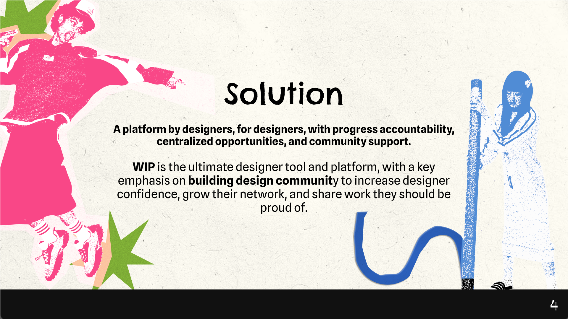
What it does
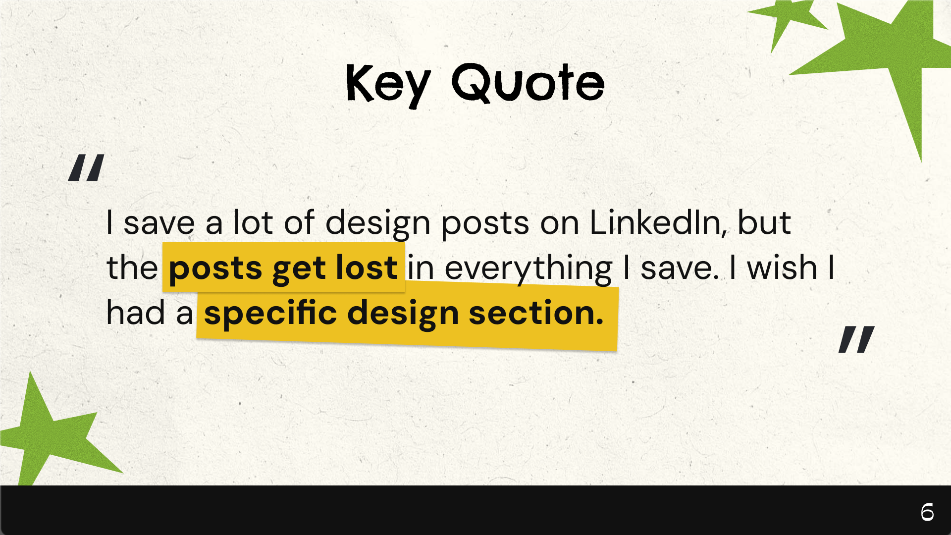
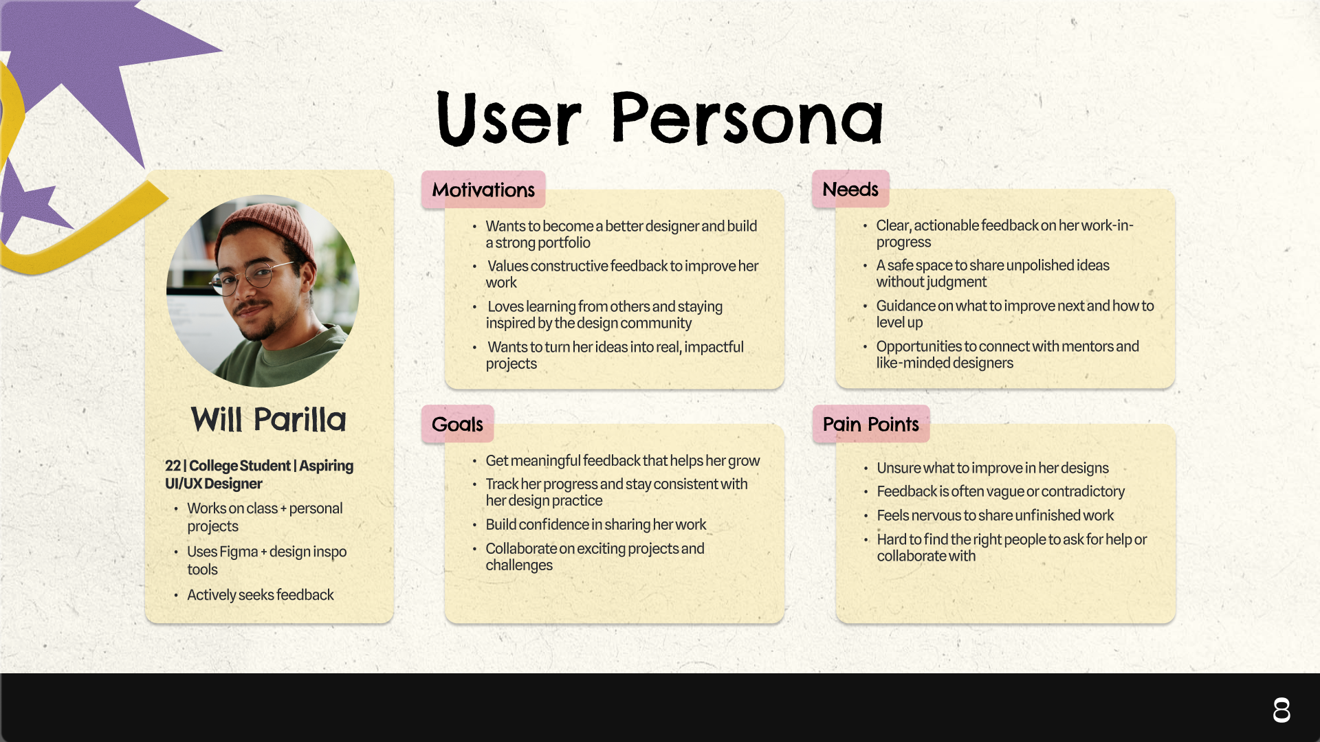
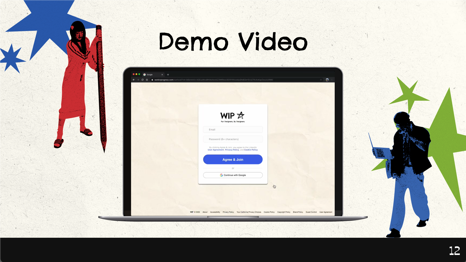
Work in Progress is a platform that helps designers turn unfinished work into clear direction. On desktop, users can share their designs more intentionally by adding tags and selecting specific feedback focuses such as hierarchy, spacing, or clarity. Instead of receiving vague comments, users get structured, targeted feedback that helps them understand exactly what to improve.
How we built it
We utilized Figma as our primary tool for both UI/UX design and building our design system.
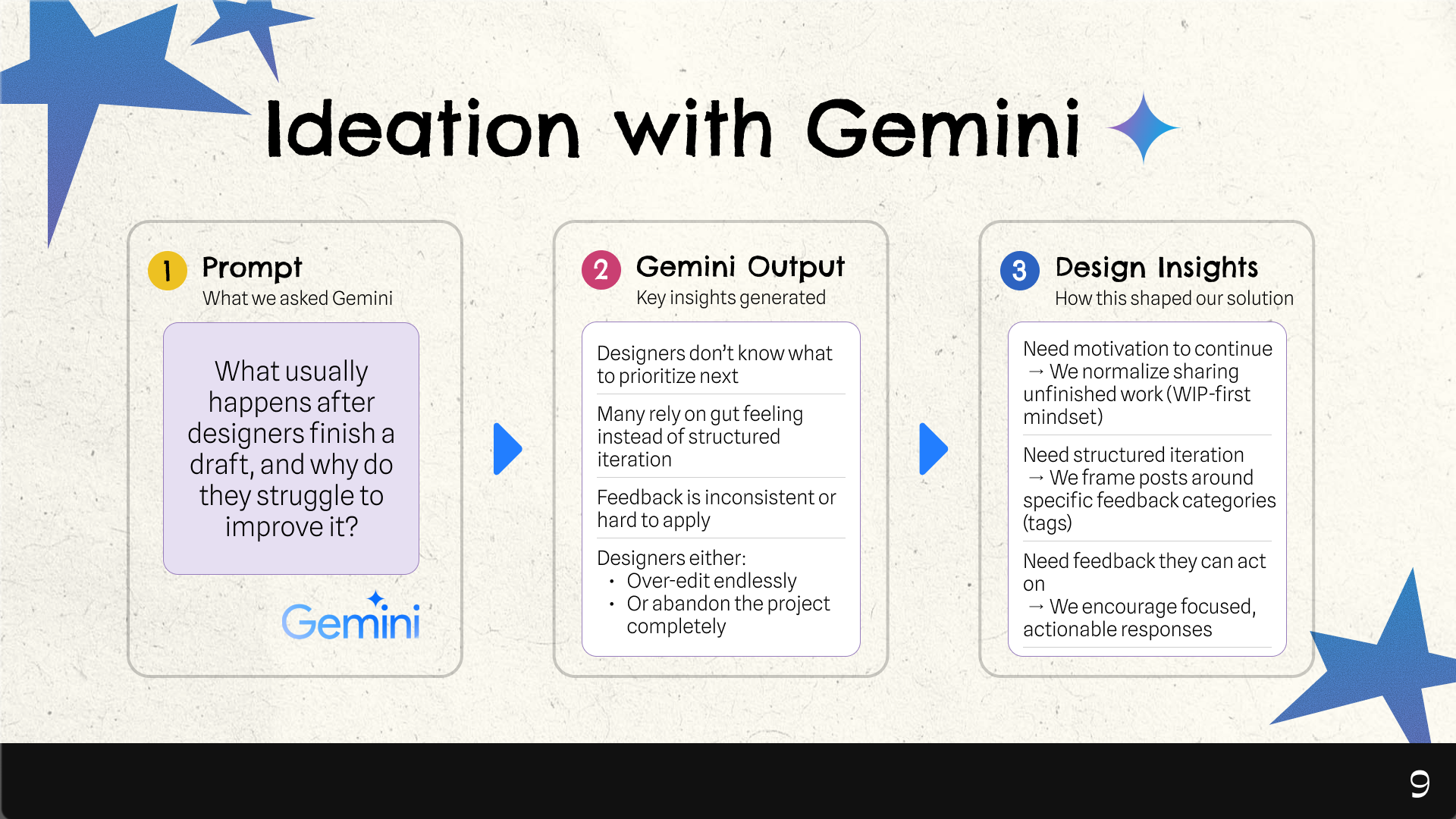
We designed WIP around the idea that feedback should be guided, not random. We introduced a system of tags and prompts that encourage users to request specific types of feedback, rather than leaving responses open-ended. We also explored integrating AI tools like Gemini to generate meaningful feedback questions and reduce the friction of asking for help. In addition, AI helps summarize the feedback users receive, highlighting key patterns and turning multiple comments into clearer takeaways. Visually, we prioritized strong hierarchy, spacing, and layout to reflect the clarity we want users to achieve in their own designs.
Challenges we ran into
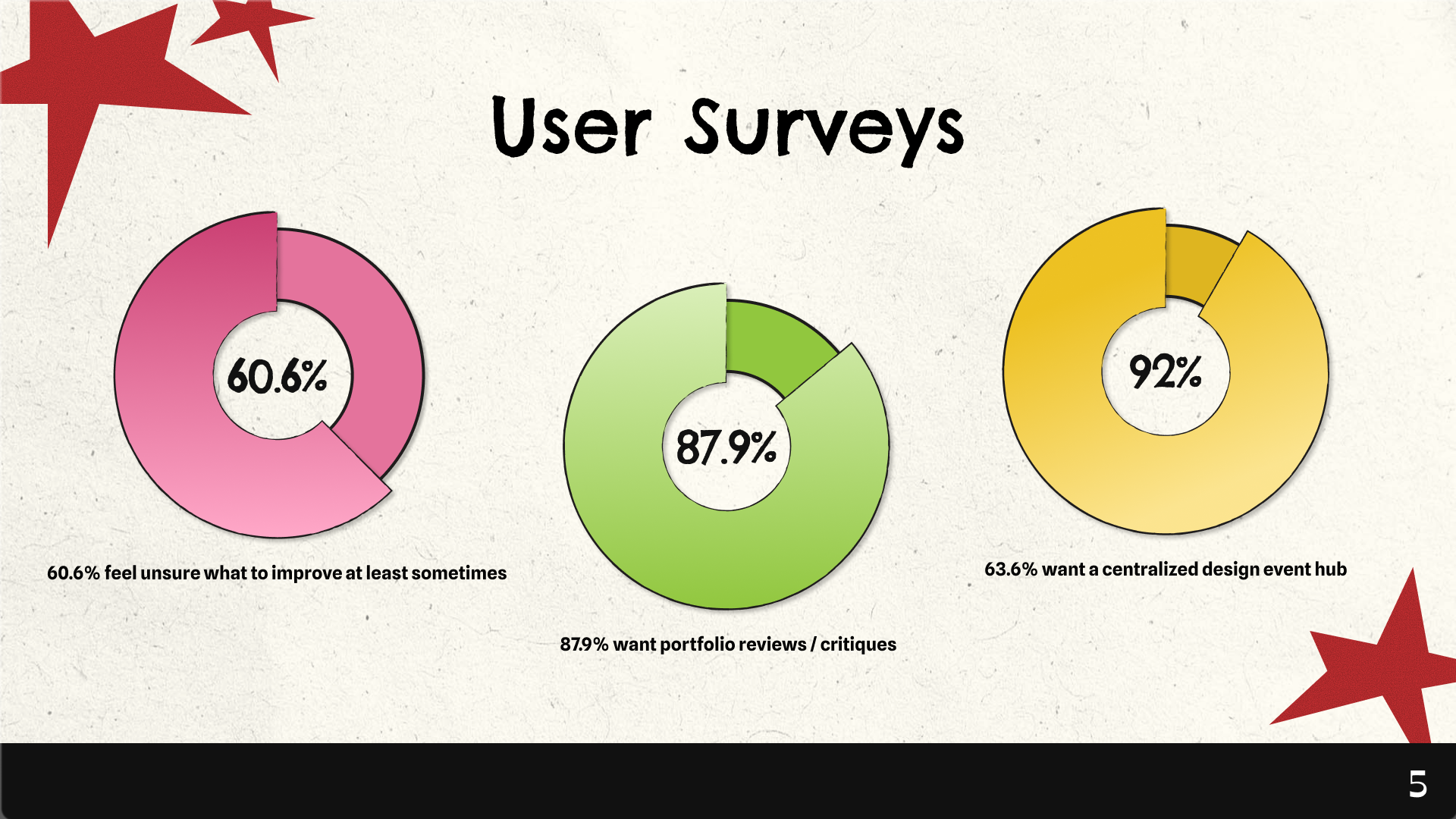
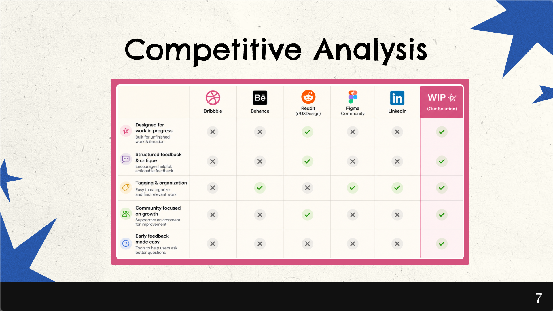
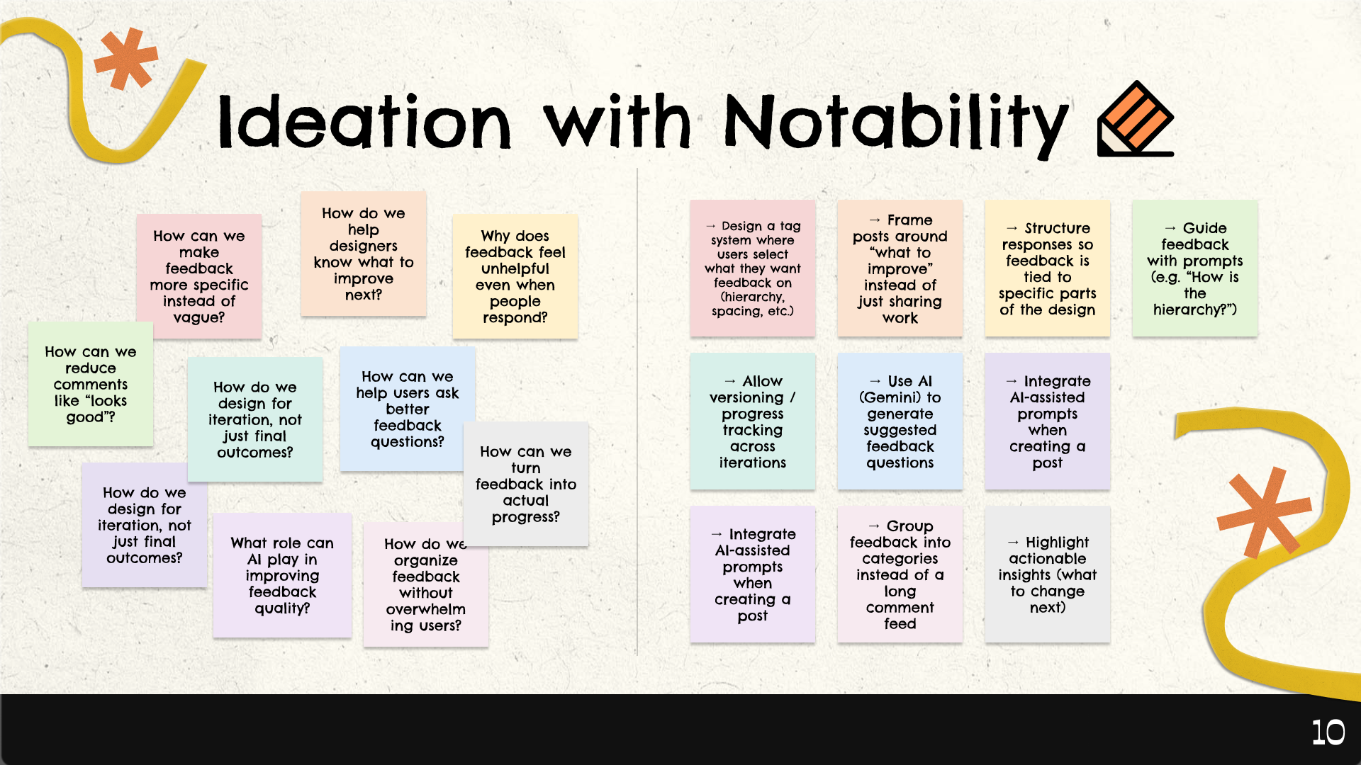
One of our biggest challenges was deciding which features to prioritize, especially within such an abstract theme. Early on, we had many ideas around feedback, collaboration, and project management, but it was difficult to translate the concept of “chaos to clarity” into a concrete, intuitive product. To guide our decisions, we analyzed user survey data to better understand where designers struggled most, particularly around unclear feedback and not knowing what to improve. We also used Notability to organize our ideas and identify patterns, and Gemini to expand on those insights and explore possible solutions. Together, this process helped us narrow our focus to the most essential features and shape a more realistic, cohesive experience.
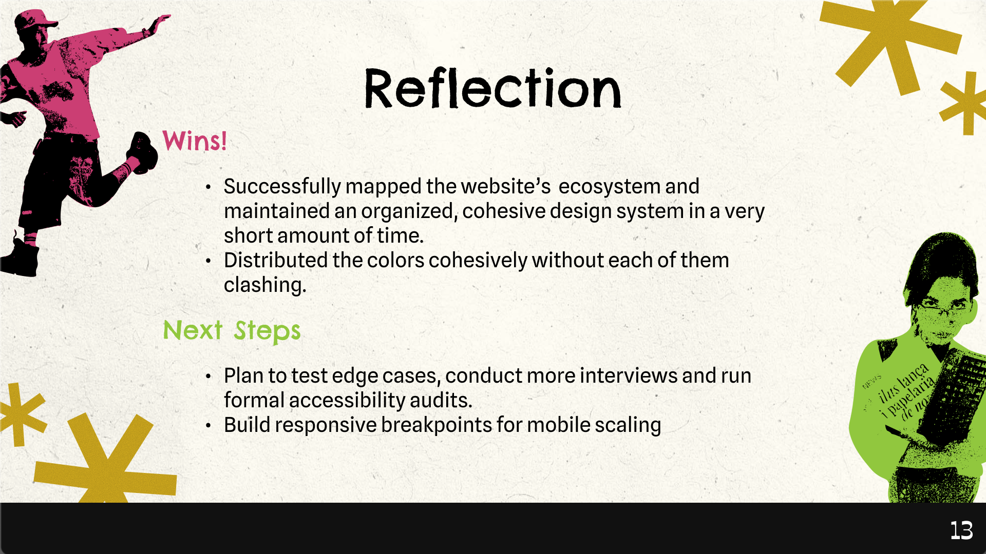
Accomplishments that we're proud of
One of our biggest accomplishments was adapting our direction in a way that made the product more realistic and usable. While we initially planned to design a mobile app, we shifted to a desktop experience after recognizing that most designers do their work in tools like Figma on their laptops. This change allowed us to better align the product with real user behavior. We are especially proud of how the UI turned out despite this shift—maintaining a clear, cohesive design while rethinking layouts and interactions for a larger screen. Overall, our ability to pivot and design for the right context helped us create a more grounded and effective solution.
What we learned
Through this project, we learned that more features don’t always lead to a better experience. Early on, we had many ideas, but trying to include everything made the product feel unclear and overwhelming. We realized the importance of simplifying and focusing on a few core interactions—sharing work, receiving feedback, and improving. We also learned that structure can actually make an experience feel easier, not more restrictive, when it is introduced thoughtfully. Overall, this project reinforced the value of prioritizing clarity, making intentional design decisions, and knowing when to step back and simplify.
What's next for Work in Progress
Moving forward, we want to strengthen the connection between feedback and iteration. This includes deeper integration with tools like Figma, expanding AI-assisted feedback using Gemini, and allowing users to track their progress over time so they can better understand how their work evolves.
We also plan to test edge cases, conduct additional user interviews, and run formal accessibility audits to ensure the experience is inclusive and works across different user needs. In addition, we aim to build responsive breakpoints to support mobile scaling, creating a more seamless experience across devices.
Ultimately, Work in Progress aims to help designers move from confusion to clarity—one iteration at a time.
Built With
- figma


Log in or sign up for Devpost to join the conversation.