-
-
-
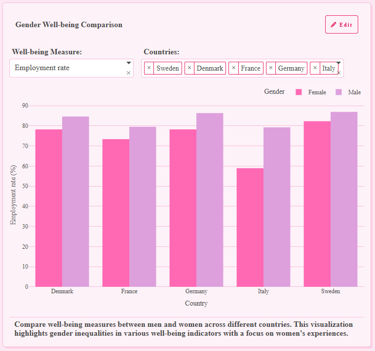
Inequalities for both men and women. The one I found super interesting was "feeling lonely" and the differences bw countries.
-

Not a lot of data available for this category, but interesting nevertheless.
-
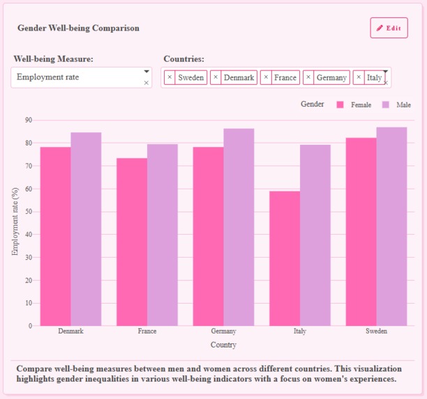
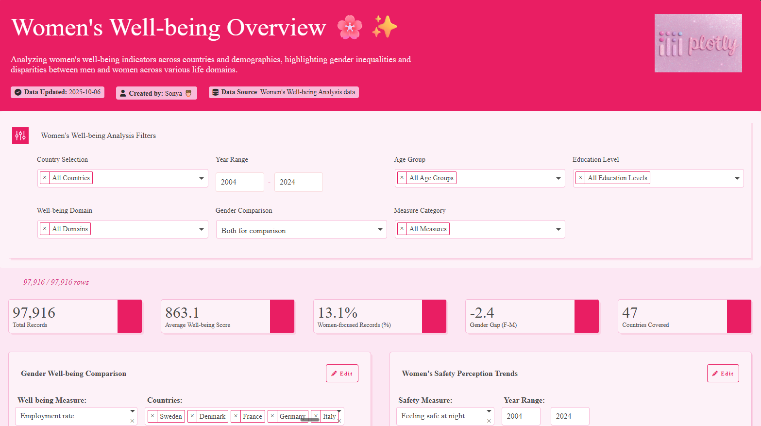
The one closest to equality is Finland! Would be interesting to see how unemployment is counted. Are sahw unemployed?
-

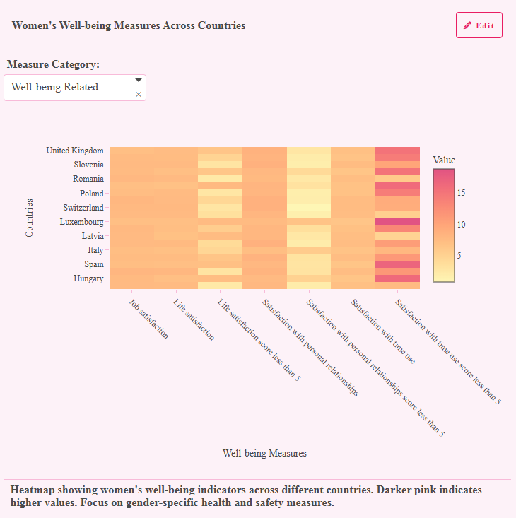
Had to include a heatmap, great way to visualise data.
-
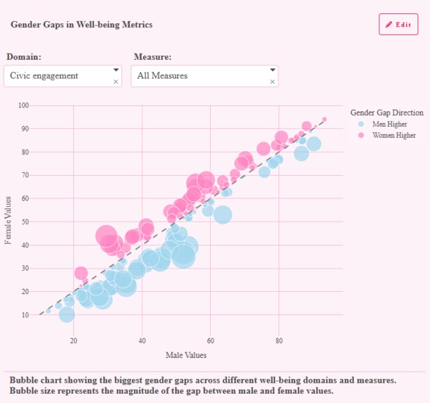
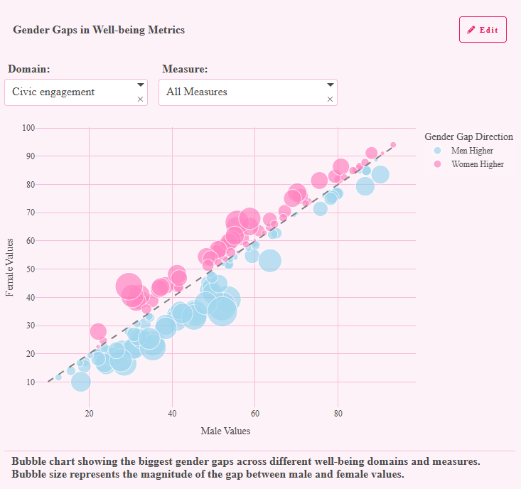
Bigger bubble = bigger inequality. Colours for gap direction.
-

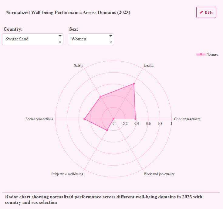
Not a lot of data for every country, but interesting visualisation for cases where data is present.
I got into coding by tinkering with HTML at the age of 10. You can imagine the type of stuff 10 yr old me came up with lol. (Really wish those websites I made were still available... 😭) Now I work in data and I still make everything bright and colourful. Believe it or not, at my last job I made a custom pink theme for my plots so that my dashboards would look nice 😁😁
Trying out Plotly Studio was so much fun, I had a blast trying out all the features! Hope you like it!


Log in or sign up for Devpost to join the conversation.