-
-

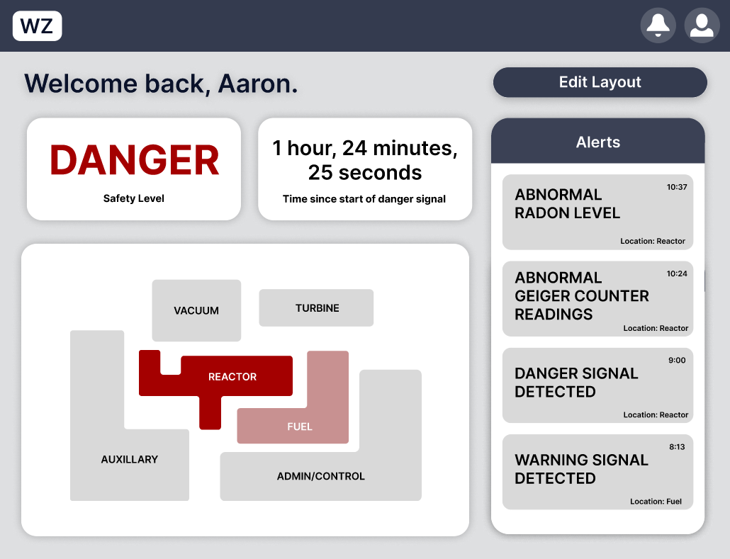
Homepage. The heatmap acts as a navigation bar to different rooms and pages.
-
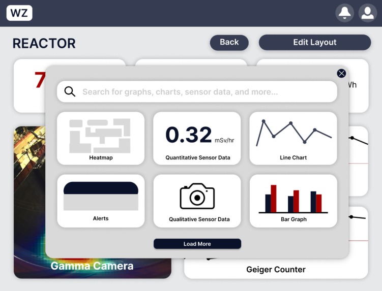
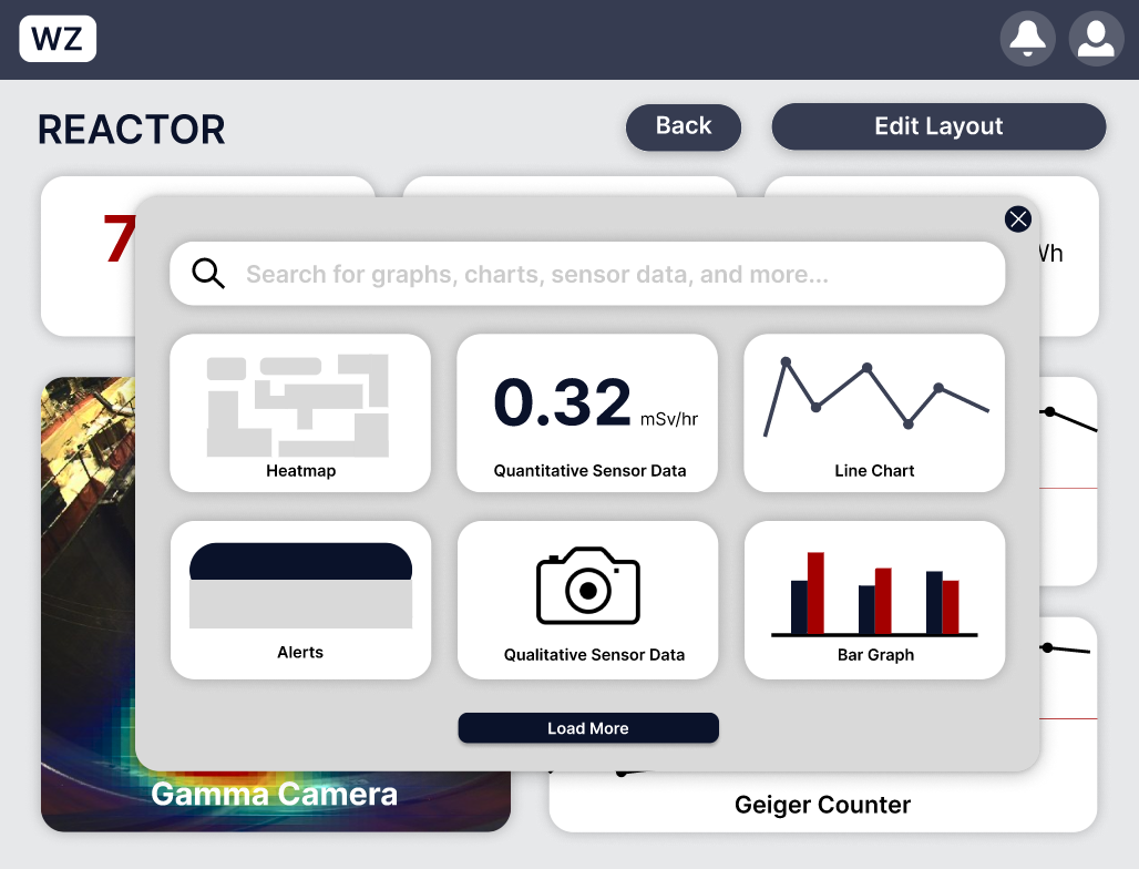
After clicking "Edit Layout", users have the option to choose from a wide selection of widgets to customize their dashboards with.
-
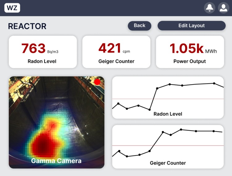
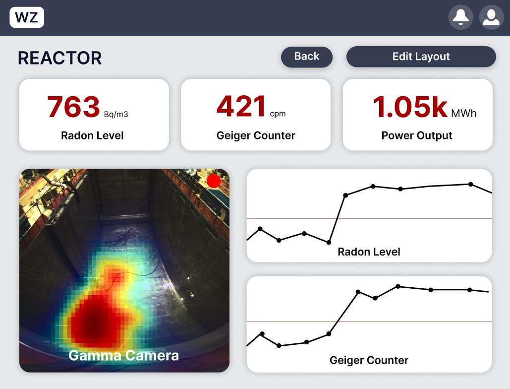
Page showing metrics specific to a room.
-
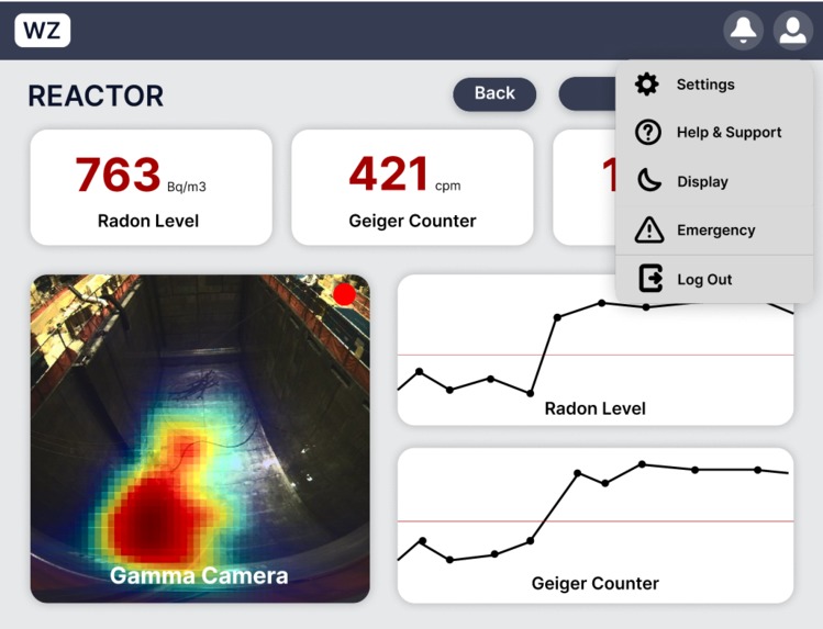
After clicking the profile button, users can see all their dropdown options.

Inspiration
Over the summer of 2023, I watched "Meltdown: Three Mile Island", a Netflix documentary that recounted the horrors that Three Mile Island caused for citizens in Pennsylvania. This documentary was my first exposure to nuclear energy and how powerful it is, both as a constructive technology and a destructive force. With this in mind, I took on the NPX design challenge, in order to contribute to the growth of nuclear energy and the protection of citizens near nuclear plants. From there, my dashboard application, "Wizard", was born.
What it does
Wizard is a simple, yet powerful dashboard application that allows nuclear technicians to quickly identify where problems exist within the nuclear reactor facility. With real-time data interpretation and safety monitoring, Wizard enhances workplace safety by providing intuitive insights. It offers safety alerts and a dynamic danger heat map. Additionally, users can also personalize their dashboard to their liking. This tool empowers technicians to swiftly identify and mitigate risks, ensuring the safety of all in the facility and beyond.
How I built it
Wizard was built first hand-sketched on an iPad to create the low-fidelity wireframe. Then, the sketched ideas were brought to life in Figma, where a high-fidelity wireframe was created.
Challenges Iran into
About a week ago, I didn't even know what UI/UX was short for. 48 hours ago, I had no idea what Figma was. In other words, I had to learn everything from scratch. For me, the biggest challenge was beating the learning curve in less than a day and a half.
Accomplishments that I'm proud of
I am most proud of finishing this designathon with a somewhat high-fidelity wireframe that has interactive components. It wasn't easy getting here in less than 48 hours, and I did pull an all-nighter along the way. But, I finished a meaningful project that has potential for real impact and acquired many new skills, and that's what's most important to me.
What I learned
I learned what UI/UX is, and learned to appreciate the expansive thought that goes into the simplest choices like color scheme and visual noise. Before, I just assumed that effective website layouts were common sense to most people. Now, it's an art to me.
What's next for Wizard, a simple dashboard for nuclear technicians
I would like to fix some blemishes, add more interactable components, and code it in Python and JS to create a functional prototype.
Built With
- figma

Log in or sign up for Devpost to join the conversation.