-
-

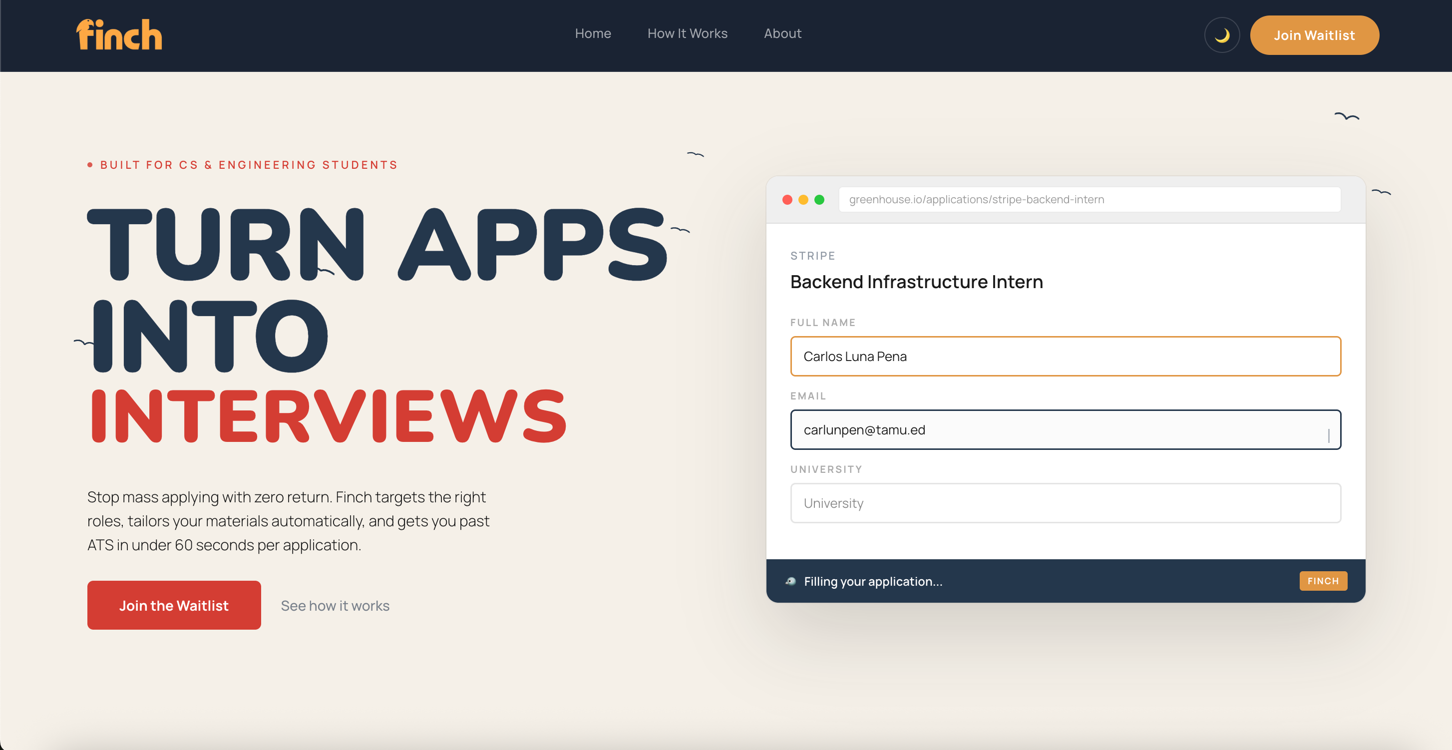
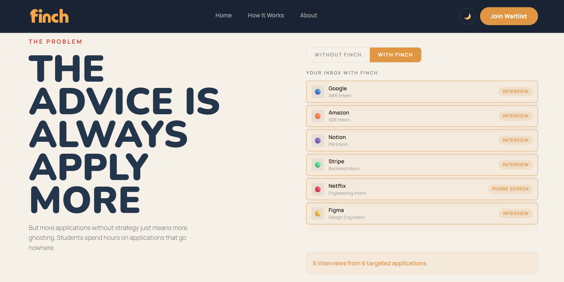
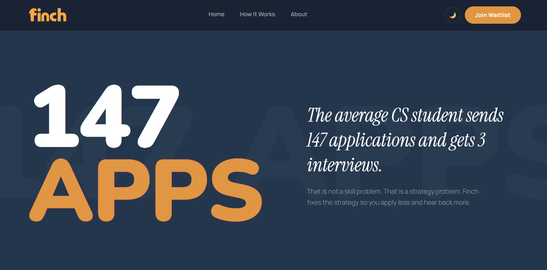
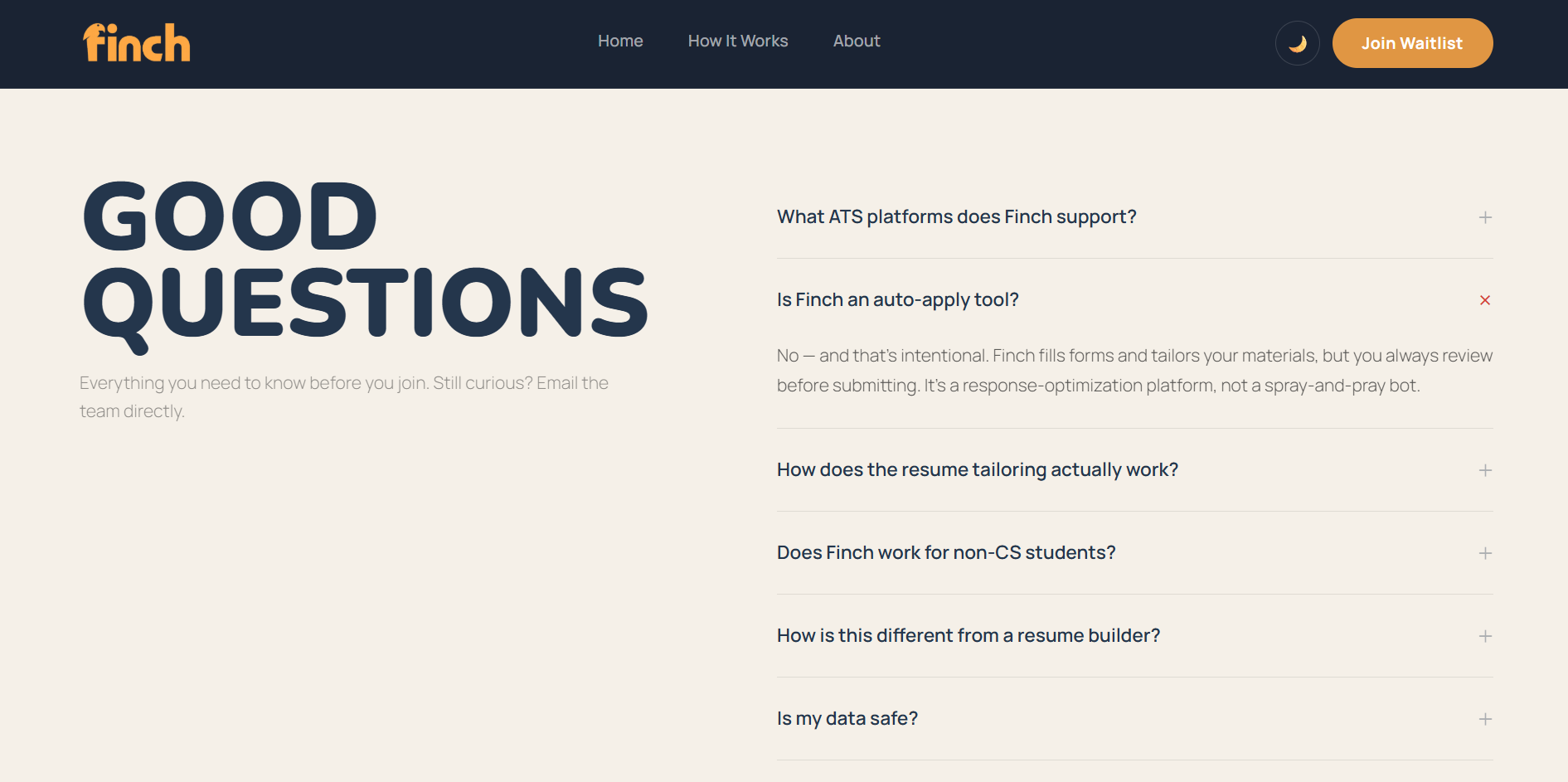
Home Page
-
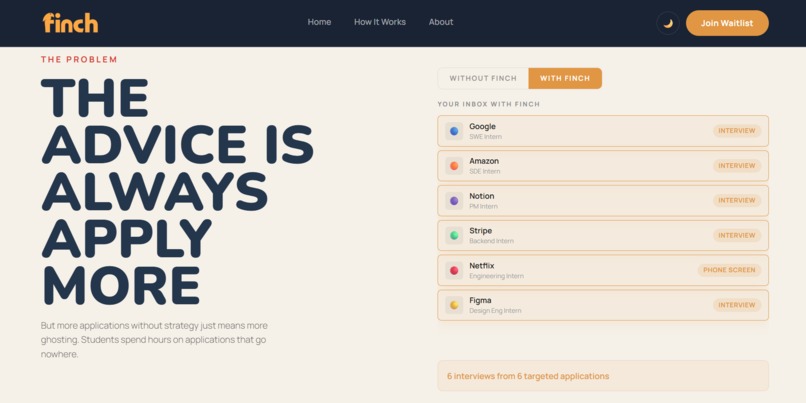
Problem section
-

Stats section
-
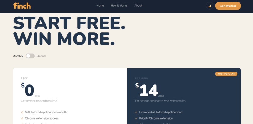
Pricing section
-
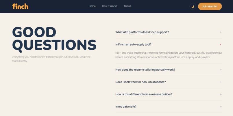
FAQ section
-
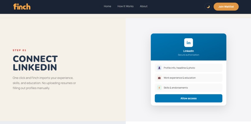
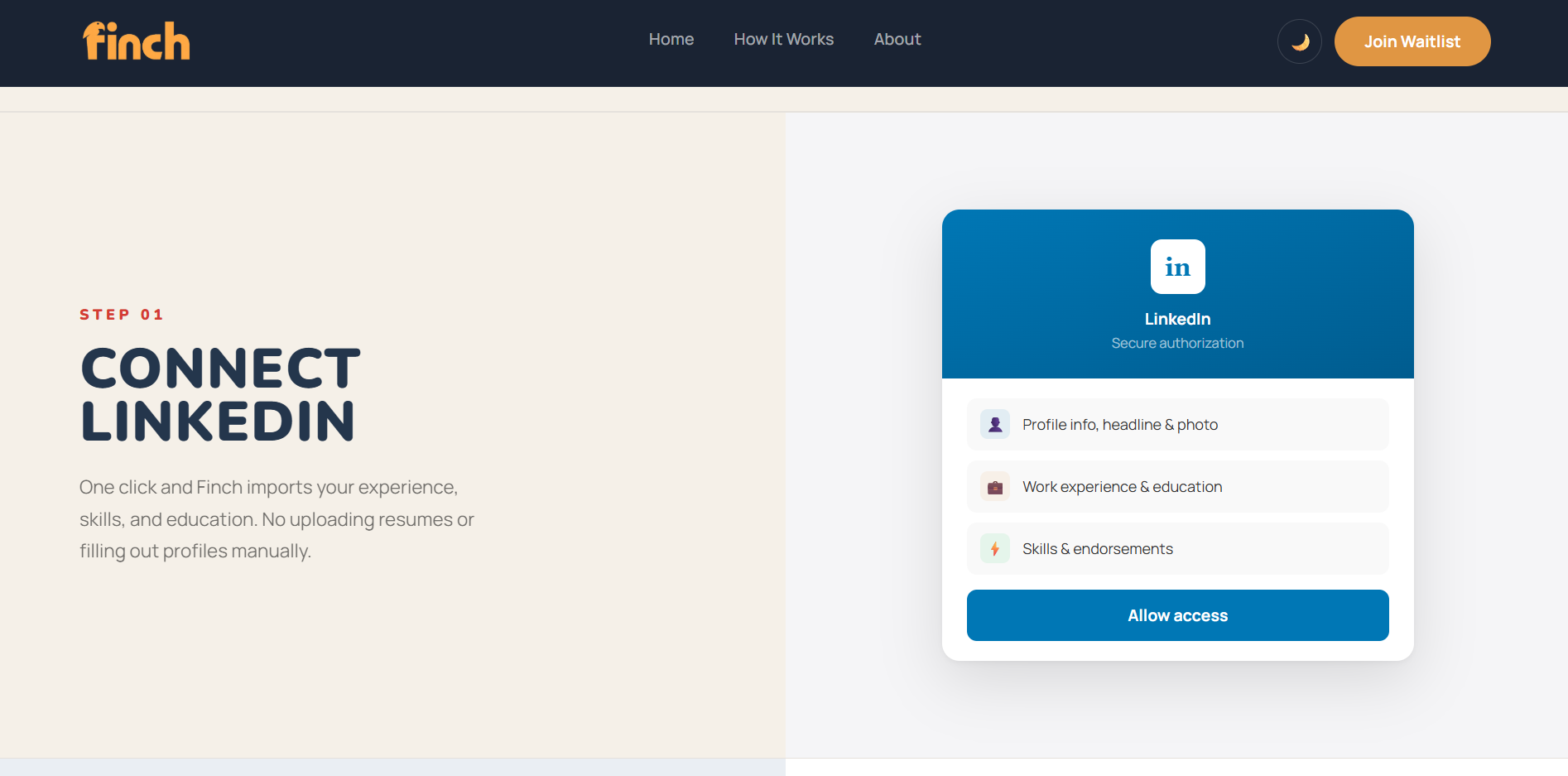
How It Works page
-
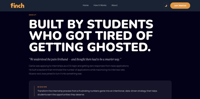
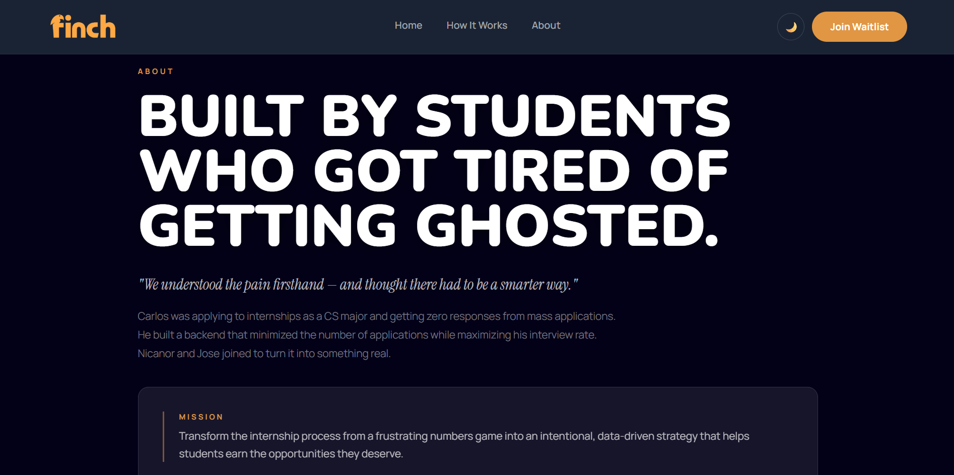
About page
-
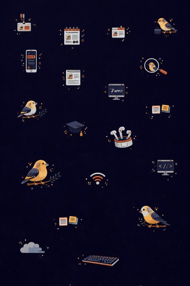
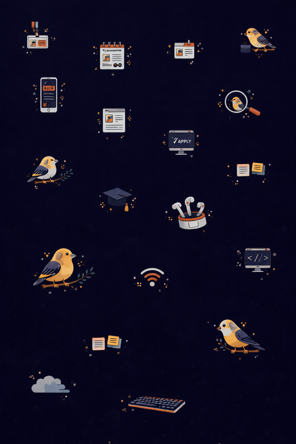
Backdrop Icons 1
-
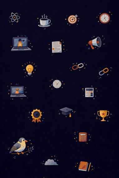
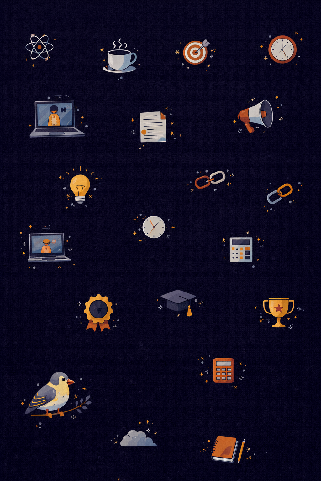
Backdrop Icons 2

Inspiration
As CS majors, we understand the struggle of mass applying to internships with little guidance. Finch's vision of streamlining that process immediately resonated with us and we saw it as an opportunity to build something meaningful. We wanted to take that vision and turn it into a polished website that feels like it belongs alongside those inspiration sites. Not just another hackathon prototype, but something Finch could genuinely launch with.
What it does
We built a multi-page marketing website for Finch that includes:
- Homepage - Hero section with an animated headline, live autofill mockup simulating the Chrome extension in action, an interactive "With Finch vs. Without Finch" inbox comparison, a 5-step "How It Works" walkthrough, feature grid, freemium/premium pricing toggle, team section, FAQ accordion, and a waitlist capture form with social sharing.
- About page - Team bios, mission/vision statements, and a scatter-backdrop system that programmatically positions brand icons across the viewport.
- Contact page - A fully designed contact form with team member cards and animated success states.
- Dark mode - Full site-wide theme toggle built on CSS custom properties.
The site is fully responsive and designed to match the brand guidelines from the brief, including the navy/red/orange color palette and the playful yet professional tone Finch asked for.
How we built it
We started by studying the startup brief and the three design inspiration sites to understand the desired website feel and functionality. From there, we built the site using Next.js, React, TypeScript, Tailwind CSS, and Framer Motion for animations.
AI was central to our workflow. We used Claude extensively throughout development, prompting it to scaffold components, debug animation logic, and iterate on layout decisions. We also used ChatGPT's image generation tools to design custom brand icons for the about page scatter-backdrop.
The brief gave us a color palette, typography direction, and page requirements, but no mockups or wireframes. Every UI decision from spacing and hover states to animation timing and dark mode behavior, was ours to make. We leaned heavily on rapid prompting and iteration cycles to explore ideas quickly and create a polished result within the hackathon time limit.
Challenges we ran into
After analyzing the design inspiration sites, we knew that a static website would't be enough. Our biggest goal was to add motion and animation to bring the Finch website to life and enforce brand identity. One of the main difficulties was coordinating multiple animations across the homepage without sacrificing performance or clarity. The site includes several dynamic elements running simultaneously, such as rotating hero text, animated SVG visuals, typewriter effects, and scroll-based reveals. Making these elements work together while having the animations feel natural required careful timing and lots of trial and error.
Accomplishments that we're proud of
Our team had little experience with UI/UX design and animation, so for this hackathon we aimed to stretch our frontend development skills and explore new ways to bring interfaces to life. We are most proud of the following design elements that thoughtfully enhance the user experience while simplifying and elevating the overall site:
The autofill component that simulates Finch filling out a Greenhouse application in real time communicates the product's value instantly without a demo video or extra copy. By taking the time to perfect the timing and feel, it became a lot more effective than a static screenshot.
The SVG birds with independent flight paths and wing-flap speeds that add subtle motion to the hero section. This effect reinforces the Finch brand and gives the site warmth and personality without overwhelming the user.
What we learned
Unlike a personal project where we define the requirements, this challenge required interpreting someone else's brand and product vision. This meant that we had to carefully analyze the existing design language, tone, and user expectations, then translate those into cohesive design. It pushed us to be more intentional and strategic with every small design choice we made.
What's next for Wingspan
While the current version provides a strong foundation, we would next focus on making the site production-ready. Our first priority would be to integrate a real backend. Currently, the waitlist and contact forms are handled locally, so connecting them to a database or API will allow submissions to persist and provide the Finch team with meaningful insights into user engagement. Accessibility is another priority. While the site follows many best practices, we would further improve keyboard navigation, screen reader support, and overall usability to ensure a fully inclusive experience. Finally, we would optimize the performance. With multiple animations running throughout the site, we need to focus on fine-tune loading behavior and ensure fast initial render times without compromising the experience.
Built With
- next.js
- react
- tailwindcss
- typescript


Log in or sign up for Devpost to join the conversation.