Inspiration
"Winning means you're willing to go longer, work harder and give more than anyone else" -Vince Lombardi
To translate this mindset into actionable on-track performance, drivers need a quantitative benchmark. We were inspired to move beyond subjective analysis and deliver a tool that quantifies the Winning DNA—the exact performance signature required for victory.
Our goal is to empower every driver to close the gap by comparing their performance vector against the race winner's optimal profile.
What it does
WinAnalyst is a hyper-focused dashboard engineered to deliver micro-performance race comparison against the race winner. We are competing for post-analysis track.
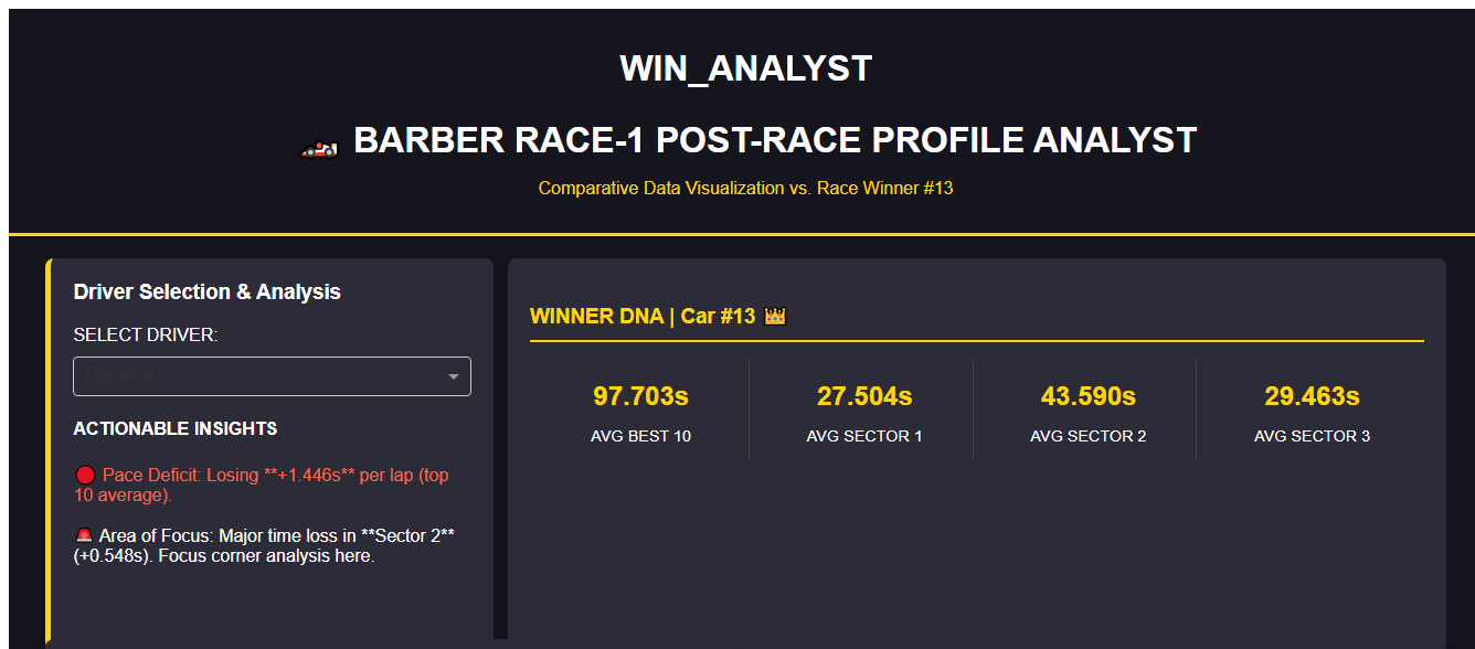
It provides a visual and data-driven answer to the question: Where exactly did the winner gain time, and how can I replicate it?
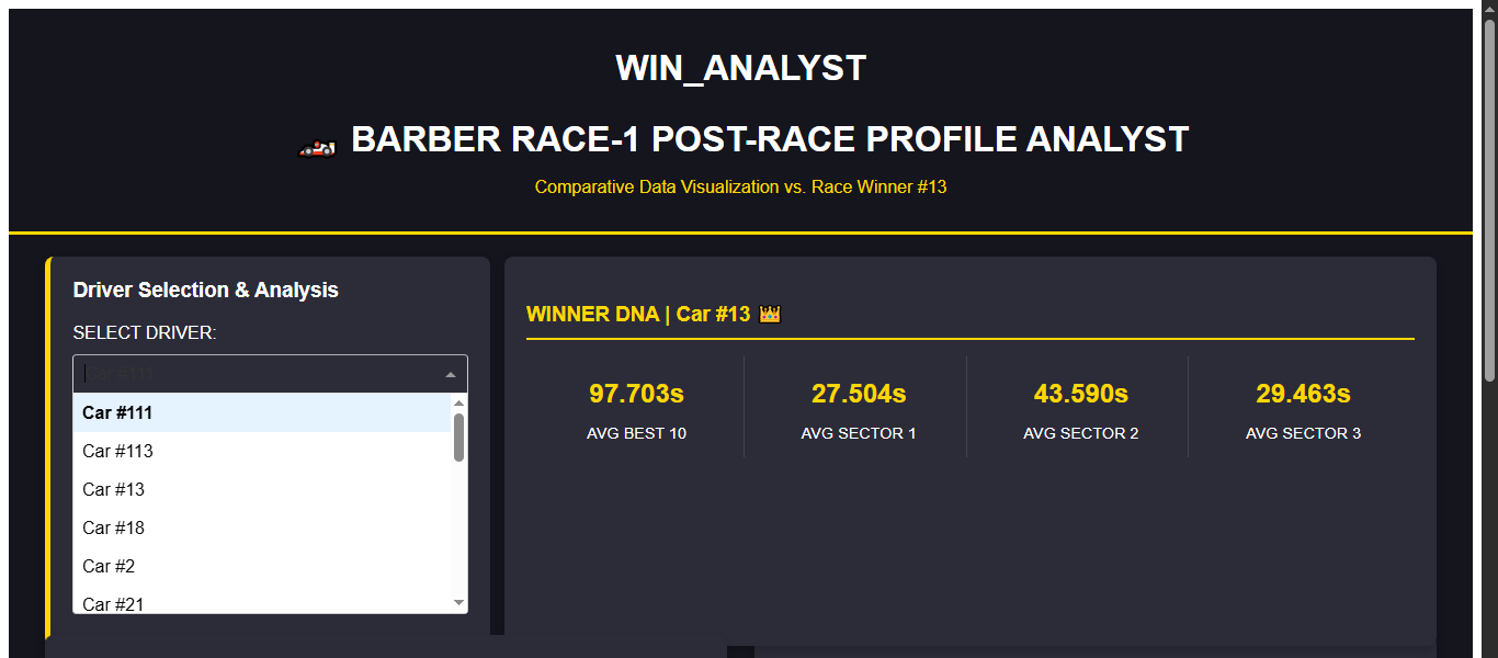
- Dynamic Driver Selection: Users can instantly select any driver to generate a real-time comparative analysis.
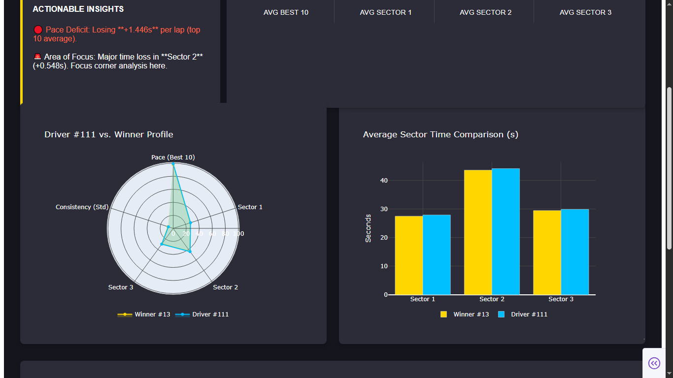
- Driver vs. Winner Radar: Visualizes the gap across five critical metrics (Pace, Sector Times, Consistency) in a single multi-axis radar chart .
- Actionable Insights Engine: A custom algorithm calculates the time delta across key performance indicators (KPIs) and generates specific, prioritized recommendations (e.g., "Pace Deficit: Losing +0.35s per lap," "Focus: Major time loss in Sector 2").
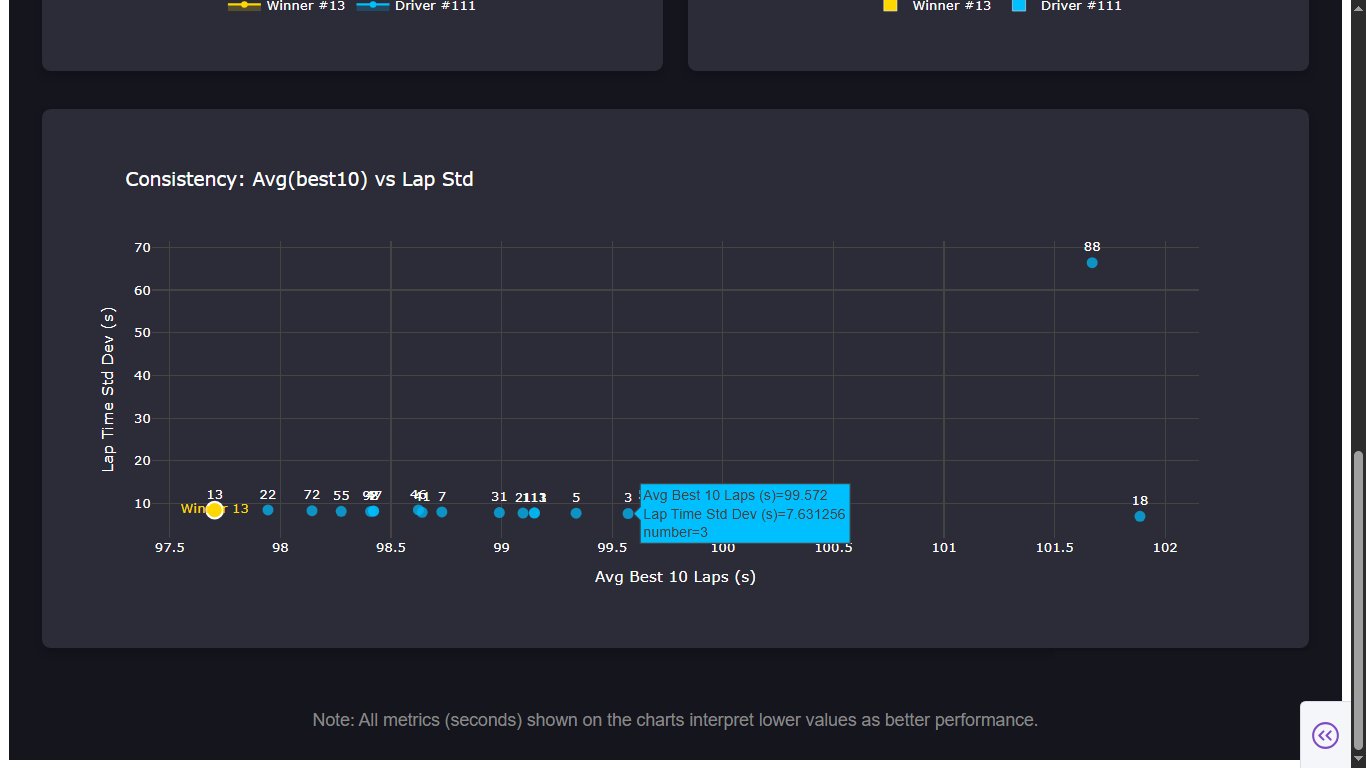
- Optimal Profile Highlighting: Clearly defines the Winner's DNA (average sector times, best-10 pace, lap standard deviation) as the target performance envelope.
How we built it
We utilized the Python Dash framework for rapid development of the interactive web application, ensuring dynamic data visualization capability.
- Data Ingestion & Normalization: We developed robust
pandasfunctions to ingest raw CSVs for BARBER MOTORSPORTS PARK RACE-1 (renamed aslap_times.csv,sections.csv,best10.csv) and implemented type coercion and string-to-time conversion to standardize disparate data formats into a unified time-in-seconds structure. - Profile Generation: A
compute_profile_forfunction was engineered to calculate complex driver profiles, including Lap Time Standard Deviation (a measure of consistency) and Average Best 10 Pace (a proxy for raw car performance). - Visualization Layer: Plotly Graph Objects were used to construct the custom Scatter Polar Radar Chart and the interactive bar charts, using a high-contrast dark theme for maximum readability.
- Insight Generation: The core innovation lies in the Insight Callback Logic. This function performs real-time subtraction of the driver's performance vector from the winner's vector, applying delta thresholds to trigger specific, prioritized, and color-coded text feedback.
- CSVs Used: The CSVs used from Barber Motorsports Park were:
03_Provisional Results_Race 1_Anonymized.CSV,
23_AnalysisEnduranceWithSections_Race 1_Anonymized.CSV,
99_Best 10 Laps By Driver_Race 1_Anonymized.CSV,
R1_barber_lap_time.csv.
Challenges we ran into
- Data Heterogeneity: The biggest technical hurdle was handling the variation in column naming and data types across the mock CSV files. We spent significant time developing robust normalization logic to ensure metrics like 'lap_time' and 'driver_number' were consistently mapped and converted to a common numeric format.
- Radar Chart Scaling: Displaying metrics with vastly different ranges (e.g., Sector 1 time $\approx 30$s vs. Lap $\text{Std Dev} \approx 0.5$s) on a single radar axis was visually problematic. We resolved this by prioritizing raw comparative values and relying on the quantitative Sector Analysis chart to provide the required granularity for large differences.
Accomplishments that we're proud of
- Actionable Insights Engine: Successfully creating a logic system that translates raw data comparison into simple, prioritized suggestions for a driver or engineer, moving the dashboard from merely informative to truly prescriptive.
- High-Fidelity UI/UX: Achieving a professional, high-contrast, and dynamic UI that mimics professional motorsport telemetry tools, enhancing the user experience and encouraging frequent use.
- Data Integrity under Constraints: Ensuring that all data processing maintained the integrity of the original column names and file structures as required, demonstrating robust data handling practices.
What we learned
We learned the crucial role of data normalization pipelines in handling real-world, messy datasets. Furthermore, we gained deep insight into using advanced Plotly features (specifically ScatterPolar and dynamic callbacks) to create interactive visualizations that serve a functional purpose beyond simple line or bar charts. The process reinforced that the value of a visualization tool lies not in the quantity of data displayed, but in the quality of the comparative analysis it enables.
What's next for WinAnalyst
- Time Series Integration: Incorporate lap-by-lap data to analyze performance degradation and tire wear management against the winner.
- Weather Correlation Scoring: Add logic to account for external factors (temperature, track conditions) when comparing profiles, adding context to the deltas.
- Optimal Race Line Mapping: Future integration with GIS data to visually map the sectors of loss/gain on a track diagram for immediate geographical reference .


Log in or sign up for Devpost to join the conversation.