
Inspiration
We liked that this dataset was extensive, and we thought it would provide much validity to our analysis. Additionally, we felt that the recent wildfires across the US (NC, NY, HI) would motivate us to create a meaningful analysis that could help the US Department of Agriculture (provider of our data) prepare for these disasters.
What it does
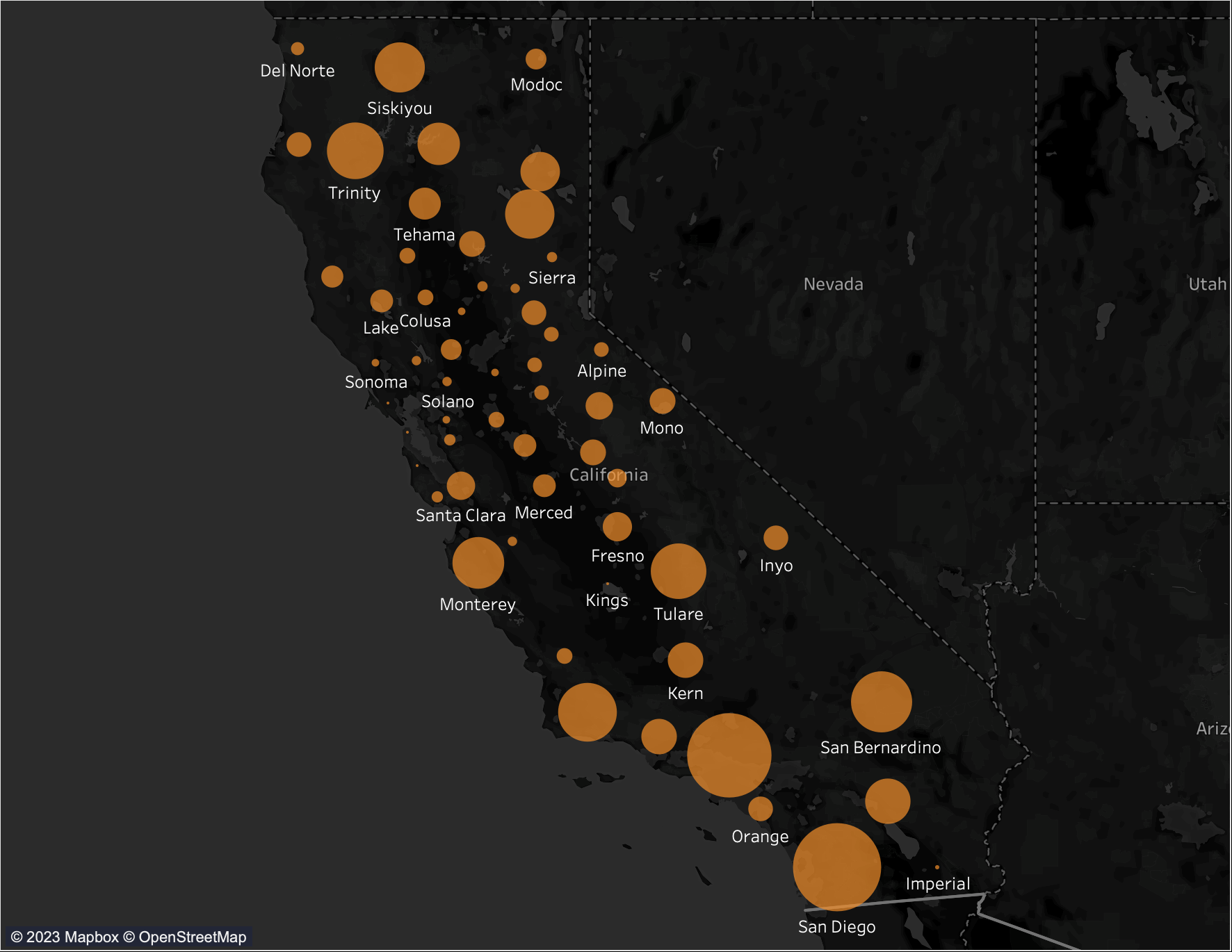
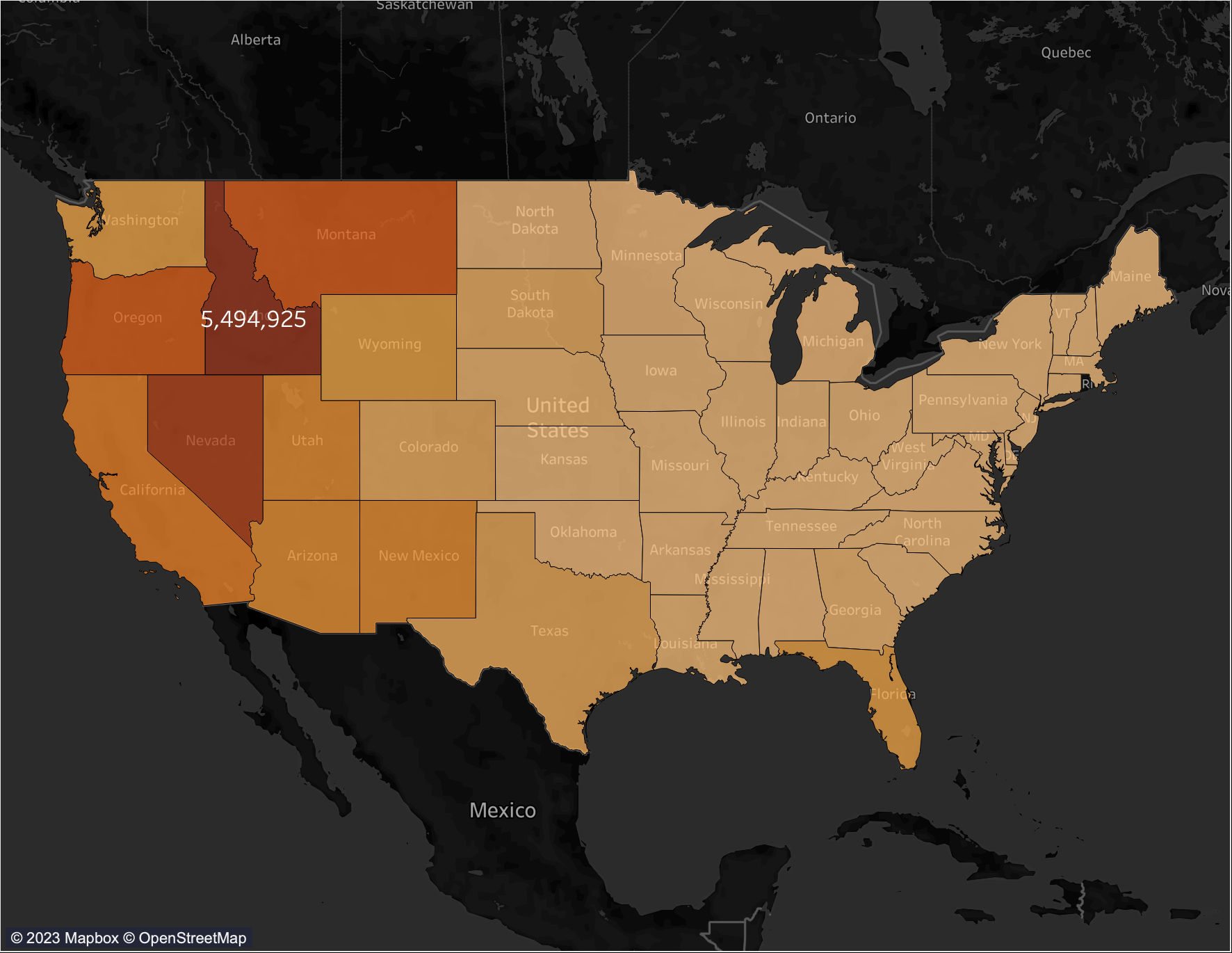
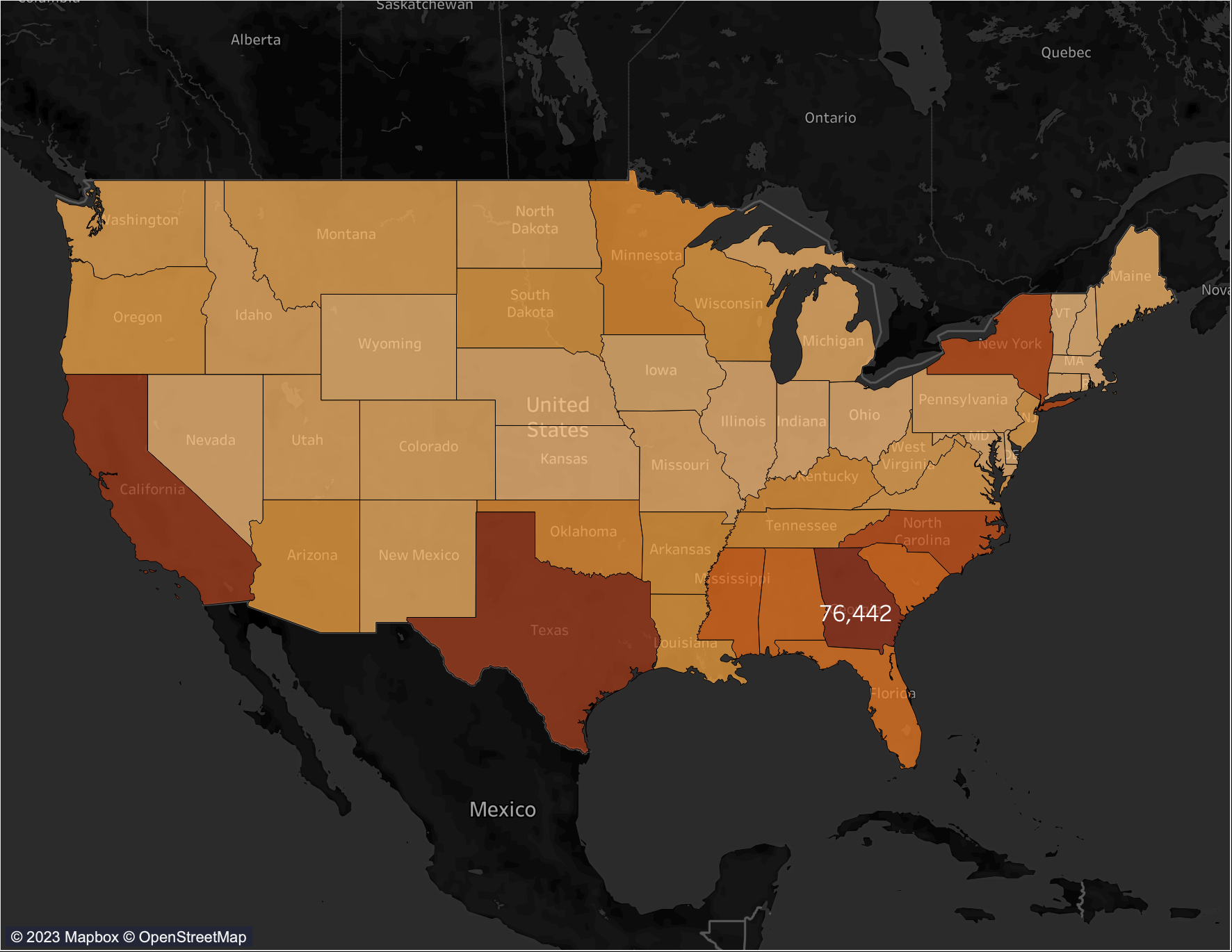
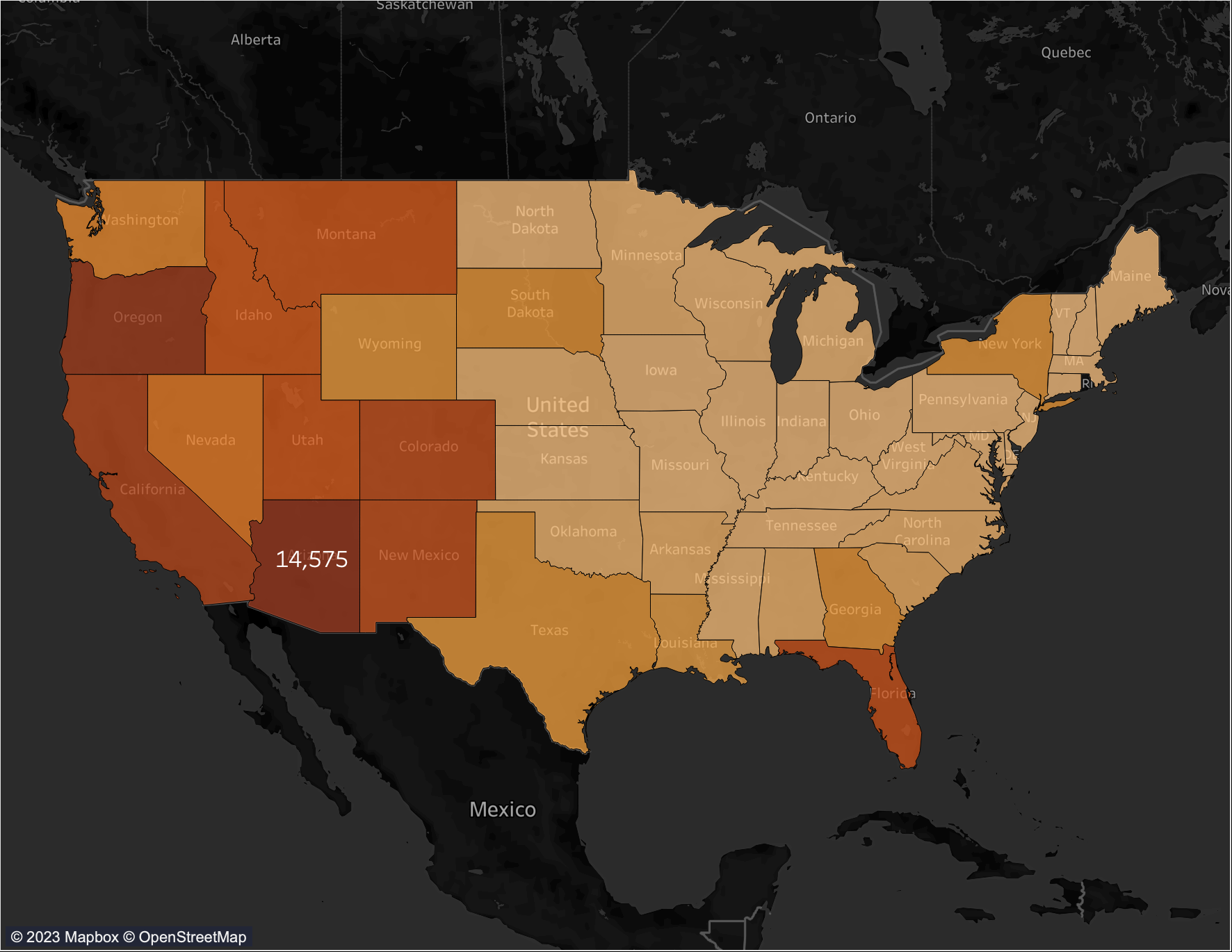
Our presentation aims to increase awareness of wildfires through a sense of nostalgia by showing relatable pictures and a detailed geographical analysis.
How we built it
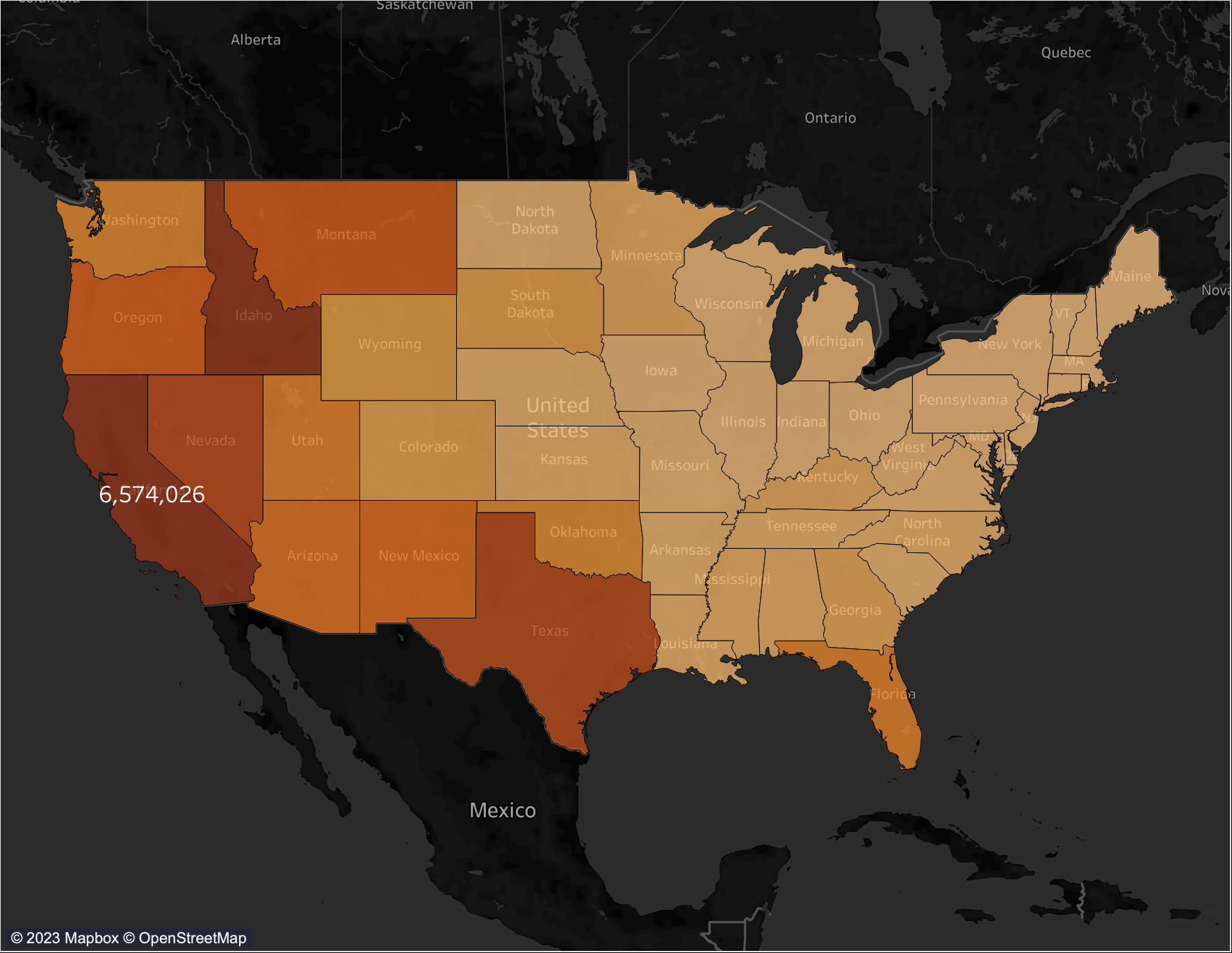
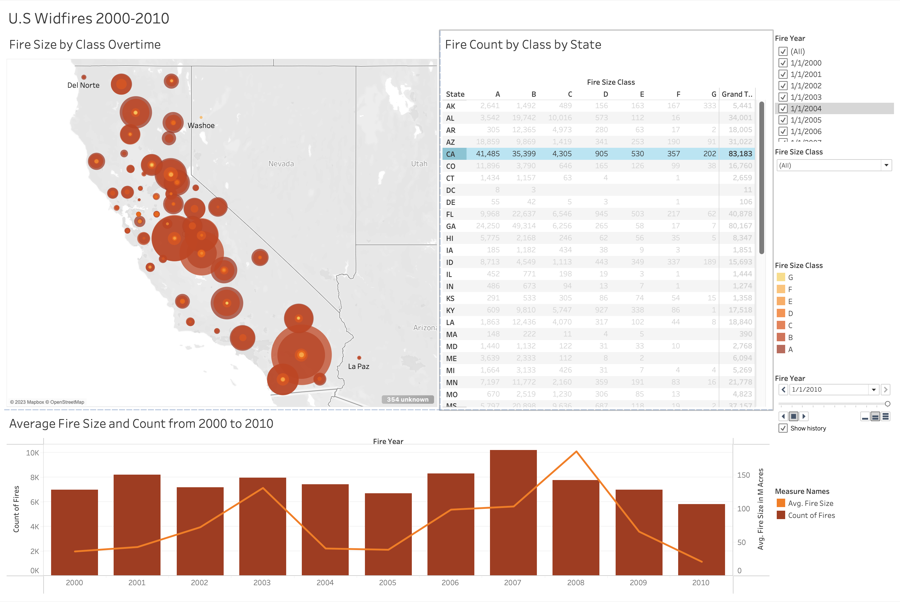
We utilized R for dating cleaning and analysis and exploring model building. We also used Tableau to visualize the data which is presented in PowerPoint.
Challenges we ran into
We spent much of the project incorporating nostalgia, limiting our analysis.
Accomplishments that we're proud of
Our storytelling through Tableau and the ability to connect to the theme throughout.
What we learned
We all were able to explore tableau at different levels and use the technical communication skills that our graduate program emphasizes.
What's next for Wildfires in the United States from 2000 to 2010
The use of our dashboard can help response organizations prepare for future wildfire seasons by examining the shift in population demographics and its impact on fire size, cause, and severity.

Log in or sign up for Devpost to join the conversation.