Inspiration
When we talk about “quality of life,” it’s often hard to visualize how everyday factors — like noise, commute distance, or access to groceries — affect our comfort. We wanted to create a map that not only displays these factors but also measures them.
What it does
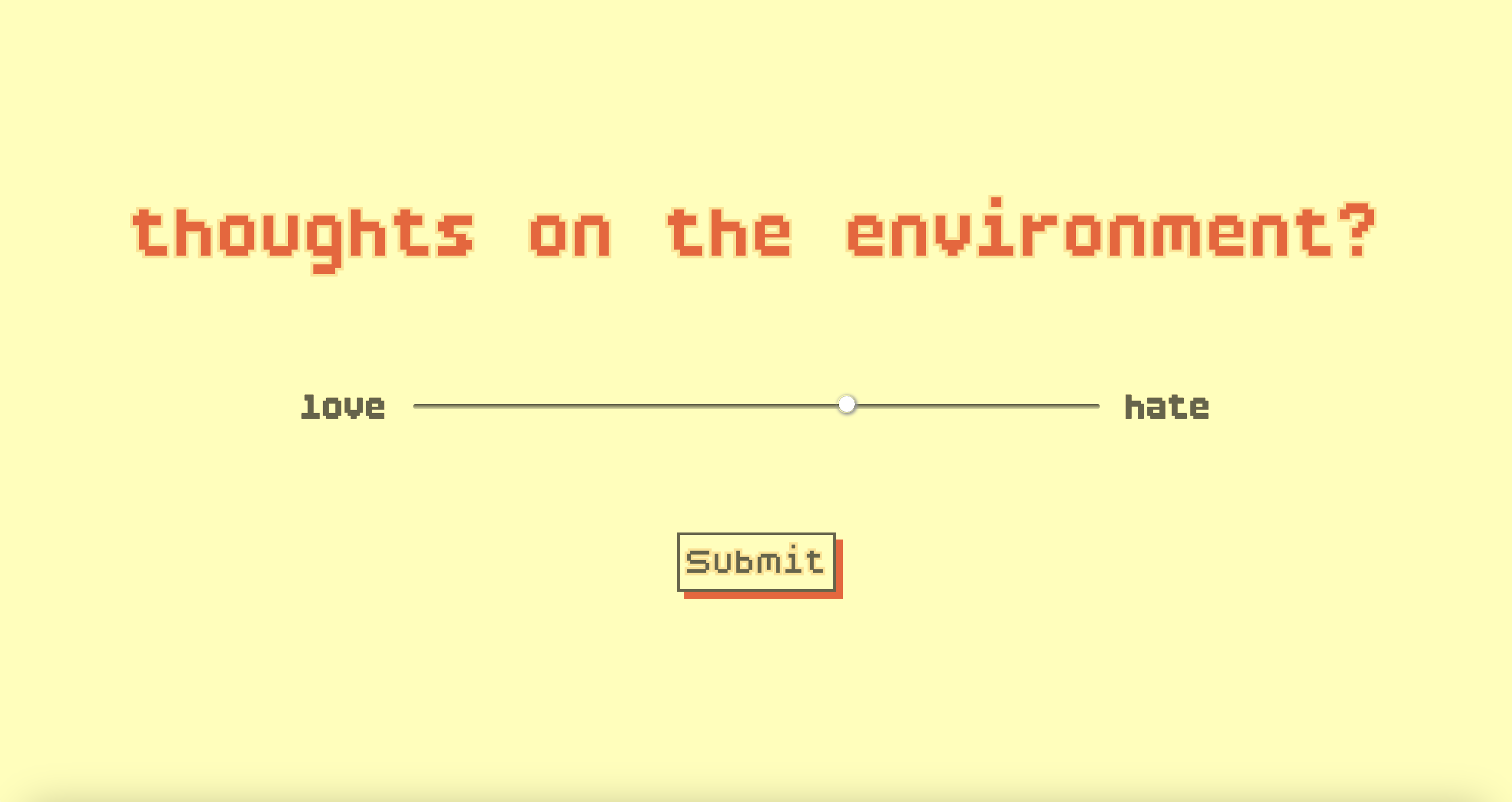
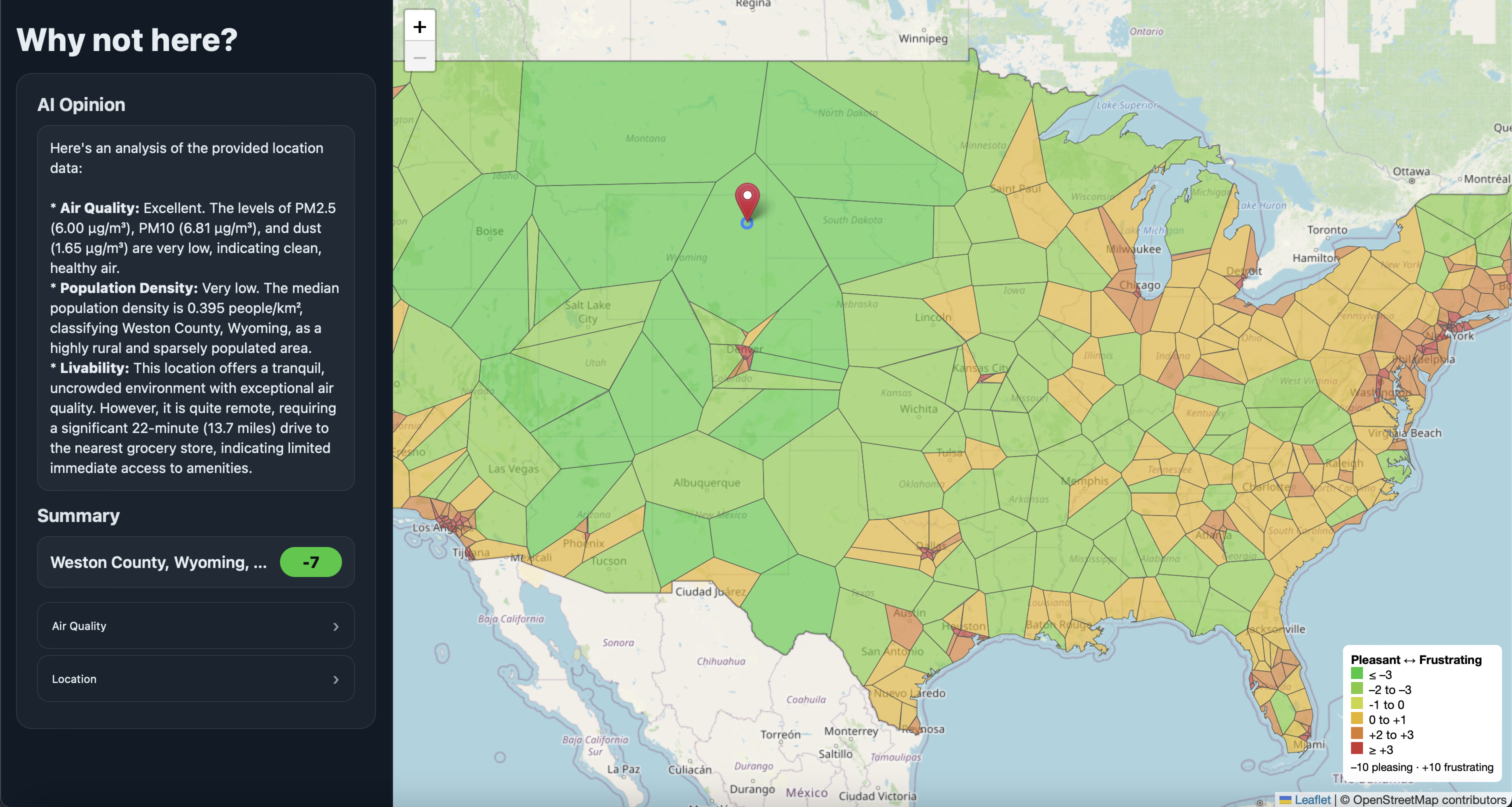
The Why Not Map displays geographic “frustration levels” based on three key variables: population density, air quality, and grocery store distance. An integrated AI summary provides key insights for each polygon, helping users quickly understand the main factors driving frustration in that area. Upon logging in, users complete a brief survey that personalizes and curates the map’s results to their preferences. Together, these elements illustrate the overall frustration profile for each polygon, with each representing roughly one million people — about 330 cells in total covering the United States.
By combining these layers, users can explore how different areas compare in accessibility and comfort across the United States.
How we built it
We built Why Not Map using a modern web development stack centered on React, Vite, and Firebase. The frontend was created with React and Vite provided a lightweight and efficient development environment,
For mapping and visualization, we integrated Leaflet to render interactive polygons, markers, and hover-based data overlays. Data was sourced from Google APIs (for grocery distance calculations) and Open-Meteo (for environmental metrics).
We used Firebase for authentication and data management, allowing users to log in, complete a brief survey, and receive curated results. The AI summaries for each polygon were powered by Gemini.
Supporting technologies like JavaScript, HTML5, CSS, and JSON were used throughout to handle the user interface, data formatting, data manipulation, and overall web design. The project was hosted through GoDaddy for reliable domain.
Challenges we ran into
- Integrating multiple APIs with different data formats and rate limits.
- Dealing with caching when fetching data from the browser.
- Troubleshooting via local host and transitioning that to the host
- Ensuring map performance stayed smooth while dynamically fetching data for multiple coordinates.
- Getting the website hosted through Vercel in tandem with GoDaddy
Accomplishments that we're proud of
- Creating a fully functional interactive map that updates!
- Successfully merging environmental, accessibility, and AI-generated insights into one cohesive visualization map
- Designing a clean, user-friendly interface that makes complex data feel intuitive.
- Turning an abstract concept — frustration — into a tangible, measurable experience.
What we learned
- How to connect and synchronize multiple APIs in a single web application hosted through GoDaddy.
- How to structure React components for performance in live geographic visualizations.
- The importance of normalizing and caching data to reduce API calls and improve load speed.
What's next for Why Not Map
- Incorporate more factors into the Frustration Map
- Add social metrics such as walkability and cost-of-living scores.
- Enable user feedback.
- Expand to other countries


Log in or sign up for Devpost to join the conversation.