-
-
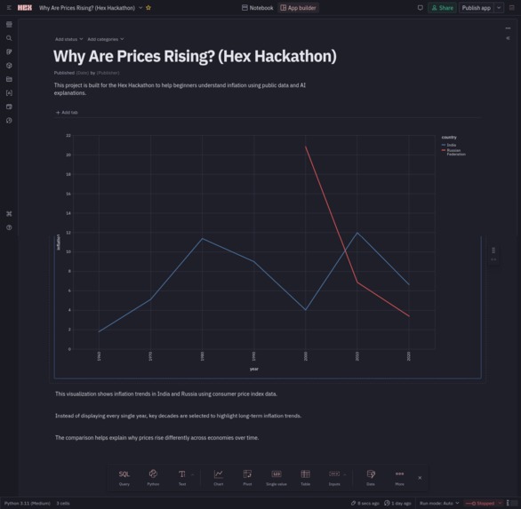
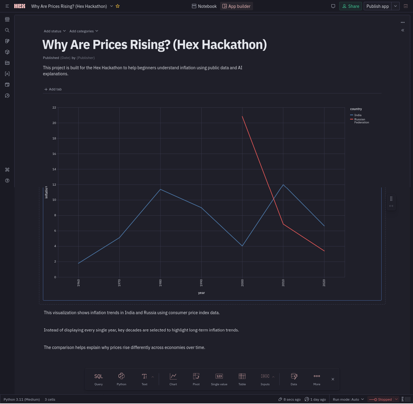
Line chart comparing long-term inflation trends in India and Russia using World Bank CPI data, highlighting key decade-wise changes.
Inspiration
Inflation impacts daily life, yet it is often misunderstood. This project was inspired by the idea of explaining inflation trends in a simple, visual, and data-driven way for beginners.
What this project does
This project explores long-term inflation trends using Consumer Price Index (CPI) data. By comparing India and Russia across selected decades (1960–2020), it highlights how inflation behaves differently across economies over time.
How we built it
The project was built using SQL within Hex. Public World Bank CPI data was queried, filtered, and transformed using SQL to extract decade-level inflation values. These transformed results were visualized using interactive line charts to clearly communicate long-term inflation patterns.
Why this approach is effective
Instead of showing raw yearly data, the project focuses on key decades. This reduces noise and makes inflation trends easier to understand for non-technical audiences.
What we learned
We learned how SQL alone can be used to perform meaningful data analysis and how visualization plays a critical role in explaining economic concepts.
What's next
Future improvements could include adding more countries, comparing inflation with GDP growth, and extending the analysis with recent post-pandemic data.

Log in or sign up for Devpost to join the conversation.