-
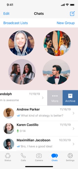
Whatsapp Frequently Contacted / Favorite Chats
-
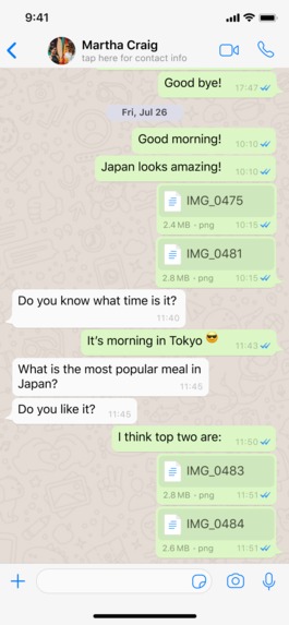
Chat View - Portrait (for reference)
-
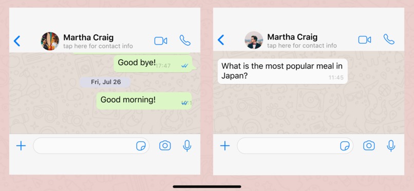
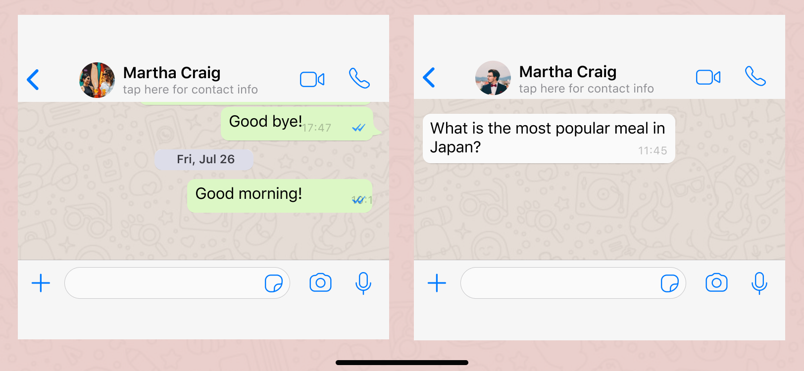
Chat View - Landscape


Inspiration
While using Whatsapp, at times, I tend to be chatting with 2 people at the same time and switching between screens becomes tedious. Also, with the huge number of group chats, mostly one has to scroll a lot to find the relevant chat. In order to cater to these UX issues, I decided to redesign the Chat UI in order to suit the user's needs better.
Demo
Figma Wireframe link : [link] https://www.figma.com/file/yjlJn9N49i1bAd81kdupOb/WhatsApp-UI?node-id=0%3A8102
New Functionalities :
- Option to view Frequently contacted chats on top
- Providing the functionality to access Two chats simultaneously in Landscape mode
How I built it
Using Figma
Challenges I ran into
I had no prior experience with Figma, so I had to learn about it from scratch
Accomplishments that I am proud of
Finishing up the desired design in time :)
What I learned
Learned a whole new tool : Figma
What's next for Whatsapp UI Redesigned
Many more improvements
Built With
- figma
- ui
- ux

Log in or sign up for Devpost to join the conversation.