-
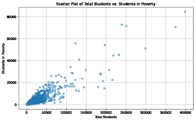
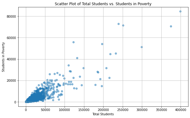
Scatter Plot of Total Students vs. Students in Poverty
-
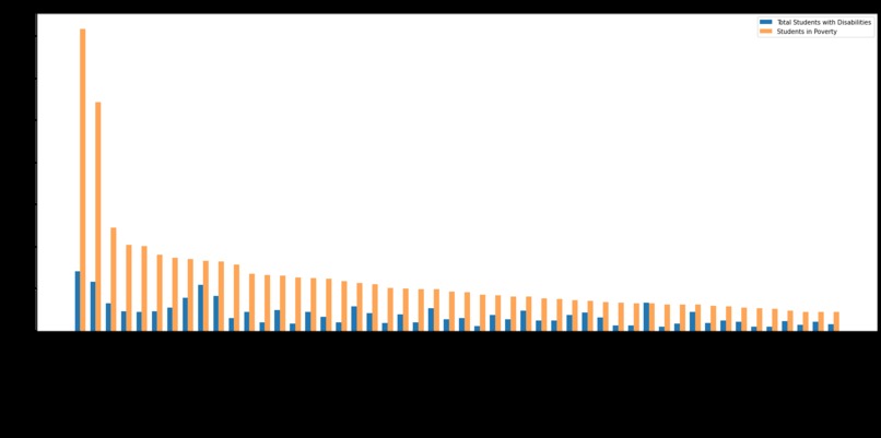
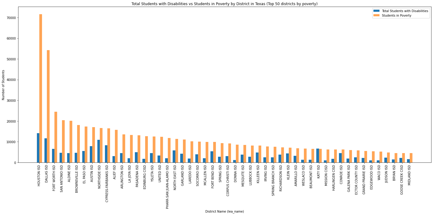
Total Students with Disabilities vs Students in Poverty by District in Texas (Top 50 districts by poverty)
-
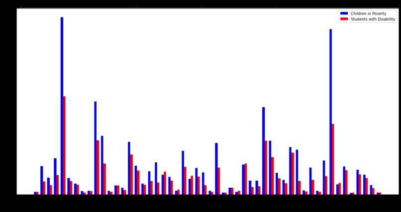
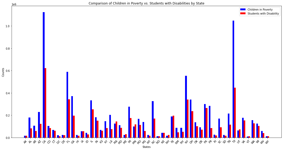
Comparison of Children in Poverty vs. Students with Disabilities by State
-
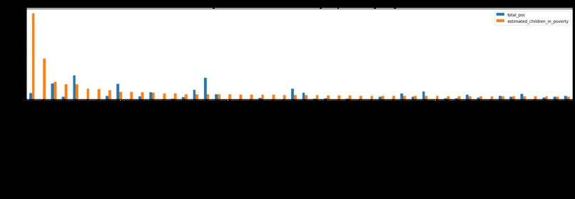
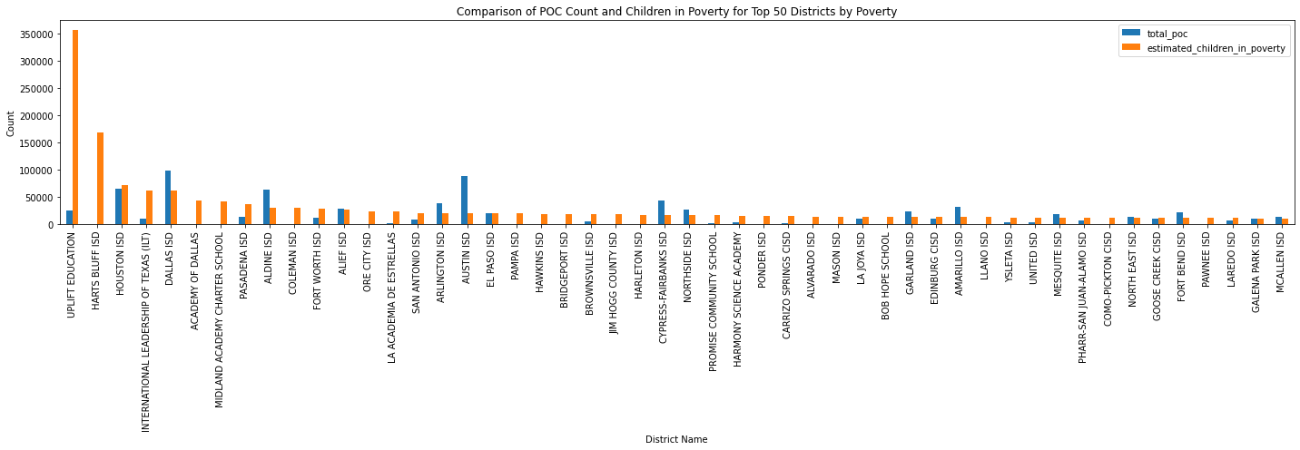
Comparison of POC Count and Children in Poverty for Top 50 Districts by Poverty
-
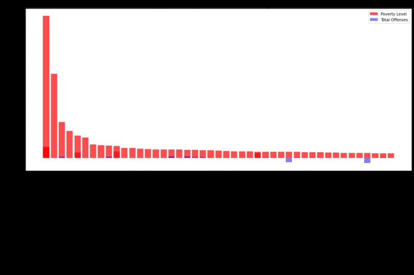
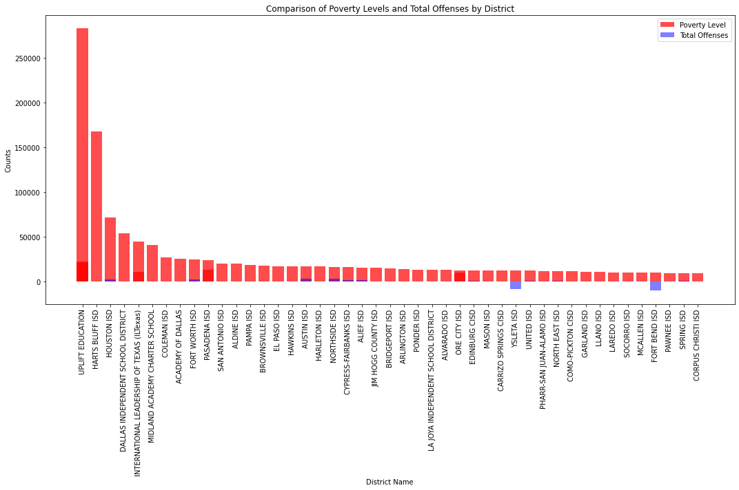
Comparison of Poverty Levels and Total Offenses by District
-
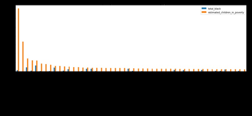
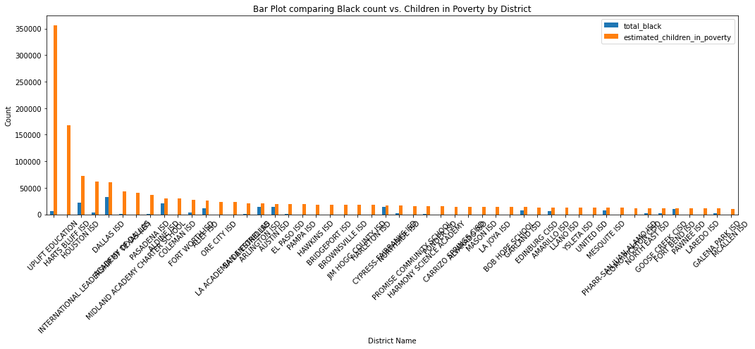
Bar Plot comparing Black count vs. Children in Poverty by District
-

Bar Plot comparing White count vs. Children in Poverty by District
-
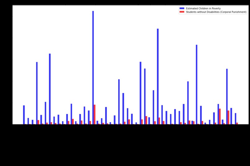
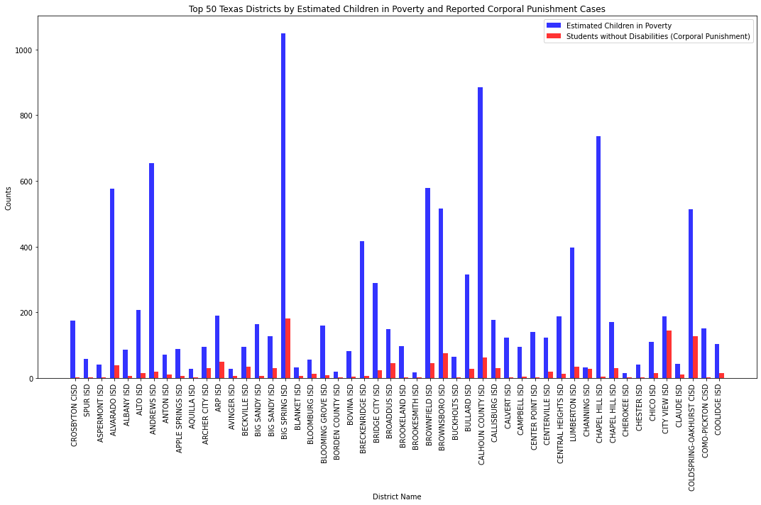
Top 50 Texas Districts by Estimated Children in Poverty and Reported Corporal Punishment Cases

Data Text Questions: Q1->17615 Q2->17616, no, excel records the first row as a header rather than a row count, thus there is one less row counted than in python Q3->It is necessary for texts that include accents or special characters that cannot be picked up by utf-8 Q4-> the SLGA is more comprehensive, including data not only for public schools, but also private and postsecondary schools. The CRDC only contains data for public middle and highschools. Q5->We would trust the SLGA file more as it is more comprehensive. The CRDC file will fall short in recounting the number of school districts as it does not document schools beyond public middle and high schools.
Inspiration
As a Black student who grew up in the projects, this was very interesting to work out
How we built it
Data Sources:
The data was extracted from the race_by_placement, poverty_levels databases, disabilities, and offenses, specifically focusing on Texas school districts.
Methodology:
Collated the count of various demographic groups (Black, Multiracial, Pacific Islander, Hispanic, White, Asian, American Indian) and derived a total count of the population of color (POC). These figures were juxtaposed against the estimated number of children living in poverty within each district. There was also a count of groups with disabilities and total offenses across each district.
Challenges we ran into
Loss of team members, lack of understanding of problem statement
Accomplishments that we're proud of
Being able to push past insecurites and feelings of defeat
Findings:
Population of Color (POC) vs. Children in Poverty:
- The first bar chart juxtaposes the total POC count with the number of children in poverty for the top 50 districts.
- Initial observations show a significant variance across districts. Some districts have a high POC count but a moderate number of children in poverty, suggesting other socio-economic factors in play.
Black Population vs. Children in Poverty:
- The second chart presents a comparison between the black population count and children in poverty.
- A trend of higher black population correlating with higher children in poverty is visible in certain districts, but this does not hold universally.
White Population vs. Children in Poverty:
- The third chart contrasts the white population against children in poverty.
- Some districts with a significant white population show a relatively low count of children in poverty, indicating potential economic stability among this demographic in those areas.
Children with Disabilities vs. Children in Poverty: -The blue bars representing "Children in Poverty" generally have higher values compared to the red bars representing "Students with Disability." This suggests that there are more children in poverty than there are students with disabilities in most of the data's segments. -However, in some sections, the number of "Students with Disability" surpasses or nearly matches "Children in Poverty," suggesting certain areas or segments where disability rates are exceptionally high compared to poverty. -There are pronounced peaks for both categories in certain segments, indicating areas or times with exceptionally high counts for both children in poverty and students with disabilities. 5.Children with Disabilities vs. Children in Poverty(TEXAS): -The first couple of bars show a stark difference between "Total Students with Disabilities" (blue) and "Students in Poverty" (orange), with the blue bar being significantly higher. -As we move from left to right, the orange bars (Students in Poverty) generally exceed the blue bars (Total Students with Disabilities). This indicates a greater number of students in poverty compared to those with disabilities for most of the data segments. -There's a gradual decline in the number of both "Total Students with Disabilities" and "Students in Poverty" as we move from left to right, suggesting a possible trend or sequence in the data.
Conclusion:
The visualizations highlight the disparities and trends in the relationship between demographic counts and children in poverty across the top 50 Texas school districts. While certain demographics appear to correlate with higher numbers of children in poverty in some districts, these trends are not universally consistent, suggesting the influence of other unanalyzed factors. Comprehensive policy-making would require a deeper dive into underlying socio-economic conditions, educational infrastructure, and employment opportunities in these districts. A significant portion of the data indicates a higher prevalence of children in poverty compared to students with disabilities. However, there are notable exceptions where the number of students with disabilities surpasses or matches those in poverty. Certain areas or segments have exceptionally high counts of both students in poverty and those with disabilities, which may require special attention or interventions. Further detailed analysis can provide more in-depth insights into the reasons behind these patterns and inform policy or strategy decisions accordingly.
Recommendations:
- Targeted Welfare Programs: For districts with a high correlation between a specific demographic and children in poverty, targeted welfare and educational programs could be introduced.
- Further Research: Delve deeper into other socio-economic factors within these districts to obtain a holistic understanding of the causes behind the high children in poverty numbers.
- Community Engagement: Engage with community leaders and residents to understand grassroots challenges and potential solutions.
What's next for What Characteristics do Students in Poverty Relate to Most
A more thorough analysis of the data and some statistical analysis for better explanation of the correlations of the different student characteristics compared to total student in poverty.


Log in or sign up for Devpost to join the conversation.