-

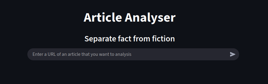
Home Screen
-
Prompt for Article Analyser
-
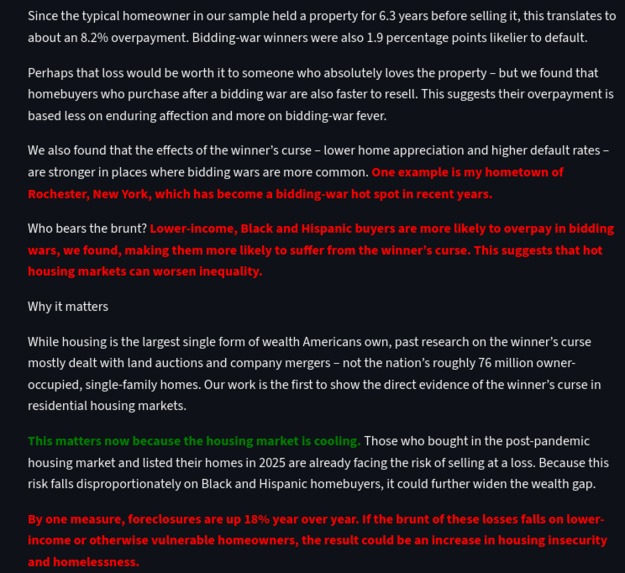
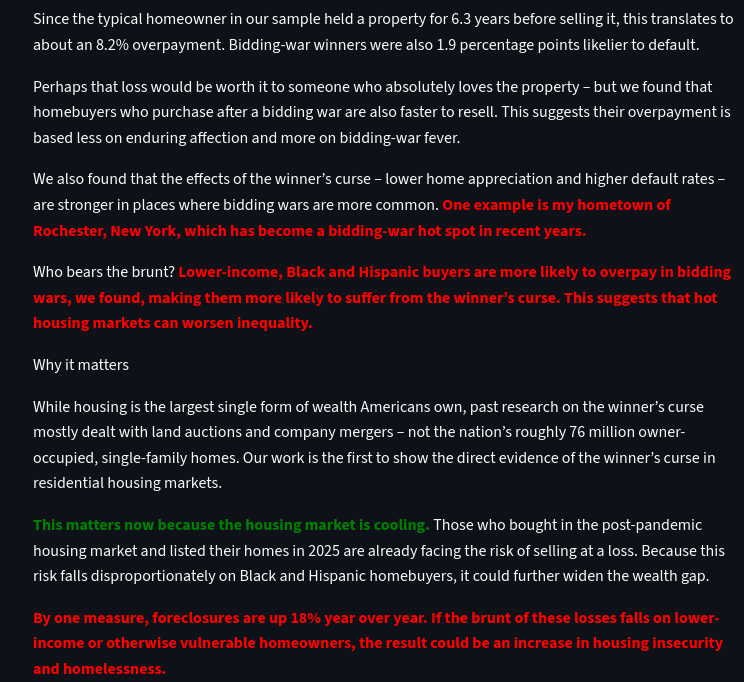
Annotated article (red are negative opinions, green is good) after analysing
-
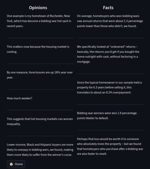
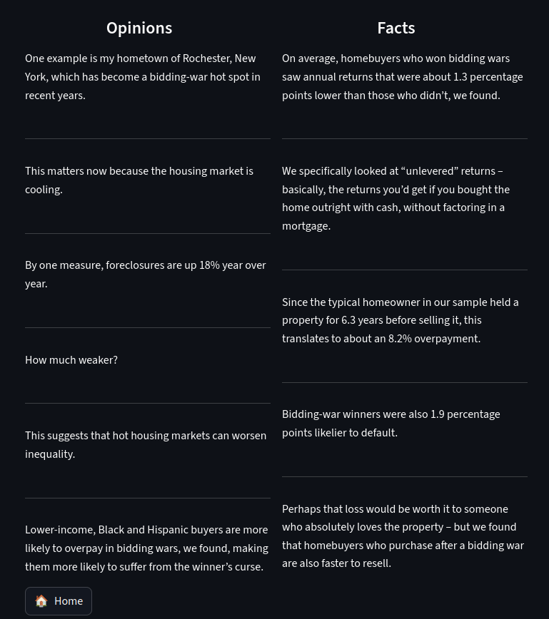
The opinions and facts of the article
-
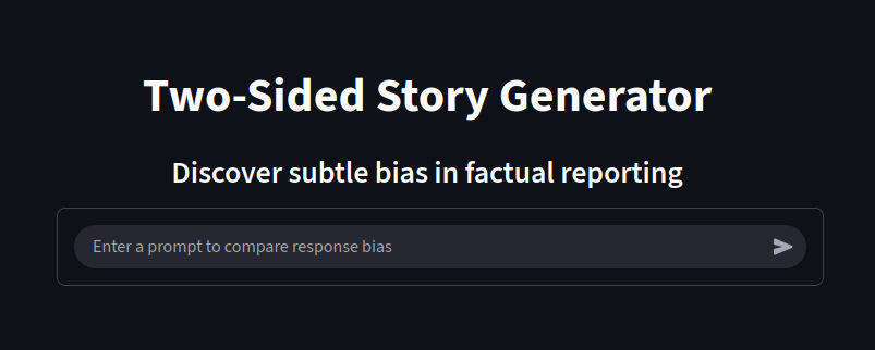
Prompt box to enter the neutral fact
-
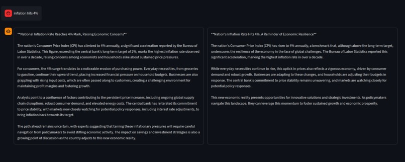
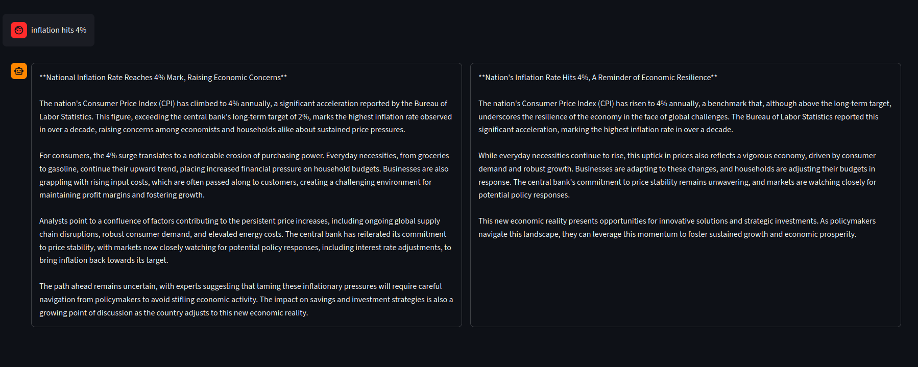
Opposing stories from a neutral fact
-
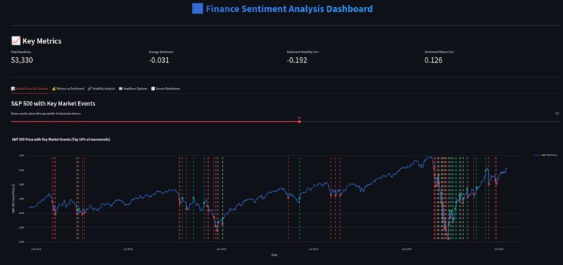
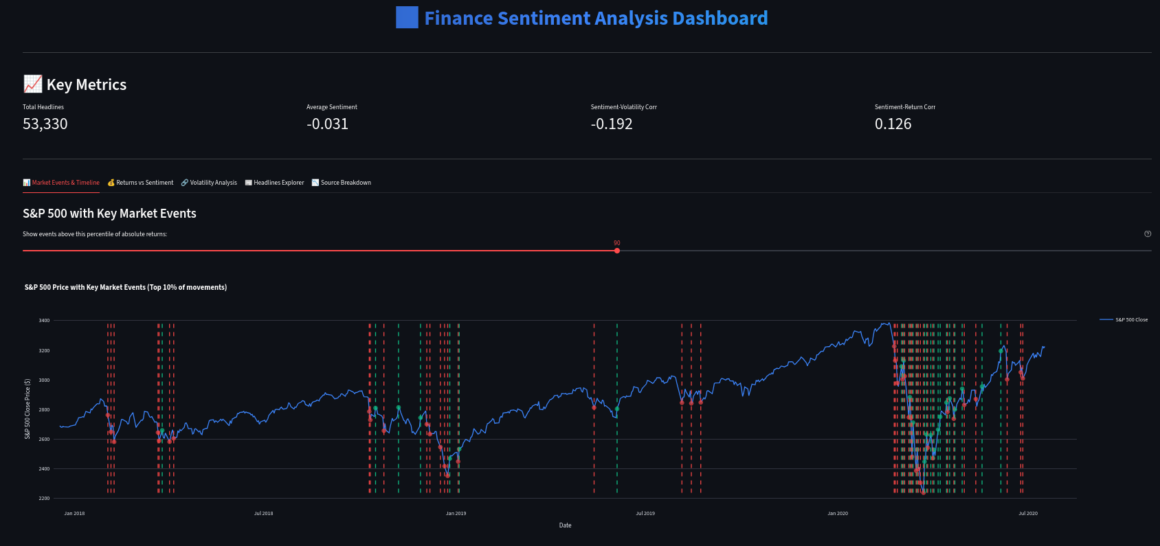
Interactive dashboard for financial sentiment
-
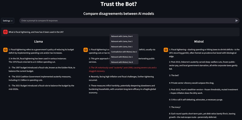
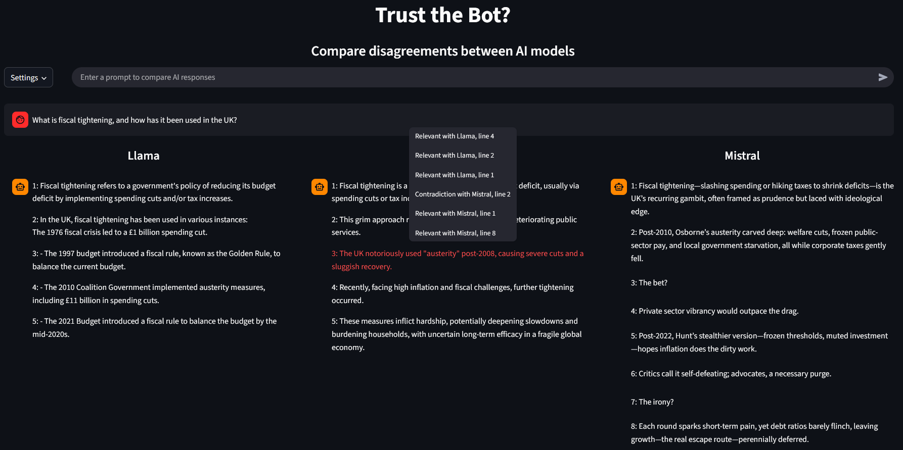
Comapring AI responses using language processing
Introduction
We live in a world where people are becoming more reliant on AI and the Internet for all their news and knowledge. Gone are the days of watching TV and going to the library for aggregating important information, instead, we are living in the digital age.
However, there is no guarantee that this information is accurate or reliable. It is very hard to sift through opinions and facts, and misinformation is prevalent in even high-level academic works. Therefore, it is important to have tools that can identify discrepancies, analyse sources, display connections, and educate people on bias. With some inspiration from sites such as Ground News and LLMArena, we present the Information Accuracy Dashboard.
Features
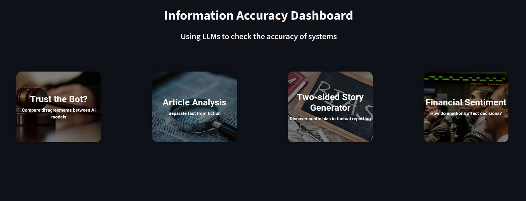
The Information Accuracy Dashboard (IAD) has four major features. Each feature has a unique focus on the topic of accuracy to equip people on all aspects of information gathering.
The first feature is "Trust the Bot?", a way to handle disagreements between major LLMs. It is very common to have varying answers, but it is very difficult to distinguish between consensus and disparities. "Trust the Bot?" identifies the areas where the bots generally agree (which means that it is more likely to be true), and contradict, which should encourage the user to look at these areas more in detail. This can also be used as an educational demo to show how important it is to not trust a single LLM blindly.
"Article Analysis" takes in a URL and is able to separate the facts from the opinions and displays them in their respective category. It is also able to highlight the positive and negative opinions so that the user is aware whilst reading the article.
However, facts can be skewed or misinterpreted to fit an agenda. In our "Two-sided Story Generator", we demonstrate this concept in action to educate people about subtle bias even within factual reporting. Here, a user can input a neutral prompt, and it should result in two stories that use the same fact to justify different or even conflicting reports. This should encourage people to be more aware when reading articles.
The "Financial Sentiment" is an interactive dashboard that shows users how market sentiment affects market returns. This is important to studying accuracy of sources because emotions play an effect in how we perceive information.
The Development Journey
In 24 hours, we came together to produce a very functional product. After much deliberation, we decided to build a suite full of smaller features that can work together as a cohesive unit, since this allows us to have a functioning product in a short time, without compromising on utility.
Our team split off into our back-end and front-end sections. In particular, we spent a lot of time handling APIs for LLMs and interacting with data. Fortunately, there was a clear pipeline from the input to the output. The sections kept close communication with each other so there were no major clashes of implementation.
A major challenges was working with the limited framework and design of Streamlit. Even though it allows us to get a minimum viable product very quickly, it has caused us many headaches when we plan to extend the functionality. In spite of that, some creative thinking allowed us to come up with a clean interface and better user interactions.
Built With
- python
- streamlit

Log in or sign up for Devpost to join the conversation.