-
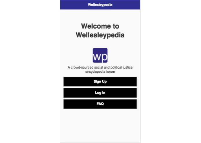
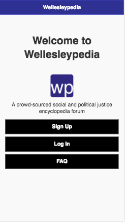
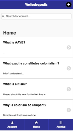
Home Page of Wellesleypedia Mobile App
-
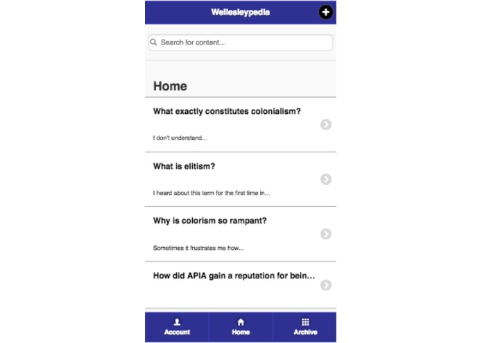
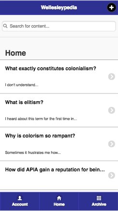
Interactive Home Newsfeed of Questions
-
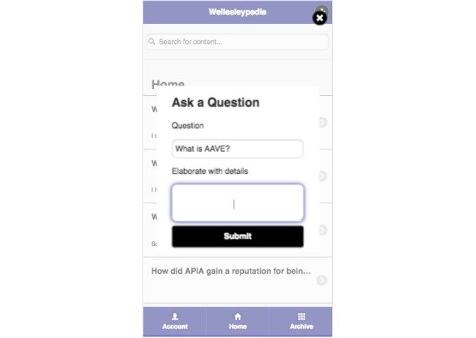
Pop-Up to ask new question
-
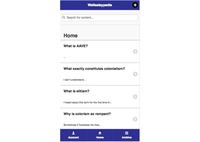
Once question is submitted, it appears on the home newsfeed and is answerable
-
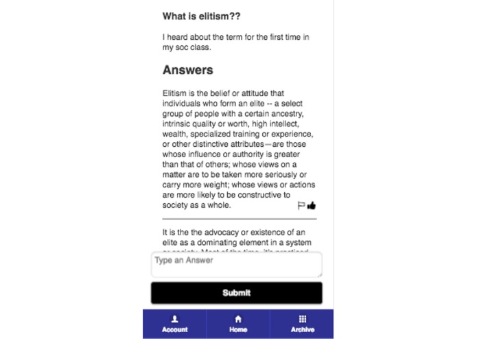
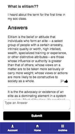
Display that appears when a question is clicked - details and answers are shown, answers can be reported or upvoted
-
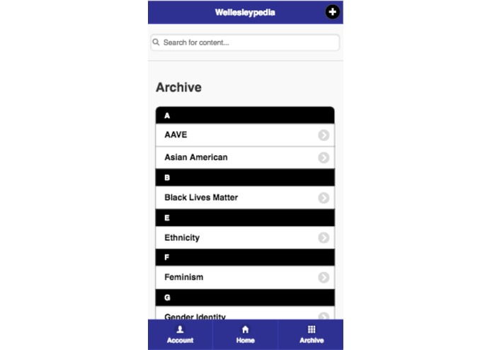
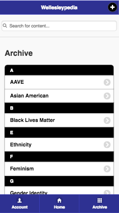
Archive page of mobile app, with existing moderated threads
-
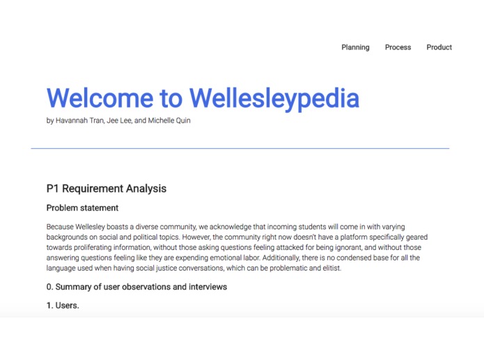
Home Page of Process Website
-
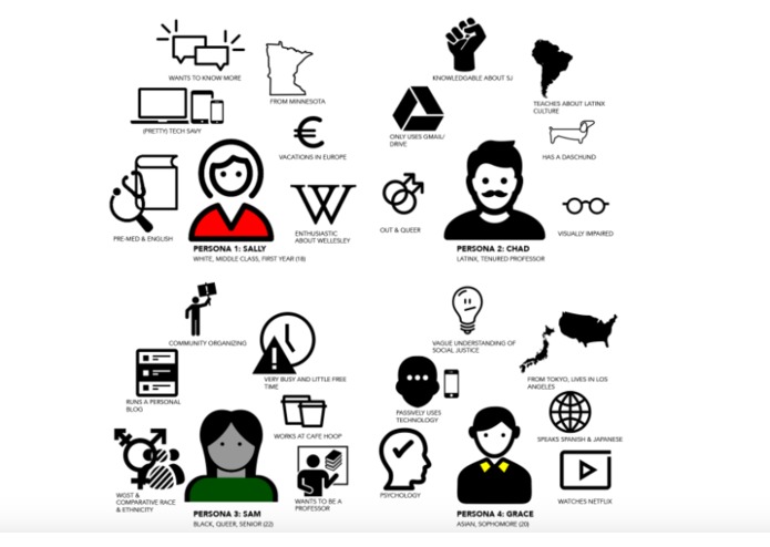
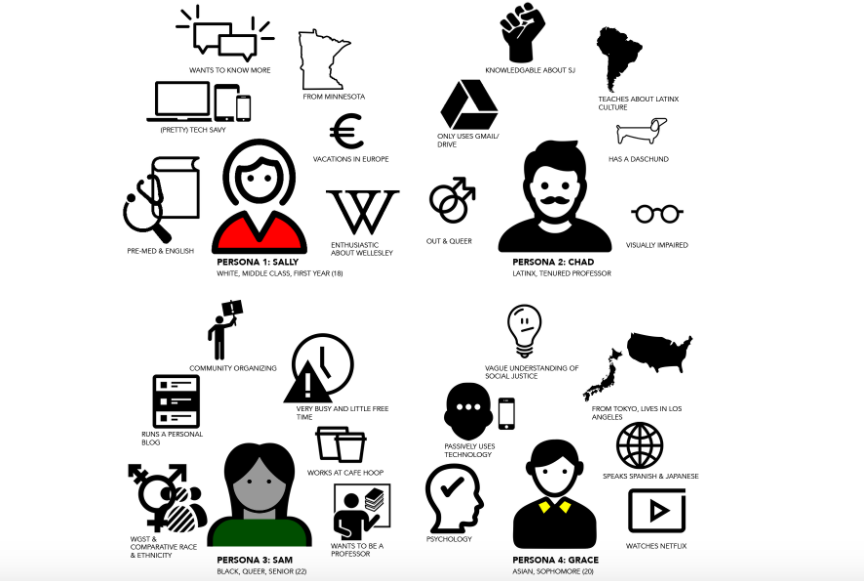
Personas
-
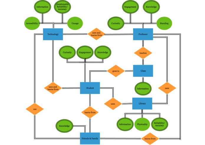
ERD
-
Digital Prototyping


Wellesleypedia
A crowd-sourced social and political justice encyclopedia forum for Wellesley College
Goal
Because Wellesley boasts a diverse community, we acknowledge that incoming students will come in with varying backgrounds on social and political topics. However, the community right now doesn’t have a platform specifically geared towards proliferating information, without those asking questions feeling attacked for being ignorant, and without those answering questions feeling like they are expending emotional labor. Additionally, there is no condensed base for all the language used when having social justice conversations, which can be problematic and elitist.
Users
Wellesley students and faculty seeking to learn about or educate others on political and social justice knowledge and terminology relevant to Wellesley College. Since our app is available to both Wellesley students and faculty, our target group is a rather large one, with the majority being 18 to 22-year-olds (college students) who use their smartphones and laptops on a daily basis.
Scenario Tasks
Scenario Task 1: Ask a question about Elitism
Scenario Task 2: Search for white privilege question/answers and upvote a good answer
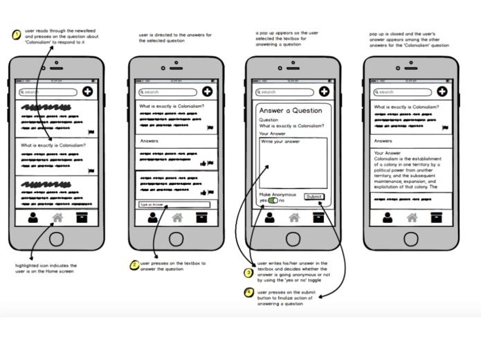
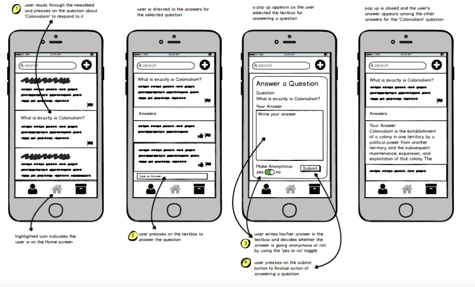
Scenario Task 3: Answer a question about colonialism
Design Iteration
The issues the pilot users addressed for task 2 influenced our changes in the prototype design. The lack of screen for typing in an answer confused the pilot users, so we created a new pop up that allows the user to write his or her answer in the text box. Pilot User 2 was confused by the ‘anonymous’ pop up set up that we decided to combine the anonymous feature and text box in one pop up screen (as shown in the image below). Since all the features are in one screen, it reduced the number of screens the user encountered with. Furthermore, the ‘Answer a Question’ pop up screen is consistent with the ‘Ask a Question’ popup screen in task 1, because inconsistency can become another confusing factor in our design. After learning how even pilot users with a further understanding of our app and the general use of prototypes had a confusion with the task, we aimed to take extra attention to each design we implemented. Reducing the number of screens reflects how our design should be economical, but also effective by combining all the features into one screen.
Resolutions
We learned that different users have different needs and usability desires. While some users found certain buttons confusing, others found the same buttons intuitive. However, there were overwhelming problems we found, such as confusion over what certain buttons were used for due to lack of text (we use icons to represent pages and actions in our app). A possible solution for this usability issue is to have a “help” screen (represented by a question mark icon) that guides the user through the different aspects and uses of the app. We could also have a tutorial that demonstrates the different features of the app when the user first signs up.

Log in or sign up for Devpost to join the conversation.