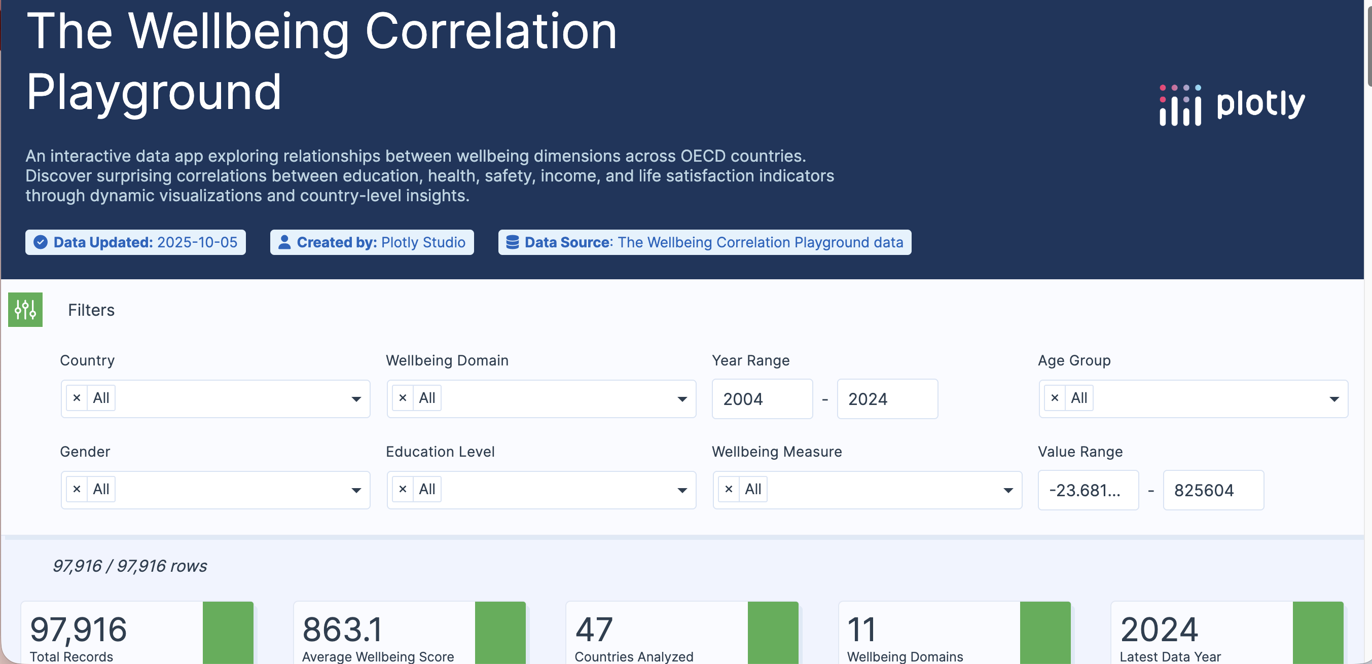
The Wellbeing Correlation Playground is an interactive data visualization app built with Plotly Studio and is designed to explore how different dimensions of human wellbeing interconnect across OECD countries.
What it does
Using OECD’s wellbeing indicators dataset, the app allows users to:
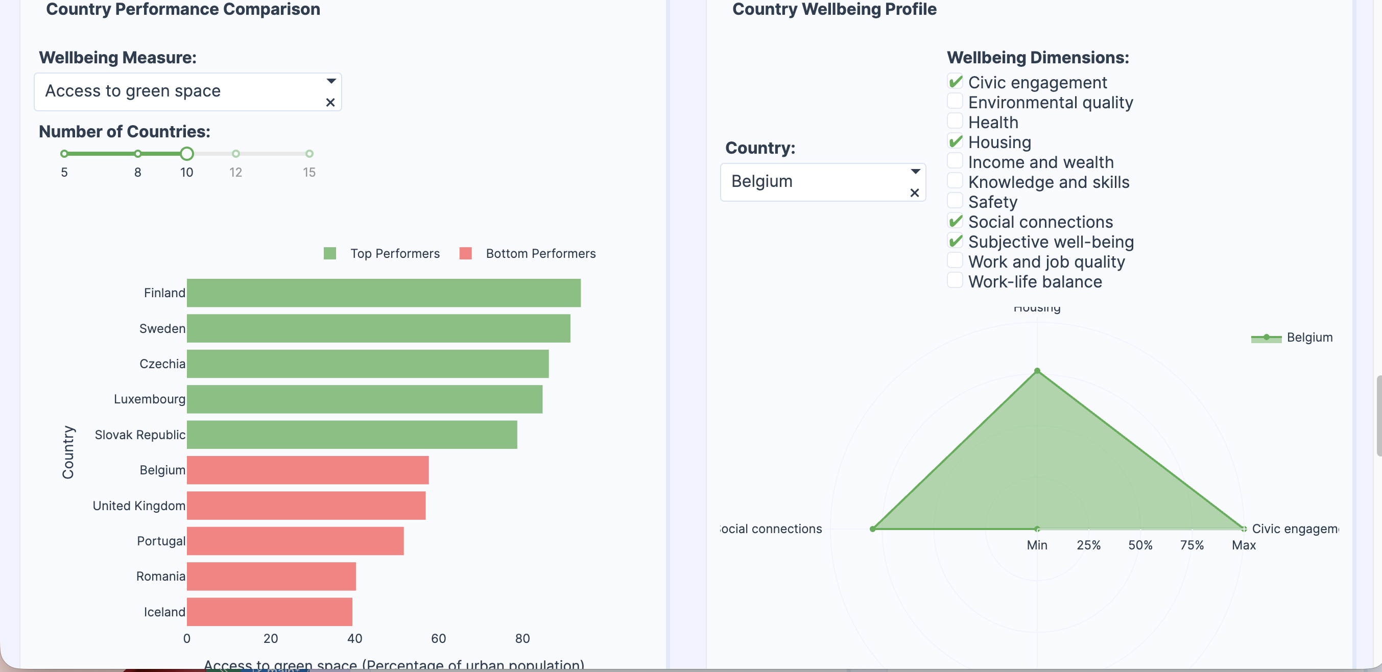
- Select and compare any two wellbeing metrics (like education attainment vs. life satisfaction or income inequality vs. mental health).
- Visualize correlations instantly through dynamic scatter plots, trend lines and correlation heat maps.
- Dive deeper into each country’s wellbeing profile through hover insights and contextual data summaries.
- Discover hidden relationships between social and economic factors shaping quality of life.
The goal is to transform statistical data into an intuitive exploration space, where users can see how different parts of life connect and how improving one dimension might influence another.
What I learned
This project taught me how Plotly Studio can turn a static dataset into a living, exploratory experience powered by natural language, data and design. I learned how to leverage Plotly Studio’s app generator to rapidly prototype a multi-chart dashboard.
Built With
- plotly
- plotly-studio


Log in or sign up for Devpost to join the conversation.