-
App Preview

The Inspiration
In a world saturated with economic data, how do we measure what truly matters for a good life? The OECD's "Better Life Initiative" provides a rich dataset on well-being, but its complexity can be a barrier. Wellbeing Atlas was born from a desire to transform this dense data into a beautiful, intuitive, and personal exploratory experience. The goal was to build an app that empowers anyone to go beyond GDP and discover which countries align with their personal definition of well-being.
What it does
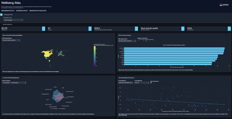
Wellbeing Atlas is an interactive data application built with Plotly Studio that guides users on a journey to discover global well-being. It allows users to:
- Explore Global Trends: A dynamic choropleth map provides a high-level overview of how different well-being measures are distributed across the globe.
- Find Your Perfect Country: The app's core feature allows users to select a well-being priority (like "Work-Life Balance" or "Environmental Quality") and instantly see a ranked list of the top-performing countries.
- Compare National "Fingerprints": A unique radar chart visualizes the balanced "well-being fingerprint" of different nations, allowing for nuanced comparisons of their strengths and weaknesses across all major domains.
- Uncover Hidden Connections: An interactive scatter plot lets users explore the complex trade-offs between different well-being measures, such as the relationship between income and life satisfaction.
How I built it
This app was built entirely within Plotly Studio, leveraging its AI-powered capabilities to rapidly prototype and iterate. The process involved several key stages:
- Strategic Prompting: The initial app was generated from a detailed prompt focused on creating a user-centric "Personal Well-being Explorer."
- Iterative Refinement: I went through multiple iterations, refining the AI-generated outlines and editing the app's layout, titles, and descriptions to sharpen the narrative and improve the user experience.
- Data Transformation & Visualization: The most significant challenge was creating the "Well-being Fingerprint" radar chart. This required crafting a highly specific prompt to guide the AI in normalizing dozens of disparate measures and then aggregating them into single, meaningful "Domain Scores."
- UI/UX Polish: I consolidated filters, improved chart titles for better storytelling, and refined the layout into a clean 2x2 grid to ensure the final app was not just functional, but also beautiful and intuitive.
Challenges I ran into
- Handling Sparse Data: I discovered that many well-being measures lacked data for specific demographic groups (age, sex, education). To solve this, I implemented a user-friendly solution by changing the app's default view to a measure with complete data and adding a note to the filter to manage user expectations.
- Complex Data Aggregation: Getting the radar chart to display a balanced "fingerprint" required moving beyond simple prompts. I had to explicitly instruct the AI on the necessary data transformation steps (normalization and aggregation) to achieve the desired visualization.
Accomplishments that I'm proud of
I'm incredibly proud of transforming the initial, auto-generated dashboard into a polished and story-driven application. Specifically, the Well-being Fingerprint radar chart is a feature I'm very proud of, as it required deep thought about data transformation to turn a complex dataset into a simple, powerful insight.
What I learned
This project was a masterclass in the art of AI-assisted development. I learned that the key to leveraging tools like Plotly Studio effectively is not just about the initial prompt, but about the iterative process of refining, guiding, and collaborating with the AI to handle real-world data challenges and achieve a specific design vision.

Log in or sign up for Devpost to join the conversation.