Inspiration
Living in a busy urban area, I grew tired of spending hours researching weekend trips—sifting through scattered sites for pet-friendly spots, driving distances, and itineraries. I wanted a simple, beautiful hub that takes the stress out of planning, so I built something that mirrors how I (and my friends) actually travel: quick, personalized, and focused on joy, not hassle.
What it does
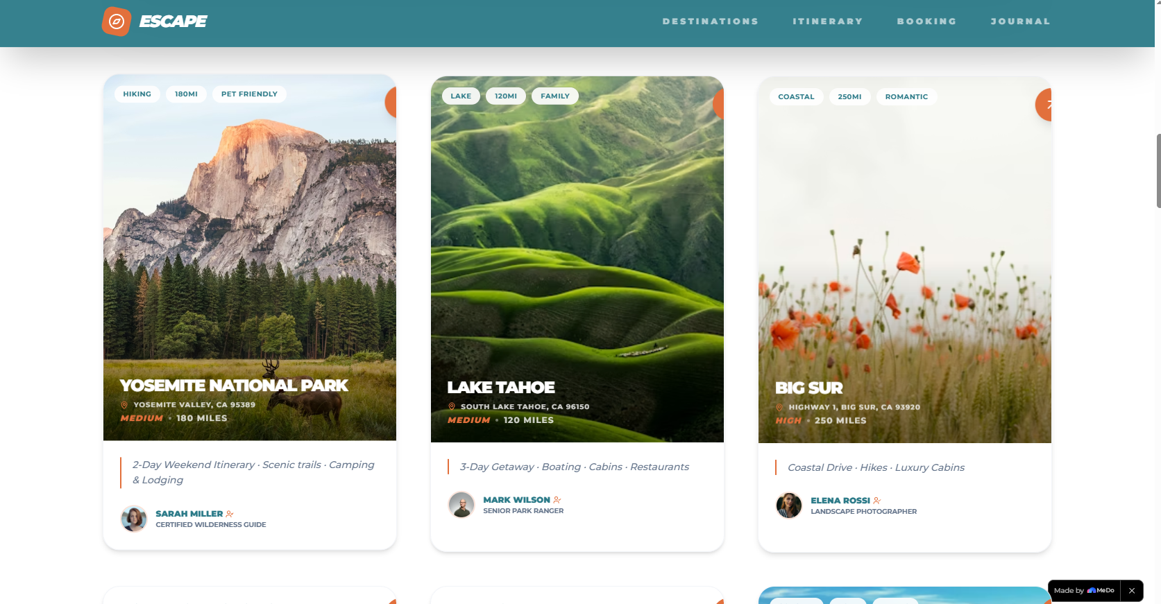
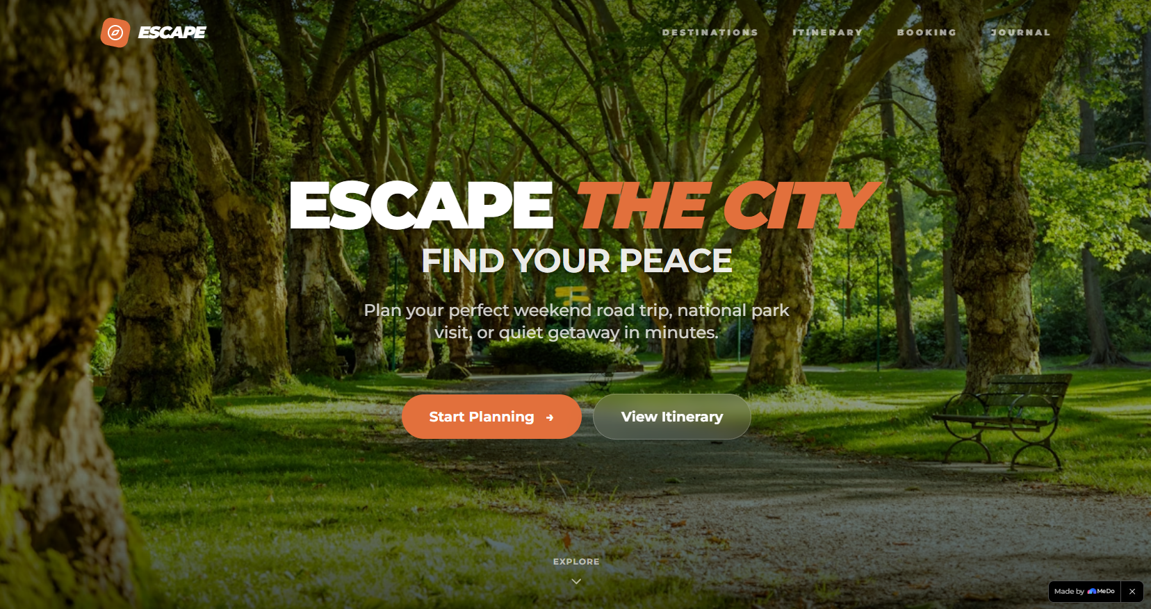
Weekend Getaway Planner is a one-stop web platform for urban professionals, couples, and pet owners to plan 2-3 day road trips. Users filter destinations by distance, interests, and budget, generate ready-made itineraries, book accommodations/car rentals, and save travel memories—all with a sleek, intuitive design.
How we built it
I started with core UI/UX principles, mapping the user journey from "start planning" to "save memories." I used HTML5/CSS3 for structure and styling (leaning into glassmorphism, gradients, and responsive grids), JavaScript for interactions (smooth scroll, filter logic, animations), and Intersection Observer API to trigger scroll animations. I prioritized accessibility (respecting prefers-reduced-motion) and mobile responsiveness.
Challenges we ran into
The biggest hurdle was balancing visual flair (parallax, staggered animations) with performance—overdoing animations slowed the site, so I optimized transitions and used lazy loading for images. Another challenge was making the filter logic intuitive: ensuring dropdown selections narrow results without confusing users, and handling "no results" states gracefully.
Accomplishments that we're proud of
Creating a design that feels premium but approachable—users comment on how the site “feels like a breath of fresh air” compared to clunky travel tools. I’m also proud of building accessibility into every feature: animations respect user motion preferences, and the layout works seamlessly on phones (where most people plan trips).
What we learned
I deepened my understanding of front-end performance optimization and user-centric design—small details (like hover micro-interactions or smooth nav transitions) make a huge difference in how users perceive the platform. I also learned to prioritize: cutting "nice-to-have" features (like social sharing) to nail the core experience first.
What's next for this project
I want to add dynamic itinerary generation (tailored to user input like start time or pet needs), integrate user accounts to save favorite trips, and partner with local businesses for curated recommendations. Long-term, I’d love to add a photo upload feature for the Travel Journal, so users can truly document their getaways in one place.
Built With
- css3
- fontawesome
- html5
- javascript
- unsplash

Log in or sign up for Devpost to join the conversation.