Inspiration
Planning my best friend’s wedding, I watched her juggle spreadsheets, vendor lists, and guest RSVPs across 5 different tools – it was chaotic. As someone who loves creating intuitive, beautiful digital experiences, I knew there had to be a better way. I wanted to build a platform that felt as elegant as the wedding itself, merging functionality with the warmth and joy of the big day – something that spoke to couples, not just "users."
What it does
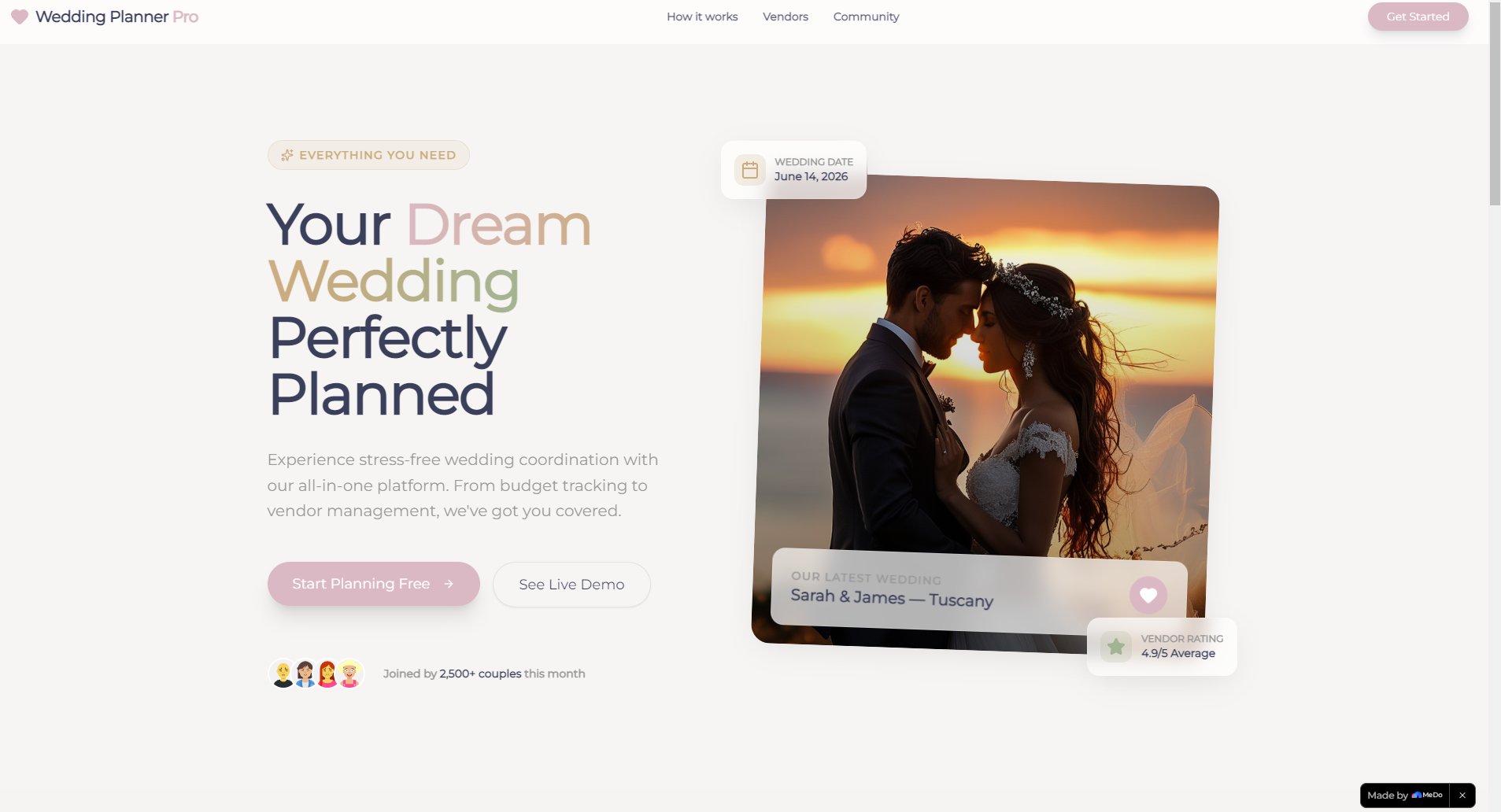
Wedding Planner Pro is an all-in-one hub for every wedding planning need. Couples can track their budget (with real-time spending breakdowns), browse trusted local vendors with ratings and quotes, manage guest lists and RSVPs, and build a personalized wedding website to share their love story. Every feature is wrapped in an elegant, wedding-inspired design that feels personal, not clinical.
How we built it
I started with Figma to craft the visual identity – soft, romantic colors (dusty rose, classic gold) and elegant typography (Playfair Display for that timeless wedding feel). I built the frontend with React and Tailwind CSS for responsiveness, ensuring it works seamlessly on desktop, tablet, and mobile. GSAP powered the subtle animations (count-up stats, smooth tab transitions) that make the platform feel alive, and Font Awesome provided curated wedding-themed icons (rings, bouquets, hearts) to tie everything together.
Challenges we ran into
The biggest hurdle was balancing aesthetics with performance – those subtle animations (like the hero fade-ins and card hover effects) looked stunning but risked slowing the site down. I spent weeks optimizing CSS transitions and GSAP timelines to keep the experience smooth, even on slower devices. Another challenge was making the budget tracker intuitive: I tested 3 different layouts with couples to ensure the progress bars and summary cards felt easy to scan, not overwhelming.
Accomplishments that we're proud of
Seeing couples (and even local wedding planners!) react to the platform was incredible – they said it felt "like a breath of fresh air" compared to generic planning tools. I’m especially proud of the responsive design: it looks just as beautiful on a bride’s phone (scrolling while at a venue tour) as it does on a laptop at home. The animation details – like the count-up stats and tab transitions – also landed perfectly, adding joy without distraction.
What we learned
I learned that "elegance" in design isn’t just about pretty colors – it’s about making hard things feel easy. Couples don’t want to "learn" a tool; they want to focus on their wedding. I also realized how important local context is: curating vendor categories and budget breakdowns to match what couples in our area actually spend on (venue, catering, photography) made the tool feel personal, not one-size-fits-all.
What's next for this project
Next, I want to add a seamless way to connect with vendors directly through the platform – think in-app inquiries and quote requests. I also plan to build a simple seating chart tool (something couples begged for in feedback!) and integrate a photo gallery feature for the wedding website that syncs with popular photo apps. Ultimately, I want to keep refining the experience to feel like a trusted friend, not a tool – making wedding planning feel joyful, not stressful.

Log in or sign up for Devpost to join the conversation.