-
-

-
Relationship Graph
-
-
-
-
Dashboard
-

Sentiment Analysis


Inspiration
The inspiration behind Webfluence originated from the need to comprehensively visualize and analyze the social media landscape of various entities. The challenge of this hackathon was to develop a platform that could offer insights into the online presence, social media handles, parent entities, languages, and regional focus of diverse organizations.
What it does
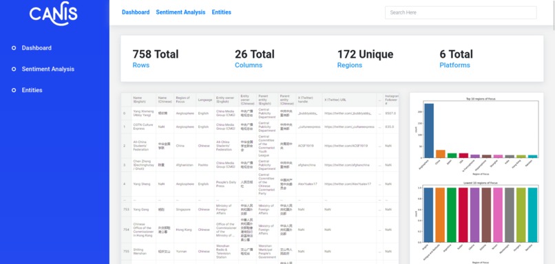
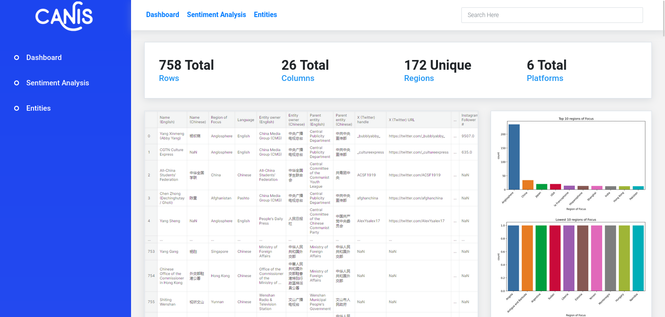
Webfluence provides a dashboard which covers every aspect of the data provided. It is divided into four sections:
1) General Analysis
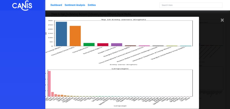
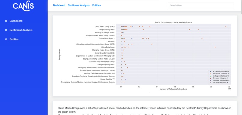
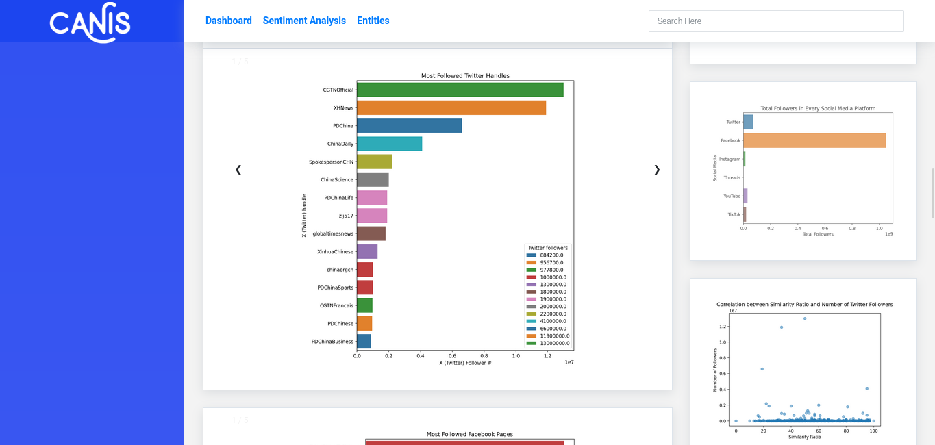
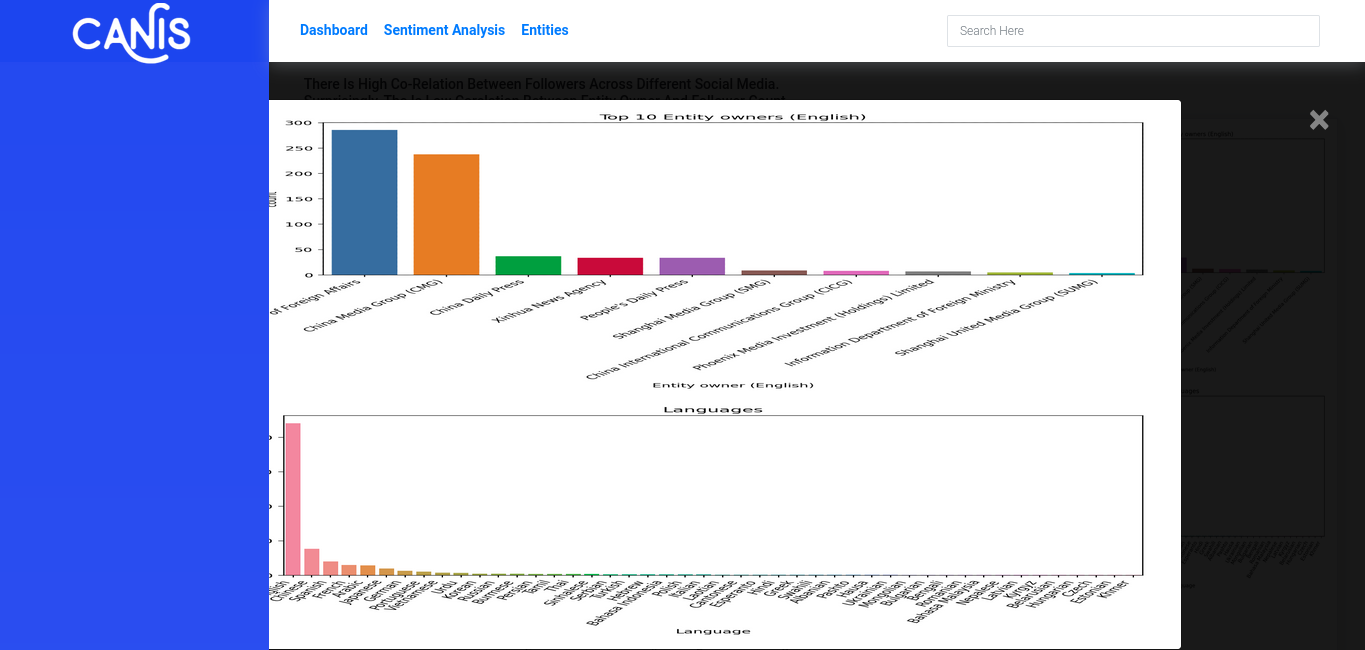
It forms the first half of the dashboard. It gives a broad view of the dataset through visualization of Top platforms, Top Accounts, Top Entity Owners and how their size compare with each other. It also includes correlation heatmap which reveals high co-relation between follower counts across different platforms. One interesting thing that we found during analysis is that although there are 69 unique Entity Owners in the dataset, when we removed accounts posting in English and Chinese, the rest of the media is owned by just 5 entities.
2) Platform Specific Analysis
Here, we analyzed each platform (X, Facebook, Instagram, Threads, Tiktok, Youtube)by comparing top accounts, their language, region of operation, owner and similarity ratio between media handles and actual name. We found that the top account in X and Facebook is CGTN and on Instagram and Threads it is ipanda channel. Both of these media are owned by CMG. In every platform except tiktok, the region of operation is mainly Anglosphere and Chinese whereas Tiktok is much diverse with operations and high number of followers in Myanmar, Japan, Egypt.
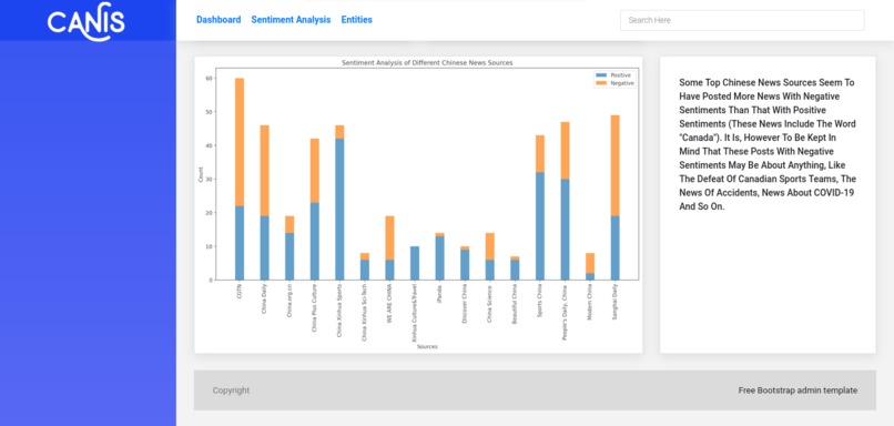
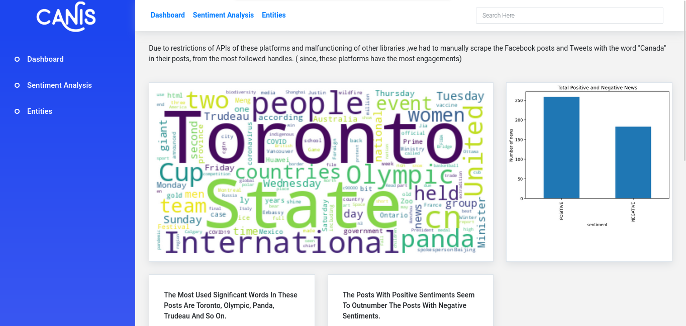
3) Sentiment Analysis
For this section, we manually collected data from Facebook. We collected posts which mentioned Canada. We specifically chose Canada because of the limited timeframe we had. To perform a meaningful analysis, we focused on collecting sizable data on a single region. We created a word cloud from the given data and found out that the media mostly mentioned Toronto in their post. “United States” also occurred with high frequency meaning that news about Canada is often conveyed in association with the USA. We ran the posts through a BERT based sentiment classifier. We found that the number of positive sentiment posts outnumbered ones with negative sentiment. However, on analyzing sentiment of posts in the level of individual accounts, we found that most of the popular media had more posts with negative sentiment. Although, it should be noted that the negative sentiment posts could be related to sports defeat, accidents, covid and so on. Collecting more data can provide clarity of this matter.
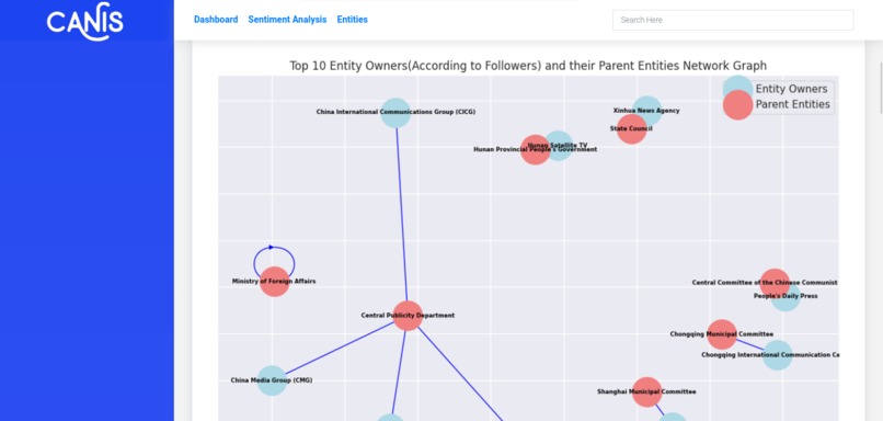
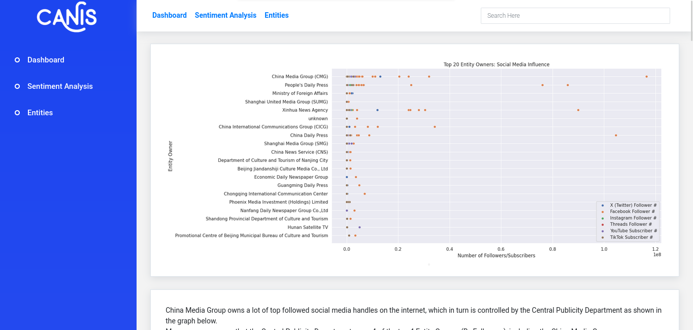
4) Entity Analysis
This page consists graphs and plots that showcase the influence of different state entities and parties over social media. It includes scatter plots to present the most followed entities and also network graphs to show the relationships between Entity owners and Parent Entity.
How we built it (Methodology)
The Webfluence platform was crafted during the hackathon using various technologies.
The website itself was created using Bootstrap.
Pandas was used for reading and processing the data as a dataframe.
Matplotlib and Seaborn were used for creating beautiful graphs and plots.
Networkx was used for creating the network graphs.
The tweets and facebook posts were manually collected to pass them through sentiment classifier due to restrictions from these platforms. We collected posts with the word 'Canada' specifically, due to time and API constraints.
Tensorflow with distilbert was used for sentiment classification
Wordcloud was used for generating wordcloud from the collected posts.
Challenges we ran into
Data Integration: Aggregating and integrating data from social media platforms, posed a challenge due to restrictions by these platforms and their APIs.
Accomplishments that we're proud of
Comprehensive Visualization: The platform provides a comprehensive visualization of social media handles, parent entities, languages, and regional focus, offering users a holistic view of an entity's online presence.
User-Friendly Interface: The team achieved a user-friendly interface that allows for easy navigation and exploration of data, making it accessible to a broad audience.
Built With
- matplotlib
- python
- seaborn
- transformers

Log in or sign up for Devpost to join the conversation.