-
-
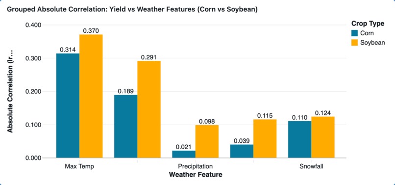
Grouped Absolute Correlation: Yield vs Weather Features (Corn vs Soybean)
-
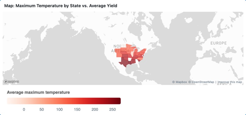
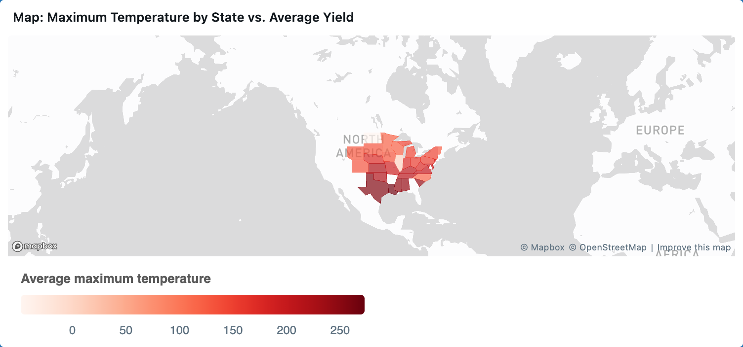
Map: Maximum Temperature by State vs. Average Yield
-
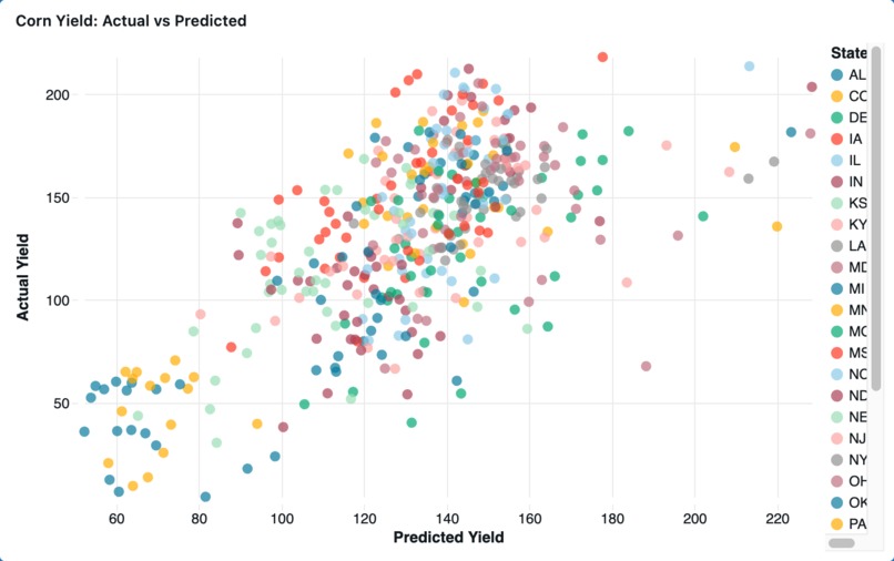
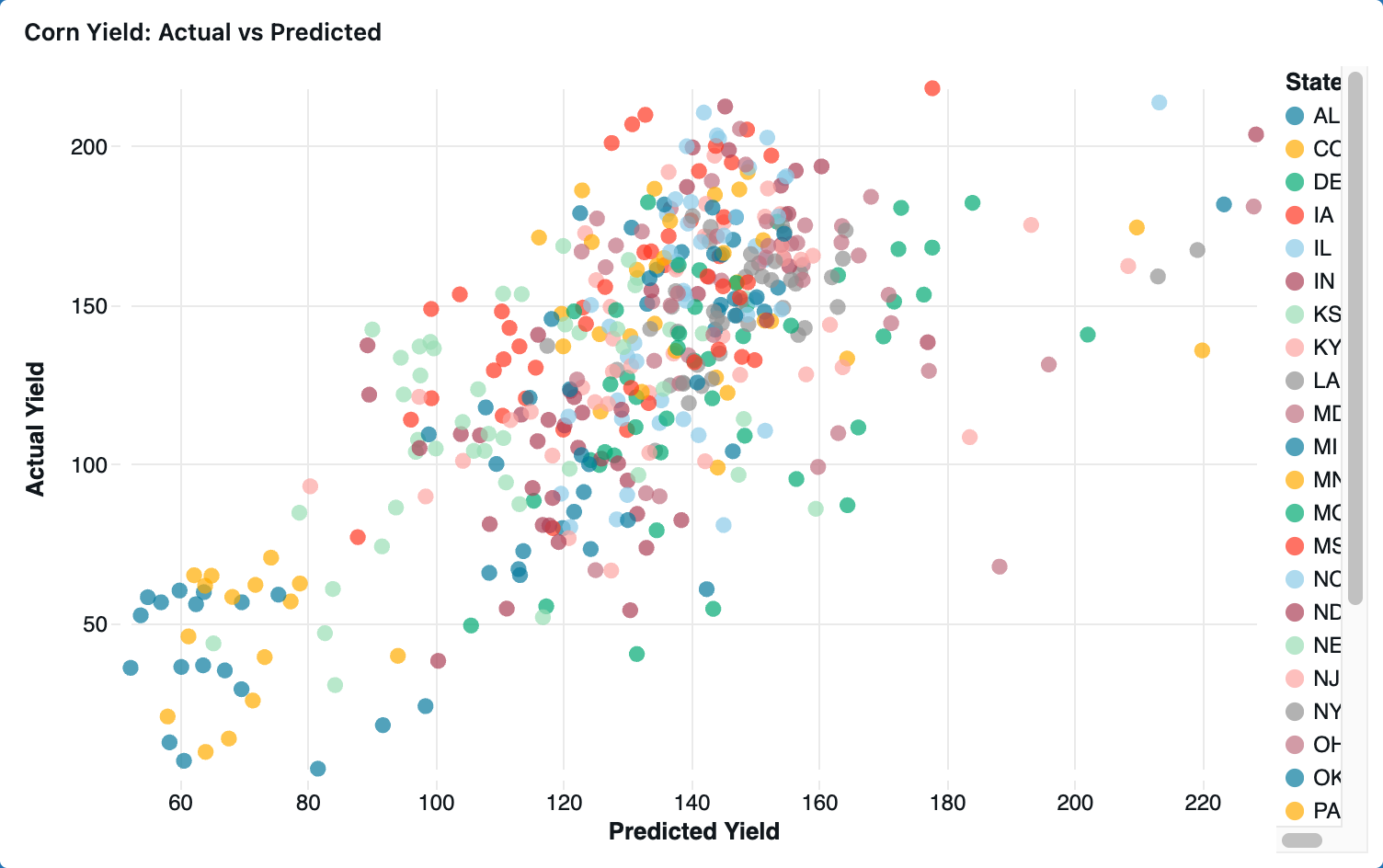
Corn Yield: Actual vs Predicted Regression Model
Inspiration
We learned from Corteva that they would like to more reliably predict how much of their seed supply they’ll be able to grow based on trends from past weather and crop yield. From that, we wanted to illustrate weather trends in different locations to allow Corteva to decide which locations were best to maximize seed supply. Additionally we wanted to give them predictions for how many seed samples they should send to already contracted locations to optimize seed growth. We wanted to see which locations had more anomalies that didn’t follow weather trend prediction so they could be advised on which places they should send seed supply.
What it does
Our Databricks dashboard shows which weather variables correlate the most to the output of corn and soybeans separately with a side-by-side bar chart. This comparison also allows users to observe differences in climate sensitivity between corn and soybeans.
How we built it
We first cleaned the data from the NOAA weather stations such that the data only includes weather observations for locations that are present in the crop yield data. Then, we linked the weather and crop yield data sets together in a SQL notebook and separated the corn and soybean data. We used the corn and soybean datasets to find which weather variables were most strongly correlated with each crop’s yield and identify when and where there were anomalies in yield. To visualize insights from this data for the end user, we used the dashboard to create visualizations of the correlation strengths and anomaly cases.
Challenges we ran into
We ran into challenges with the data quality and understanding how to use Databricks’ tools to implement our vision. For example, when we were trying to visualize our data at the end, we saw that unrealistic temperatures were displayed, which led us to realize that our initial dataset was not fully filtered for bad data. When we were formulating our product idea and approach at the beginning, we had many details which we wanted to include, such as a model that searched the internet for anomaly explanations. However, we realized that those ideas would take significantly more time so we had to reduce and simplify our scope.
Accomplishments that we're proud of
We are proud that we were able to build a complete workflow from raw data to modeling and dashboard visualization in Databricks. We are also proud of shifting our mindset from a purely technical approach to a user-centered design perspective. After speaking with Corteva employees, we restructured our analysis to focus on actionable insights like what characteristics are important for a farm to be ideal for raising seed samples.
What we learned
We learned how to approach product development and design from the perspective of business consulting and knowing the customer because it was very insightful to be able to speak with the Corteva employees. We also realized the importance of data quality. We did not spend enough time on data cleaning in the early stage, which affected the reliability of some of our results. We learned that we should prioritize filtering out incomplete or inconsistent data before beginning our analysis. In addition, we learned how to organize a data pipeline effectively in Databricks. Specifically, we learned how to order notebooks and connect them together so they can be run all at once instead of running each one manually.
What's next for Weather-to-Yield Signal Explorer
We plan to enhance the interpretability of our anomaly-explanation model. In the current stage, we just finished identifying the top three observations with the largest residuals, calculated as the difference between the weather-based expected yield and the actual yield. These instances represent the most deviations from expected performance under given weather conditions including extreme climate scenarios. We plan to expand the analysis on the three observations with the smallest residuals as well. We also want to be able to create a map visualization which shows where anomalies occurred given a certain year. We want to aggregate the weather variable-yield correlation data and the anomaly data to be able to give suggestions to the Corteva employees for where they should grow their seed supply and how much seed should be sent to contract farmers in different locations to maximize seed production.


Log in or sign up for Devpost to join the conversation.