-
-
example classification
-
top

Ideation & Development Process We chose Option 1 — Weather-to-Yield Signal Detection — because the core question is directly actionable: given that a county had a bad crop year, was it the weather's fault, or something else?
We broke the problem into a linear, auditable pipeline:
Step 1 — Ingest & clean (01_ingest_setup.py): USDA RMA county-level actuarial yield data (Corn + Soybeans, 2010–2024, 32 states) was loaded, standardised, and written to Delta Lake as the bronze table. FIPS codes and county centroids were resolved for spatial joins.
Step 2 — Weather fetch (02_fetch_weather.py): Growing-season weather aggregates (April–October) were computed from NOAA GHCN-Daily station data using Spark Pandas UDFs to parallelise the per-county fetch. Features engineered: mean Tmax/Tmin/Tavg, total precipitation, growing degree days (base 10°C), heat stress days (Tmax > 35°C), ET₀, Crop Water Stress Index (CWSI), and a SPI drought proxy.
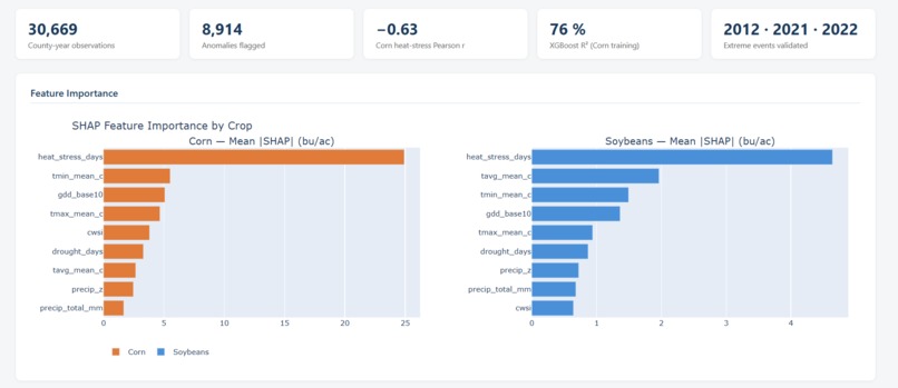
Step 3 — Correlation & feature importance (03_correlation_analysis.py): Pearson and Spearman correlations were computed per crop and feature. An XGBoost model (400 trees, depth 5) was trained on 2010–2022 data with a 2023–2024 holdout, and SHAP TreeExplainer was used to produce per-prediction feature attributions. Results logged to MLflow.
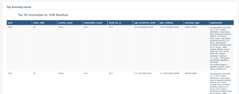
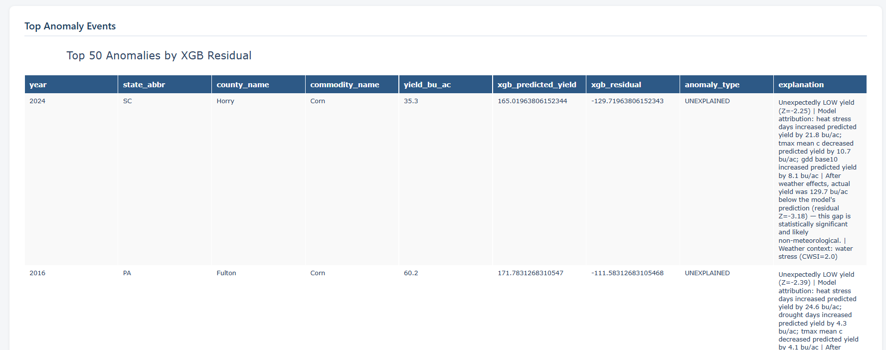
Step 4 — Anomaly detection (04_anomaly_detection.py): A three-layer system:
Layer 1 — Leave-one-out robust Z-score per county (threshold |Z| > 1.5) Layer 2 — XGBoost residual (actual − predicted), flagged when residual Z < −1.5 Layer 3 — Isolation Forest on residuals (contamination = 0.08) Each flagged observation was then classified as: WEATHER_DRIVEN (Z-score + model residual both confirm), UNEXPLAINED (Z-score anomaly but model predicted normal yields), RESIDUAL_ONLY, or ISOLATION_ONLY.
Step 5 — Visualisation (05_visualization_maps.py, 06_create_dashboard.py): Folium county choropleth maps, Plotly interactive heatmaps (state × year for heat stress and precipitation anomaly), scatter plots, and time-series panels with anomaly flags.
Key findings:
Heat stress days (Tmax > 35°C) are the dominant yield predictor for both crops (Corn r = −0.63, Soybeans r = −0.56) The 2012 Great Plains Drought, 2021 Western Heat Dome, and 2022 Southern Heat Wave were correctly classified as weather-driven 14.9% of anomalies were "unexplained" — counties that underperformed despite normal weather conditions, pointing to non-meteorological causes
How We Used Databricks
Delta Lake: Bronze/silver/gold medallion architecture for yields and weather tables MLflow: Tracked XGBoost hyperparameters, RMSE, R², and SHAP feature importance across runs Spark Pandas UDFs: Parallelised per-county weather aggregation across 1,238 counties Unity Catalog :Namespace management for Delta tables across pipeline stages DBR 14+ runtime :Python 3.10 with XGBoost, SHAP, Folium, Plotly pre-available What worked well: Delta Lake's time-travel capability made iterative pipeline development fast — we could re-run individual notebooks without re-ingesting data. MLflow's auto-logging reduced boilerplate significantly.
Friction points: The Spark–pandas boundary still requires explicit .toPandas() / createDataFrame() calls that interrupt the development flow. SHAP's TreeExplainer is not natively distributed, so the explanations step ran on the driver only; at larger scales this would need applyInPandas to shard across counties.
Credits & Third-Party Tools USDA RMA County Yields: Primary yield dataset (Corn + Soybeans, 2010–2024) NOAA GHCN-Daily: Historical weather station data (~15,000 US stations) XGBoost: Gradient boosting yield model SHAP: Model explainability / feature attribution scikit-learn: Isolation Forest anomaly detection Folium: County-level choropleth maps Plotly: Interactive heatmaps, scatters, time-series Pandas / NumPy: Data wrangling MLflow: Experiment tracking (via Databricks managed MLflow) Delta Lake: Storage layer (via Databricks)
Built With
- databricks
- python