-
-
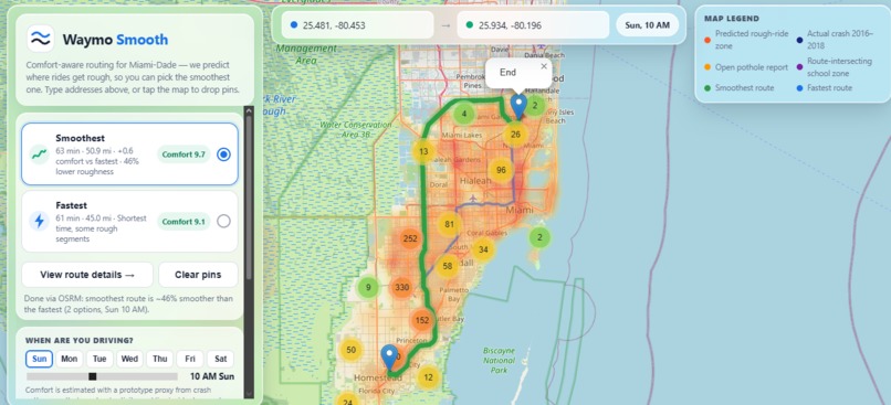
General view
-
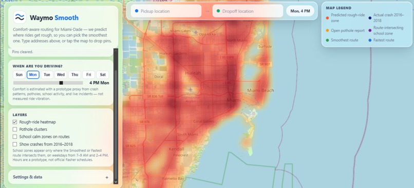
HeatMap
-
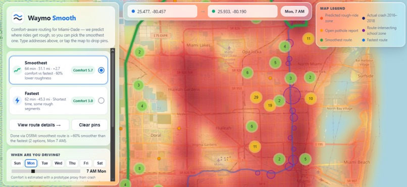
School zones
Inspiration
Every navigation app optimizes for one thing: arrival time. But the fastest route is often the roughest — patched highways, stop-and-go corridors, bumpy construction zones. For robotaxi riders who can't choose their own path, that means motion sickness and miserable trips. We asked: what if routing had a comfort term, not just a time term? route cost = time + hazard + discomfort.
What it does
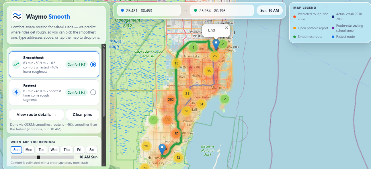
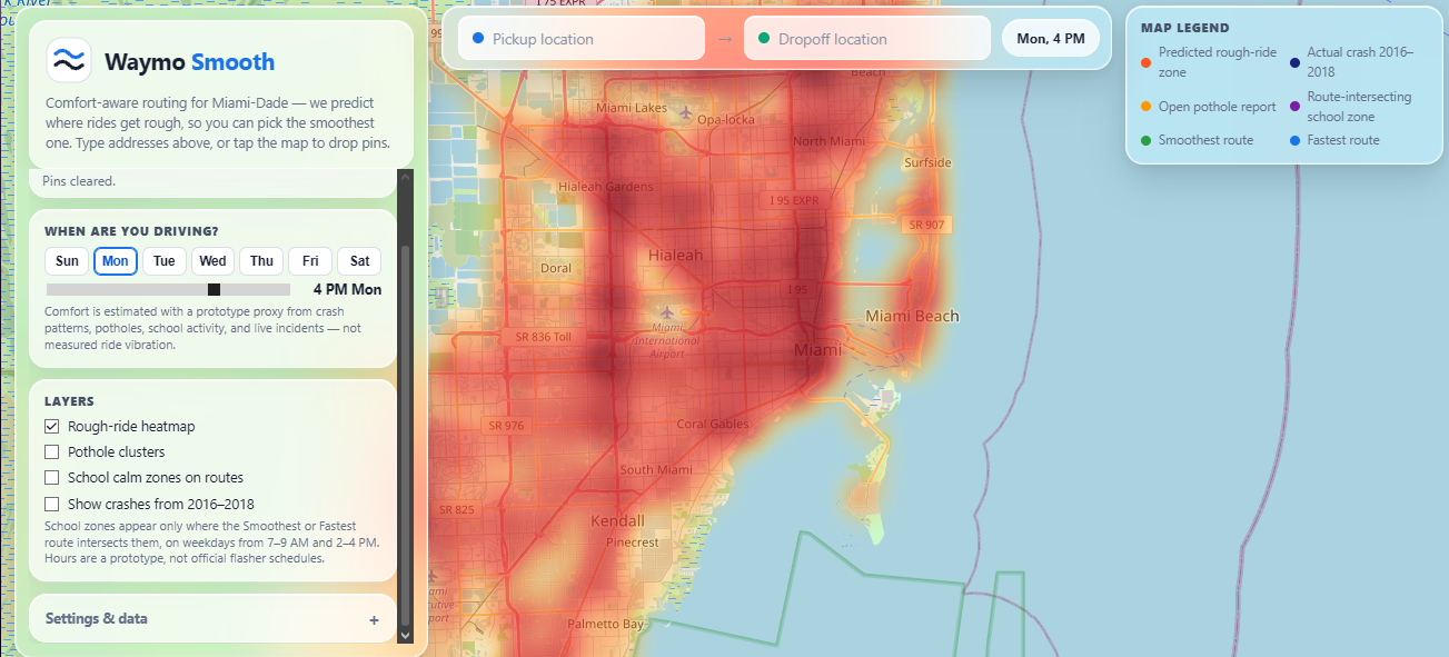
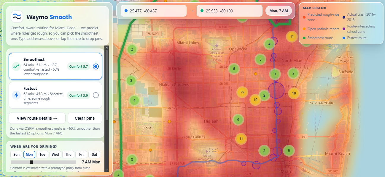
Waymo Smooth is a comfort-aware routing demo for Miami-Dade. It scores candidate routes by estimated road comfort — built from public crash history, 311 pothole reports, and school-zone activity — and shows Smoothest vs Fastest side by side. On our rehearsed demo route, the smoothest option delivers 37% less roughness for 3 extra minutes (35 min vs 32 min). The map layers tell the story: a rough-ride heatmap from 4,544 modeled points, 1,525 clustered pothole reports, and 451 real Miami-Dade public school sites carrying a 1.75× risk weight during school windows (weekdays 7–9 AM & 2–4 PM). A live layer folds in TomTom traffic incidents and Google traffic-aware ETAs, and Gemini writes a plain-English chauffeur brief for each trip.
How we built it
A static site (Leaflet + vanilla JS) on GitHub Pages — no backend, so it always loads. Historical priors build the base comfort map: crash data (2016–2018) and pothole reports feed a 201×181 spatial grid. Live traffic and incidents adapt it to the moment via the TomTom Traffic API and Google Routes API. We even measured congestion instead of assuming it: a probe script hit the Google Routes API across 3 corridors × 7 day/time combos and found Brickell → Doral runs 1.88× free-flow on Fridays at 5 PM (38 vs 20 min) — while our beach corridor was actually worst on Monday at 8 AM. APIs measure; Gemini narrates. Built with: JavaScript, Leaflet, Google Routes API, Google Geocoding API, Gemini API, TomTom Traffic API, GitHub Pages
Challenges we ran into
Public data is messy and stale: crash history ends in 2018, potholes are a 2023 snapshot, and reports are geocoded to addresses rather than exact pavement spots (we snapped them to roads via the Google Roads API). Our school-zone layer shipped with zero schools due to an empty dataset — we rebuilt it from Miami-Dade County's official open-data portal (451 sites). The biggest intellectual challenge was honesty: crash history doesn't directly measure vibration, so we frame it as a proxy for corridors with chronic road issues, and every weight in the model is labeled a prototype assumption. We also learned mid-hackathon what are API'S capable of.
Accomplishments that we're proud of
A working live demo comparing Smoothest vs Fastest on real Miami corridors Measured, don't assumed: real congestion factors from 21 live Routes API calls — the beach corridor's worst hour wasn't Friday 5 PM, and we have the numbers to prove it 451 real school sites recovered from the county's open-data portal after our dataset shipped empty An honest model: every limitation stated up front, proxies labeled as proxies
What we learned
Measure, don't assume — our biggest surprise was that Friday 5 PM wasn't the worst time on every corridor. We also learned that public data wins hackathons only if you're honest about its age and gaps: judges on a transportation-data track can spot an overclaim instantly. And that a 60-second fallback video is worth more than a perfect live demo that might not load.
What's next for Waymo Smooth
A comfort-vs-time preference slider so riders choose their own tradeoff Replace proxies with real measurements — phone accelerometers today, vehicle IMUs tomorrow Personalize scores by rider and vehicle type Expand beyond Miami-Dade with the same public-data pipeline
Built by an independent student team for the Waymo transportation-data track at ShellHacks 2026, FIU. Not affiliated with Waymo.
Built With
- api
- css
- github
- google-gemini
- google-routes-api
- html
- javascript
- json
- leaflet.js
- open-data
- python
- tomtom
- tomtom-api
- tomtom-geocoding


Log in or sign up for Devpost to join the conversation.