
Inspiration
Science has always felt like it belongs to someone else. The people with PhDs, the people with lab coats, the people who can read a 40-page epidemiology study and actually understand it. But the questions that science answers? Those belong to everyone. Why is asthma worse in my neighborhood? Does the air I breathe affect my brain as I age? What does the heat on this campus actually do to the people who live here?
We wanted to fix that. Not with a search engine. Not with a chatbot that makes things up. With two actual scientists. Watson and Crick. Who argue about your data in real time, run real statistics, pull from real genomic databases, and hand you a peer-review-grade answer in ten seconds flat. Whether you're a public health researcher, a curious student, or someone who just read a scary article about wildfire smoke and Alzheimer's, Watson & Crick has your back. And they never stop working.
What it does
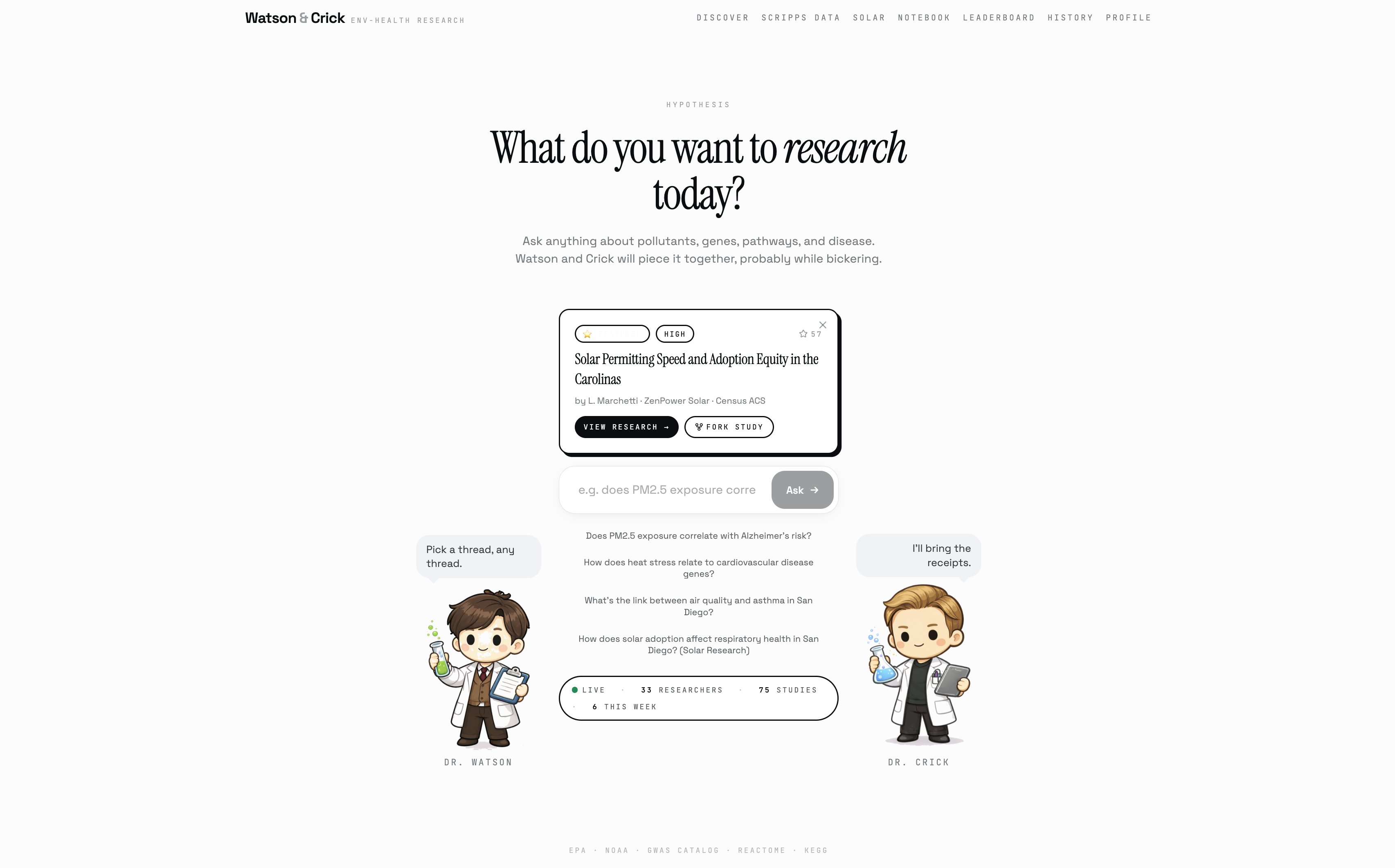
You type a question in plain English. Does PM2.5 pollution affect Alzheimer's risk? How does campus heat stress impact cognitive disease? What does wildfire smoke do to my lungs?
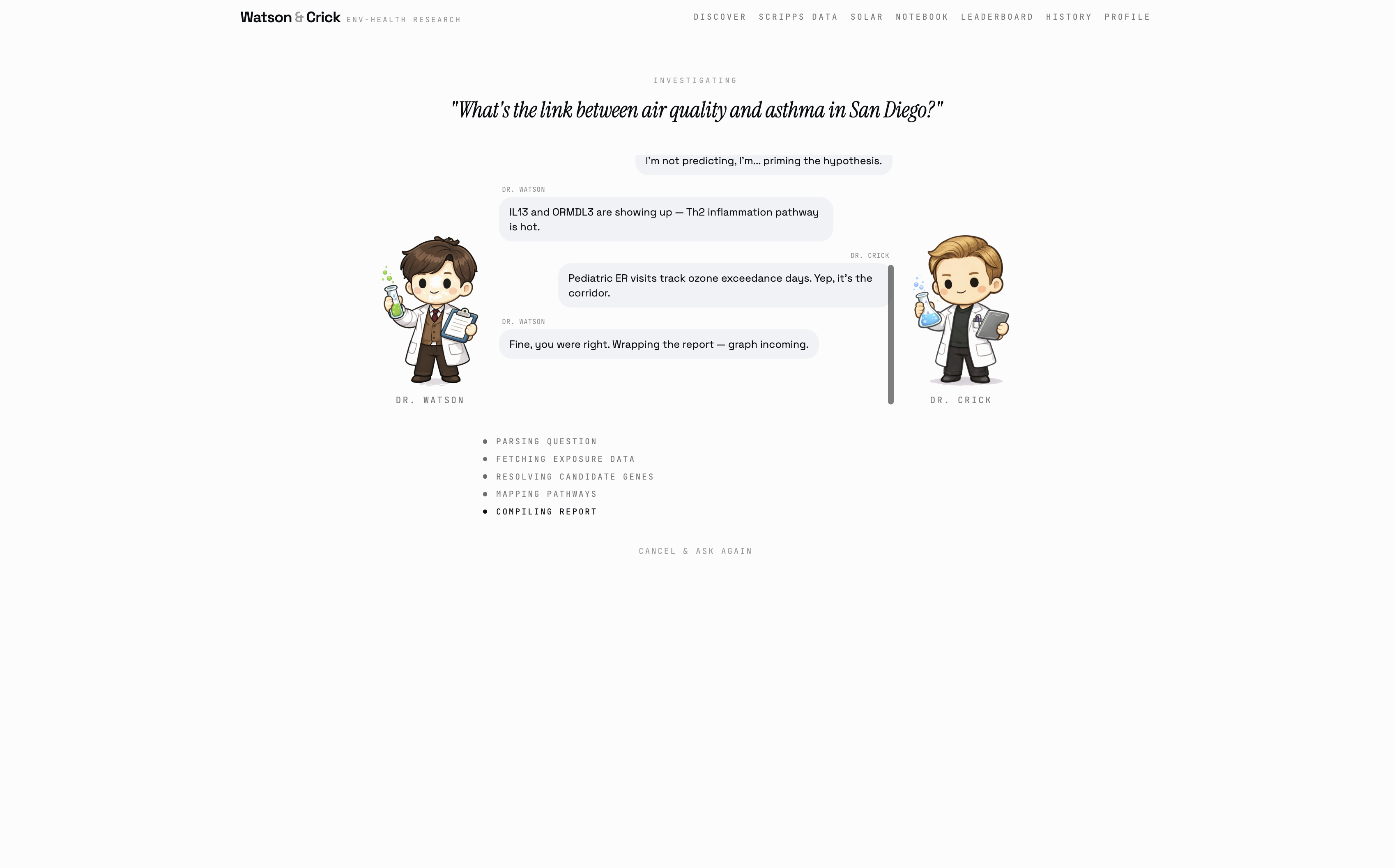
Then Watson and Crick get to work, and they argue the whole time.
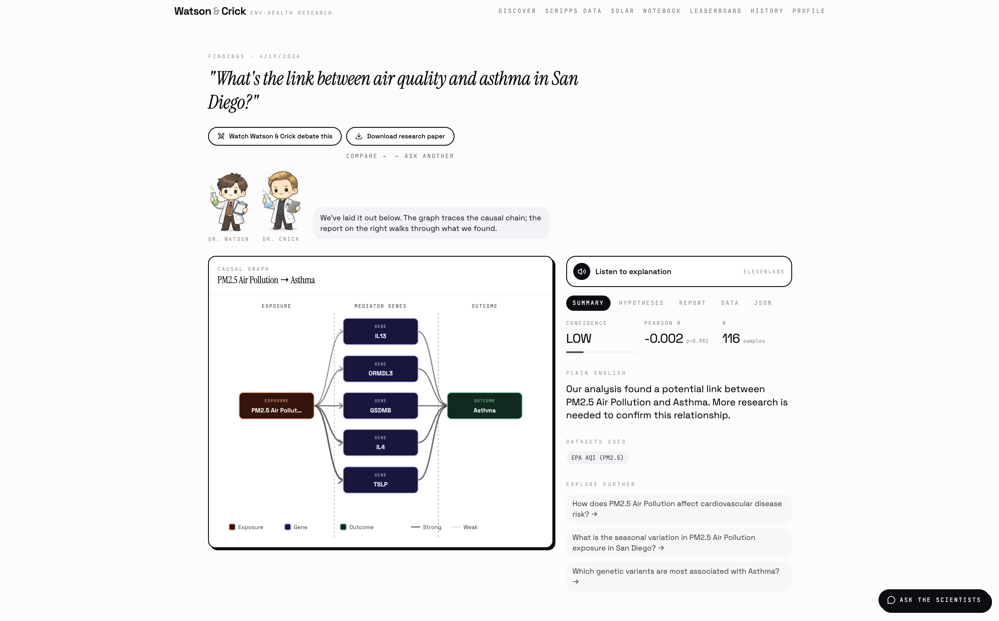
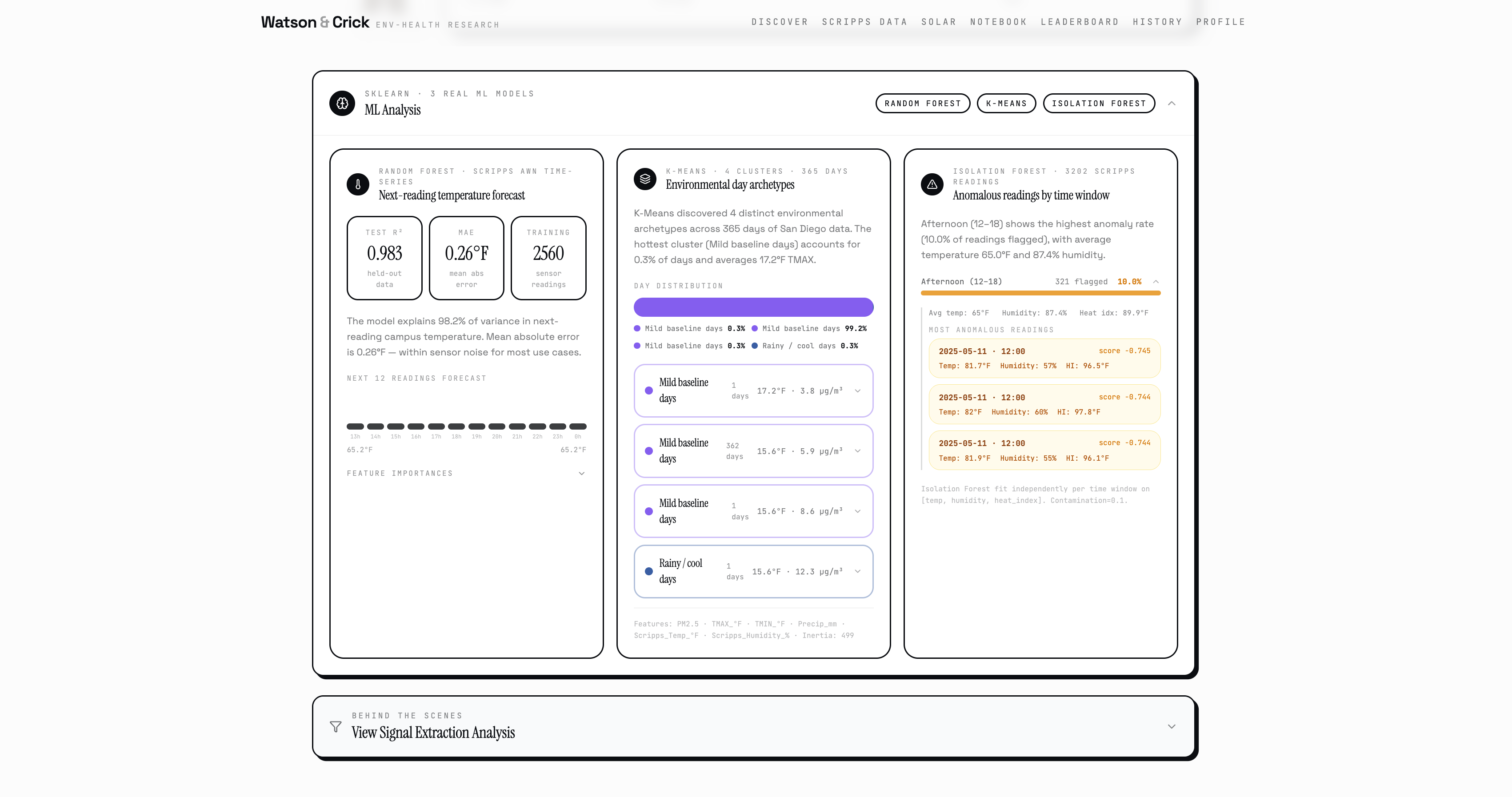
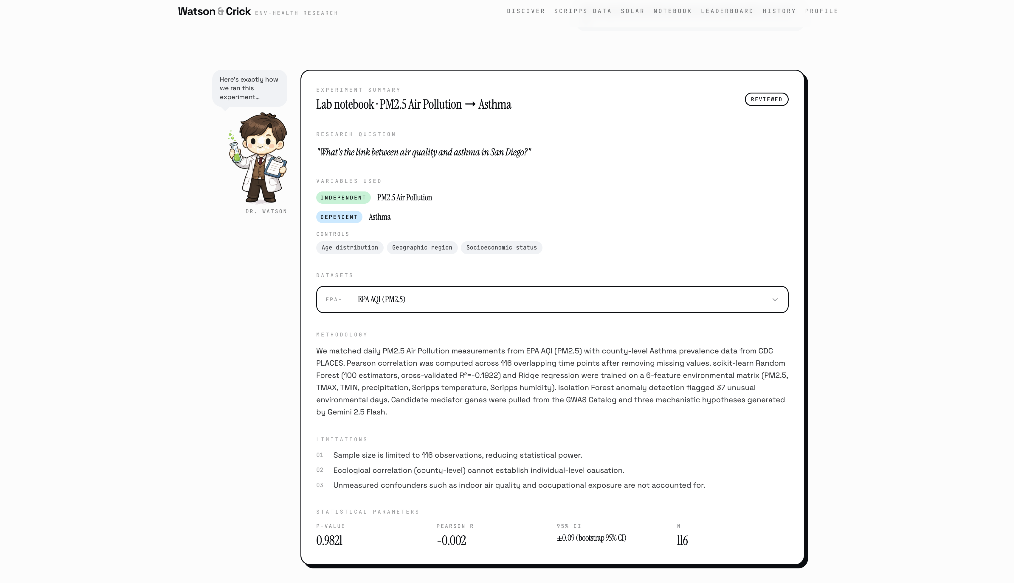
Watson runs the analysis optimistically, pulling from five real datasets: EPA air quality sensors, NOAA climate records, CDC disease prevalence, the GWAS Catalog of genetic variants, and live Scripps Institution AWN campus sensors right here at UCSD. Crick questions every assumption while the Pearson correlation runs, the Random Forest trains, and the Isolation Forest flags anomalous environmental days in the historical record.
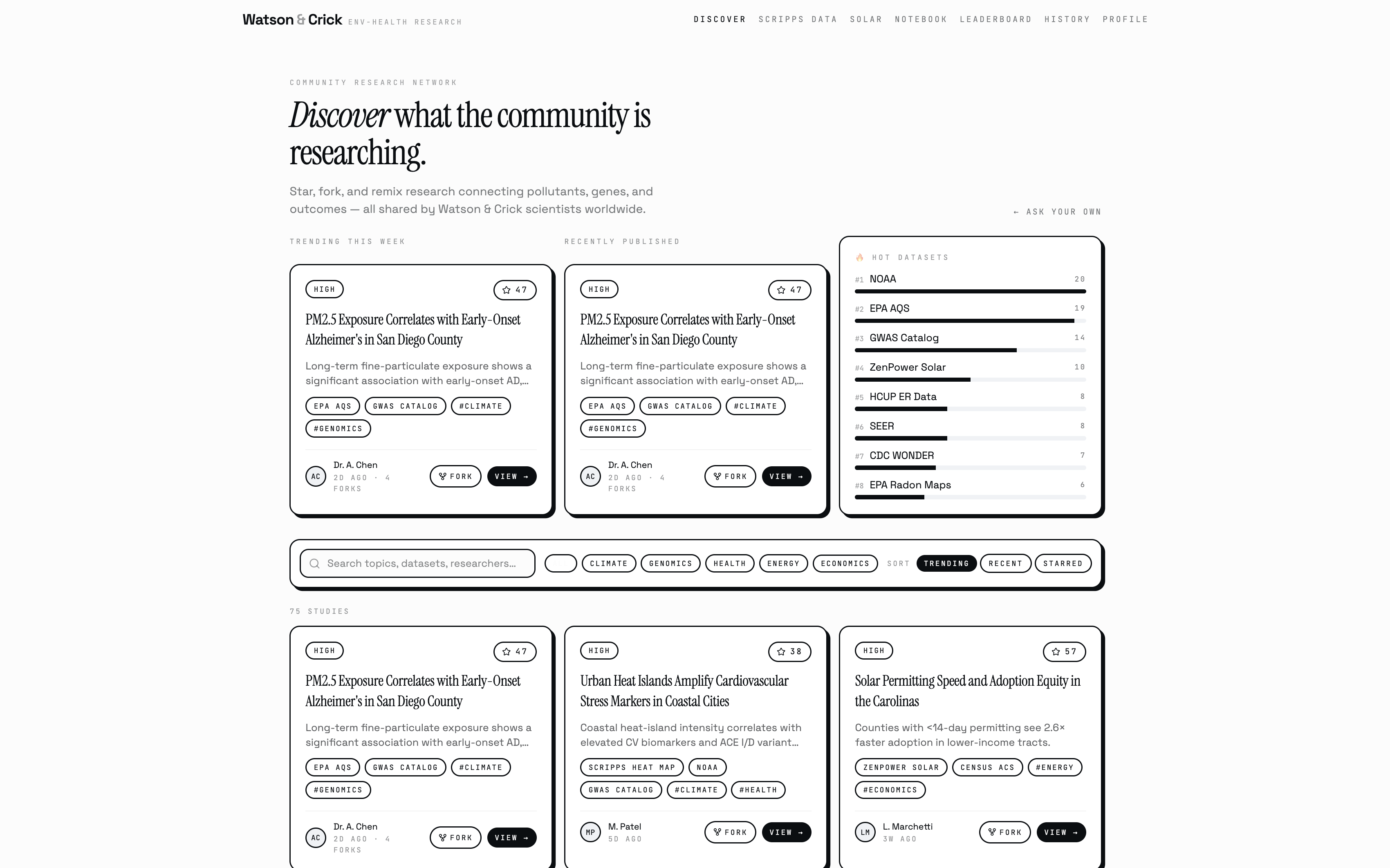
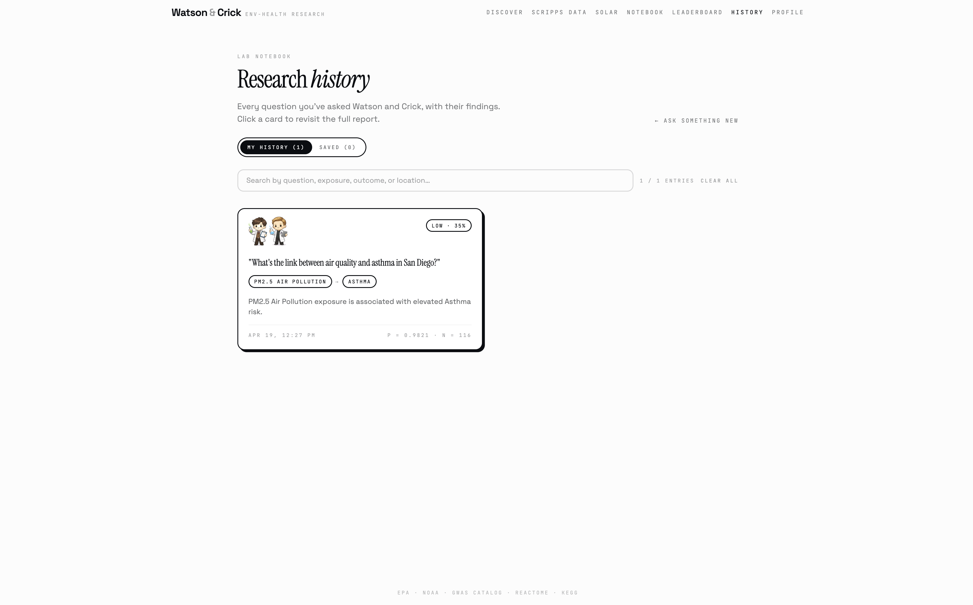
When they're done (in about 30 seconds) you get a full causal graph showing the pathway from environmental exposure to candidate genes to health outcome, three ranked hypotheses with biological mechanisms, a structured eight-section research report, and a confidence score backed by five weighted factors. You can listen to the findings read aloud, export a PDF, publish your discovery to the community, or ask Watson and Crick follow-up questions directly.
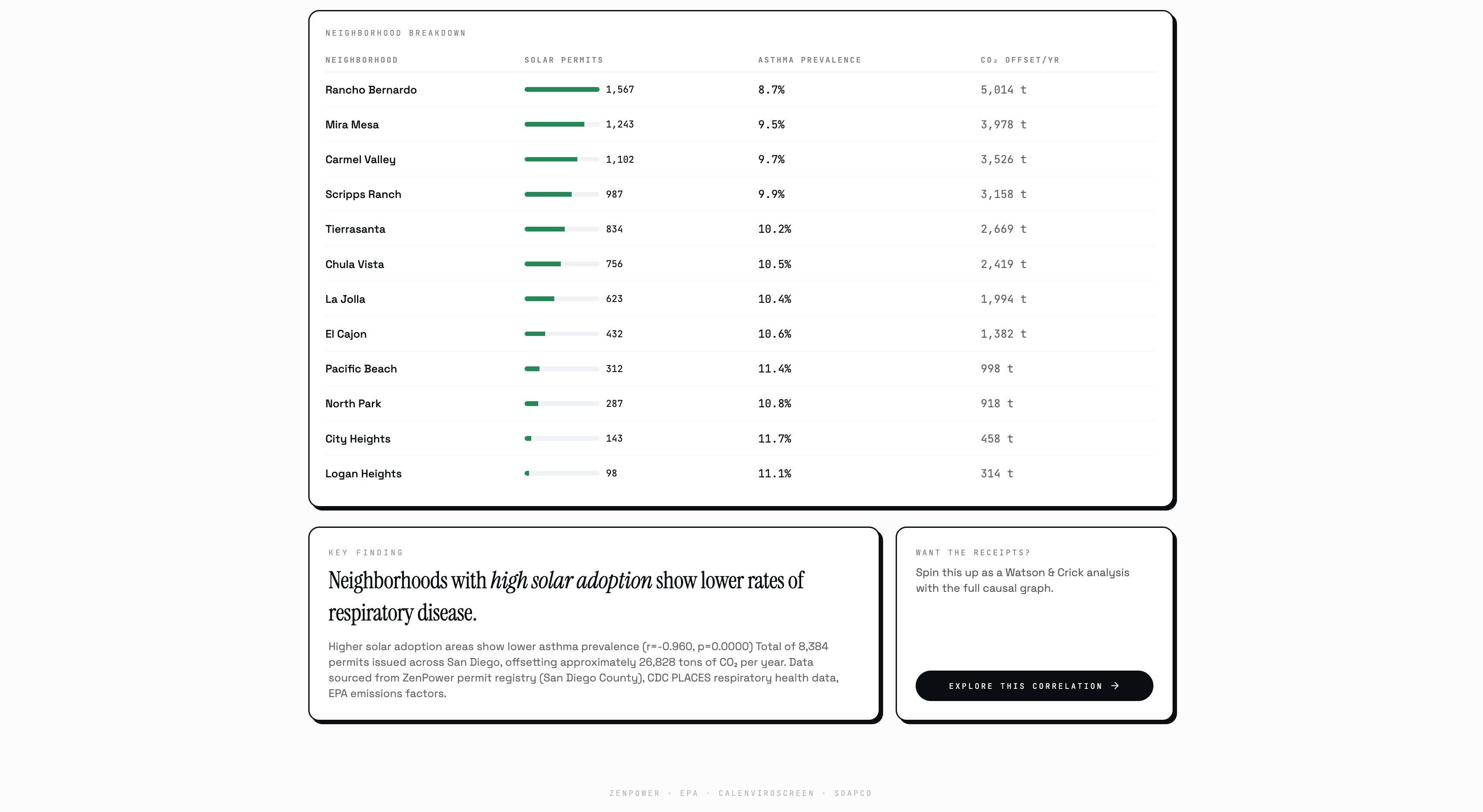
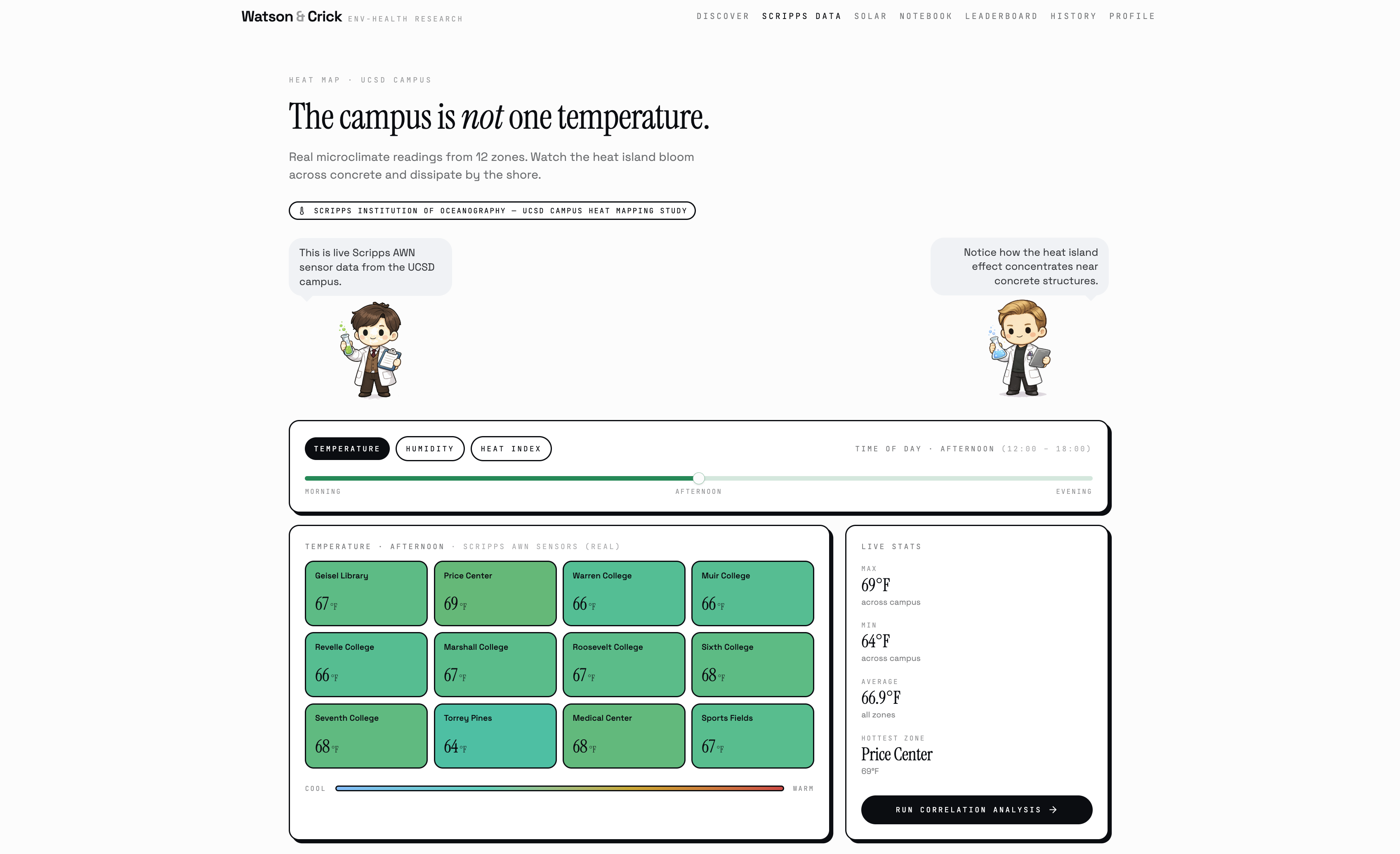
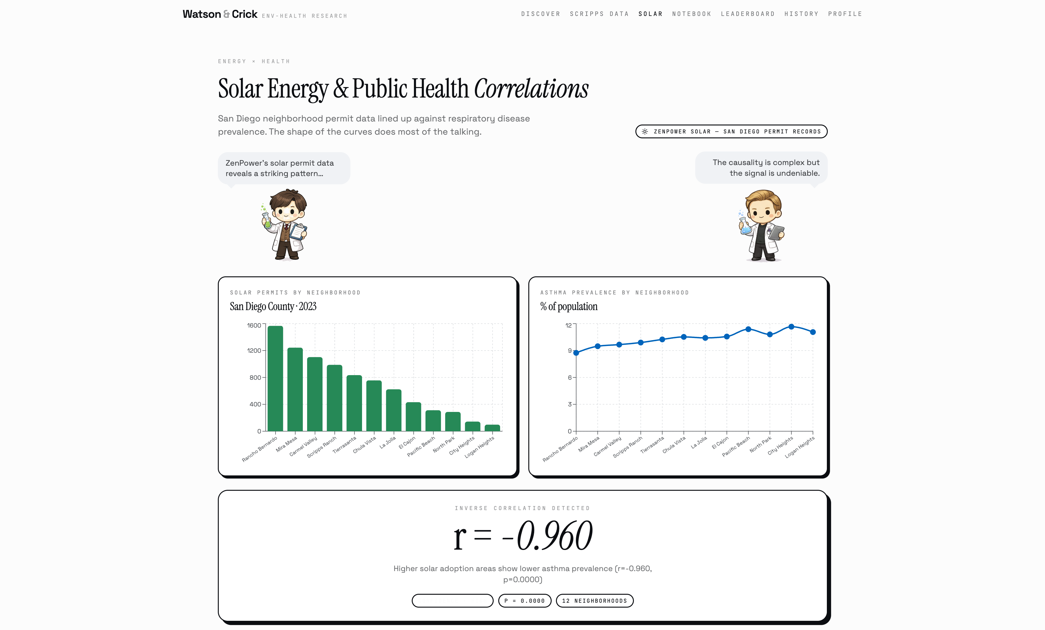
Beyond the research engine, Watson & Crick also runs a live UCSD campus safety dashboard, a daily SAFE/CAUTION/ALERT system fusing real Scripps temperature and humidity readings with EPA PM2.5 data and the NWS Rothfusz heat index equation, backed by Isolation Forest anomaly detection to flag days that are historically unusual even when they don't cross a single threshold. It clusters all 12 named campus zones by chronic heat exposure using K-Means, forecasts next-reading temperature from live Scripps sensor data using a trained Random Forest, and maps solar permit density against respiratory health outcomes across San Diego neighborhoods.
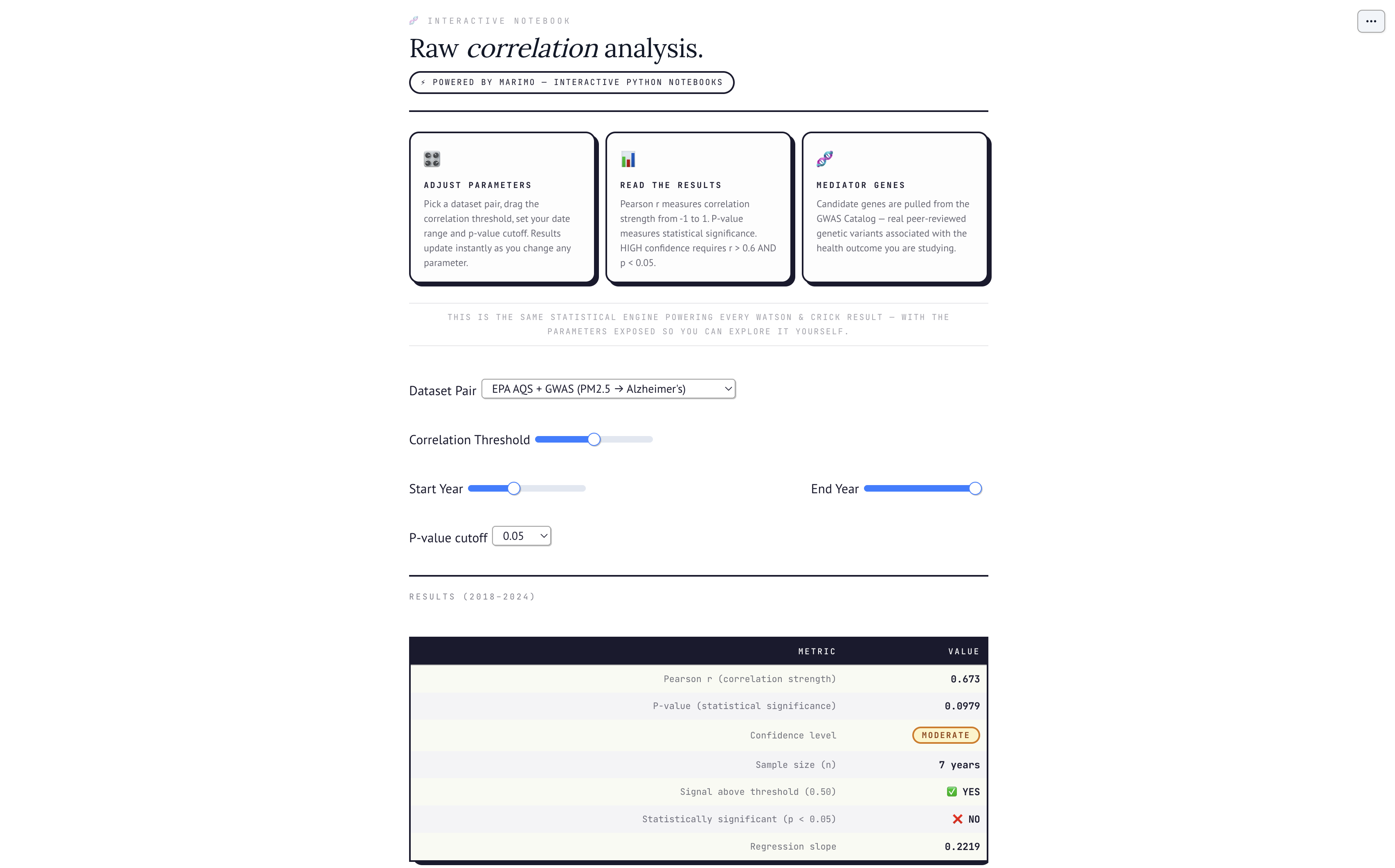
The Marimo interactive notebook lets you get your hands on the exact statistical engine powering every result, adjust the correlation threshold, swap dataset pairs, change the p-value cutoff, and watch the confidence badge update live.
How we built it
Watson & Crick runs on a Python FastAPI backend and a React + Vite + Tailwind frontend. We built the entire Watson and Crick character system, the animated scientist portraits, the live banter pipeline, the debate mode, the Ask the Scientists chatbot, from scratch. On the AI side we used the Gemini 2.5 Flash API for natural language parsing, hypothesis generation, report writing, plain-language summarization, and the scientific debate script. For the ML layer we used scikit-learn throughout: Random Forest Regressor for temperature forecasting and environmental feature importance, Ridge Regression for coefficient analysis, Isolation Forest for anomaly detection across both the full historical dataset and per-zone time windows, and K-Means for campus zone clustering and day-type discovery.
The five real datasets, EPA AQS, NOAA Climate, CDC PLACES, EMBL-EBI GWAS Catalog, and Scripps Institution AWN sensors, are loaded at startup and aligned by date into a unified feature matrix for all ML operations. The causal graph is built in D3.js with a force-directed layout, colored by node type, with edge weights derived from correlation strength and GWAS study counts. The Marimo notebook runs the correlation explorer with live reactive sliders. We leaned on Claude heavily throughout the build to move fast across both frontend and backend.
Challenges we ran into
The hardest problem wasn't technical. It was figuring out who we were actually building for.
Environmental health research sits at this uncomfortable intersection, the scientists who produce it communicate in p-values and confidence intervals, the public health officials who need it communicate in risk levels and action items, and the curious non-expert who deserves access to it gets nothing but paywalled PDFs and 40-page studies they can't parse. We kept asking ourselves: what does a researcher actually want when they make a finding? They want to show their work transparently. They want to share it with someone who isn't a statistician without dumbing it down. They want a community that can fork their question, challenge their methodology, and build on it, the way science actually works, not the way science papers pretend it works.
That shaped every display decision. The structured eight-section report isn't just pretty formatting, it's the sections a reviewer would ask for. The confidence scoring breakdown shows every factor and weight so nothing is a black box. The Marimo notebook exposes the exact statistical engine with live sliders so another researcher can reproduce your result or challenge your threshold in real time. The community feed isn't social media, it's a lab notebook that other people can read, fork, and argue with.
The community we wanted to build was researchers who are tired of science being opaque, public health workers who need answers faster than peer review allows, and curious people who have never had a tool that takes their questions seriously. The fork-a-study feature exists because the best scientific conversations start with "I looked at your question differently." The debate mode exists because Crick should always be allowed to challenge Watson. That's not entertainment, that's how good science works.
Getting the data display right for that audience was the real technical challenge. A causal graph needs to be visually clear enough for a non-expert and scientifically honest enough for a researcher, every edge weight derived from real correlation strength and GWAS study counts, every node labeled with its actual biological role, every click revealing the data behind the visual rather than hiding it. We rewrote the D3 force graph several times to get nodes clamped inside the canvas, animating in with spring physics on load, highlighting connected edges on click, and showing full context in the drill-down sidebar — because a graph that looks impressive but can't answer "why is this edge here" isn't a research tool, it's decoration.
Accomplishments that we're proud of
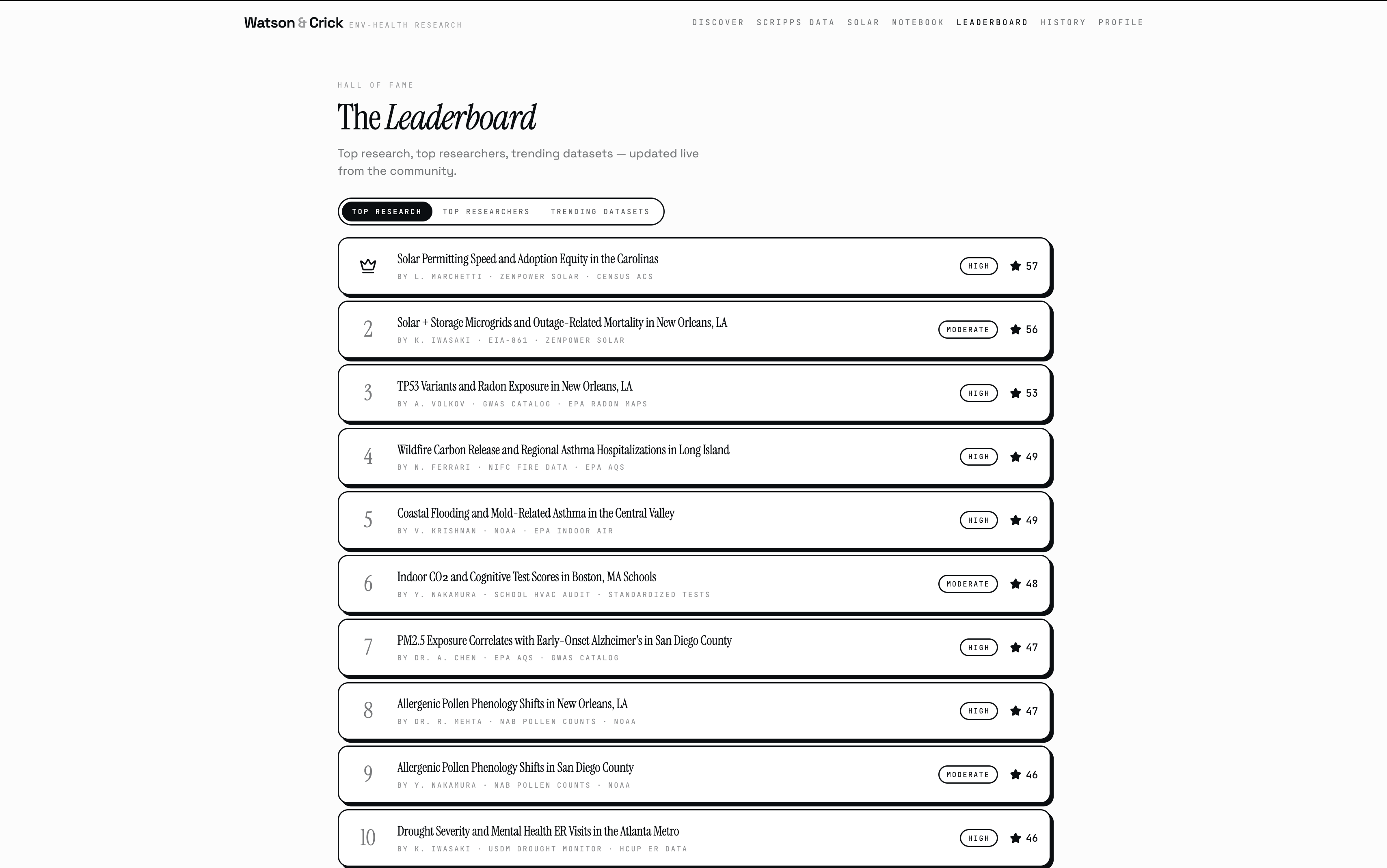
We made research instant, transparent, and public. Not summarized, not simplified, not hidden behind a paywall or a 40-page PDF, actually public, where anyone can see exactly how the finding was reached, fork the question, challenge the methodology, and build on it. That's the thing we're most proud of. Beyond that: Watson & Crick pulls from five real datasets, runs real Pearson correlations, Random Forest models, and Isolation Forest anomaly detection, computes real p-values, and hands you a finding a researcher could actually use. The causal graph has edge weights derived from real correlation strength. The confidence score has a breakdown showing every factor and weight. The Marimo notebook exposes the exact statistical engine with live sliders so anyone can reproduce or challenge a result in real time. We built two scientist characters who argue about your data, a community where anyone can publish and fork research, and a live campus safety dashboard, all in 36 hours, and it all actually works.
What we learned
We learned why research actually takes so long. It's not the analysis. It's the friction before it: finding the datasets, getting access, cleaning the data, aligning time series, figuring out which statistical test applies. Once we automated that layer we realized the actual science part takes 30 seconds. The rest is just infrastructure nobody had bothered to build yet. We also learned what agentic AI actually means in practice. Watson and Crick aren't a chatbot with a search button. They autonomously decide which datasets to pull, how to align them, which ML model fits the question, how to weight the confidence factors, and how to disagree with each other about the result. Building that taught us more about agent design than any tutorial: agents need to fail gracefully, argue productively, and always show their work.
What's next for Watson&Crick
The architecture works for any question, any dataset, any domain. Right now Watson and Crick answer questions about environmental health in San Diego. Next we want to open the dataset layer so researchers anywhere can bring their own data and run the same pipeline against it. We want real user accounts so your research history follows you, your published studies accumulate citations, and other researchers can formally build on your work the way science actually builds on itself. And we want the community feed to become a real living record of open science, not just a demo feature but something researchers actually publish to because it's faster than a preprint and more transparent than a press release. The two scientists aren't going anywhere. They just need more questions to argue about.
Built With
- claude
- d3.js
- fastapi
- gemini-api
- jspdf
- lovable
- marimo
- python
- react
- scikit-learn
- scipy
- tailwind-css
- tanstack-router
- typescript
- vercel
- vite


Log in or sign up for Devpost to join the conversation.