Inspiration
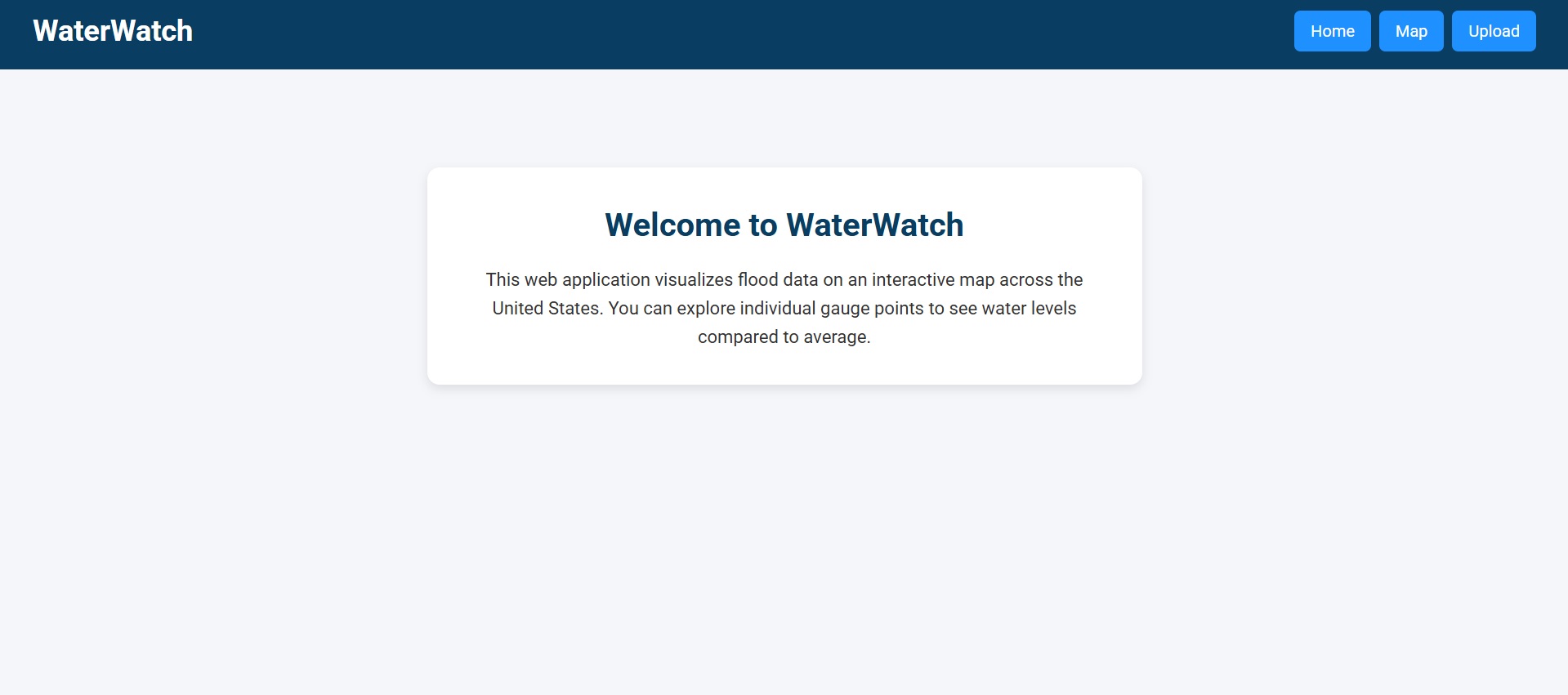
Our goal was to provide a platform that pools critical information of flooding in an interface easily accessible by affected communities.
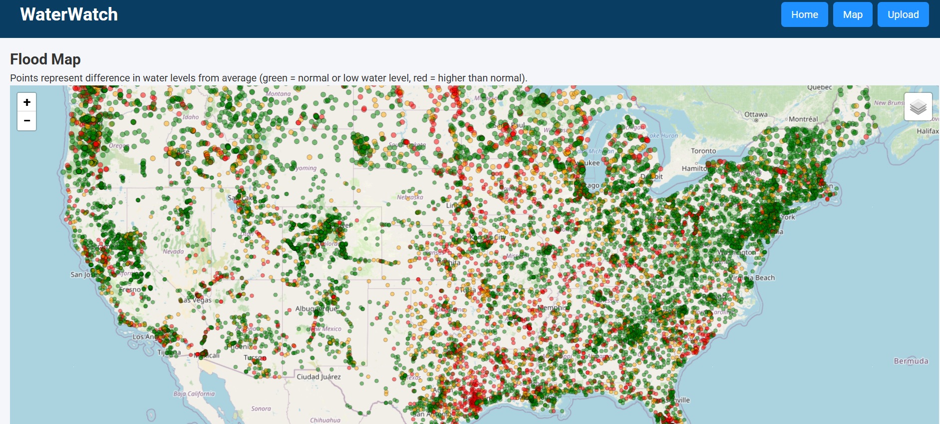
What does our map show?
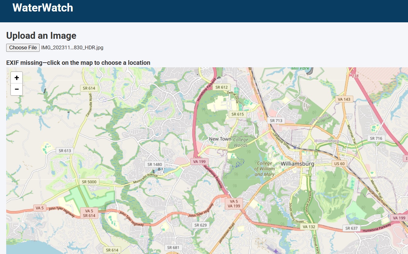
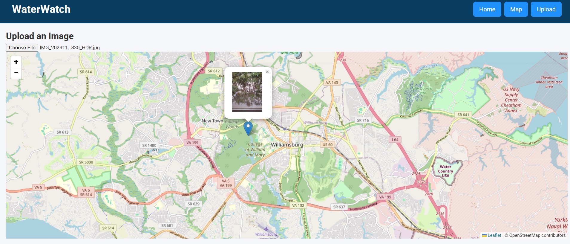
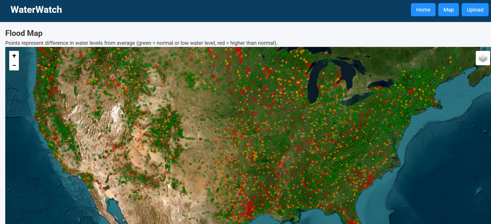
Our map is composed of three superimposed layers. The first, base layer is a real sallelite map of earth. The second layer is water guages represent the intensity of flooding. (Red = high water level, green = normal water level.) The third level is an empty palette for a user to add a "pin" for an image of flooding.
How did we build our map?
We sourced the satellite map from [link]. Water guages were sourced from https://waterdata.usgs.gov/nwis/rt. The third level unites crowd-sourced data of contributors into a cohesive visual layer.
Our project faces these challenges...
Successfully integrating all three layers was difficult. Each layer originates in a different location (ex. water guages from a database), and all layers must be precisely superimposed upon each other to achieve the intended functionality of the map. Some specific challenges: (1) connecting firebase, (2) data for the map, (3) deploying a stable site url.
Accomplishments that we're proud of
Displaying all three layers with precise alignment (i.e. mapping images precisely to gauges and the street map). Geting everything in right before the deadline. :)
What did we take away from this experience?
Successfully integrating real world data presents many unexpected challenges.
What's next for WaterWatch
(1) Further integrating additional water gauge data. (2) Flood prediction with AI/ML (3) Saving and updating in real-time to the database


Log in or sign up for Devpost to join the conversation.