-
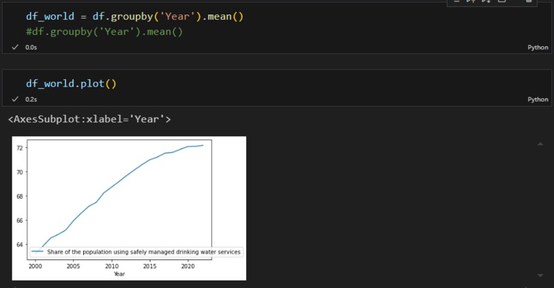
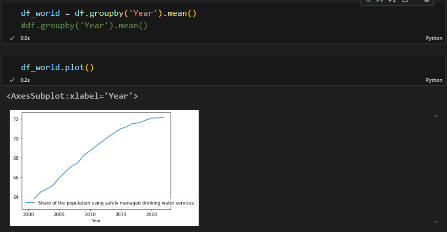
That is the overall development plot (1.) built in python
-
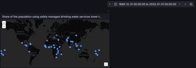
This is the map that shows where the share of the population using safely managed drinking water services in below 50% (3.) in Grafana
-

This is me suffering from frustration


Inspiration
We all know water accessability is not something that is common everywhere and the older I get the more I value that I just have to walk a few steps to get safely drinkable water. And I wanted to firstly know how much has changed in the last years and what is still missing from the goal.
What it does
Well, that is a difficult question, it should have been showing a dashboard with the following visualisations
1. The overall development of the Share of the population using safely managed drinking water services
2. An interactive visualisation where the development of the share of the population using safely managed drinking water services can be looked at for each country individually
3. A map that shows where the share of the population using safely managed drinking water services in below 50%
But well that did not work, sadly. I built some of the visualisations in Python at some point just to prove to myself that my ideas were not completly undoable and I'm more used to working with python.
How we built it
I built it with Grafana and with a lot of hope and trying. And python.
Challenges we ran into
Data, finding useful data was very difficult and I am also not satisfied with the Data I ended up with. And getting used to the query options from Grafana
Accomplishments that we're proud of
That I am submitting anything at all, because after the first few hours I lost all hope to come up with something that would be remotly considerable as something at all
What we learned
I learned that even tho I studied for a while that I still need to google almost every step
What's next for Water everywhere
Hydrate and try to help hydrate the rest of the world

Log in or sign up for Devpost to join the conversation.