-
-

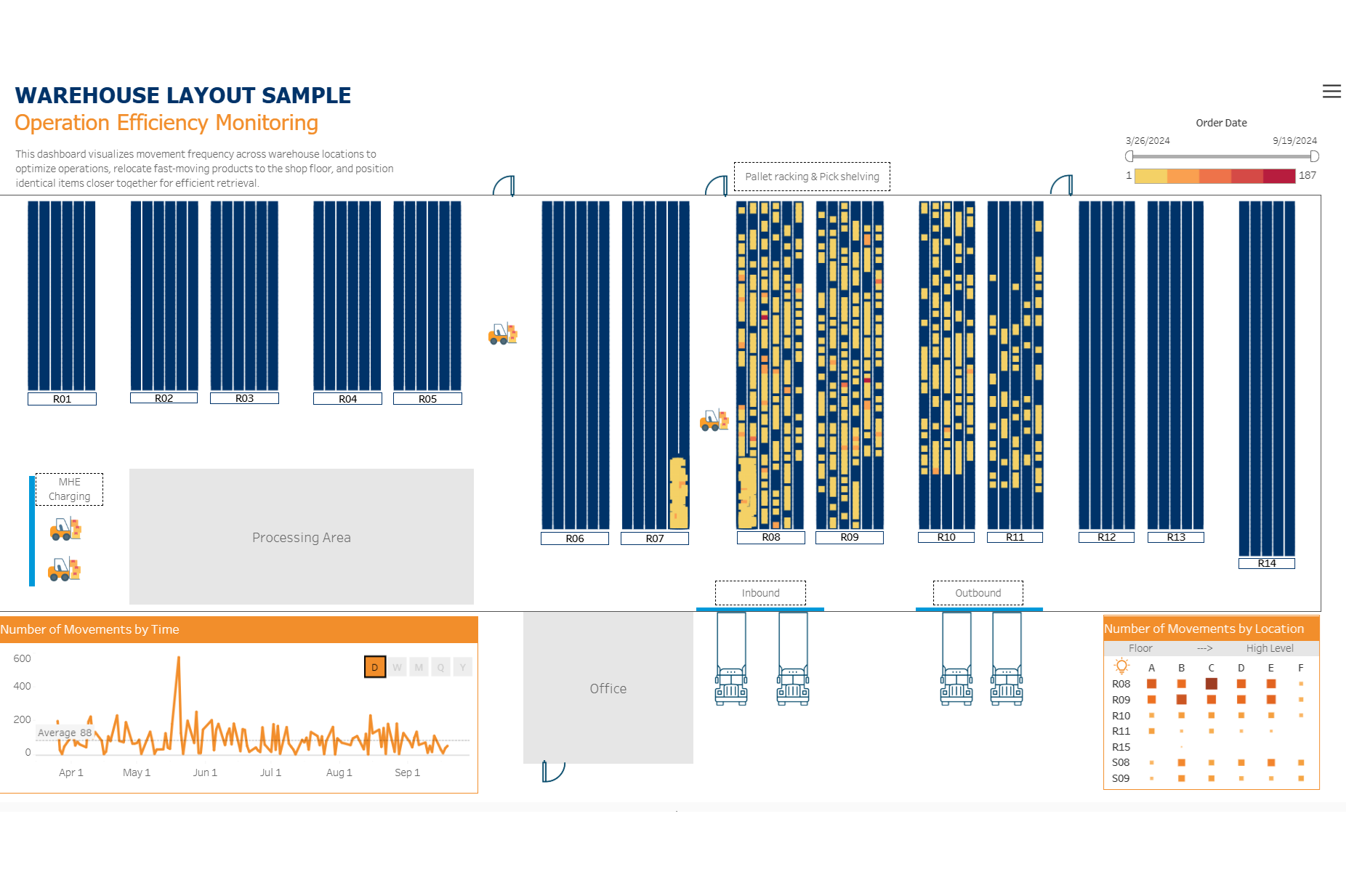
Warehouse Operation Efficiency Dashboard
Business Context (Why is this project?)
The warehouse team struggled with inefficient pick routes and missed KPIs due to a poor layout and lack of visibility into real-time operations. High-frequency items were scattered, causing staff to zigzag through long routes, wasting time and labour.
Objective (What is it for?)
This project aimed to build a visual, data-driven dashboard that would:
- Provide spatial visibility into warehouse activity and layout.
- Track order-picking frequency by location.
- Support strategic stock placement (e.g., moving fast-moving items to floor-level shelves).
- Optimize pick routes to reduce travel time and increase labor efficiency.
Key Insights Delivered (What does data tell?)
- Identified high-activity zones within the warehouse based on picking frequency (darker red areas on the heatmap indicate busier locations).
- Highlighted inefficient pick paths that caused excessive walking time for staff.
- Showed temporal peaks in activity, enabling better labour planning.
- Visualized opportunities to:
- Relocate frequently picked items to floor-level, high-access zones.
- Store similar items near each other to minimize walking time.
- Reorganize picking sequences and optimize routes to meet KPIs.
- Managed inventory and optimized storage by grouping items for the same customer together to reduce operational time.
Business Impact (So What?)
- Enabled warehouse managers to redesign stock placement based on actual usage patterns—not assumptions.
- Reduced picker travel distance and time, directly supporting improved labor productivity and order fulfillment KPIs.
- Informed staffing decisions by visualizing activity trends over time.
Scalability & Future Use (What Else?)
Provided a scalable visual model that could be applied to:
- Other warehouse locations
- Inventory control efforts
- Cycle count accuracy analysis
- Physical stock monitoring and reconciliation.
Tools & Approach (How was it done?)
- Excel (Layout Mapping): Drafted a digital map of the warehouse using X and Y coordinates to represent bin/rack locations.
- Excel (Operational Data): Compiled daily operational reports, including order number, item, quantity, time stamps, and storage locations.
- Tableau: o Mapped the physical layout of the warehouse using the coordinates. o Visualized pick frequency heatmaps across different storage zones. o Created time-series dashboards to analyse activity by day, week, and month.

Log in or sign up for Devpost to join the conversation.