-
-
# question, itinerary in 30 seconds
-
answer , Plan, go

Inspiration
It started on a freezing day in New York City in late 2025.
My friend and I were exploring Manhattan with a ChatGPT-generated itinerary that looked perfect on paper. The reality? We were standing on street corners in 20°F weather, pulling out our phones with gloves on (half the taps didn't even register), trying to figure out where to go next.
The ChatGPT plan was just a wall of text - no visuals, no hierarchy, impossible to scan quickly. We were on a budget trying to squeeze everything in, so every decision mattered. I found myself typing place names into Google Maps over and over, waiting for it to load, trying to remember what was next.
That's when it hit me: this shouldn't be this hard.
We needed something with fewer taps, visual clarity, instant Google Maps integration, and simple questions - especially when you're already at your destination trying to plan the next 3-6 hours. Or when your checkout is at 11am but your flight is at 11pm and you need to plan those 12 hours fast.
That day, Wanderly was born.
What it does
Wanderly is your travel companion that makes city exploration effortless.
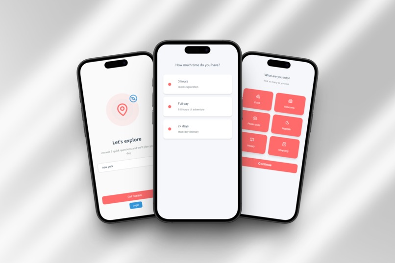
Quick Setup (30 seconds):
- Answer 3 simple questions: time available, transportation mode, and interests
- Choose when to start: right now, custom time, or morning with breakfast
- Set your hotel and where your day ends (back at hotel, airport, train station)
- AI generates a personalized itinerary instantly
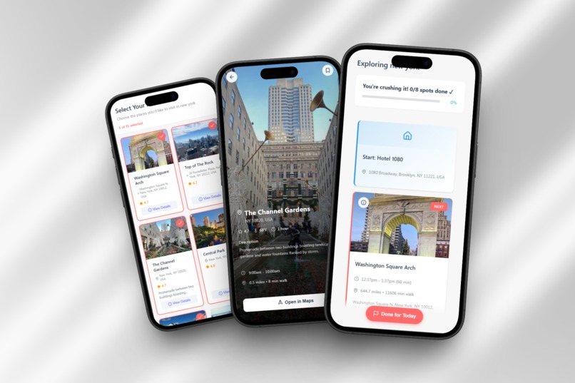
- Review and customize which spots you want to visit
Smooth Exploration:
- Visual progress tracking shows exactly how you're doing ("You're crushing it! 3/7 done ✓")
- Animated progress bar fills as you complete spots
- Hotel start/end cards show your departure and return points
- One-tap handoff to Google Maps for navigation
- Complete button minimizes finished spots, activates the next one with smooth animations
- Green borders on completed cards, red on active, gray on upcoming
Human-Centered Design:
- "Done for Today" button when you're tired (no guilt, no shame)
- Flexible end points: Route to airport/train with time picker and luggage handling
- Summary screen showing what you completed and what you skipped
- Time breakdown with actual vs. estimated duration
- "You ended your day early" messaging that's supportive, not judgmental
Core principle: Talk like a friend, not a robot. Make exploring feel effortless, not exhausting.
How we built it
Tech Stack:
- React Native for cross-platform mobile (iOS/Android)
- Claude API (Anthropic) for intelligent itinerary generation
- Google Maps API for seamless navigation integration
- Google Places API for spot details, ratings, and photos
- AsyncStorage for state persistence (never lose progress)
- Custom animations for card minimization and progress tracking
Development Timeline:
Day 1 (12 hours): Built core onboarding flow, spot selection, itinerary layout, hotel/end point selector
Day 2 (12 hours): Implemented animations, progress tracking, "Done for Today" flow, summary screen, tested in Las Vegas
Design Philosophy:
"Human enough" - not "smart enough" or "feature-rich enough."
Every decision filtered through: does this make exploring easier or just add complexity?
Challenges we ran into
1. The Handoff Flow
Making the transition from Wanderly → Google Maps → back seamless. If it took more than 2 taps, people would just use Maps alone.
Solution: Deep linking with automatic location passing. One tap works perfectly.
2. Simplicity vs. Features
Every travel app wants to be "comprehensive." I fought the urge to add features. Stayed focused on: plan fast, explore smooth, end gracefully.
Learning: Saying "no" to features was harder than building them.
3. State Management
Users constantly switch apps (Maps → Camera → Messages). Can't lose state.
Solution: Auto-save after every action. Always recovers perfectly.
4. Time Tracking Bug
Had issues with negative time displays (-1h -44min).
Status: Fixed for most cases, edge cases remain. Top priority for post-CES.
5. Testing in Reality
Lab testing doesn't reveal real problems. Testing in Las Vegas in January 2026 showed issues I'd never have caught:
- Battery drain after 6+ hours
- Need for "Done" button when exhausted
- Users want progress visibility for motivation
- Luggage question for airport routing
Build → Test in reality → Learn → Iterate.
Accomplishments that we're proud of
1. Built Something I Actually Use
A real app that solved my real problem, tested during actual Vegas exploration. Not a demo.
2. Real-World Validation
Features emerged from genuine use, not guesswork:
- "Done for Today" button from getting exhausted
- Airport routing from checkout-early-flight-late scenario
- Progress tracking from wanting to feel accomplished
- Luggage question from realizing I'd need to grab bags
3. Achieved "Human Enough"
The app talks like a friend:
- ✓ "You're crushing it! 4/7 done"
- ✓ "You ended your day early"
- ✗
"Itinerary completion: 57.14%"
4. Seamless Google Maps Integration
One tap → Maps opens with location ready. No retyping, no friction.
5. Balanced AI + Control
AI suggests, user chooses. Not dictation. Not manual hell. The sweet spot.
6. 90% Feature Completion in 48 Hours
Implemented all core features:
- 3-question onboarding with start time options
- End point selector with luggage handling
- AI spot generation with user selection
- Progress tracking with animated bar
- Complete button with animations
- "Done for Today" flow
- Summary with time breakdown
7. Professional Design Quality
Polished UI with smooth animations, consistent design, thoughtful UX.
What we learned
1. Users Want AI Help, Not AI Control
People want smart suggestions they can customize. The spot selection screen (AI suggests, you choose) was key.
2. Simple is Harder Than Complex
Getting to 3 questions instead of 47 took more design thinking. Every removed question required understanding what's essential.
3. Real-World Testing Reveals Everything
Vegas testing revealed:
- Cold hands make touchscreens frustrating
- Battery concerns after 6+ hours
- People need graceful exits
- Plans change spontaneously
- Progress tracking is motivating
4. Manual > Automatic (Sometimes)
Users want control - manual "Complete" button works better than automatic geofencing.
5. Human-Centered Design > Feature Lists
"Does this make exploring easier?" became my filter. Cut features that added complexity:
- ❌ Weather awareness
- ❌ Automatic meal insertion
- ❌ Smart notifications
Core experience first.
6. Integration > Innovation
Don't fight Google Maps - work with it. Make the handoff seamless.
7. Edge Cases Are Real Use Cases
Checkout-at-11am-flight-at-11pm? Real. Tired early? Real. Train with luggage? Real.
What's next for Wanderly
Phase 1: Bug Fixes (Weeks 1-2 - February 2026)
- Fix time tracking bug
- Battery optimization
- Edge case testing
Phase 2: Complete Started Features (Weeks 3-4 - February 2026)
- Breakfast auto-insertion with morning start
- Automatic meal suggestions (lunch/dinner)
- Coffee/snack breaks between activities
Phase 3: Smart Automation (Q2 2026)
- Automatic location detection (geofencing)
- Smart suggestions ("You're near X, want to add it?")
- Golden hour timing for photos
Phase 4: Intelligence Layer (Q3 2026)
- Weather awareness
- Energy pacing (alternate intense/chill activities)
- Learning preferences
- Context-aware notifications
Phase 5: Expansion (Q4 2026)
- Multi-day support
- Offline mode
- Social features (share itineraries)
- Saved spots and trip history
- Widget and smartwatch integration
Long-term Vision:
Make solo city exploration effortless. Not by adding features, but by perfecting the experience.
The goal isn't to be the smartest travel app - it's to be the easiest one.
Built With
- ai
- api
- asyncstorage
- claude
- maps
- native
- places


Log in or sign up for Devpost to join the conversation.