-
-
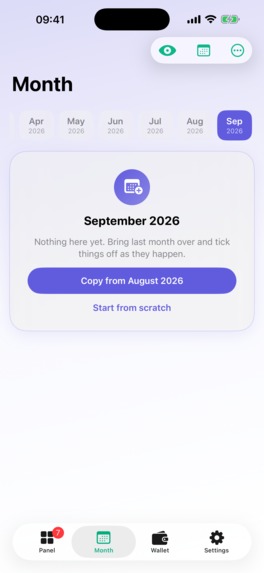
new month
-
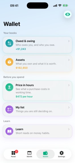
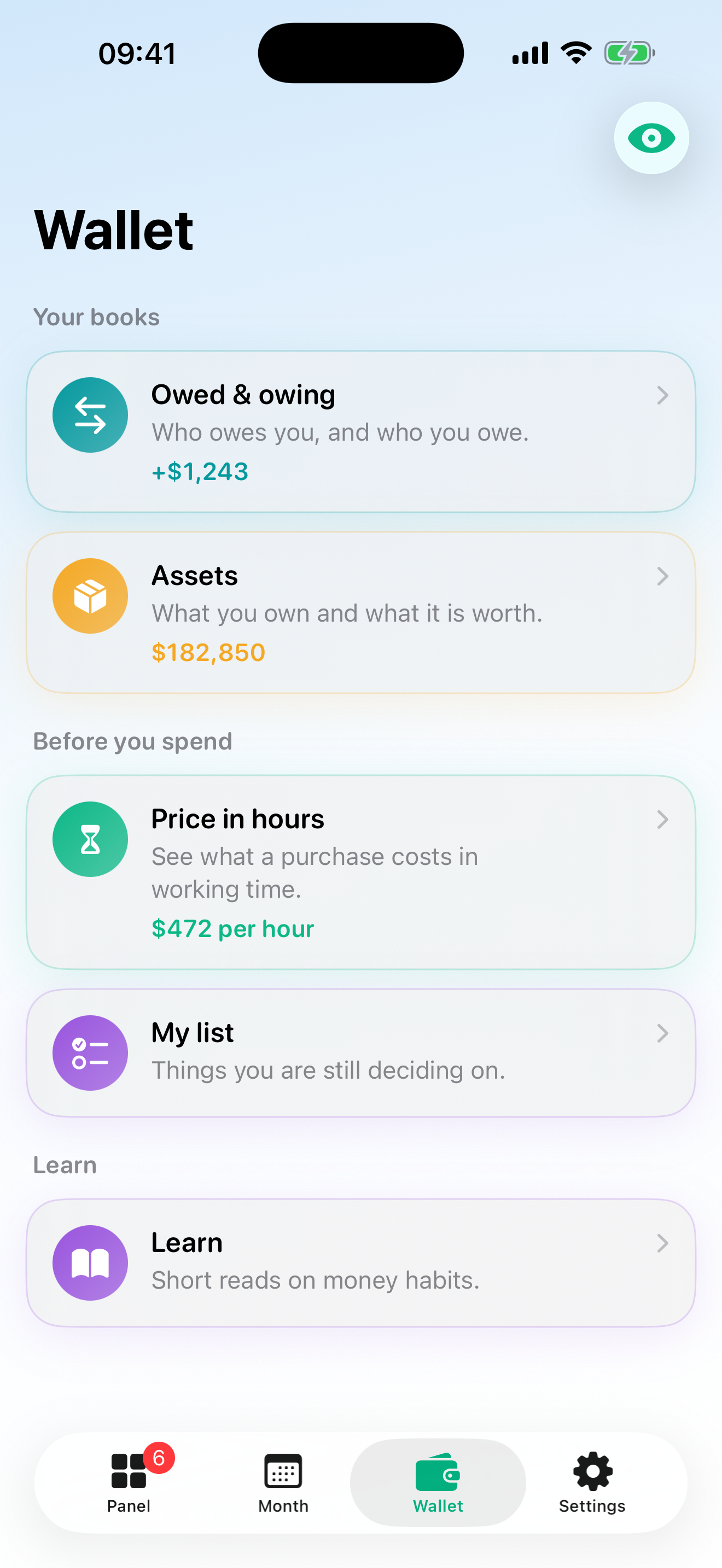
wallet and utilities
-
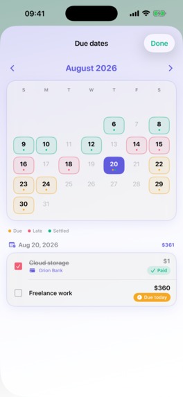
calendar
-
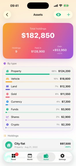
assets
-

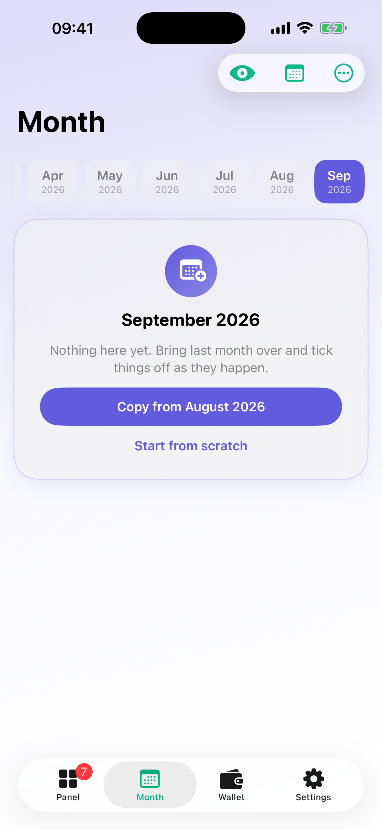
month screen
-
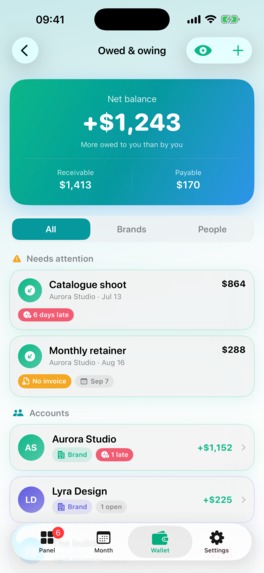
panel
-
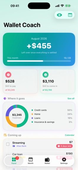
detailed panel
Inspiration
For years my household finances lived in a spreadsheet with one tab per month. Every month I duplicated last month's tab, cleared the "paid" ticks and worked through it. It was clunky, but it was honest: I could see the month as a whole, and nothing was categorised for me by an algorithm that had never met my landlord.
Every budgeting app I tried wanted me to log transactions and then told me what I had spent. I did not want a diary of the past. I wanted the spreadsheet, on my phone, with reminders — and I wanted it to keep working when my income changed, when a loan ended, when a subscription moved to a different card.
Wallet Coach is that spreadsheet, rebuilt as an app.
What it does
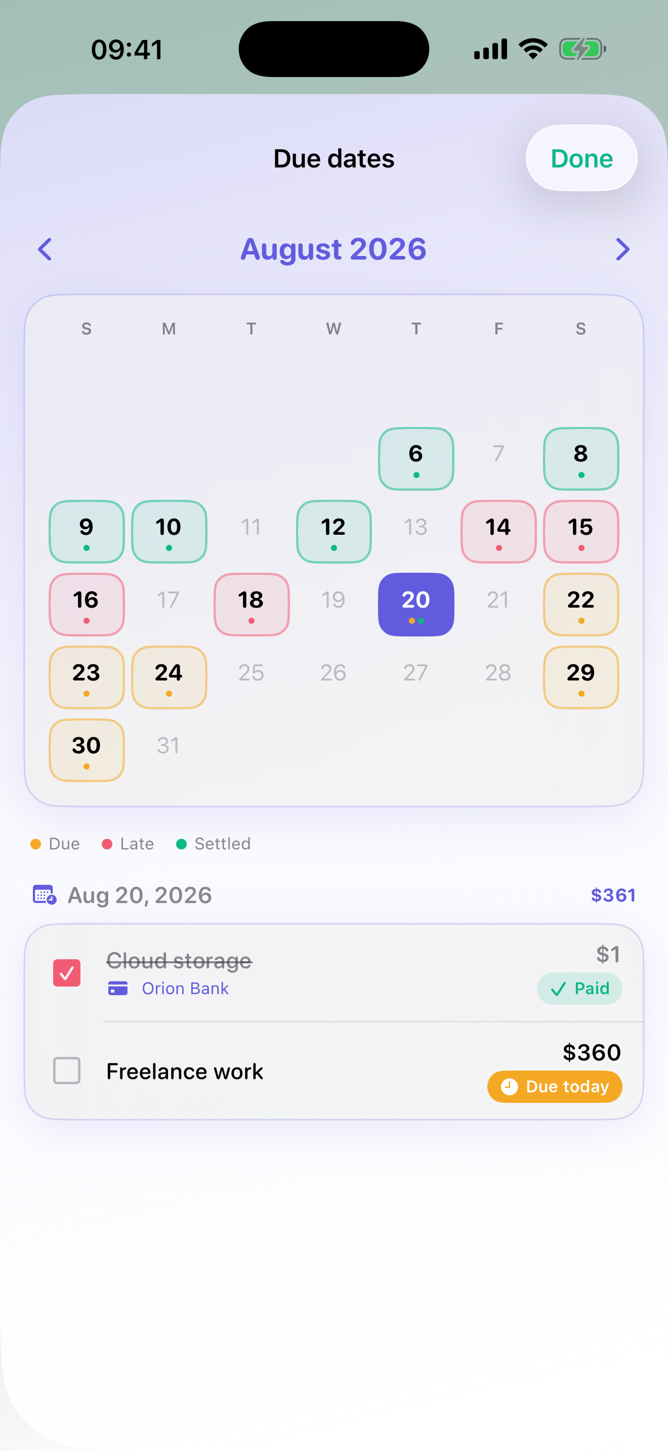
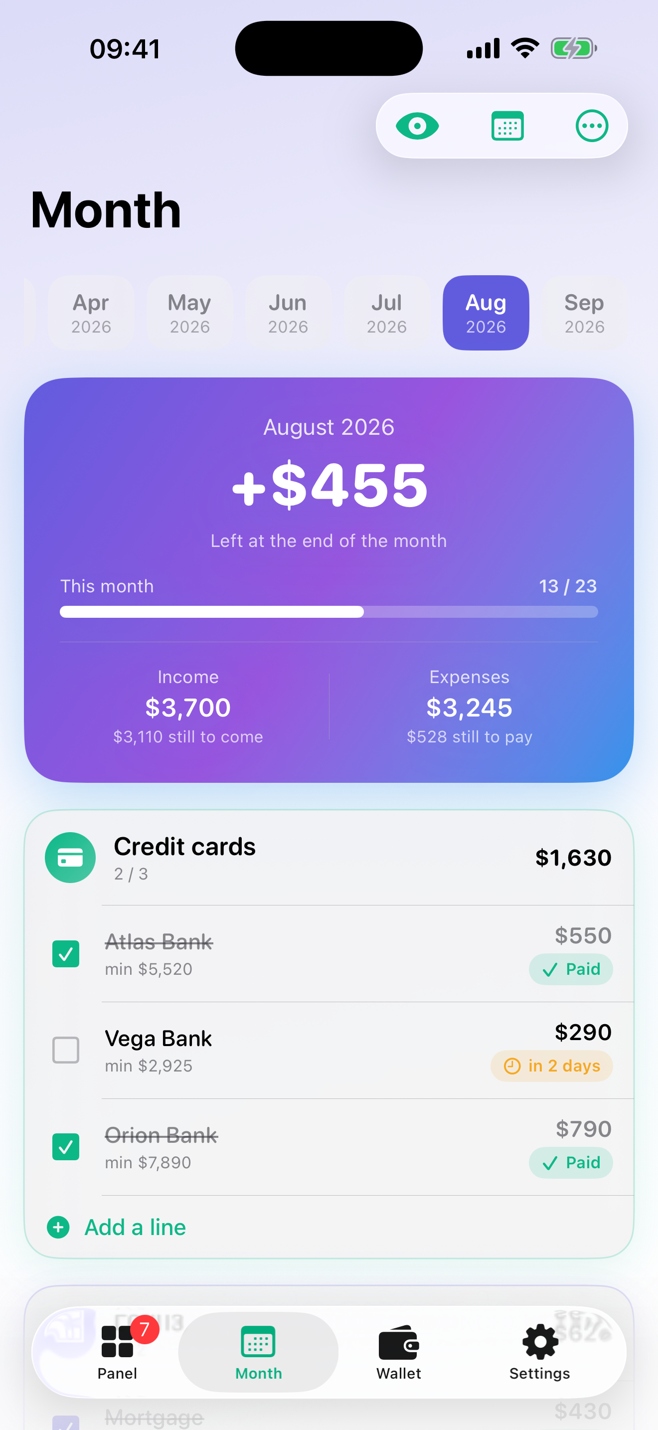
The month is a page. You list the things that go out (cards, loans, rent and bills, insurance and savings, subscriptions, other) and the things that come in. Each row has an amount, an optional card minimum, the day of the month it is due and a checkbox. As money moves, you tick.
Next month copies itself. One tap creates the next month from this one, ticks cleared, due days re-anchored to the new calendar (the 31st becomes the last day of February by itself). A loan with an end month shows "4 months left" and stops copying itself when it is done. A subscription paid by card is linked to that card's row, so it shows in its section but is never counted twice.
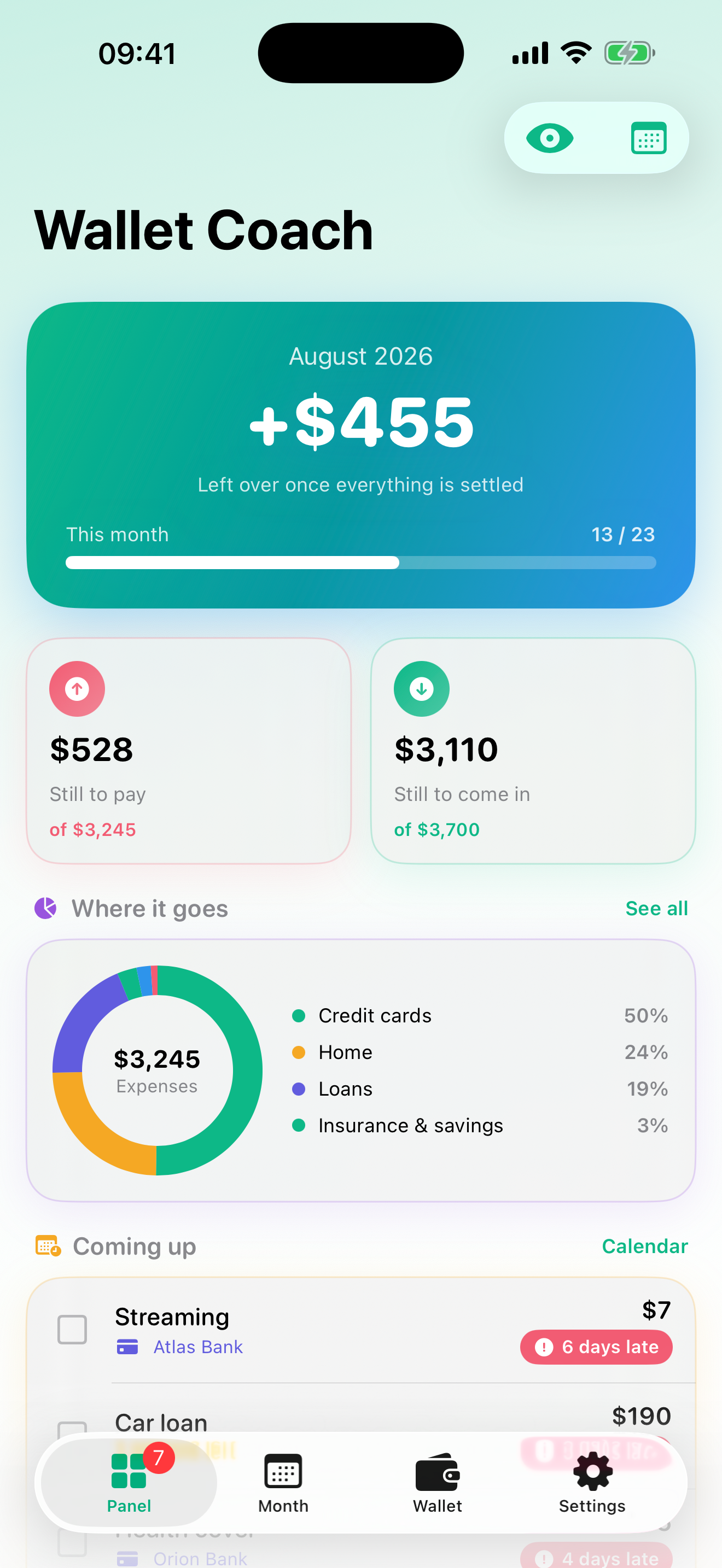
The dashboard answers the questions you actually ask. What is left at the end of the month, what is still unpaid, which incomes have not landed yet, what is due in the next few days, which commitments end soon — and a ring of where the money goes, plus six months of in-versus-out. Every section header shows how it moved against the previous month.
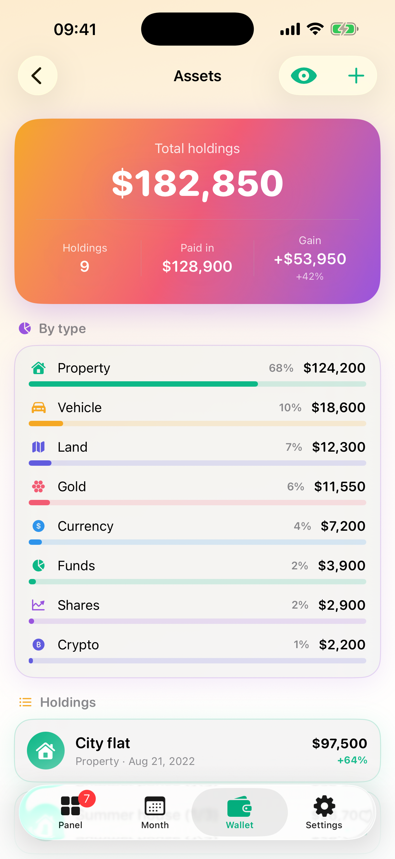
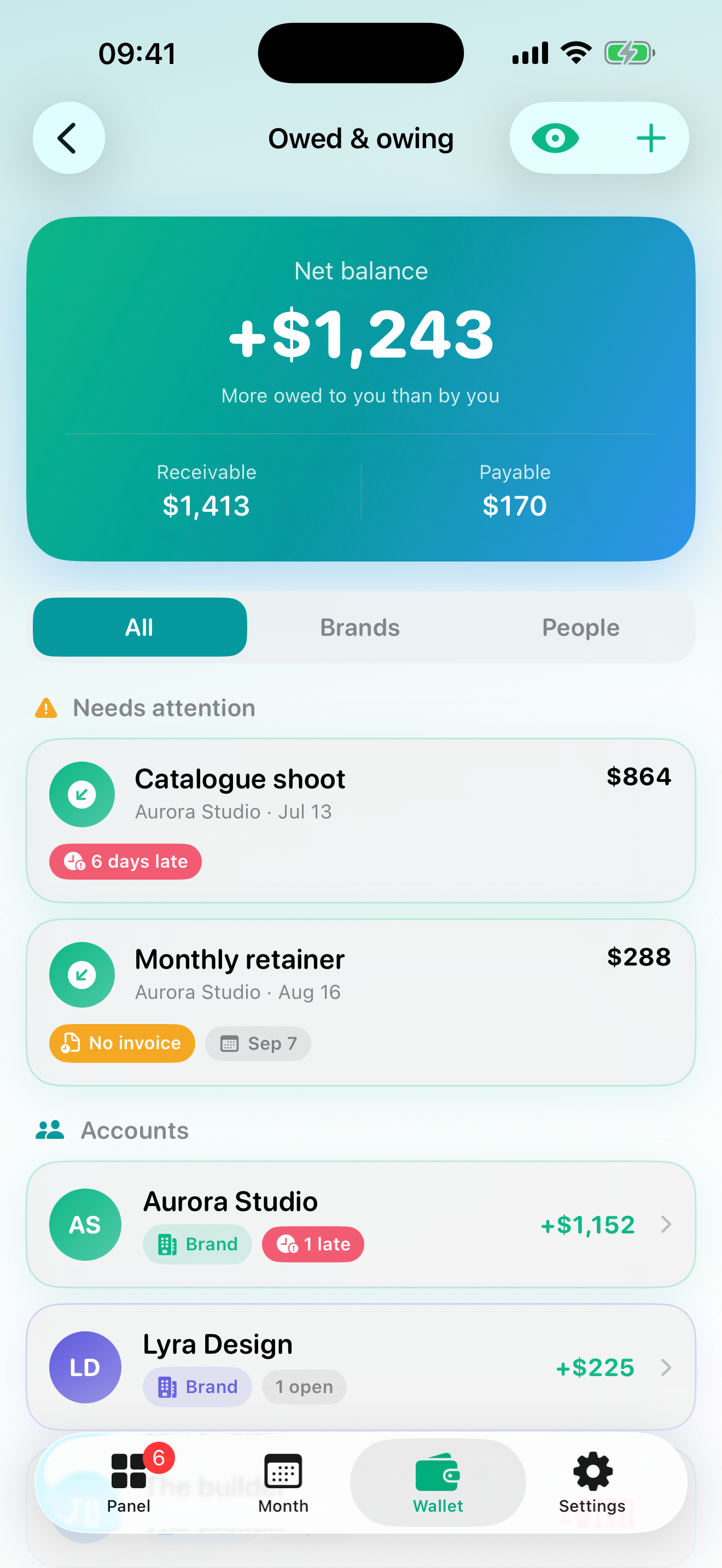
Books above, calculators below. A ledger for who owes whom, a portfolio of assets you value yourself (property, gold, currency, funds — with real return against official inflation, not just nominal), projects & plans (a holiday, a wedding, a move — each with its own budget, categories and a pooled chart), savings pots, and a price log. Underneath: price-in-hours (what does this cost in your own working time), "what is it worth now", gross-to-net payroll and a raise-vs-inflation check.
Privacy is structural, not a promise. There is no account and no server holding your numbers. Data lives on the device; backup goes to your own iCloud (or a file). Old records come in through a deliberately roundabout route: photograph your spreadsheet, hand it to whatever AI assistant you already use together with a prompt the app writes for you, bring the file back. The app never parses your columns wrong because it never parses them.
Export any period to PDF or spreadsheet. Seven languages, switchable inside the app. A privacy eye that turns every number into *** when someone is looking over your shoulder.
How I built it
Two native codebases, one product. iOS is SwiftUI (iOS 17+, ~80 Swift files, 285 unit tests). Android is Jetpack Compose (~75 Kotlin files, 259 tests), written after the iOS version had settled — every screen, tour and paywall was ported one-to-one, including the same product IDs.
Architecture. No backend. Each month is an independent document, stored as JSON on device, so editing August never touches July — the same guarantee the spreadsheet gave. Due dates are stored as a day-of-month, not a date, which is what makes roll-forward correct for free. Backups are an archive written to the app's iCloud container with a file fallback when iCloud is absent.
Monetization — RevenueCat. One entitlement (Pro), three products: monthly, yearly and a lifetime non-consumable, in one offering with the standard package types. ProStore wraps the SDK so the rest of the app only asks "is this user Pro?"; it observes customerInfoStream so refunds and lapses propagate without a relaunch. The paywall is custom and context-aware: it opens with a different headline depending on which wall you hit (third month, fourth asset, export, your own section…), shows a free-vs-Pro table, and the yearly plan shows its monthly equivalent and the saving. Every open and every dismiss is logged with its source, so I can see which wall converts.
Onboarding. A six-step animated intro, then a guided first setup (income, fixed costs, a subscription — skippable) so nobody lands in an empty app, then per-screen coach-mark tours: eleven screens, each explained the first time you open it, with an example and a "now add one of your own" closing step.
Economic data. The inflation tools run on the official Turkish central bank series (CPI, USD/TRY, gram gold; monthly since 2003). A Python tool converts the source export into a compact JSON that ships in the binary as an offline snapshot and refreshes once a day from Cloudflare R2, so a new month of data is a file upload, not a release.
Ads. AdMob with the UMP consent flow first, then ATT, then SDK start. Banners only on secondary screens, never on the month table, never for Pro.
Challenges I ran into
- The free tier had to be honest. Capping the core (the month table) would have made the app punitive; not capping anything would have made Pro pointless. The answer was to cap accumulation: two months free, three assets, three ledger parties, one project. Reminders, the calendar and the privacy eye stay free because those are what build the habit.
- The first outside tester got lost, not confused. The words were fine; the empty app was the problem. That single session produced the guided first setup and the coach-mark system, and most of the copy in the app is now hers.
- Drag-to-reorder inside a scrolling list. A long-press-drag gesture ate the page scroll on both platforms. Reordering became a mode, with a handle as the only draggable thing and rows that stay put while the target highlights.
- Localisation is indexing, not translation. The app spoke seven languages but the store page existed in two — and the App Store indexes keywords per language, so five languages could not find it at all. Seven full listings later, that is fixed.
- Porting a product, not code. The Android version is not a transliteration; Compose dialogs are separate windows, the screen under a dialog keeps living,
LazyColumndrops off-screen items. Every one of those broke a coach mark until it didn't.
Accomplishments that I'm proud of
Shipped 1.0 on 8 August and reached 2.3 by 9 September with three approved updates in between. The first eight reviews are all five stars. And Android caught up with the whole onboarding-and-paywall system in one release.
What I learned
People do not read; they get lost. Show them a filled screen before you explain anything. And measure the walls — a paywall without a source tells you nothing.
What's next
Read the paywall-source data and cut the walls that never convert. Localised screenshots for the five languages that only have English ones. Reply to those eight reviews.


Log in or sign up for Devpost to join the conversation.