-
-
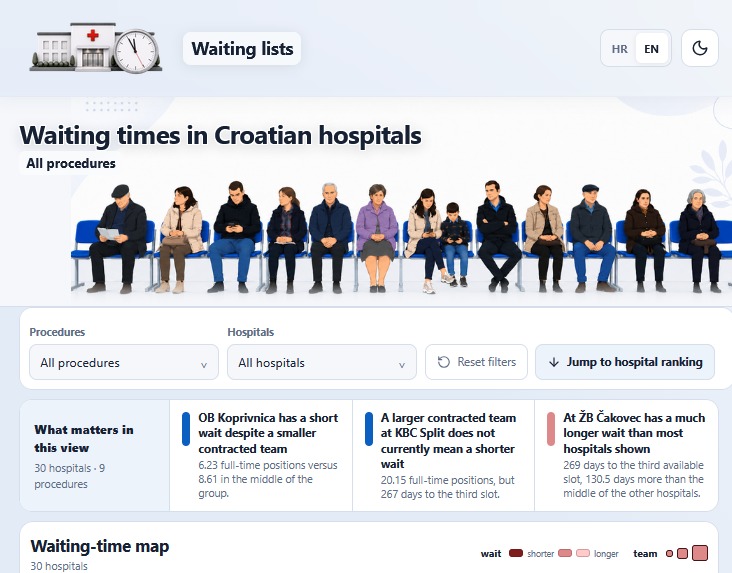
Light theme
-
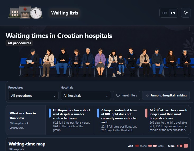
Dark theme
-
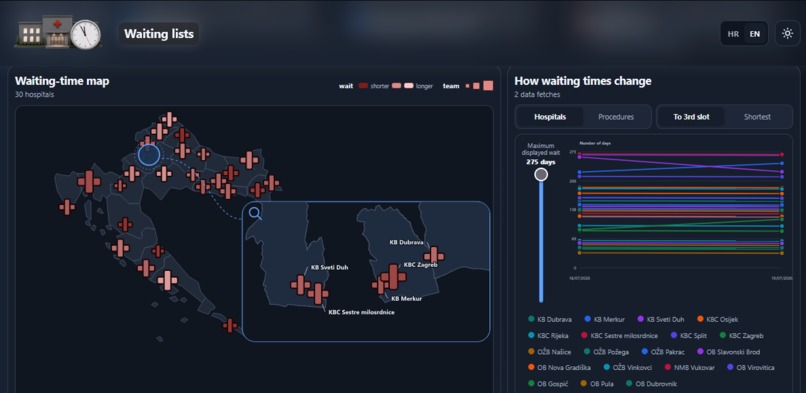
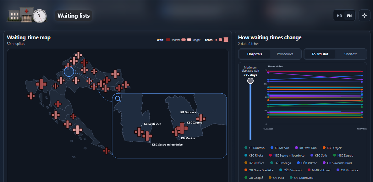
Interactive map and trend
-
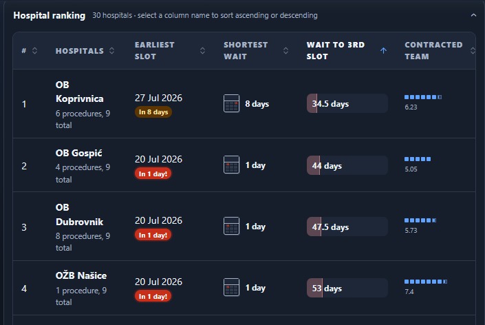
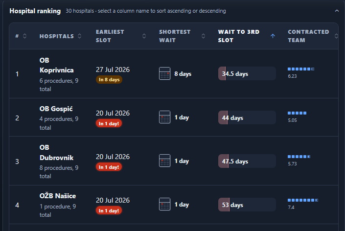
Hospital comparison
-
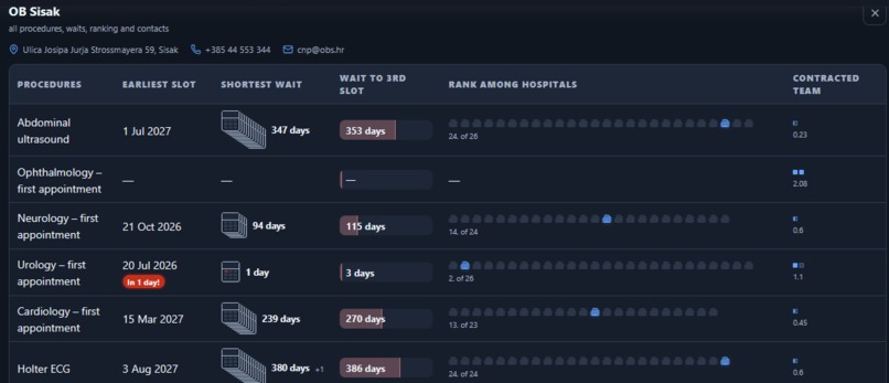
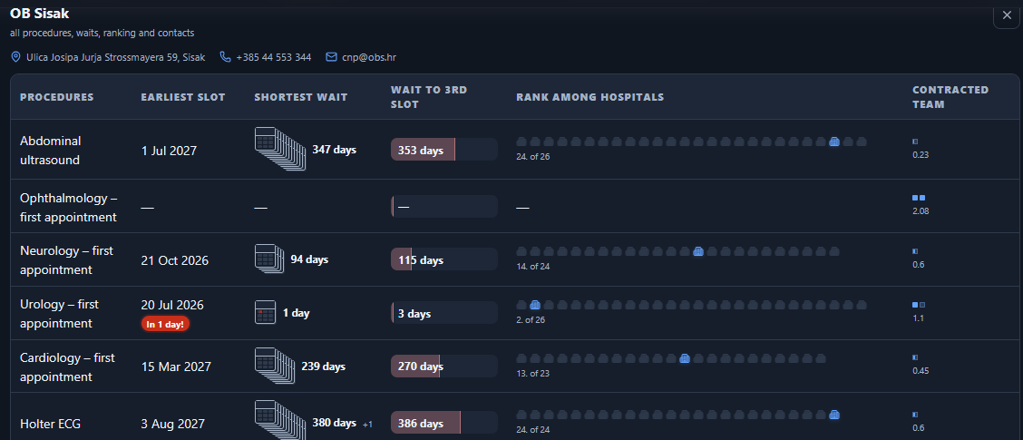
Individual hospital
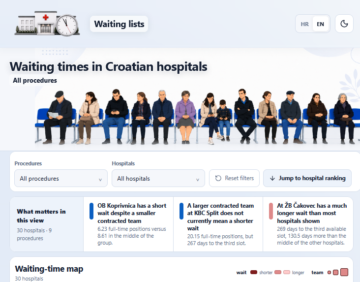
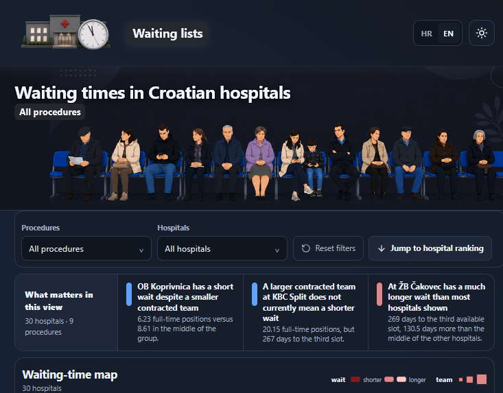
Waiting Lists
Find the earliest available hospital appointment, track waiting-time trends, and compare Croatian hospitals.
Waiting Lists is an interactive web application that makes Croatian hospital waiting-time data easier to understand and use.
Inspiration
Finding an available appointment in a Croatian public hospital should be simple. In practice, the relevant information is difficult to search, compare, and interpret.
For many years, patients have relied on the public search tool at liste.cezih.hr. It allows users to select a procedure or hospital and view the first five available appointments, but the search experience is basic, the data quality can vary, and the information is updated several times each day without an accessible historical overview.
Information about contracted medical teams is even less accessible. It is published in an Excel file located deep within the Croatian Health Insurance Fund website.
The idea was to bring these scattered public datasets together and make them useful to ordinary citizens.
The project was also inspired by a broader question: how can citizens have an informed discussion about healthcare reform when the available public data are difficult to access and understand?
Waiting lists are one of the clearest indicators of how well a healthcare system is working. Making them more transparent can support discussions about hospital capacity, the allocation of medical teams, regional development, demographic change, and the future of public healthcare.
What it does
Waiting Lists provides an operational and analytical overview of waiting times for selected procedures and diagnostic services in Croatian public hospitals.
The application helps users:
- find the earliest available appointment;
- compare hospitals offering the same procedure;
- identify unusual differences in waiting times;
- explore hospital rankings;
- monitor how waiting times change; and
- examine the relationship between waiting times and contracted medical-team capacity.
Interactive map
The main view is a map of Croatia, with an enlarged view of Zagreb because of its high concentration of hospitals.
Each hospital is represented by a cross-shaped marker:
- the size of the marker represents the size of the contracted medical team;
- the colour intensity represents the waiting time, with stronger intensity indicating a shorter wait.
This allows users to quickly identify where they may be able to obtain an earlier appointment.
Waiting-time trends
The application records appointment data over time and displays them in a trend chart.
Historical data collection has only recently begun, but the chart will become more useful as additional observations are collected.
Hospital rankings
A sortable table ranks hospitals according to several criteria.
Numbers are accompanied by simple visual indicators, such as:
- a warning for an unusually early appointment;
- a calendar-based representation of the waiting period; and
- comparative indicators showing how a hospital performs against others.
Hospital details
Users can select an individual hospital to view:
- all supported procedures available at that hospital;
- the waiting time for each procedure;
- the hospital’s position relative to comparable hospitals; and
- hospital contact info
Accessible presentation
The application avoids conventional business-dashboard terminology. Instead, it uses short sentences, familiar visual elements, and automatically generated descriptive insights based on the selected data.
It includes:
- Croatian and English versions;
- light and dark themes;
- responsive interactive visualisations; and
- a recognisable visual identity inspired by Croatian hospital waiting rooms.
How we built it
The application was built using:
- Next.js
- TypeScript
- ChatGPT Plus
- Codex (with 5.6 Sol)
- GitHub
- Cloudflare Pages
The project combines data from two main public sources:
- appointment availability published through the Croatian national health information system; and
- contracted hospital-team data published by the Croatian Health Insurance Fund.
The data are processed and transformed into a structure that can be used by the map, charts, rankings, hospital pages, and descriptive insights.
The prompts given to Codex combined functional requirements with design goals. Focus was on making the application as useful and simple as possible while extracting as much value as possible from the available data.
With clear instructions, Codex was able to implement features while also applying its own development logic and validation checks.
The online version is deployed as a static website through Cloudflare Pages.
The local version includes two additional controls:
- one for updating the source data;
- one for publishing the updated application through GitHub and Cloudflare Pages.
Challenges we ran into
Data accessibility
The source data were publicly available, but not designed for analysis or easy reuse.
Relevant datasets were distributed across a basic search interface and an Excel workbook located deep within an institutional website.
Data quality
Appointment information is refreshed several times per day, but individual records may be incomplete, inconsistent, or questionable.
The application therefore needs to present the available information without giving users a false sense of precision.
Lack of historical data
The public search tool displays current appointment availability but does not provide a convenient historical overview.
Only by regularly collecting observations the trend analysis will become statistically meaningful.
Visualising Zagreb
A standard national map does not work well for Zagreb because many hospitals are located close together.
An enlarged view of the capital was created while preserving the national overview.
Designing for ordinary citizens
The source data can easily turn into a dense business-intelligence dashboard.
One of the main challenges was deciding what not to show. Technical indicators were replaced with simple language, familiar icons, visual comparisons, and short explanatory insights.
Development limits
The application was created during one extended ChatGPT Plus and Codex development session over several days.
The main constraint was the seven-day usage limit. One allowance was exhausted, after which a reset made it possible to continue development with a second, partially used allowance.
Accomplishments that we're proud of
Project turns fragmented public information into a functional application with a clear benefit for citizens.
In a short development period, these functions were created:
- an interactive national hospital map;
- an enlarged Zagreb hospital view;
- procedure-based searching and filtering;
- waiting-time trend charts;
- sortable hospital rankings;
- detailed hospital comparisons;
- descriptive data-driven insights;
- Croatian and English interfaces;
- light and dark themes;
- an integrated data-update workflow; and
- a static deployment workflow through GitHub and Cloudflare Pages.
The application does more than display numbers. It translates difficult institutional data into information that an ordinary citizen can understand and act on.
What we learned
Making public data available is not the same as making it accessible.
A dataset can technically be public while remaining difficult to find, interpret, compare, or use. Good public-data products need both reliable information and a clear user experience.
Healthcare waiting times require context. A single number becomes more useful when it can be compared across hospitals, related to available medical teams, and observed over time.
From the development perspective, clear prompts and well-defined functional goals allow AI-assisted tools to complete substantial parts of a web application with limited additional explanation.
At the same time, human decisions remained essential when defining the purpose of the product, evaluating the data, selecting meaningful comparisons, and simplifying the interface.
What's next for Waiting Lists
The next priority is to automate the data collection and updating process.
Plan is to:
- move the application to a more visible permanent location;
- include more medical procedures and diagnostic services;
- prioritise procedures with the greatest public interest;
- collect enough historical data for stronger trend analysis;
- improve data-quality validation;
- add more comparative and regional insights;
- make the methodology and data limitations clearer; and
- improve the experience based on feedback from patients and healthcare professionals.
Access to a broader set of connected and historical data could significantly improve the quality of the analysis and provide citizens with a more complete picture of hospital capacity and waiting times.
Built With
- cloudflare
- github
- next.js
- typescript

Log in or sign up for Devpost to join the conversation.