Inspiration
Finding a good way for data visualization can be very difficult, and not everyone has the resources to build their own custom software. Our goal was to create a platform to help make understanding large amount of data easier. This is intended as a tool for people who want to start doing analysis - cleaning data and giving quick visualizations for data exploration. This opens the way for doing more in-depth data analysis, even from amateurs.
What it does
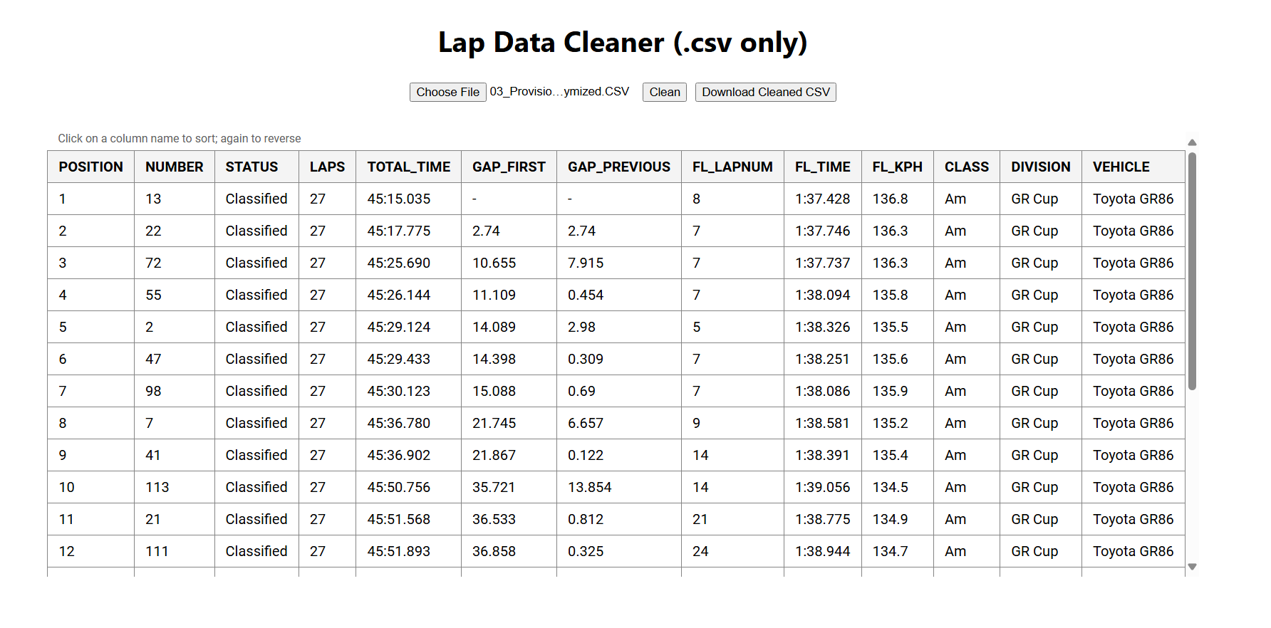
We wanted to keep it sweet and simple: there are 2 goals, and it is to organize data in a human friendly way and to fix inconsistencies in the data.
You can upload any .csv file from this series, and it will be cleaned and ready for you to download. We addressed the known data issues (like lap count errors) as well as other issues we discovered, like removing lap 0 testing rows, duplicates, unused columns, etc...
How we built it
ReactJS and Django Rest Framework
Challenges we ran into
First, processing capacity and data normalization. Originally, we wanted to offer more in-depth analytics as well as full telemetry cleaning, but we ran into the issue of not having server hosting resources or processing power (for training models and such). As a result, we decided to streamline everything as much as possible, and offer a highly specialized but robust tool.
The other challenge we ran into was inconsistent data gathered and formatted across different race. For example, although time gaps are represented in a easily human readable way as seconds, +minutes:seconds, and lap count, these are not easy for programs to read.
What's next for Lapped
Supporting and detecting more data formats. Adjusting for more data inconsistencies, including ones that haven’t been caught. Custom data visualization for users. Increasing processing capabilities for large telemetry files.
Log in or sign up for Devpost to join the conversation.