Inspiration
Most wellness apps ask for too much.
Too many fields. Too many streaks. Too much noise that pretends to be care.
I wanted the opposite.
One sentence. One Light. Your Sky.
VORA started from a simple question:
What if looking at yourself did not feel like work?
Not a journal people quit after three days. Not a feed that performs emotion. Just a night sky that grows when you tell yourself the truth.
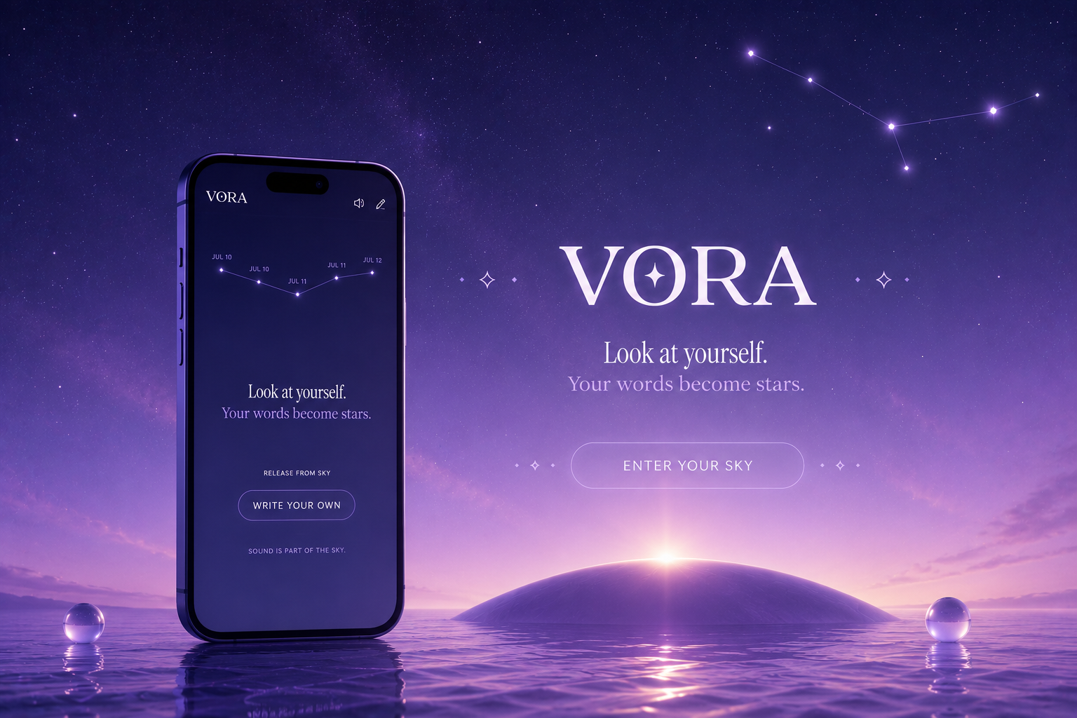
Look at yourself. Your words become stars.
That was enough.
Everything else had to protect that feeling.
How I built it
I built VORA like a small film you can hold.
Product
- Next.js, React, and TypeScript as one immersive client experience
- Only two surfaces: Sky and Me
- localStorage persistence so the first Light is immediate, with no signup wall
Design
- Editorial typography so one sentence feels precious on a phone
- Careful line breaking so long Lights do not look broken or orphaned
- Five full-sky themes (Default, Pure, Black, Pink, Aurora) that change atmosphere, chrome, and cards together
- Soft motion with late easings, hold and ascent, and reduced-motion support
Engineering
- Constellation layout with dated stars and gentle pan
- Theme Studio that previews smoothly without remounting the whole sky
- Web Audio ambient bed and soft cues, preferred on by default, unlocked on first touch
- Light card reveal and rounded PNG export
- Seeded first-sky state so onboarding is felt, not explained
Challenges I ran into
Restraint. The hardest part was saying no. No voice gimmick. No third tab. No guilt streak. Every “impressive” addition made the quiet feel fake, so I cut until the feeling stayed.
Teaching the metaphor without a tutorial. An empty sky looks broken. A sky full of “today” looks fake. So I seeded seven past-dated Lights. First-time users understand the constellation in one glance, and today still has room to arrive.
Typography that can break the spell. If “Your words become stars.” wraps and leaves only “stars.” on the next line, the brand falls apart. I made the tagline quieter, moved it closer to the headline, and kept it on one line.
Theme switching without jank. Live theme changes used to feel heavy. I moved preview into the Theme Studio, applied changes on Done, paused the dust while scrubbing, and let the Sky colors crossfade.
Sound without pressure. Browsers block autoplay. I made sound preferred, not forced, and let the first touch wake the sky bed.
Accomplishments that I'm proud of
- A brand you can feel in a few seconds
- A write to Light to star loop that needs no tutorial
- A constellation that feels like memory, not a list
- Design craft that still feels human on a phone
- A hackathon build that is emotionally complete from enter to sky
If someone opens VORA for fifteen seconds and feels a little softer, that is the win.
What I learned
Clarity is a product feature.
When the sentence is true, the interface can stay almost invisible. When the brand is honest, onboarding can be a ritual instead of a lecture. When the Sky feels alive, people understand with their body before their brain.
I also learned that a beautiful demo and an honest product can be the same thing, if every technical choice protects one feeling.
What's next for VORA
This submission is the heart.
Next, without breaking the quiet:
- a deeper Me journey over weeks
- sync so the Sky survives devices
- reminders that still work when the tab is closed
- constellation wallpaper export
The promise stays the same:
One sentence. One light. Your sky.
Built With
- creative
- css
- design
- html
- javascript
- motion
- next.js
- pnpm
- react
- tailwind
- typescript
- vercel

Log in or sign up for Devpost to join the conversation.