-
-
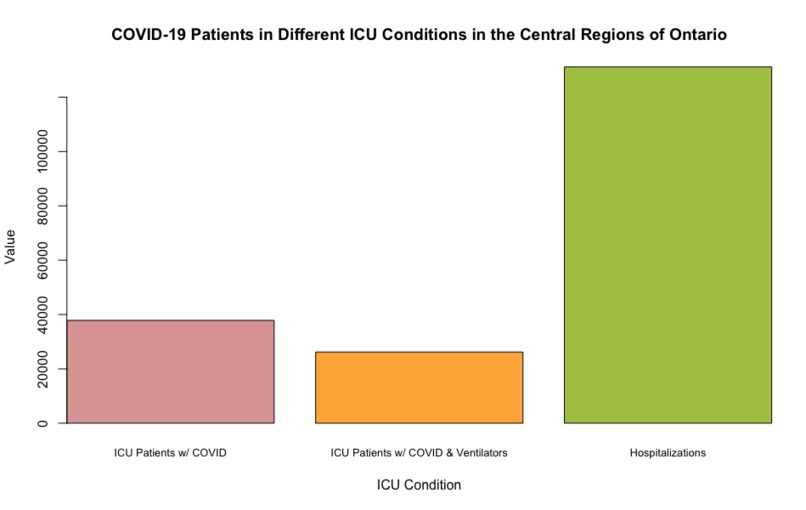
COVID-19 Patients in Different ICU Conditions in the Central Regions of Ontario
-
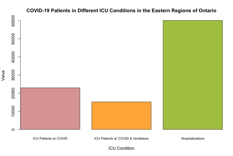
COVID-19 Patients in Different ICU Conditions in the Eastern Regions of Ontario
-
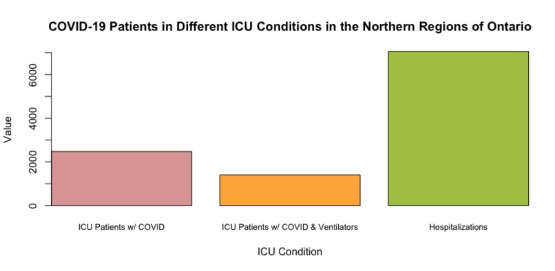
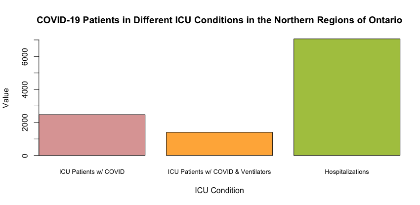
COVID-19 Patients in Different ICU Conditions in the Northern Regions of Ontario
-

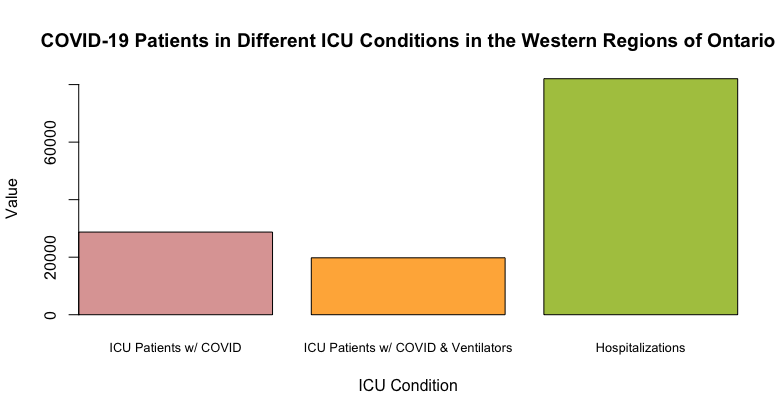
COVID-19 Patients in Different ICU Conditions in the Western Regions of Ontario
-
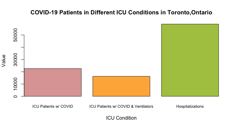
COVID-19 Patients in Different ICU Conditions in Toronto, Ontario
-

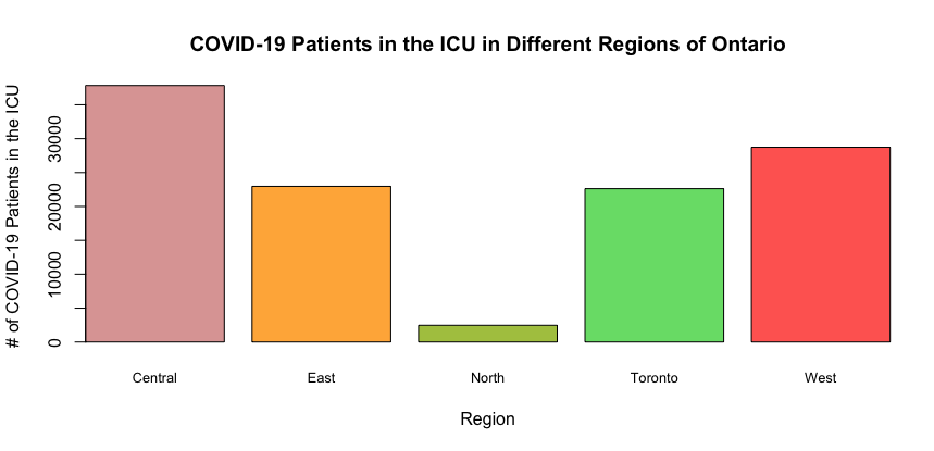
COVID-19 Patients in the ICU in Different Regions of Ontario
-

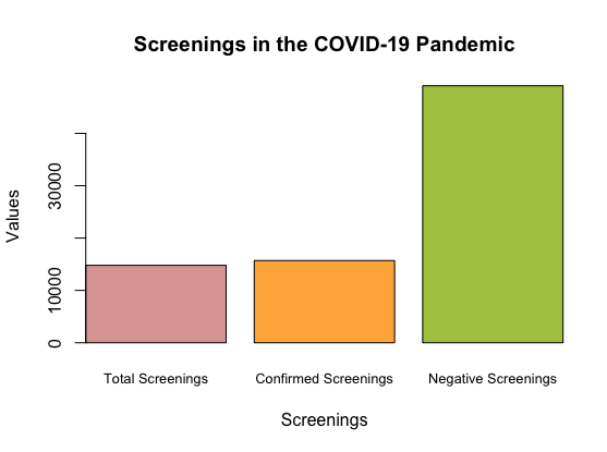
Screenings in the COVID-19 Pandemic
-
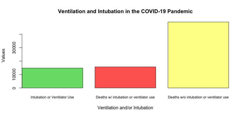
Ventilators and Intubation in the COVID-19 Pandemic


Inspiration
Seeing how severely the COVID-19 pandemic affected everyone, but especially vulnerable populations galvanized my interest in researching the socioeconomic factors that may play a role behind it. Specifically, I was interested in examining how accessibility to resources might influence COVID-19 recovery, or lack thereof, in different geographic regions. This relates heavily to ventilators, which played a tremendous role before the dawn of the vaccine in helping afflicted people in their recovery. However, there is a lot of controversy over the efficacy of ventilators, which is why I wanted to look into them more and also survey the differences in accessibility in different areas.
What it does
The interactive graphs and bar charts allow for a visual display of the data and how different subgroups are affected by COVID-19 indicators, as well as how different regions of Ontario vary in their access to ventilators.
How we built it
This was built entirely through Tableau as well as RStudio.
Challenges we ran into
The initial challenge came with finding good data on ventilators, and thereafter filtering it through R to ensure only relevant information remained. This was extremely tedious, but it allowed for a stronger end product.
Accomplishments that we're proud of
I'm proud of being able to face the large and intimidating mess that is often public data, as seeing large numbers and thousands upon thousands of cells can be initially very daunting. I'm also proud of having been able to explore Tableau, which is a platform I had not used prior to this project.
What we learned
Overall, I learnt the importance of analyzing healthcare issues from a broader perspective, taking into account accessibility and geography when making larger scale decisions.
What's next for Vizathon - Ventilators and the Healthcare Crisis
I hope to continue this project by looking into geographical variations and disparities in access outside of Ontario. I aim to do this through an interactive visual map built through HTML, Java Script, and CSS!
Built With
- rstudio
- tableau

Log in or sign up for Devpost to join the conversation.