
Inspiration
I take supplements in courses, and I kept losing the thread of them. When did I start this one? When did it end? When is it fair to begin the next cycle? And then, in the middle of an ordinary loaded day: did I already take it this morning, or am I about to take it twice?
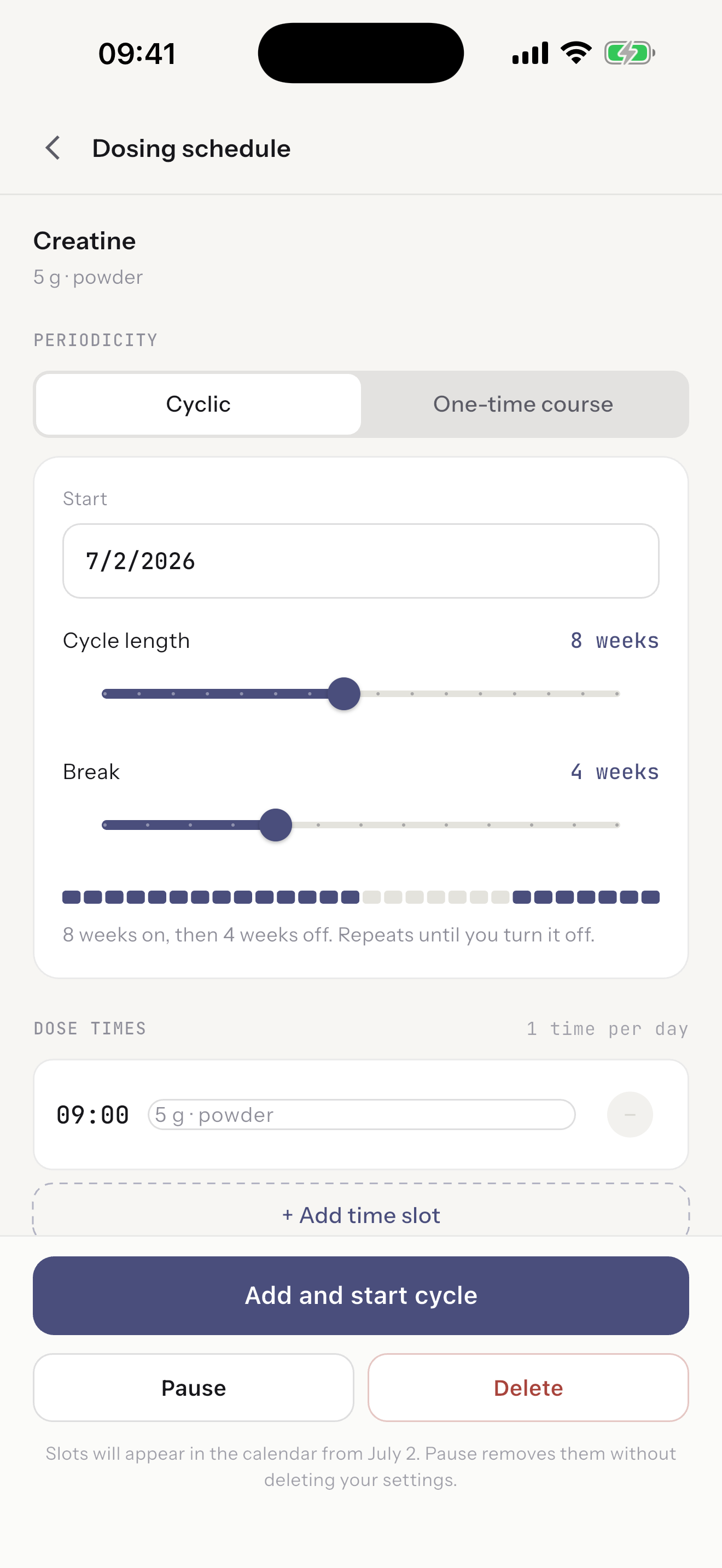
Notes apps lasted about a week each. So I built the thing I actually wanted: something that holds the start date, the length, the break, and the question of whether today is done.
I built it for myself first. Putting it in the store is the part that might turn out to be useful to somebody else.
What it does
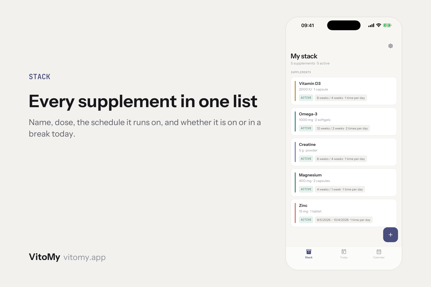
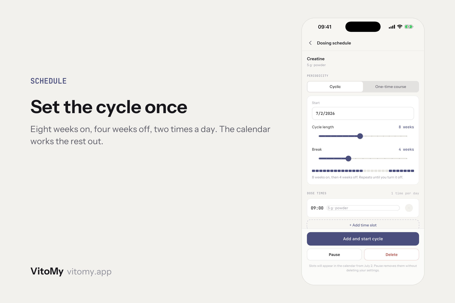
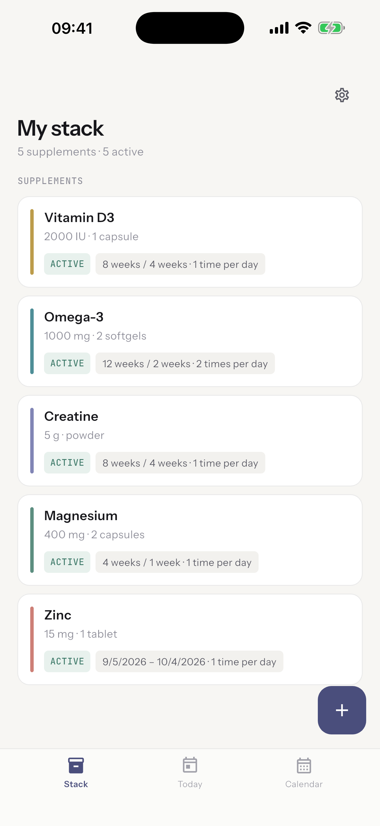
You add what you take, set the schedule once, and the app keeps the calendar.
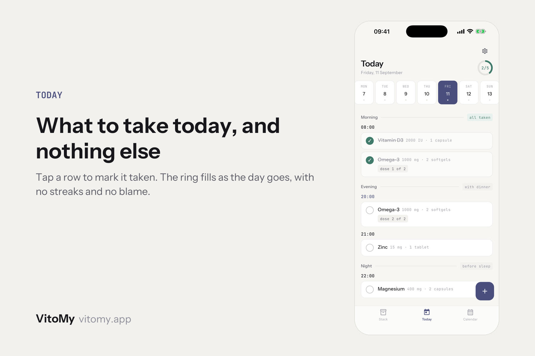
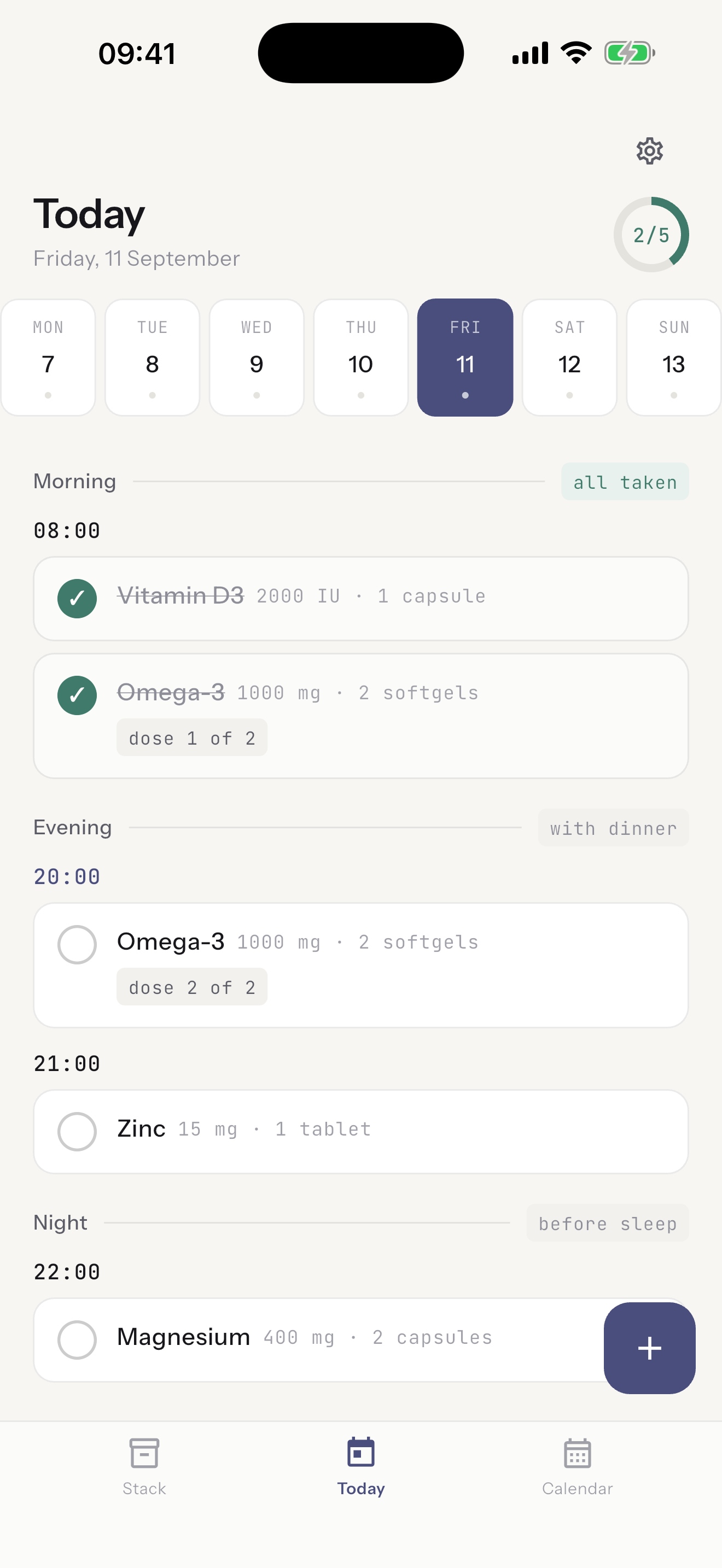
Today lists the doses due with the time beside each one. Tap a row to mark it taken. An unmarked dose is described neutrally, never as a failure.
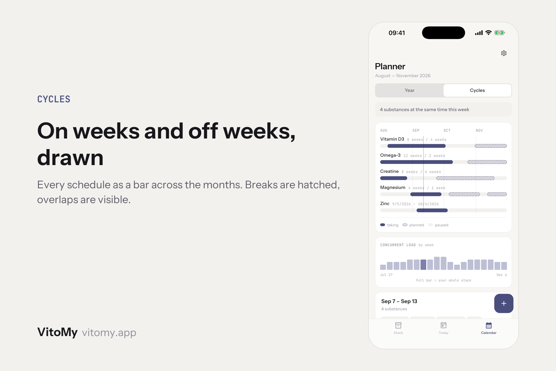
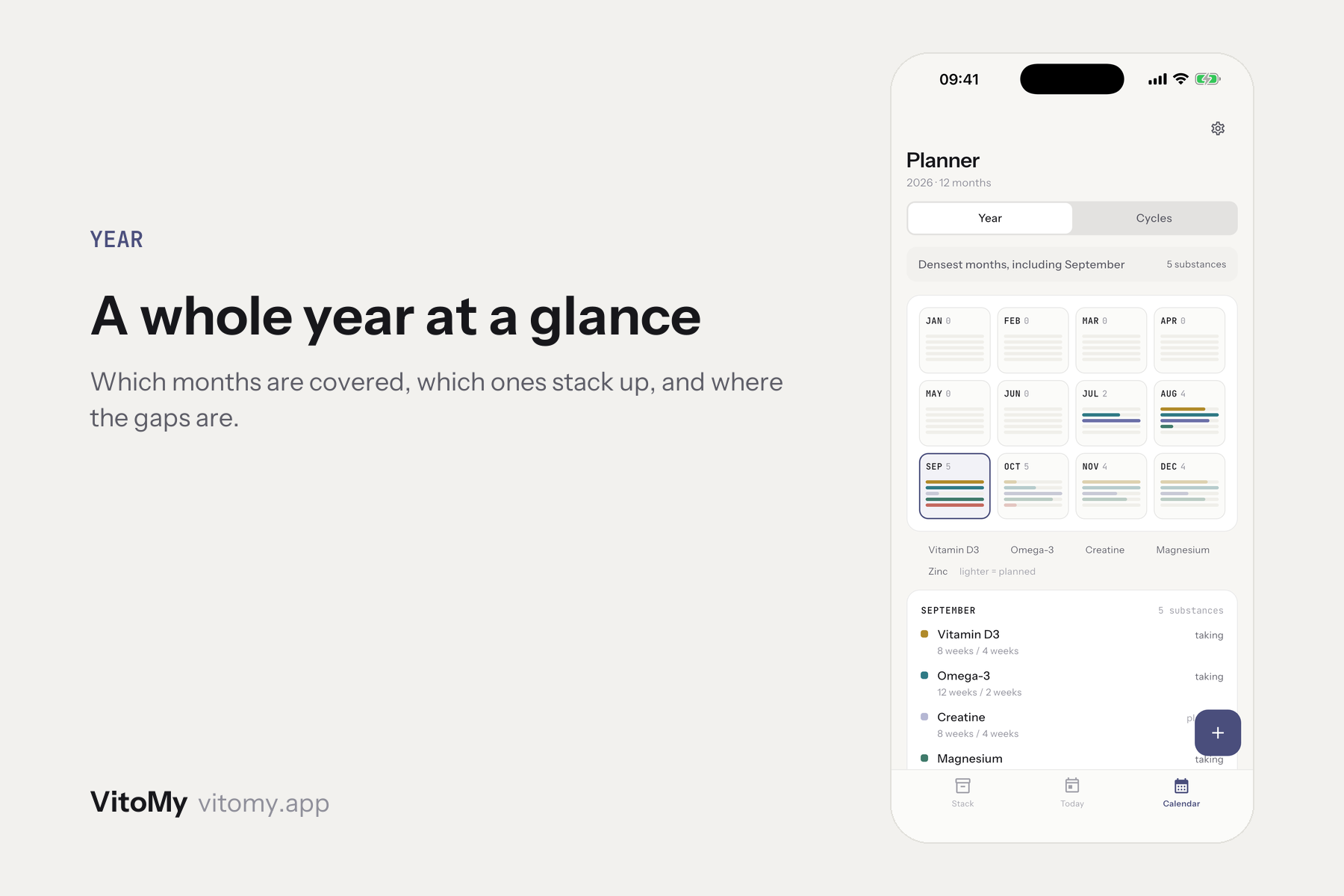
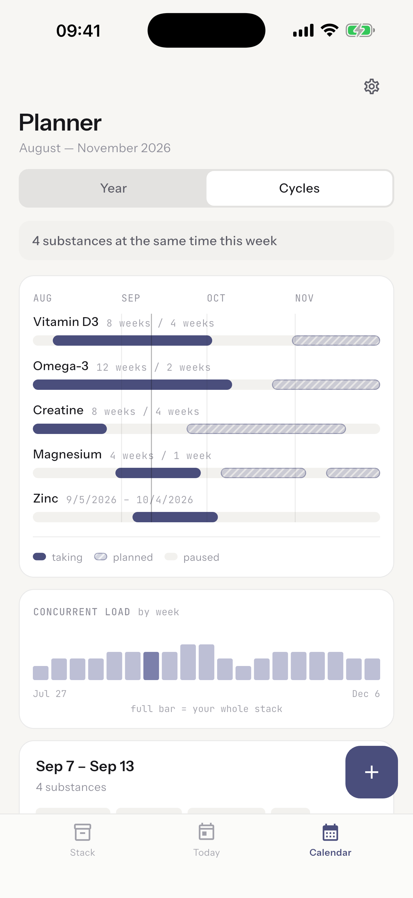
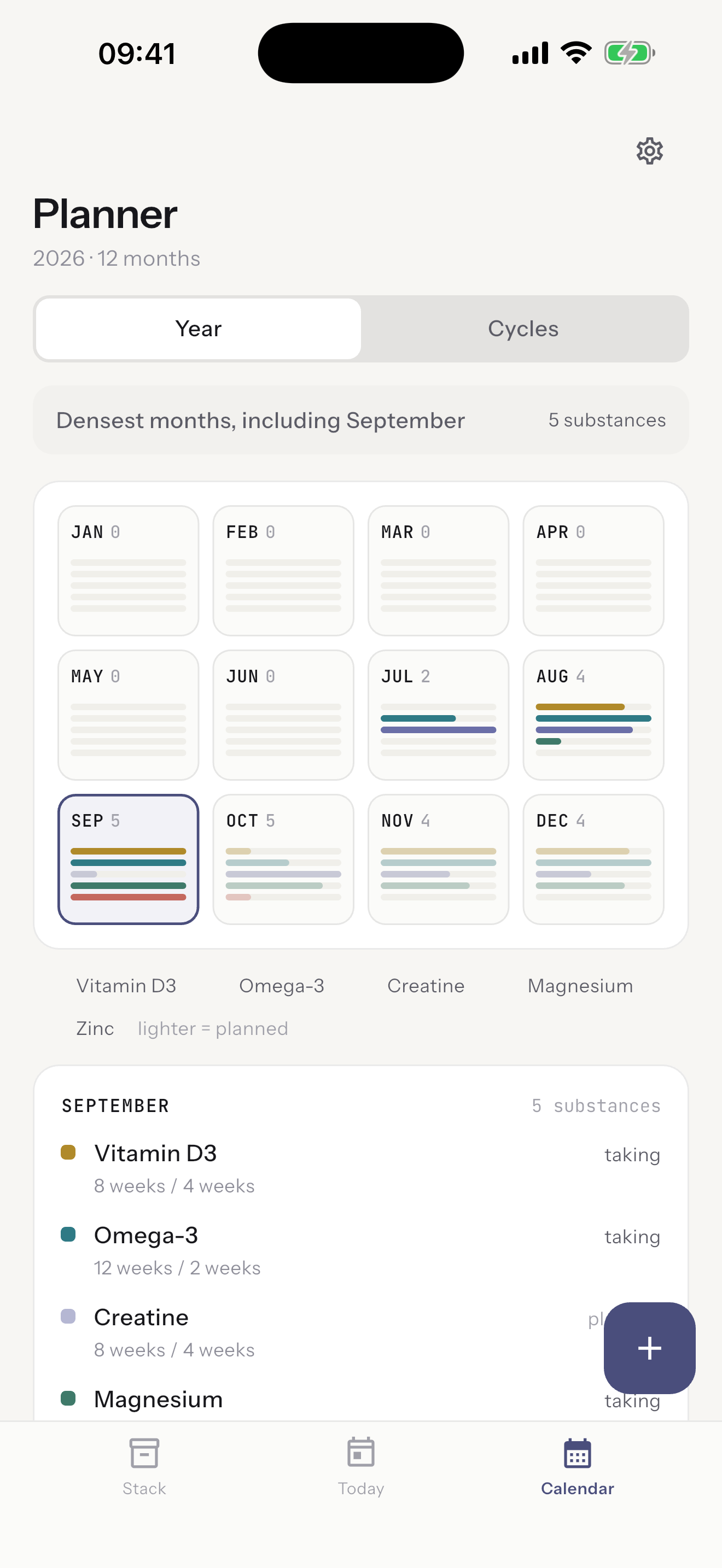
Cycles draws every schedule as a bar across the months with the breaks hatched, so overlaps and gaps are visible instead of inferred. Year is the same information at twelve-month range.
Reminders are local notifications that never name a supplement, in the title or the body, because a lock screen is public.
How we built it
Most of the code was written together with Claude Code, on Flutter, so one codebase covers iPhone and Android.
My design skills are weak, so the visual side leaned on AI too. The whole app was drawn as a mockup first and then transcribed into a fixed set of tokens, so no screen gets to invent its own colours or spacing later.
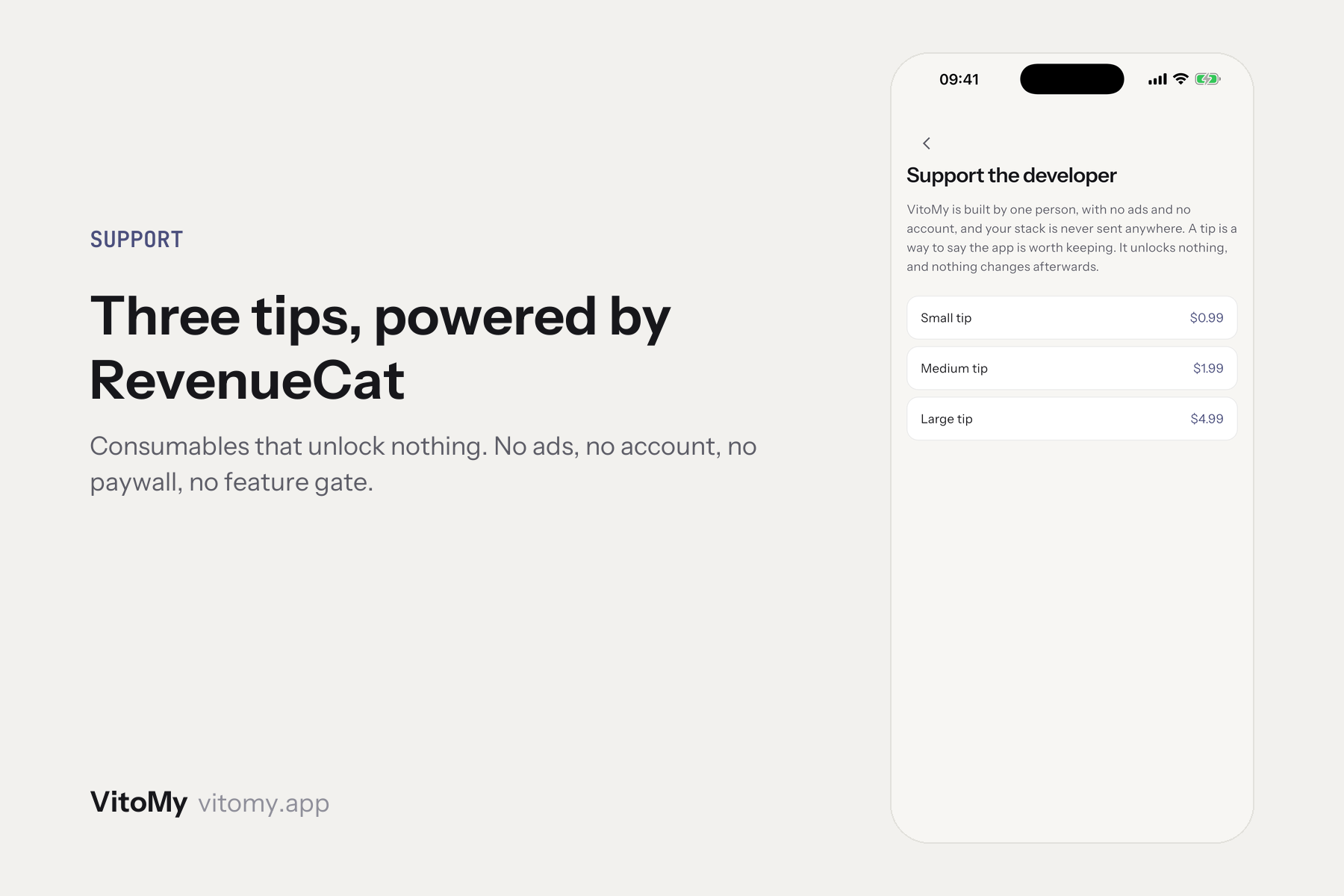
RevenueCat handles the purchase side: consumable tips, no entitlement and no paywall, because there is nothing to unlock for now.
Challenges we ran into
The interesting one was design, and it was selfish. I wanted the app to be pleasant for me, and the part I actually wanted to solve was the timelines. A supplement course is a bar with a hole in it, and several of them at once is a small gantt chart. Nothing off the shelf draws that, so the Cycles view and the year grid are built by hand, and it took several passes before a break read as a break rather than as missing data.
The other challenge is still in front of me: Google. Play wants twelve testers opted in for fourteen consecutive days before a personal account can publish anything, and its own review on top. Apple was the faster door.
What we learned
The hardest part of a tracking app is not the tracking. It is the wording.
A dose you did not mark has to be called something, and the obvious word is "skipped". But the app has no idea what happened: maybe you took it and forgot to tap, maybe you decided not to, maybe the bottle was empty. "Skipped" makes the app a judge. "Not marked" keeps it a record. Changing that one word changed how it feels to open the thing, which I did not expect from a copy decision.
What's next for VitoMy
Android, once the Play testing clock has run.
The direction I actually want is an assistant: describe what you are planning and it helps you put the stack together and lay the schedule out, instead of you entering five courses by hand. That is the feature a subscription would be for, and the purchase layer was built so one can be added without reshaping anything.

Log in or sign up for Devpost to join the conversation.