-
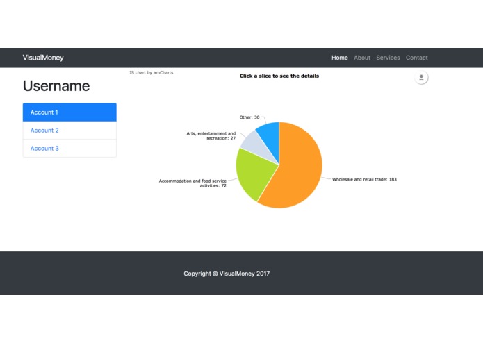
Data visualized in a pie chart
-
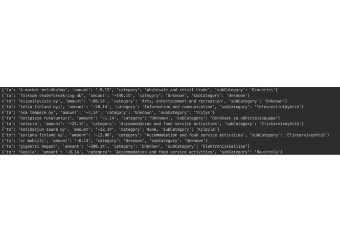
We can map transactions to categories based on information from the Finnish patent office and Facebook
Inspiration
Budget apps are a dime in a dozen, however they require a lot of effort due to manual labeling. It is hard to really know how you spend your money, and especially understand how each bought coffee for 1 euro easily adds up to a large sum. There's still no simple, easy solution for quickly and effortlessly getting a grasp of you own spending. We wanted to be able to see what we spend our money on in a clear and visual way.
What it does
VisualMoney is a web application that visualizes how you spend (and earn) your money. The application groups together account transactions automatically. For example, a transaction of 10 euros to McDonalds would automatically be labeled as “Fast food”. The grouped data is presented to the user as pie charts.
How we built it
The account and transaction information is accessed via Nordea's API.
The grouping of the data is done according to two data sources:
- Information from the Finnish patent office, through their API
- Information from the company’s Facebook page.
The visualization is done with in a basic Bootstrap page with the charting tool amCharts.
Challenges we ran into
The transactions don't always contain the right information to be able to compare it to information from the Finnish patent office.
The visualization of the data (pie charts with expandable subcategories) was challenging to implement.
Accomplishments that we're proud of
Managing to produce meaningful data by combining information from bank transactions and the Finnish patent office.
Built With
- amcharts
- bootstrap
- html
- javascript
- python


Log in or sign up for Devpost to join the conversation.