-
-

Website Page 2
-

Website Page 1
-
Website Page 3
-
Website Page 9
-

Website Page 4
-
Website Page 11
-

Website Page 5
-
Website Page 7
-
Website Page 6
-
Website Page 8
-
Website Page 10


Inspiration
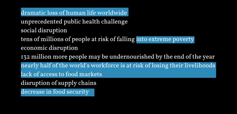
We were inspired by the wealth of information available on COVID 19, but wanted to make a tailored tool for health officials and policymakers. Thus, we've created an easy-to-interpret data visualization tool that could be critical for health officials who are making key decisions regarding COVID-19.
What it does
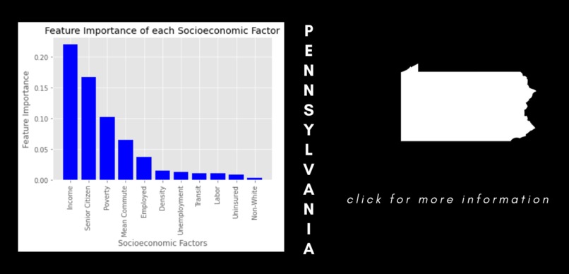
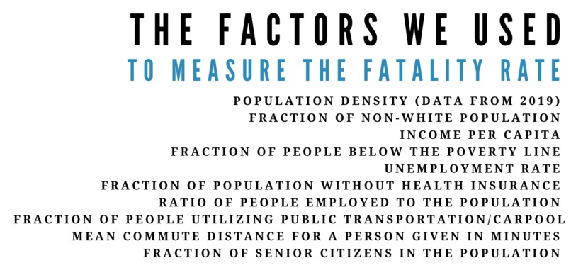
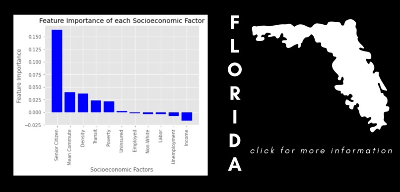
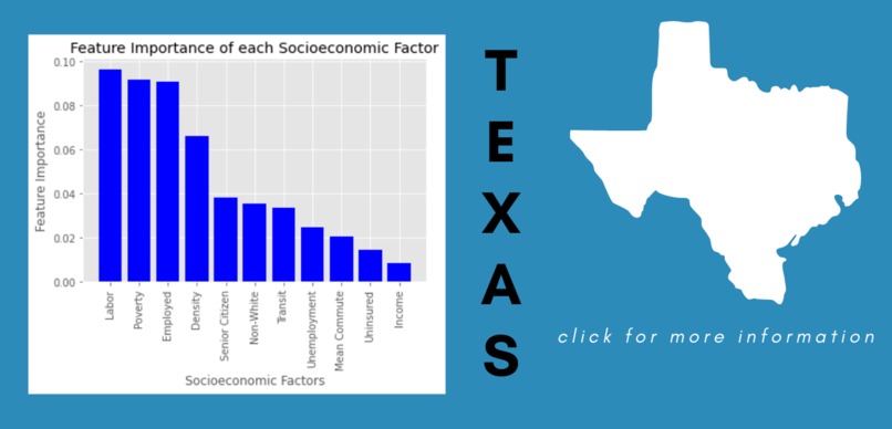
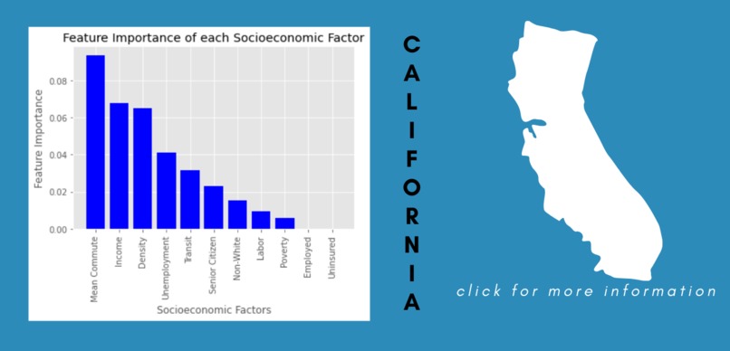
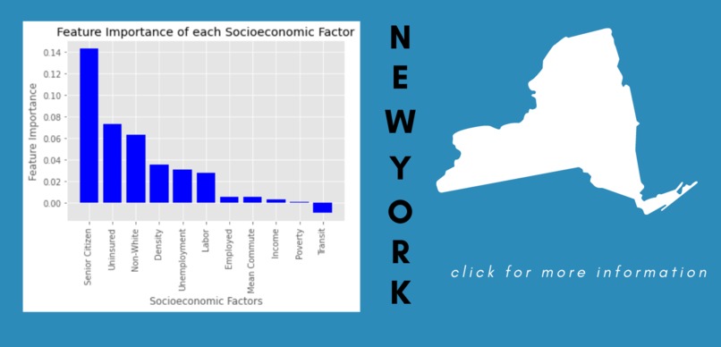
Our website takes socioeconomic factors, such as income per capita and poverty levels, and demographic information in order to present a bar graph showcasing the impact of each of these variables on COVID-19 fatality rates. Users are able to select a US State to see this bar graph, and in future versions, we hope to show more information about each of the specific factors. In order to create our bar graphs, we trained a random forest classifier using data points based on county data. We also used permutation feature importance to gain insight into the variables associated with the fatality rate. Overall, our model identified the impact of each socioeconomic variable on the fatality rate.
This website (currently in demo form) will aid health officials and inform policy-making.
How we built it
We built the project using Google Colaboratory and Python with data pre-processing based partly from the work by Ayan Paul et al. Our data was sourced from the USA Census Bureau and the Johns Hopkins University, Center for Systems Science and Engineering database.
Challenges we ran into
The main challenge we ran into was finding a suitable source of data. We eventually solved this issue after researching various health documents and then finding the databases from the USA Census Bureau and the Johns Hopkins University, Center for Systems Science and Engineering database.
Accomplishments that we're proud of
We are proud of how the model generalizes trends from the county level to the state level. Such information could be extremely useful for officials making statewide decisions.
We are also proud of the final design of the website pages as we feel that they effectively convey the information from our model while also providing a good user experience.
What we learned
We learned how to organize and process huge datasets. We also learned more about data communication and visualization, for example how the way data is presented is often affected by the target audience.
What's next for Visualizing Inequalities and COVID-19 Fatality Rates
We will expand upon this project by building a full website containing a map of the US which users can interact with to visualize socioeconomic inequalities in all 50 states. Beyond this, we would also like to increase the scale of our project to include more countries and exist on a global scale.
Citation
Data pre-processing is partly based on the work by Ayan Paul, Philipp Englert, and Melinda Varga Citation: Ayan Paul et al 2021 J. Phys. Complex. 2 035017 Link: https://iopscience.iop.org/article/10.1088/2632-072X/ac0fc7/meta

Log in or sign up for Devpost to join the conversation.