-
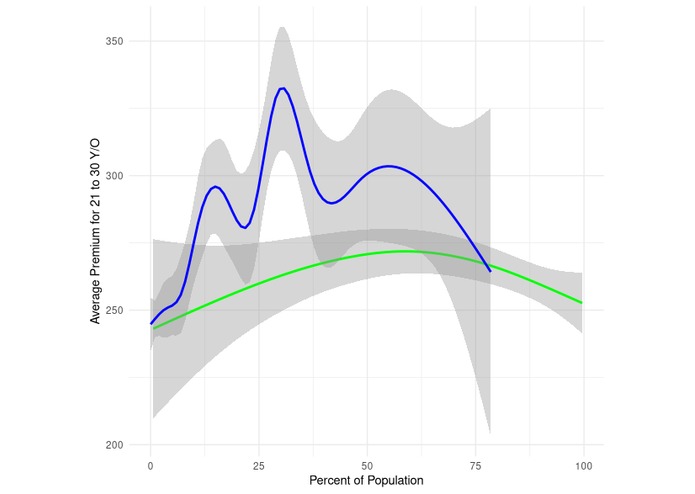
Graph of Black Percentage(blue) vs White Percentage(green) and Insurance premiums
Inspiration
We wanted to draw awareness and highlight the disparity in access to quality healthcare.
What it does
The dataset combines demographic data by county, whether it is a medically underserved community, and the average insurance data per county.
How we built it
We looked on the internet for datasets and used R to combine them and create visualizations.
Challenges we ran into
We had tried to fit a neural net model to the data and hopefully be able to visualize implicit bias in the model, but we ran into issues of time and had to stop there.
Accomplishments that we're proud of
We implemented knowledge we learned from our classes this year, such as R, in order to make the datasets and the visualizations.
What we learned
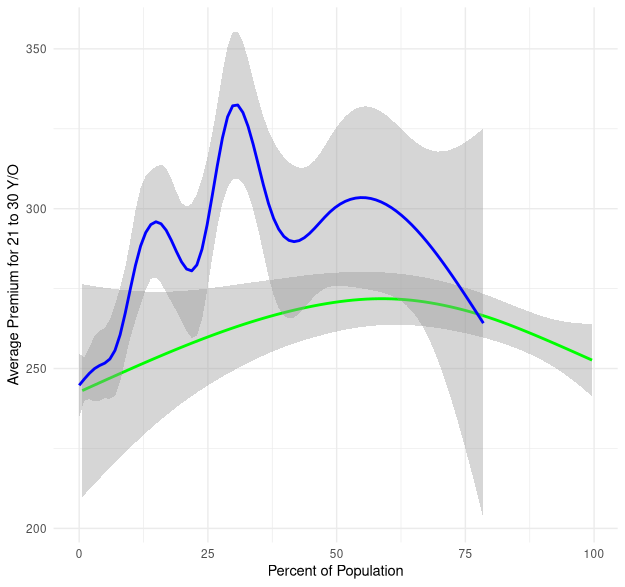
An interesting graph we have is one that graphs black percentage vs premium and white percentage vs premium. Premiums increase at a much larger rate when the percentage of black people increases.
What's next for Visualizing Health Insurance Inequality
We want to create a library that can automatically spot implicit racial biases in models. Models need to become "race-aware" in order to prevent implicit biases.

Log in or sign up for Devpost to join the conversation.