-
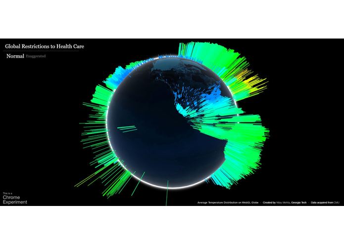
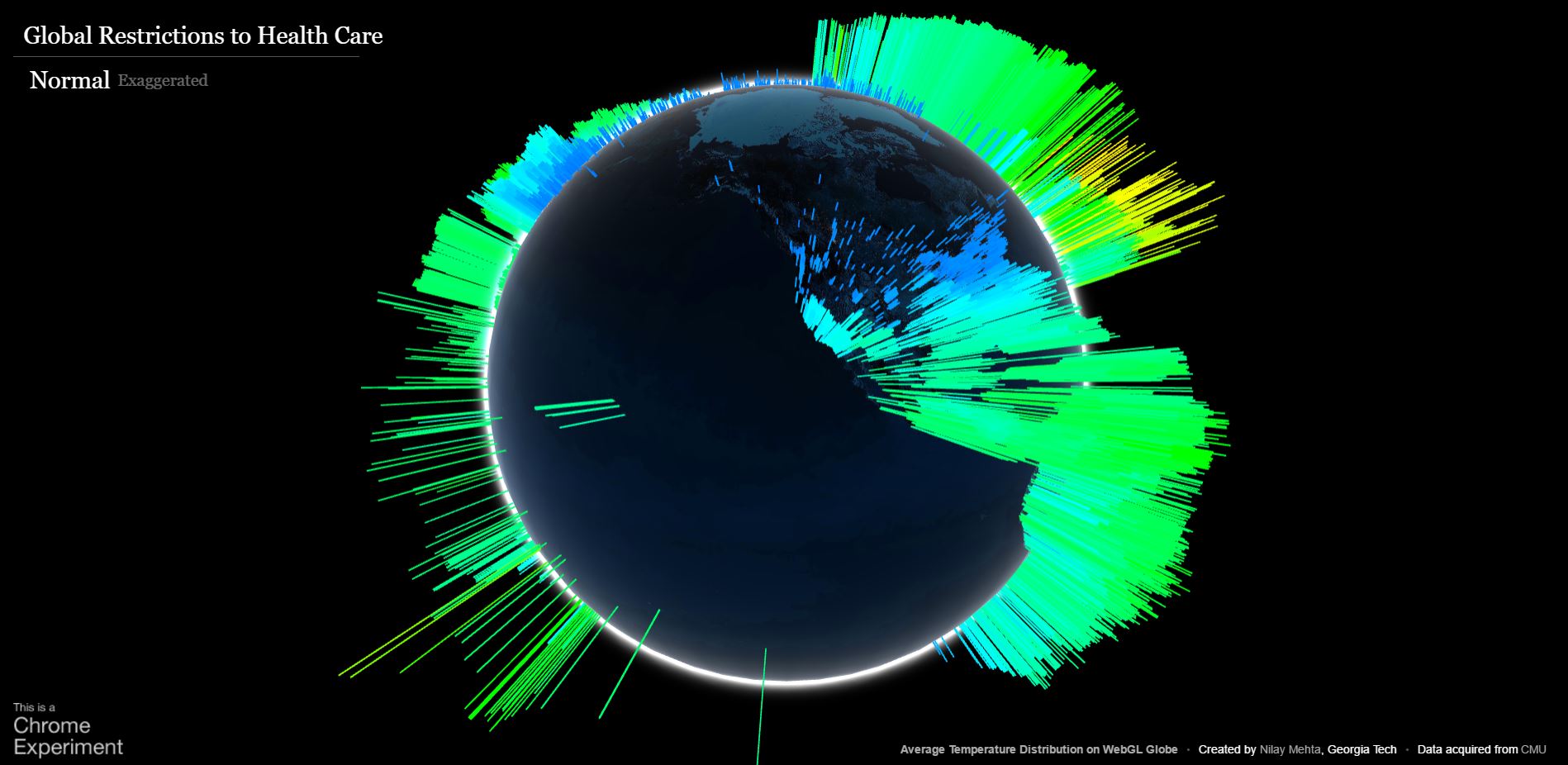
Normalized data
-
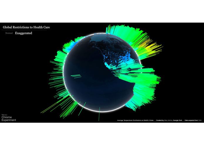
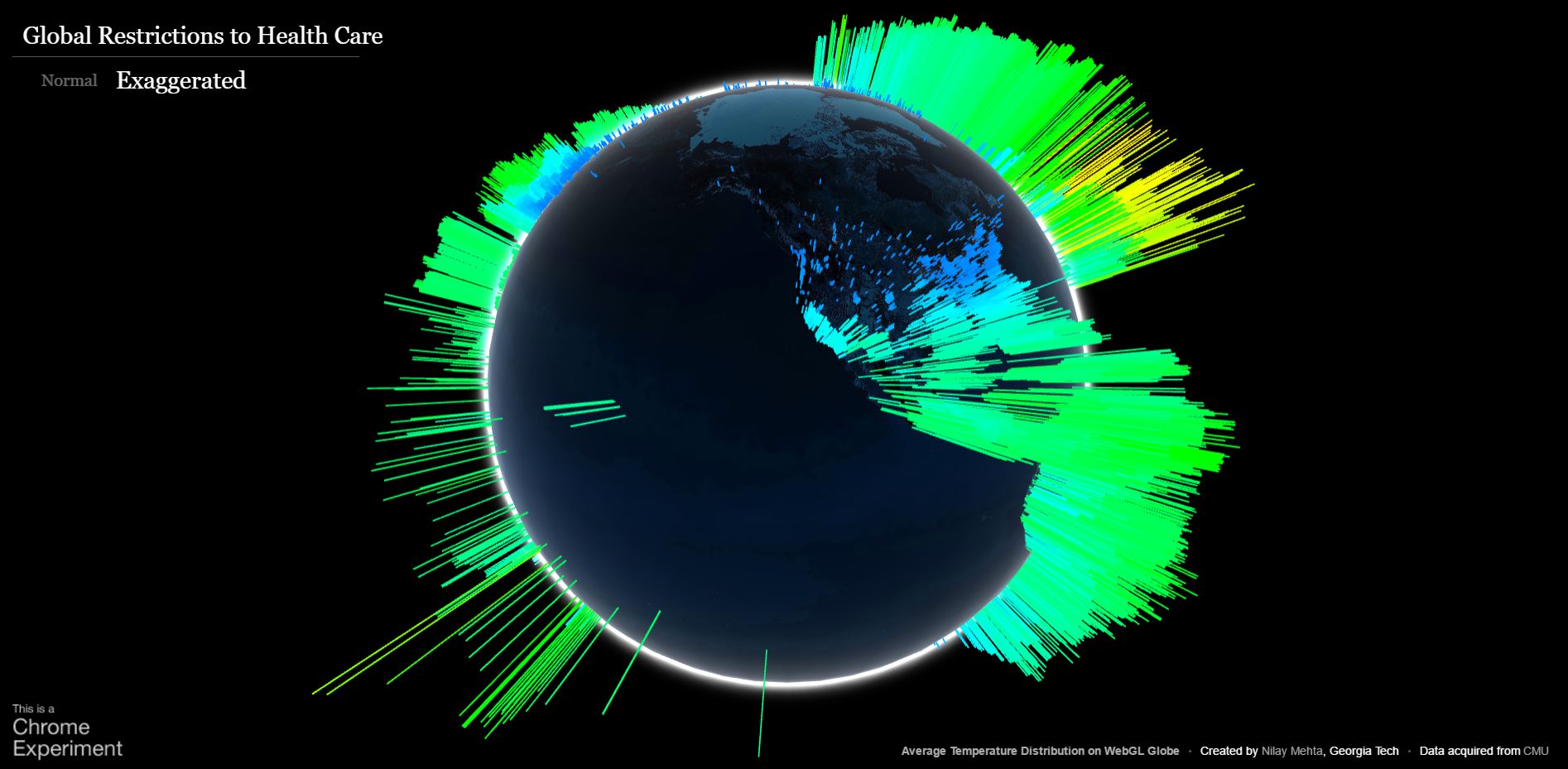
Exaggerated data
Inspiration
Most of the data that we found was mainly percents for each country and we thought it was hard to grasp the disparity and lack of accessibility to health care. We chose the WebGl Globle to accurately pinpoint each location's limited access to health care, mainly due to poverty.
What it does
The project was a visualization to more accurately depict a detailed breakdown of locations around the world that have limited health care reach because of their exclusive access.
Challenges we ran into
The data set was not as uniform as we had hoped and had a lot of unnecessary information that we had to strip away. Also, the data was not as drastic as we had hoped, so we included an "exaggerated" data set that works by amplifying the differences between the data in the normalized data.

Log in or sign up for Devpost to join the conversation.