-
-
Poster Summary of Hack
-
Preview of Interactive Graph
Inspiration
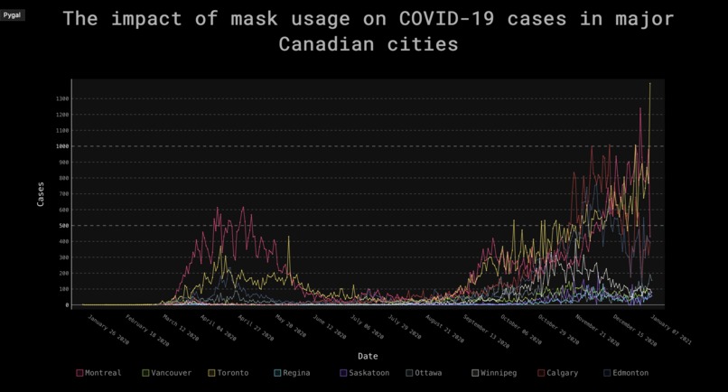
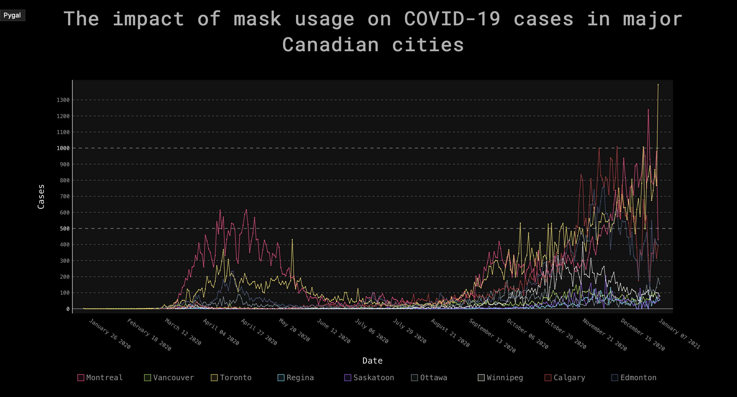
Masks have become a contentious issue in the current day and age. Some people refuse to leave their homes without donning one, and others violently despise even strangers wearing them. Many experts and studies have come out claiming that masks are beneficial for reducing COVID-19 (and other respiratory disease) spread and saving lives, and we certainly do not disagree. However, being able to see the effects of mask usage visually can ultimately drive the point home for those who deny their effectiveness. There are many videos showing how masks prevent microdroplet spread, however, we wanted to see if we could see th effects of mask usage on a more macro scale. To that end, we chose to graph several major Canadian cities along with their date of mask bylaw introduction to see if a noticeable difference can be observed following mask bylaw introduction.
What it does
Interactive graphs of 9 major Canadian cities and when masking regulations were implemented. A way to visualize the trends for confirmed cases and when masking legislation was implemented in each of these cities.
How we built it
The data was extracted from each city's COVID-19 database and then plotted using pygal in python. Plots were rendered through Flask and then committed to a heroku instance as an easily accessible format for users
Challenges we ran into
Learning how to use pygal to create interactive plots in python. Finding data for the major cities because they were not all easily accessible. The formatting of the .csv files was also not consistent so they had to be prepared for implementation in pygal.
Accomplishments that we're proud of
Creating an informative and interactive plot to show the effectiveness of masking during the COVID-19 pandemic.
What we learned
How to use Flask and pygal on the programmatic side. Although, there appears to be a decrease in cases after Canada recommended masking (May 20th, 2020), many other factors may have come into play. This is because after cities implemented masking bylaws, they appear to have little to no effect but again this may be due to a variety of reasons (e.g. masks being regularly worn already). As a result, masking may be effective on an individual and small group level but on a macro level other factors may dominate.
What's next for Visualization of Masking and Covid-19 Cases in Major Cities
Updating the daily cases for the interactive plot so that they reflect real-time confirmed cases. Adding more features to the plots so that they are more informative. Adding a variety of cities (e.g. from around the world) in order to better understand the connection between masking and confirmed cases for more conclusive findings.

Log in or sign up for Devpost to join the conversation.