-

Our generated biodiversity heatmap. Notice it is an inverse of an official NYS heatmap, indicating the crowdsourced data's weakness
-

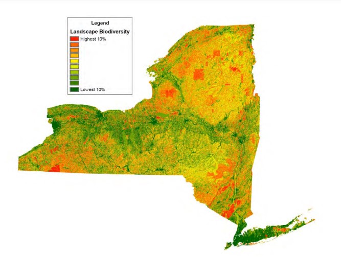
Official NYS Heatmap from https://parks.ny.gov/documents/environment/BITToolSummary.pdf
-

Raw crowdsourced data from the Global Biodiversity Information Facility's iNaturalist Research-grade Observations database. Matches our map.


Inspiration
This project was inspired by a biology related brainstorming session a few days before the hackathon between four brilliant minds. It further evolved throughout the hackathon into what it is now.
What it does
This code displays a biodiversity heatmap of New York State (NYS) based on crowdsourced data from the Global Biodiversity Information Facility. Interestingly, this heatmap is an inverse of an official NYS biodiversity heatmap. This showcases a potential weakness in crowdsourced data, excessive representation of urban communities. This is particularly harmful when trying to view data largely irrelevant to urban communities, such as statewide biodiversity data. Our project functions as an example of this weakness.
How we built it
We built this in Jupyter Notebook using python libraries such as Numpy and Gmaps. The map is rendered in a web browser.
Challenges we ran into
By far the greatest challenge we faced was project setup. Trying numerous tools such as MapBox and OsgEarth, we struggled to find a setup that would run on any of our machines. This was largely due to build failures outside our control and slow download speeds preventing us from testing our ideas and data for hours on end. Finding quality data to visualize was also a challenge.
Accomplishments that we're proud of
We are proud of not giving up. Spending hours failing to make progress was immensely demoralizing. However, we have still managed to learn a lot and have presentable material by the end of the 24-hour mark.
What we learned
Generally, we learned a lot about hackathon strategies and task delegation. We also learned a lot about Numpy, dependency management, Docker, and the Google Maps api.
What's next for Visualization of Biodiversity in New York State
Moving forward, were our group to continue to use what we've created, we would further explore the weaknesses of crowdsourced data in different contexts, and compare them to population data.


Log in or sign up for Devpost to join the conversation.