Project Name: Flowboard
Challenge(s) We’re Responding To: We’re responding to the challenge of making unfamiliar codebases easier to understand, especially for new contributors, junior developers, hackathon teams, and maintainers inheriting large projects. Modern repos can be hard to onboard into because structure, dependencies, file purpose, and system flow are often spread across code, docs, and tribal knowledge.
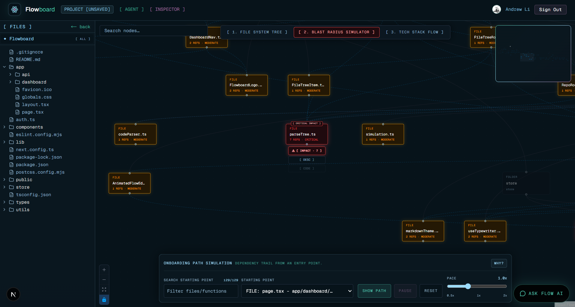
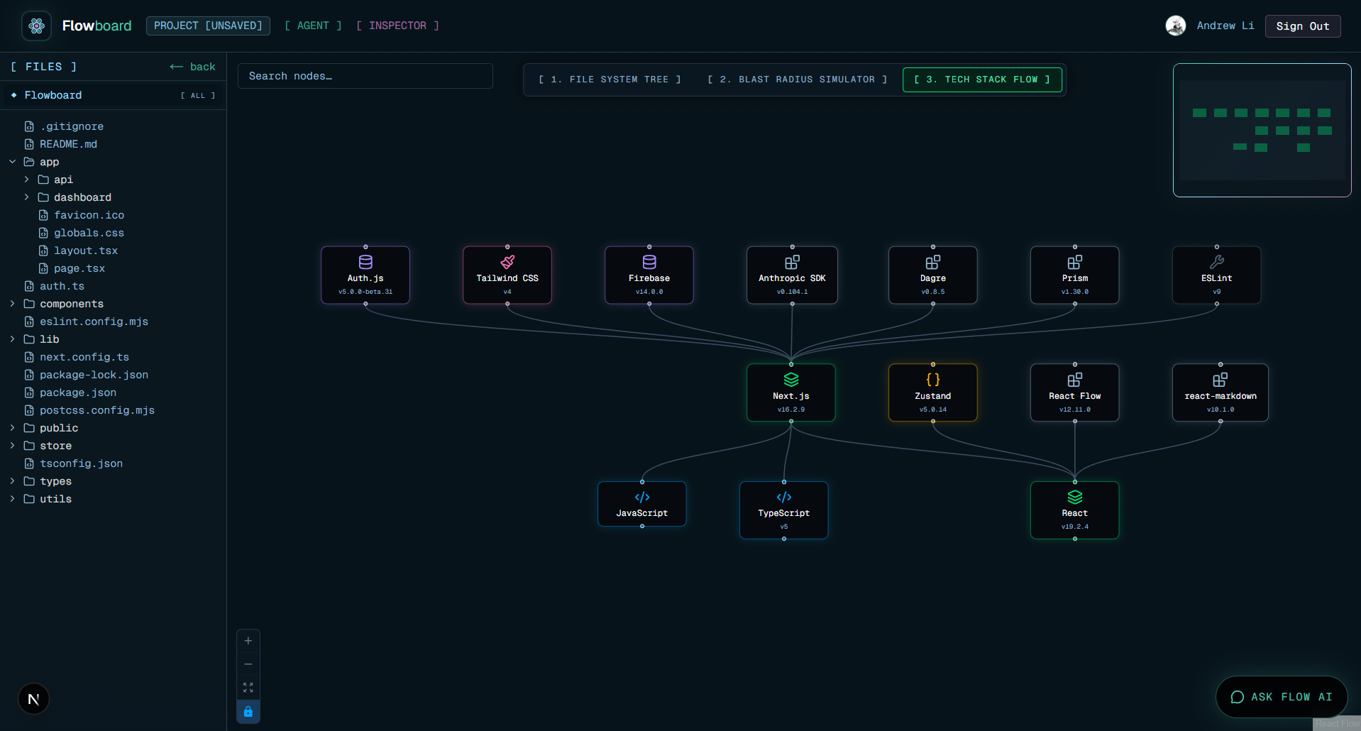
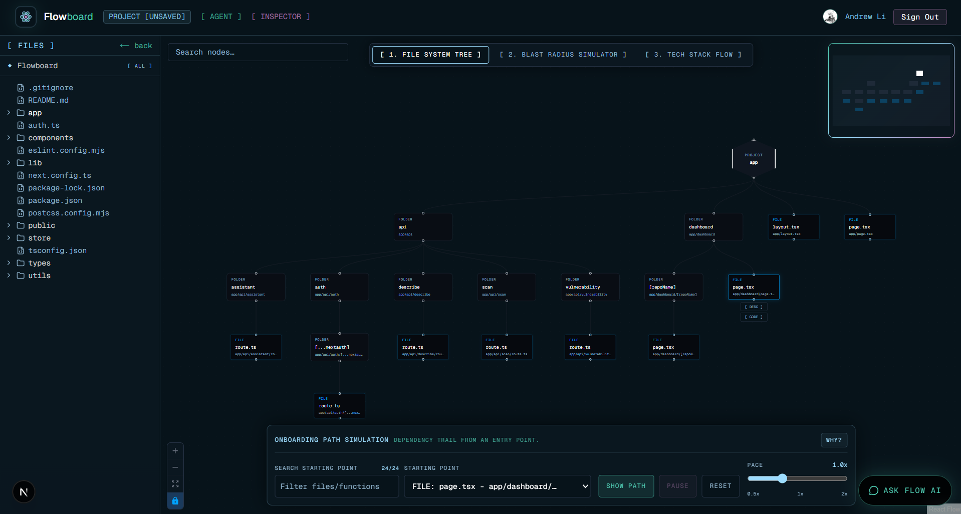
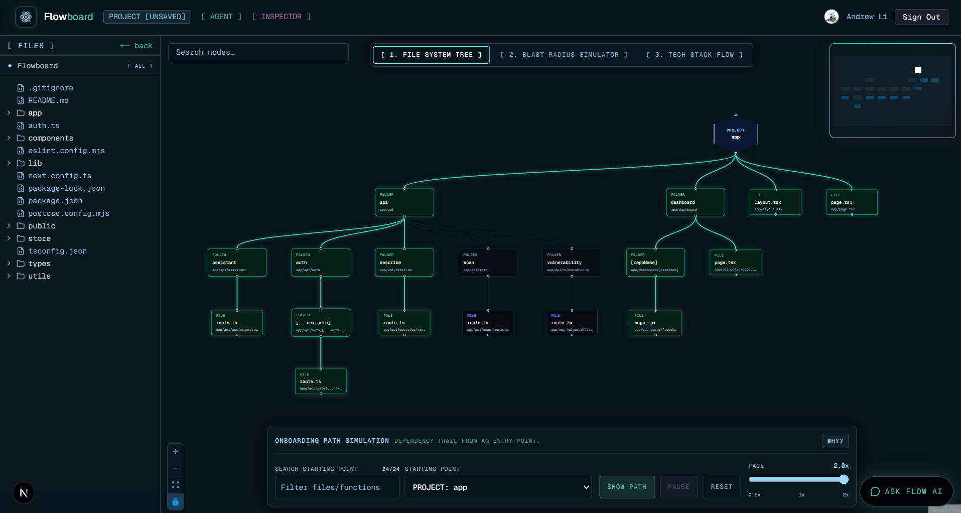
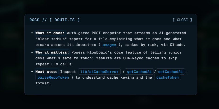
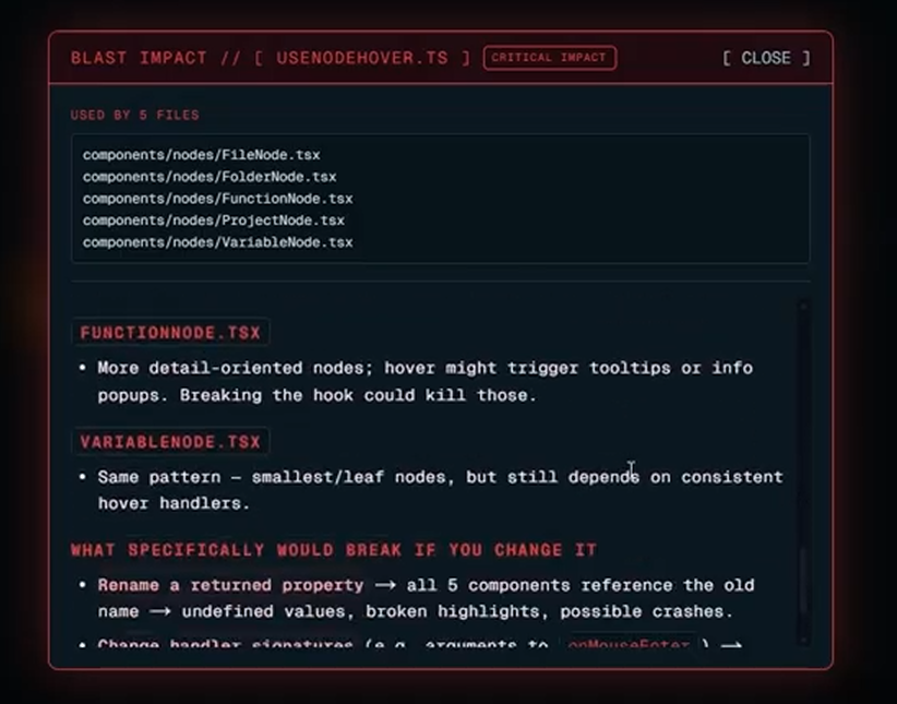
How Our Project Addresses The Challenge: Flowboard turns a GitHub repository into an interactive visual flowchart. It scans the repo, maps folders/files/functions/variables as nodes, and shows relationships between them so developers can understand the system faster. It also includes an AI flowchart assistant that can answer questions about the current repo, summarize files, explain the tech stack, and help users decide where to start reading. The goal is to make onboarding feel less like digging through a maze and more like exploring a guided map.
Technologies Used: Next.js 16 with the App Router, React 19, TypeScript, Tailwind CSS, React Flow / @xyflow/react for the graph visualization, Zustand for state management, GitHub OAuth and repository access, Anthropic API for the AI assistant, Custom repo scanning/parsing utilities, Vercel-style frontend architecture,
What We Learned: We learned a lot about turning raw repository data into something visually useful. It’s one thing to list files, but another thing to design a graph that actually helps someone understand structure, dependencies, and intent. We also learned how important UI clarity is for developer tools. Small things like node styling, minimap borders, assistant formatting, and collapsible controls made a big difference in how usable the project felt.
Problems We Ran Into And How We Solved Them: One challenge was making the AI assistant actually useful instead of generic. At first, it only knew basic graph labels, so its answers were too vague. We solved this by giving it better context: file hierarchy, visible graph nodes, high-impact files, and code excerpts from files that actually contain code.Another challenge was visual polish across devices. For example, the minimap border looked good locally but disappeared on another device because of how the SVG minimap handled gradient borders. We fixed that by switching to a more reliable visible border and inline fallback styling.We also had to simplify features that became redundant, like the trace/telemetry idea, and focus the app around the core onboarding experience: repository visualization, code context, and AI explanation.
Built With
- claude
- firebase
- nextjs
- react
- typescript

Log in or sign up for Devpost to join the conversation.