-
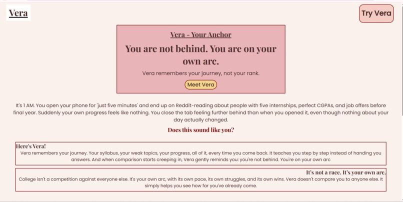
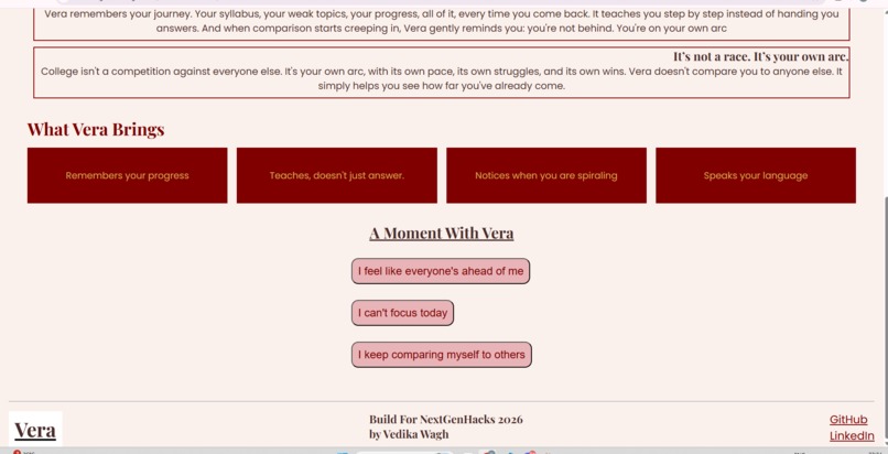
Vera's homepage hero section: the core message, you're not behind, you're on your own arc.
-
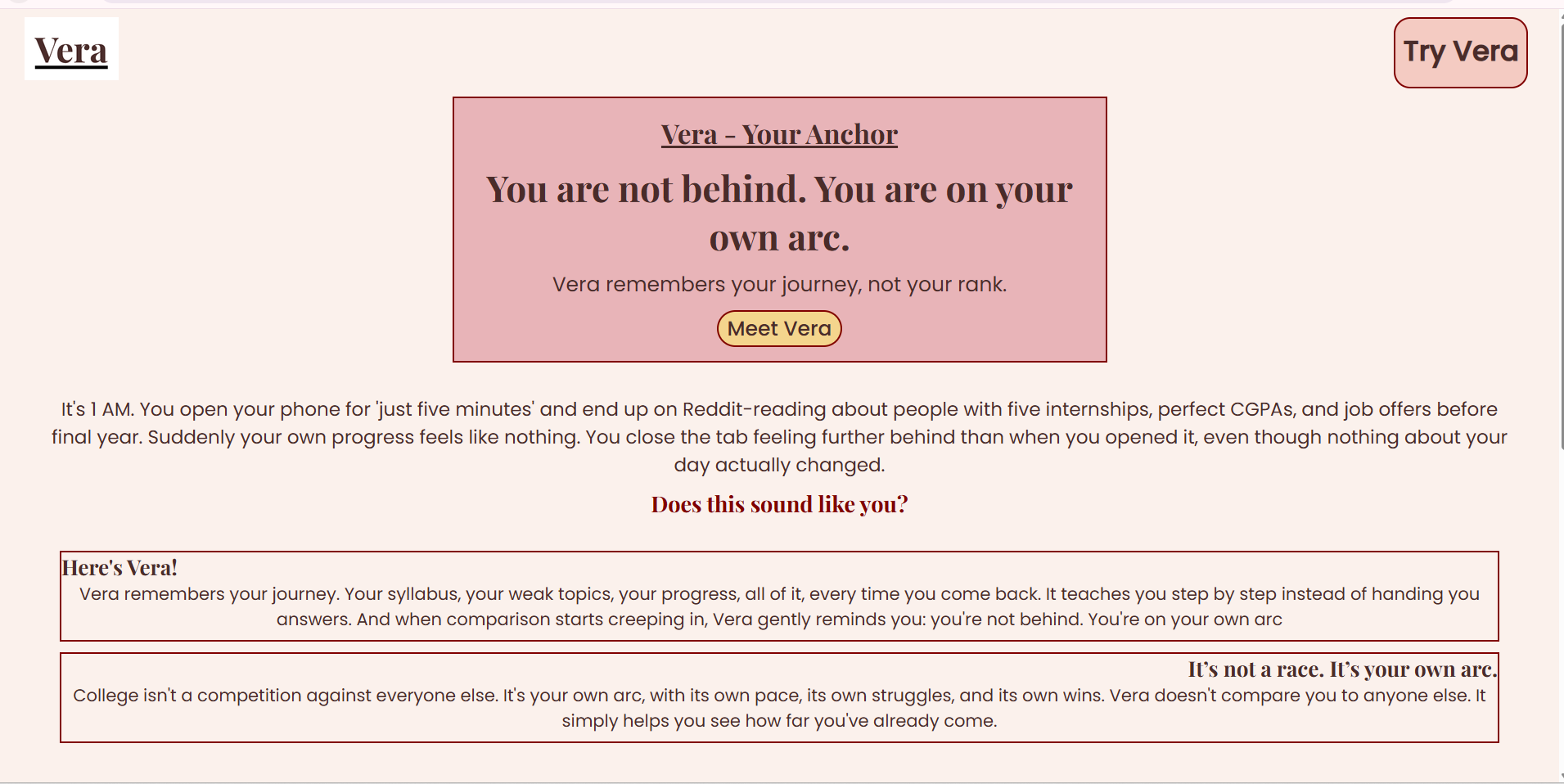
Feature highlights and the interactive 'A Moment With Vera' section, where visitors can try Vera's responses.
Inspiration
The idea for Vera started from something personal: late night scrolling on Reddit, seeing peers with multiple internships and perfect CGPAs, and feeling like I was already behind, even though nothing about my actual progress had changed. I wanted to imagine a study tool that didn't just answer questions, but actually remembered your journey and reminded you that you're not in a race against everyone else.
What it does
Vera is a concept site for a study tool that remembers your progress, teaches you step by step instead of just giving answers, and notices when comparison starts creeping in. It gently reminds you: you're on your own arc, not behind anyone else's. The site includes "A Moment With Vera," an interactive section where clicking how you're feeling reveals a real Vera style response. Vera is built for students, especially first years, who are trying to keep up with coursework while feeling the weight of comparison culture around them.
How I built it
Built with HTML, CSS (Flexbox and Grid for responsive layouts), and JavaScript for the part where clicking a button reveals a response. I designed the layout and color palette (cream, dusty rose, gold, espresso) in Canva first, then built it section by section, testing it on both desktop and mobile as I went. Hosted on GitHub Pages.
Challenges I ran into
This was my first time building a fully responsive site from scratch. I learned how max-width and margin auto work together to keep layouts centered on desktop but full width on mobile, debugged CSS Grid so the feature cards stack properly on phones, and wrote my first ever JavaScript for the interactive "Try Vera" section.
Accomplishments that I am proud of
I'm proud that this went from a rough idea to a fully designed, coded, and deployed website in one sitting. Designing the color palette and layout in Canva first made the coding much smoother. Getting the interactive section working with my first ever JavaScript felt like a real milestone, and seeing the whole site adapt cleanly between desktop and mobile was genuinely exciting.
What I learned
I learned how responsive layouts actually work in practice: how max-width and margin auto keep things centered, how flexbox and grid handle wrapping on smaller screens, and how small CSS choices affect spacing and alignment. I also wrote and understood my first real JavaScript, using element IDs to show and hide content on click.
What's next for Vera - Your Anchor
The next step would be turning this concept into a working prototype: connecting the "Try Vera" responses to a real AI model, adding actual progress tracking tied to a student's syllabus, and expanding the emotional check in feature into something more personalized over time.

Log in or sign up for Devpost to join the conversation.