Inspiration
Venmo is a leading P2P payment platform where friends can transfer money and has a record of your interactions with the person. The current platform’s design is already centered on the feed of seeing your friends' transactions. Venmo turned a plain app that is primarily used for transferring money to become something warmer in terms of being able to see what your friends are doing, be it splitting for food, for a trip, or even a gift. You can see a transaction from years ago as well, for instance, when you first transferred money to a friend if you search deep enough. So unfortunately, the current design treats all of those moments as disposable since it is only temporary and eventually becomes buried. The current UI has branched the connection of a payment closer through leaving a transaction note. This section allows for the user to express something, be it an inside joke, a gratitude, or a note of what the payment was for. However, it does not have a lasting meaning in the long run of whether this person is someone consistent in your financial life or not. Another issue is how a screen of contacts or friends in which it documents down the transactions that happened between the two. But, once again, the relationship is flat and has no special feeling compared to paying money to a vendor. With analysis of the current app design situation, we noticed a gap. Venmo already has the basic necessities in a traditional payment platform, but there are ways to improve the connection between users. We wanted the interface to visualize your relationships with friends in a memorable way where users would be encouraged to return to the app, even for non-payment purposes.
What it does
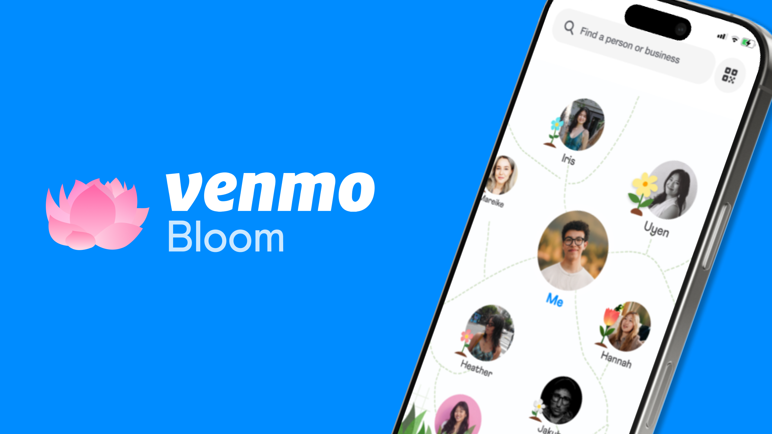
Venmo Bloom reimagines the transaction history as a friendship garden. Every person that you have a transaction with would have a unique flower that exists between the two of you. The flower would begin as a seed and will be buried into the soil, which then evolves through the growth stages such as sprout and bloom. The growth stage displayed would be a record based on the frequency of your shared transactions over time. The flower does not just only show a bloomed flower, but also shows a moment where the flower can wilt if there has been a long gap of no transactions between the two of you. This demonstrates the natural flow of real relationships in life, where this could be someone you were extremely close to in the past but not currently.
How we built it
We built the new Venmo view almost entirely in Figma. Throughout the design process, we developed the concept in progressive layers in ensuring the interactions and transitions are meaningful. For instance, we focused on how a seed is buried into the soil when a new friendship is made. Or if a transaction was made to a friend, the flower would be watered and proceed into the next stage of the growth cycle. The first thing we had focused on was the visual language of growth. We spent some time building the stages of the flowering plant to build it into a functional design system. Each stage needed its distinctions so that users could immediately read where their relationship is at, depicting a continuity in a friendship. We marked the stages through interaction milestones. When befriended, the seed is planted into the soil and watered. Eventually, when there are more interactions, the seed begins to grow into a sprout and gradually works its way to a flower as the transaction history grows between the friends. The flower that is next to the profiles would be the same on each other’s screens. This was a design decision made with the intention to reinforce the relationship into being mutual and related rather than being just a person’s record of someone else. This also challenged Venmo's design as a one-sided view screen, as this design intention helps depict your history with a friend and being something you two can share. Throughout the building process, we constantly returned to the central prompt on if the design lets the content evolve, resurface organically, and deepen the meaning through repeated interactions. The plant structure provided us with a clear answer to the prompt. First is the flower visibly evolving with every transition. Second, it always resurfaces whenever you open the app and is not buried through all the transactions. This deepens in meaning of having a reward through repeated interactions, which is something that Venmo currently does not present in their design.
Challenges we ran into
The first challenge that we ran into was on how we should take something as transactional and utilitarian as a payment app and make it become a genuine relationship without making it feel forced. Venmo’s current design works well because it branches away from making that friendship connection. This ultimately makes the app work extremely fast and frictionless, as it does not require much effort. It makes the app still work the way it needs to, which is the concept of transferring money. The gamification of the app was something we kept wanting to implement, but struggled on finding the perfect way. Early versions of the app were centered on a progress indicator. It was good to show friendship, but it was not what we had wanted. It would lead to the thinking of how much more interaction is necessary to move on to the next stage, rather than having an organic relationship. We wanted to branch away from that idea and hoped for the flower to be responding to their authentic relationship rather than a scoring machine. Attempting to define what the “growth” is was harder since the overall concept was that more transactions between two people obviously meant there should be more growth. For instance, if you pay a transaction to someone often but is not a friend, then you would have a bloomed flower while an actual close friend that you Venmo rarely would need more time to bloom. This did not accurately represent the emotional aspect of the relationship. Therefore, we had to put more thought behind building a model that felt intuitive to human relationships than being just measurable.
What we learned
This project helped us reinforce a deeper meaning to something that is purely a functioning transactional platform to become something more intricate with connection between users. The most important lesson learned was to look deeper into a tool we use on a daily basis, and figuring out how this app is working to touch on human emotions. Venmo users already are capable of writing transaction notes to make the transfer more intentional. Therefore, the emotional aspect is there. The current design lacks a framework that allows for a connection. Through the process, we learned how to incorporate a meaningful visual theme that can shape a decision making process. Once we had committed to the plant growth cycle, we were able to apply that concept into how a relationship operates. Every moment of the cycle had a direct parallel to how human connections work. The most meaningful takeaway from this project was how we think about some apps disposing of genuine human interactions to create something that is efficient. We usually think of transaction apps as something that just transfers money, so we were able to think beyond that and discover relationships within the process of transferring money.
Built With
- fcpx
- figma
- photoshop


Log in or sign up for Devpost to join the conversation.