-
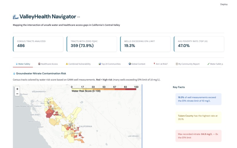
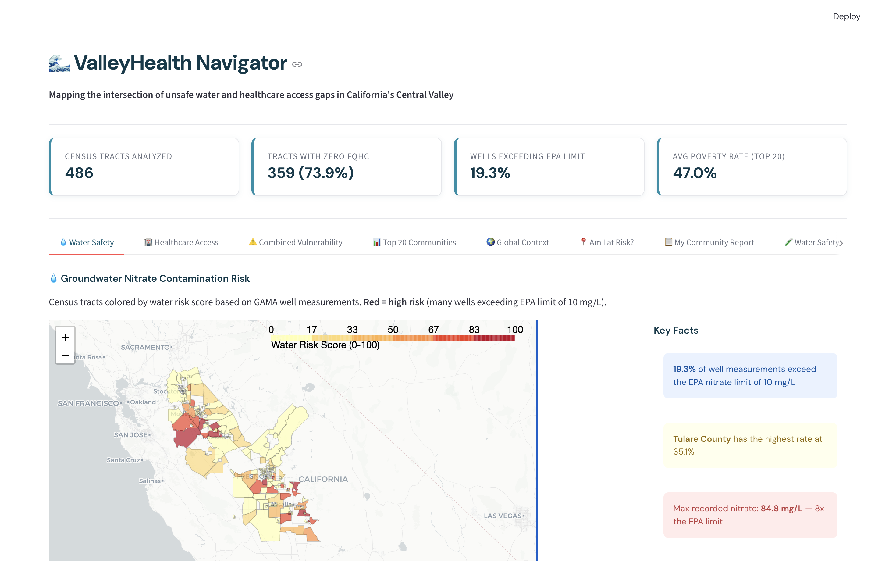
Water Safety Map - Groundwater Nitrate Contamination Risk
-
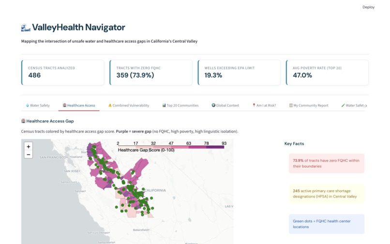
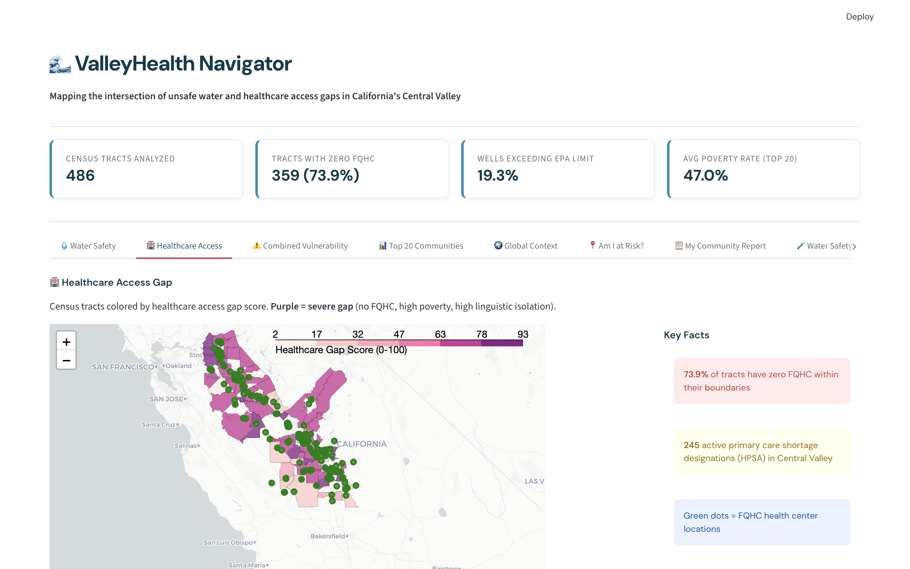
Healthcare Access Gap Map
-
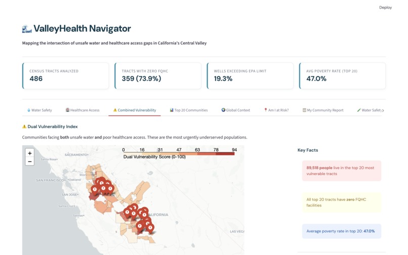
Combined Vulnerability Index Map - Communities facing both unsafe water and poor healthcare access
-
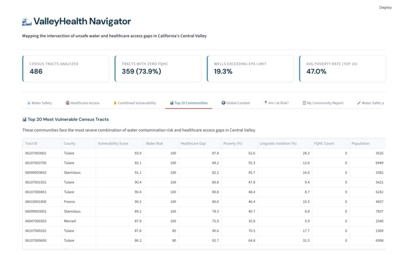
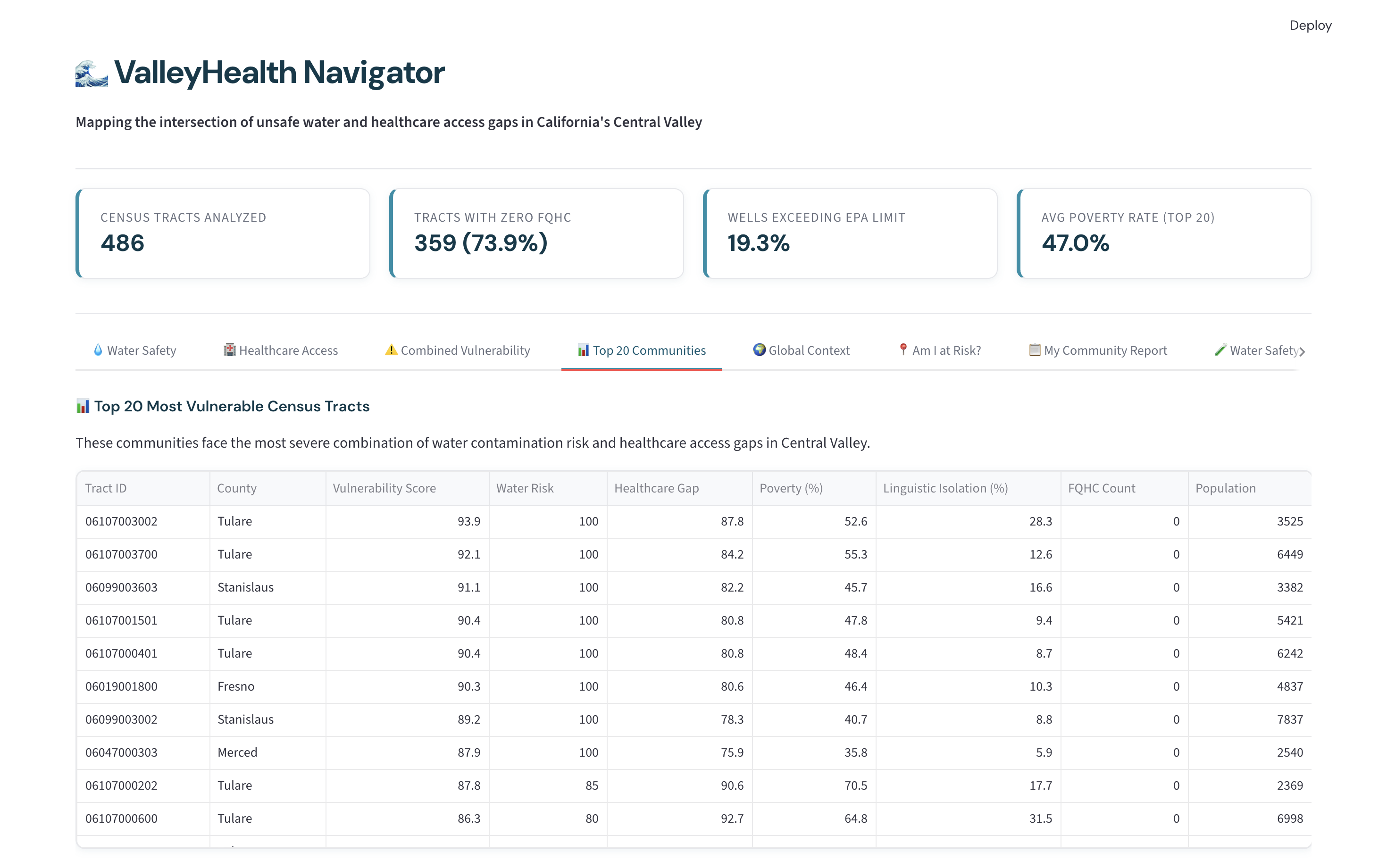
Table of the top 20 communities with the most severe combination of water contamination risk and healthcare access gaps in Central Valley
-
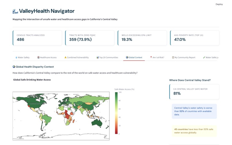
Global Health Disparity Map - Central Valley VS World
-
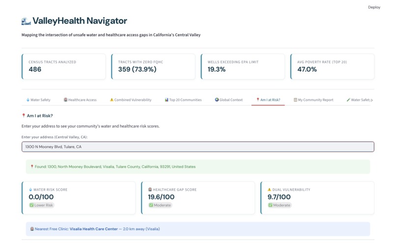
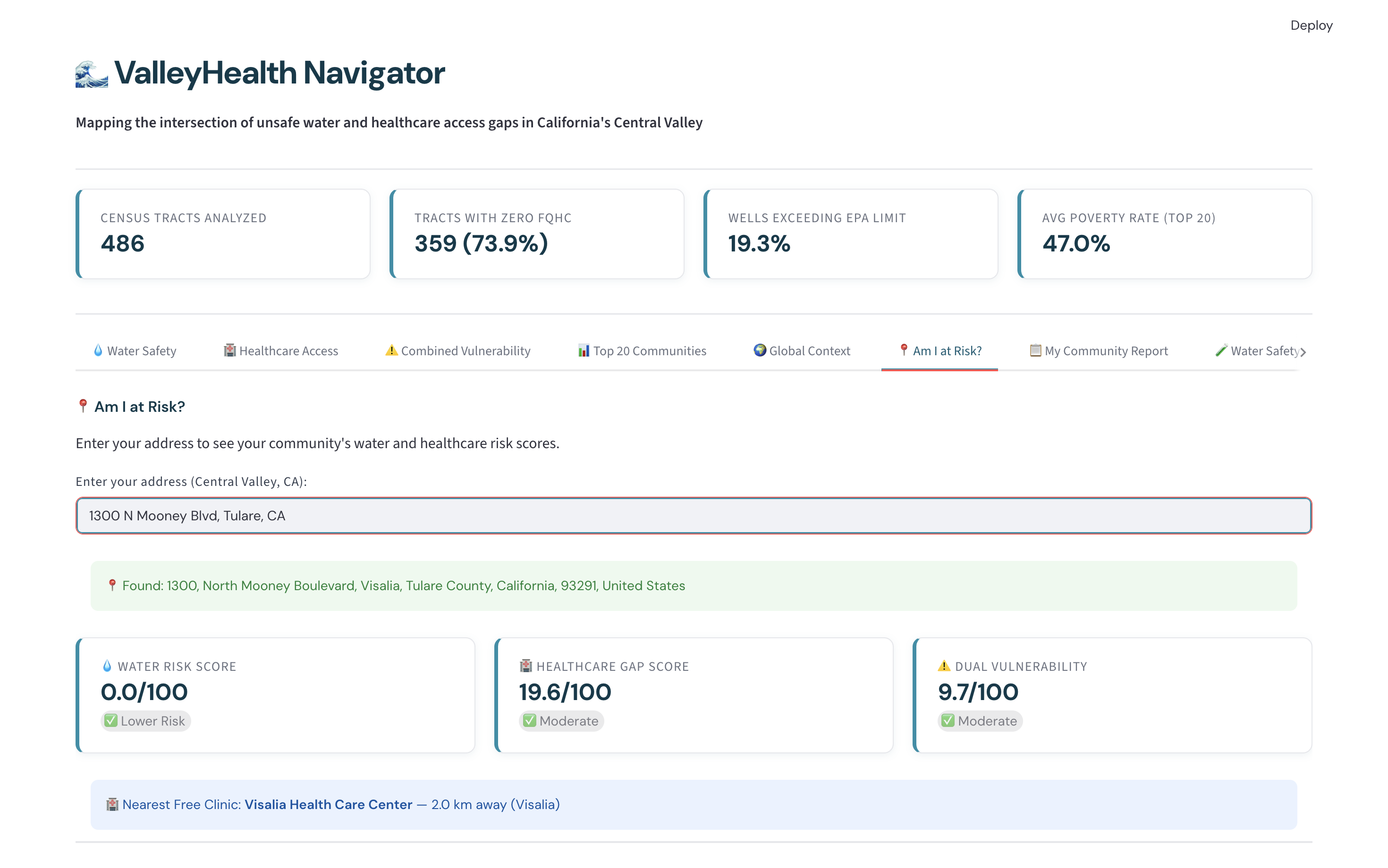
Am I at risk? - Enter your address to see your community's water and healthcare risk scores.
-
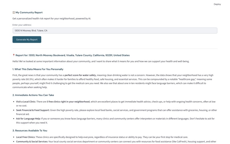
My Community Report - Get a personalized health risk report for your neighborhood, powered by AI.
-
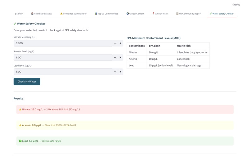
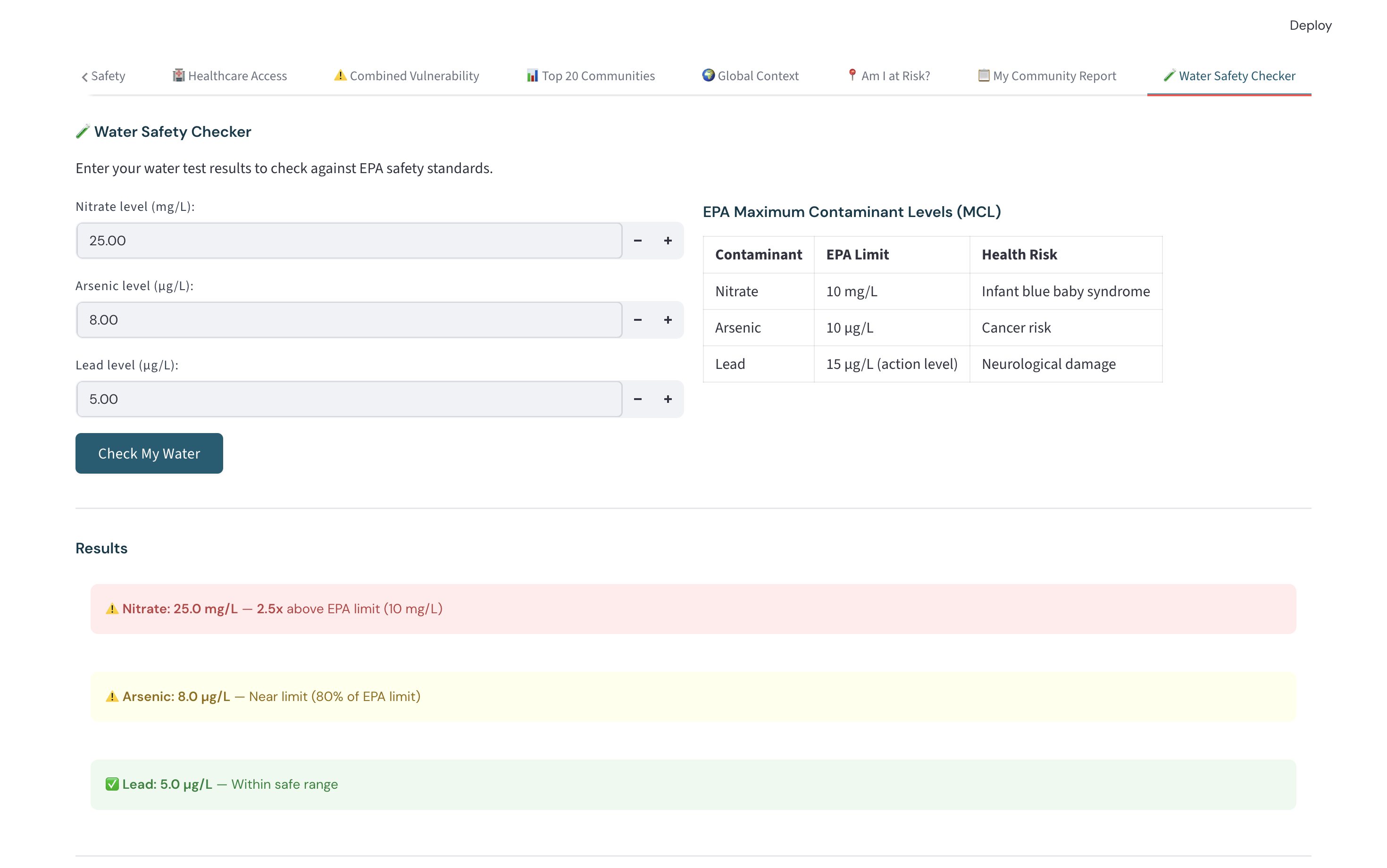
Water Safety Checker - Enter your water test results to check against EPA safety standards.


Inspiration
By taking a course on the history of California's Central Valley, I learned about water contamination issues in this region. The Central Valley is a region that feeds much of the world, yet struggles with some of the worst environmental health disparities in the United States. When I saw the HackMerced XI "Health for Social Good" theme, I knew I wanted to tackle this head-on. The question that drove this project: What happens when a community has both unsafe drinking water AND no access to healthcare? These two crises rarely get studied together, yet they disproportionately hit the same communities — low-income, predominantly Latino, linguistically isolated farmworker families. The statistic that shocked me most during research: California's Central Valley, in one of the wealthiest states in the world's largest economy, has water safety that ranks worse than 52% of all countries globally.
What it does
ValleyHealth Navigator is a dual-pillar public health dashboard with 8 interactive tabs:
- Water Safety Map — Choropleth map of groundwater nitrate contamination risk by census tract, built from 10,000+ GAMA well measurements
- Healthcare Access Map — Identifies healthcare deserts using FQHC locations and HPSA designations
- Dual Vulnerability Index — Combines both crises into a single score per census tract, highlighting the 20 most urgently underserved communities
- Top 20 Communities — Ranked table with data-driven policy recommendations
- Global Context — WHO global comparison showing where the Central Valley stands relative to 174 countries
- Am I at Risk? — Address lookup that returns personalized water and healthcare risk scores + nearest free clinic
- My Community Report — AI-generated personalized health report powered by Google Gemini 2.5 Flash
- Water Safety Checker — Input your own water test results and check against EPA limits
Key findings:
- 486 census tracts analyzed across 7 Central Valley counties
- 73.9% of tracts have zero FQHC within their boundaries
- 19.3% of well measurements exceed the EPA nitrate limit of 10 mg/L
- Highest recorded nitrate: 84.8 mg/L — 8.5× the EPA limit
- 89,518 people live in the top 20 most vulnerable tracts, with an average poverty rate of 47.0%
How we built it
Data Pipeline
- Downloaded GAMA groundwater data, CalEnviroScreen 4.0, US Census TIGER shapefiles, HRSA FQHC locations, and WHO Global Health Observatory data
- Merged all datasets on census tract GEOID using GeoPandas spatial joins
- Computed water risk scores from nitrate measurements, healthcare gap scores from FQHC coverage + poverty + linguistic isolation
- Built the Dual Vulnerability Index as a 50/50 weighted composite
ML Model
- Trained an XGBoost classifier to predict "High Risk" tracts (top 25% dual vulnerability)
- 94% accuracy, 93% recall on high-risk class
- Used SHAP values to explain feature importance: water contamination is the single strongest predictor
Dashboard
- 8-tab Streamlit interface with Folium choropleth maps, Plotly global visualization, and interactive address lookup
- Custom CSS design system (DM Sans/DM Mono fonts, teal public-health palette)
- Gemini 2.5 Flash API for personalized AI community reports
- Nominatim geocoding for real-time address-to-tract lookup
Challenges we ran into
- GEOID leading zeros — Census tract IDs silently lost their leading zeros during CSV read/write, causing every spatial join to fail. Fixed with
dtype={'GEOID': str}and.zfill(11) - CRS coordinate system mismatches — GeoPandas threw warnings when computing centroids in geographic CRS. Solved by projecting to EPSG:3857 for centroid computation, then reprojecting back to EPSG:4326
- Nominatim rate limits — The free geocoding API has a 1 request/second limit, which caused intermittent failures during testing
- CalEnviroScreen data mismatches — County names had trailing whitespace that broke joins with GAMA data; fixed with
.str.strip().
Accomplishments that we're proud of
- The "Am I at Risk?" feature makes complex environmental health data personally actionable for any Central Valley resident
- The WHO global comparison reframes a local crisis in globally resonant terms — California's water safety ranks worse than 52% of all countries
- SHAP explainability shows why the model flags certain communities, not just that it does — making the ML component trustworthy for real policy use
What we learned
- Spatial data engineering is genuinely hard — coordinate systems, GEOID formatting, and join keys will silently break everything if you're not careful
- Linguistic isolation (our third strongest ML predictor) is a proxy for immigrant and Latino communities facing systemic barriers — the data encodes inequity, and any responsible analysis has to name that
- Combining multiple open government datasets (EPA, HRSA, CalEPA, WHO, Census) can surface insights that none of them reveal individually
What's next for ValleyHealth Navigator
- Global expansion — Apply the dual-vulnerability framework to WHO member states as a global early warning system using the same methodology
- Real-time data — Connect to the CA State Water Board's live monitoring API for up-to-date nitrate readings
- Spanish-language interface for linguistically isolated communities who need this information most
- Mobile PWA for field use by community health workers and environmental advocates


Log in or sign up for Devpost to join the conversation.