-
-
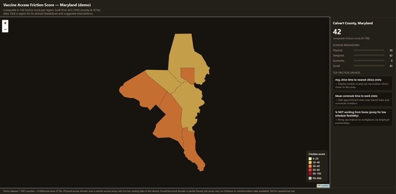
VAFS UI
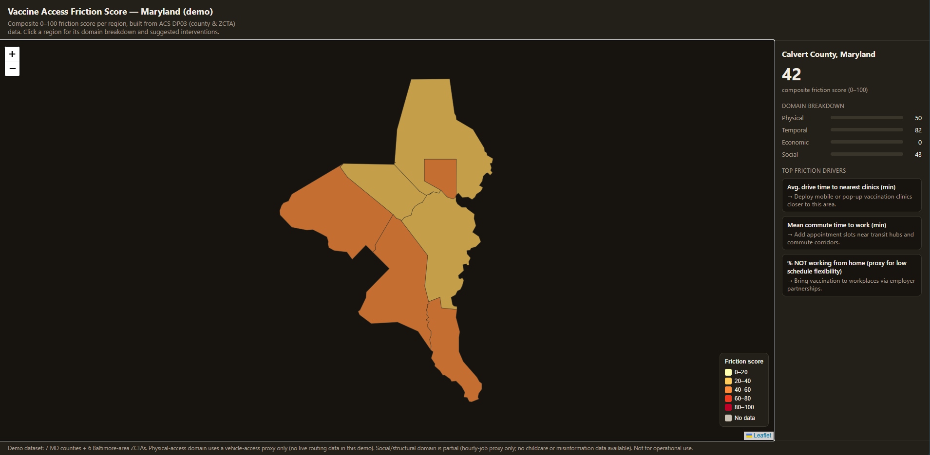
Inspiration
What inspired me to make this project was a TED Talk given by a Meyerhoff Scholar and UMBC alumna, Dr. Kizzmekia Corbett. She talked about how important the communication of science was for the sake of vaccine uptake. She called it ‘vaccine inquisitiveness’. The fact from the TED Talk that really sparked my idea for this project was that even before the pandemic, vaccine hesitancy was deemed to be one of the top 10 global health threats. Although that pertains to the side of skepticism and not logistical reasons, the issue of vaccine uptake became an interesting problem that I wanted to provide a solution to. I’m not the most confident in predicting the ins and outs of the psychological pipeline someone goes through when experiencing vaccine hesitancy but I do know the realistic barriers that can stand in the way of someone who wants to get vaccinated but has trouble doing so, and that’s what triggered my idea for the vaccine access friction score.
What it does
This project takes US Census Bureau socioeconomic data and formulates a score, the Vaccine Access Friction Score (VAFS), that measures how hard it is for people in a given community/county to actually get vaccinated, not just whether a clinic exists nearby. It pulls American Community Survey(ACS) data (employment, commute patterns, income, insurance coverage) at the county level, combines it with real drive-time data to vaccination sites, and rolls everything into a single 0–100 score broken into four domains: physical access (travel time, vehicle access), temporal access (work schedule rigidity, commute burden), economic/administrative burden (insurance status, income, public assistance reliance), and social/structural friction (hourly-job prevalence). Clicking any county or ZIP code on the interactive map shows its score, a domain-by-domain breakdown, and its top three individual friction drivers — each mapped to a concrete, suggested intervention (e.g., "high % uninsured → run no-cost walk-in clinics with insurance navigation on site").
How we built it
The pipeline runs in four stages: geocoding vaccination sites and computing real driving distances/times from the general latitude and longitude of a county to healthcares with vaccinations via the OpenRouteService API; pulling and cleaning ACS DP03 data for Maryland counties; computing per-region indicator scores, normalizing them to a 0–100 friction scale, and aggregating them into a weighted composite (with weights renormalized on the fly whenever a domain is missing data for a region, so a gap never silently drags a score toward 0); and finally rendering everything into a single self-contained HTML file — boundary polygons merged with scores, a Leaflet choropleth, and click-through detail panels — that needs no server, database, or API key to view. The main.py orchestrator ties all four stages together so the whole thing can be rerun end-to-end or resumed from any stage.
Challenges we ran into
The biggest challenge was being honest about what the data could and couldn't support. I wanted a "digital access" domain, but sectioning off cities into counties, specifying devices, and specifying dataplans in comparison to the general population of an area proved to be challenging. Rather than fabricate placeholder numbers, I dropped that domain and surfaced that gap directly in the UI. On the routing side, free-tier API limits meant batching origin/destination requests to stay under matrix size caps, and I also had trouble implementing real transit (bus/rail) routing options as well, which would require a GTFS feed and a transit-aware router like OpenTripPlanner, so I stubbed it out explicitly rather than approximating it with a multiplier and presenting it as real number.
Accomplishments that we're proud of
I’m proud that the project doesn't paper over its own data gaps — every score comes with a completeness accounting, and missing domains are flagged rather than faked. I built a real sensitivity analysis into the scoring model itself: it checks that each domain moves the composite score in the intuitive direction, and it measures how much the county rankings shift when a domain's weight is nudged up or down, so the weighting scheme isn't just a guess. And the whole thing ships as one dependency-free HTML file that deploys to GitHub Pages with zero configuration, making it easy for anyone — including non-technical stakeholders — to open and explore.
What we learned
Real-world civic and public-health data is messier than it looks from the outside: inconsistent geographies, suppressed values, and gaps in what's even measurable for free. Surfing through so many datasets, I learned that a transparent "here's what I don't know" is more useful, and more trustworthy, than a complete-looking score built on filled-in assumptions. I also got a much clearer picture of the actual free-tooling landscape for routing and geocoding (what OpenRouteService, OSRM, and GraphHopper can and can't do), and the value of building the pipeline as reusable, rerunnable scripts instead of one-off notebooks.
What's next for VAFS
Next steps include expanding coverage beyond the current 7-county Maryland demo to a full state or multi-state footprint; adding real transit-time data via GTFS feeds and OpenTripPlanner instead of leaving that domain blank; filling the digital-access and childcare-constraint gaps as suitable open datasets become available; and validating the friction score against actual vaccine uptake data (a validation hook already exists in the scoring code, just waiting on a real uptake dataset to test against). Longer term, I'd like to work with local health departments to pilot the suggested interventions in the highest-friction areas and see whether targeted action actually moves uptake.
Built With
- cdc-open-data
- claude
- copilot
- numpy
- openrouteservice
- pandas
- pathlib
- scipy
- shapely

Log in or sign up for Devpost to join the conversation.