-
-
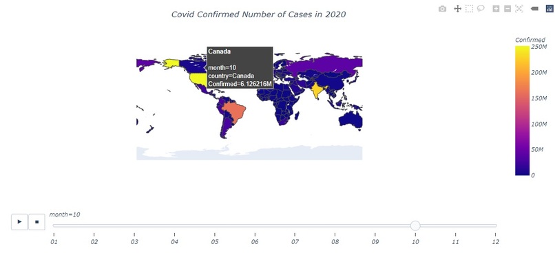
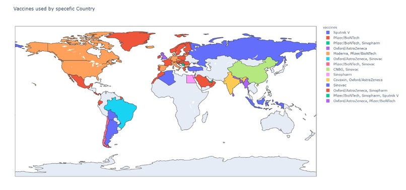
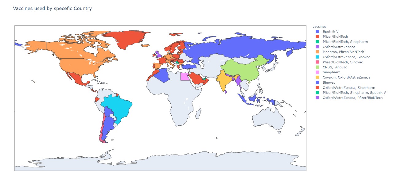
Example of COVID heat map.
-

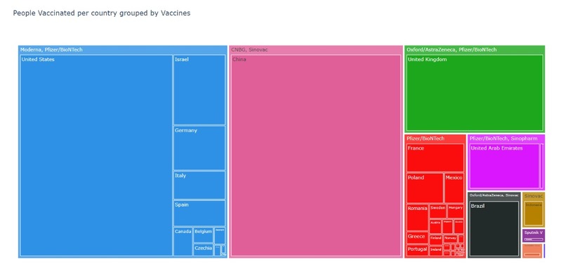
Example of COVID heat map.
-
-
-
-
-


Inspiration
Each of our teammates were fascinated by the healthcare challenge right off the bat! We had different ideas, originally considering making a color coordinating application that would allow the user to upload a color and return a color palette that would create a more positive atmosphere in hospital rooms. We quickly changed gears, reflecting on how each of our lives had been affected by the current pandemic. To begin anew, our search was for a dataset that we could use, hopeful that browsing data would spark an idea. And it did! Once we found the datasets we used in the project, our team quickly put together an idea: fight COVID where it is fighting the most. Vaccine deployment has been structured in the countries that it reaches, but it seemed that the chosen countries were the most developed or most capable of paying for the vaccine. To reach a state of pre-COVID, we believe it would be most beneficial to send vaccines to the places most ravaged by COVID and then move outward to places better facing the disease.
What it does
Currently, our project parses through Excel sheets of relevant data regarding COVID-19 cases and creates a heat map of where the cases are the most concentrated. Our project also displays this information in an API format.
How we built it
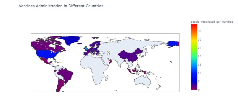
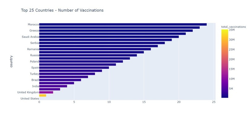
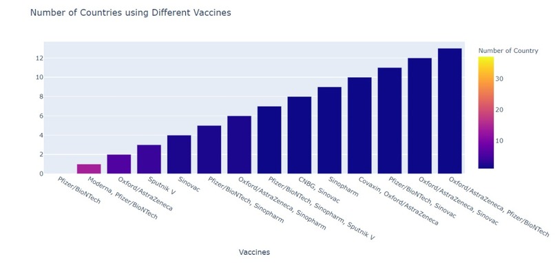
Vaccine Visualization
- Plotly in Python: The Plotly Python library is an interactive open-source library. This can be a very helpful tool for data visualization and understanding the data simply and easily. The thing that I liked the best with Plotly is that it has hover tool capabilities that allow us to detect any outliers or anomalies in many data points. The graphs produced are visually attracted and better to comprehend.
- Nltk(Natural Language Toolkit): This is one of the most usable and mother of all NLP libraries. This toolkit is one of the most powerful NLP libraries which contains packages to make machines understand human language and reply to it with an appropriate response.
- Wordcloud: A Wordcloud (or Tag cloud) is a visual representation of text data. It displays a list of words, the importance of each being shown with font size or colour. This format is useful for quickly perceiving the most prominent terms.
Project API
- Python, SQLite3, and Excel To begin, I familiarized myself with the data using Google Colab. I played around with different focuses, trying to understand how the data would be most useful to a user. Then, I took the data from its csv format and used SQLite3 to transform it into a database. I searched through quite a few conversion sources before finding one that was readily available and free for use. I then wrote up a Python script to create the API, defining the parameters that could be used to search through the API and creating a json for each data entry.
Challenges we ran into
- Collaborating over time zones made group meetings more difficult
Accomplishments that we're proud of
- Created first API!
- Competed in first Hackathon!
What we learned
- Planning out the challenge we wanted to tackle beforehand was a great way to start, it allowed us to hit the ground running and focus on the programming of the project!
What's next for Vaccine Recommendation Project
The next step would be to integrate each aspect of the project, allowing us to make real time recommendations on where the vaccines should be concentrated based on the parts of the world that need it the most.


Log in or sign up for Devpost to join the conversation.