


Inspiration
An internet rabbit hole once took me to a site called User Inyerface, a website where you had to accurately fill a form in the shortest time possible, with a catch: the form was purposely built with the most atrocious user interface/experience you could imagine, so it presented a fun (albeit useless) challenge while simultaneously providing me with a good laugh.
When I heard about Hacklarious and was brainstorming silly ideas, this website resurfaced to the front of my mind, and I started thinking of ways to put a unique spin on it. Perhaps, I could create a mobile version of this website as an app, and treat navigating bad UX as a fun game. That's where the idea for User Inexperience emerged.
What it does
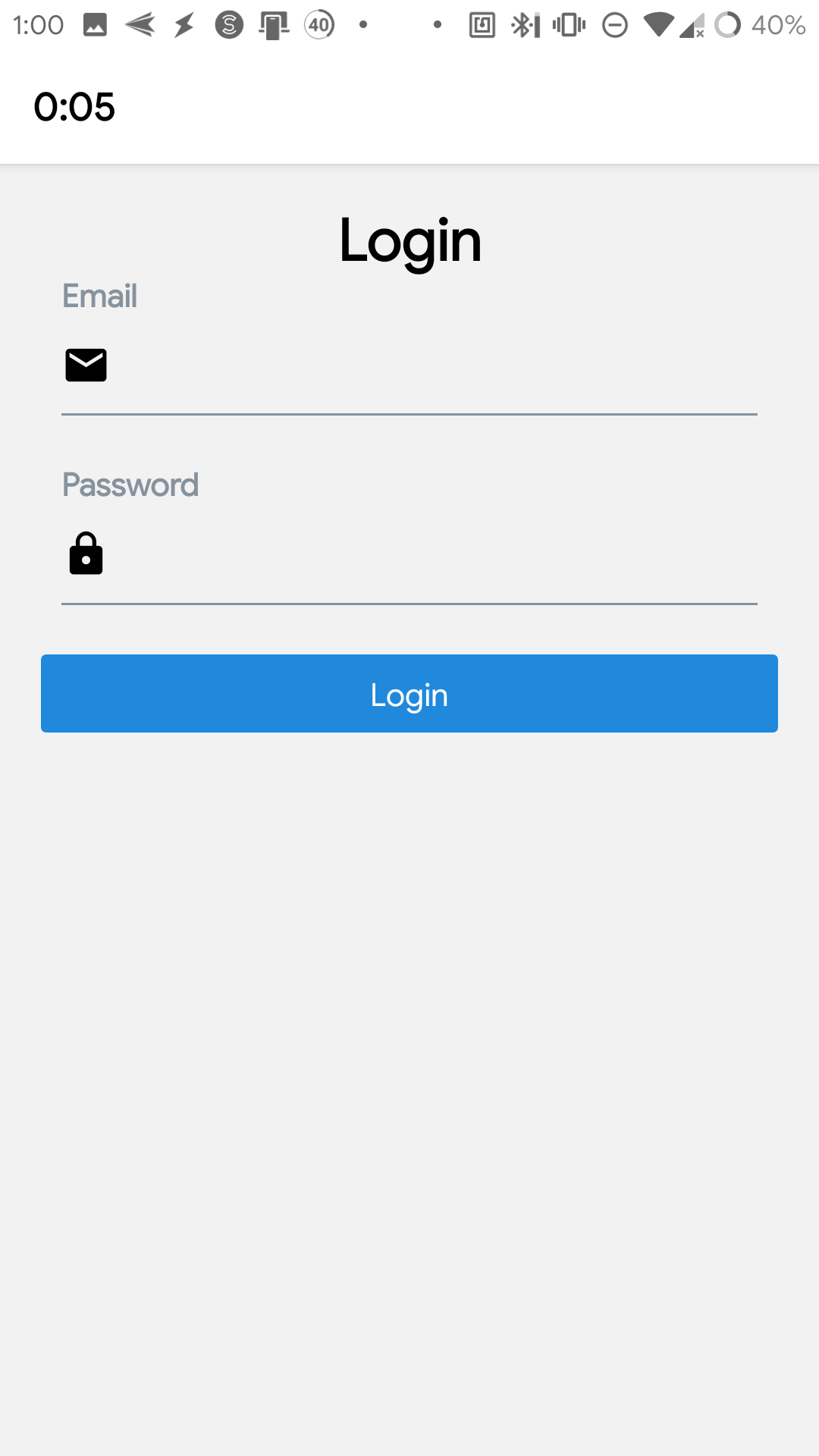
User Inexperience as an app that puts you in a competition with others to try and complete a simple task in an with horrible UX. Due to the 24-hour time limit of Hacklarious, we decided to only implement one of these "levels," where the task is to simply create a checklist item in a todo list app. Sounds easy, right?
Of course, no todo list app is complete without its unique features. Some of the "nifty" features of our todo app include:
- An unskippable 5-second ad that pops up every minute
- The most unintuitive account creation pages you'll ever see...
- Random error messages that DON'T tell you how to fix them
- Perhaps the most unreasonable paywalls for basic features of a checklist app
- The worst design choices for simple actions with todo items
- Extremely questionable ways to navigate the app
Oh, and did we mention the omni-present ticking timer that's designed to stress you out?
After the torture ends and you successfully complete your simple task, you are brought to a leaderboard screen and your time is logged (anonymously, if you prefer) and displayed for the world to see: Congratulations, you are a master of navigating horrendous UX.
How we built it
The original idea started out on a whiteboard:

We then started building the app using React Native and Expo. Expo allows us to run our app across multiple devices and platforms, which makes it extremely easy to develop and test. We also used a bit of Node.js + Express to host a server to interact with our MongoDB backend.
We used many APIs and technologies, including:
- Similar Words API - This was used for our "Word of the Day" ad, and because we couldn't find a free word-of-the-day ad online that didn't require a credit card, we instead decided to combine this synonym finder API with an NPM package to simulate the "Word of the Day"
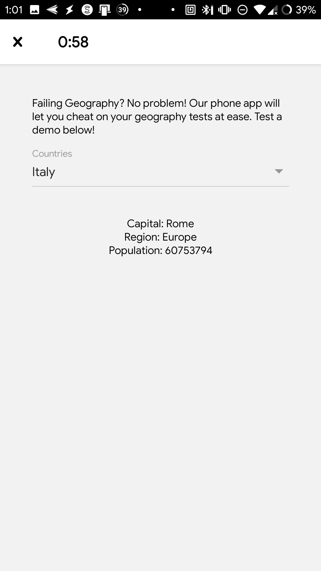
- REST Countries API - This was used for an ad for "an app that helps you cheat on Geography tests." It gave the user a "demo" by presenting them with a dropdown where they can select a country from the complete list given by this API.
- Numbers API - This was in an ad for an education institution, as it gave a fun fact about numbers and proceeded to inform the user that they could learn more facts like these by signing up for their free* course (*to only the last person who registers, of course).
- YesNo API - This was used to decide whether or not the user would be able to delete a todo, helping simulate the frustrations of a buggy app that only sometimes works.
- MongoDB Atlas - This was used to store the usernames and times of the users that completed the Todo List challenge to display the leaderboard at the end.
- Node.js + Express - Used to communicate with the backend MongoDB Database.
- React Native + Expo - Used to develop and test the mobile app.
Challenges we ran into
Developing a terrible UX has one clear downside, you kind of have to deal with this terrible UX yourself when testing your app. As you can probably notice from the video (which took more than one take), actually trying to "beat" our game was a lot less fun and enjoyable than coding it. This is likely because we needed to restart the game every time we made changes, or to have to pass certain parts of the game in order to debug a particular screen.
Accomplishments that we're proud of
We're proud of developing an app that's mainly about exaggerating terrible user experiences, because this required us to often dive deeper into parts of React Native, as React Native is generally designed around good UX. As follows, we needed to explore the APIs a bit deeper compared to our previous dives, but it taught us more low-level aspects about React Native that we can now powerfully use in the future.
What we learned
We have learned that UX is extremely important to a good user impression. We've learned UX bad practices and now know to avoid them when making our own apps.
What's next for User Inexperience
With the time limit of 24 hours, we were not able to implement all the annoying features we had hoped to implement. We could add plenty more silly ads, awful UX design choices, and dumb errors that don't mean anything and a variety of other annoying features.


Log in or sign up for Devpost to join the conversation.