-
-

Users are greeted with a clean, minimalist interface.
-

Clear, easy-to-understand phrasing allows users to easily provide input.
-

Autofill support saves users from the burden of manually entering data.
-

Conditional layout shows and hides elements appropriately.
-

Contextually-aware tooltips automatically appear at potentially confusing parts of the form.
-

Confirmation text helps verify the accuracy of the data.
-

Prefilled data makes it clear what data needs to be provided.
-

Translation support allows non-English speakers to use the form.
-

Form validation catches incorrect data and prompts user to fix it.
-

Optional fields can be skipped.
-

Presubmit preview shows summary of data filled out and option to fix it.
-

Required statements displayed in popover UI ensures users read it.
-

Electronic signature certifies user.
-

Form download option allows users to store submission for their records.
-

School district login page allows districts to view submitted responses.


USDA Reduced Lunch Online Form Design
Thanks for visiting. Over the past few months, we've been working on a really cool online form that lets parents sign their children up for free and reduced school lunches. Our design includes a public user-facing interface for parents and guardians to apply for reduced school lunches as well as a password protected school-facing interface for school administrators to view and download the submitted applications.
Online Access
For testing purposes we have set up a server, and you can view our form online here:
- Application Form for Parents/Guardians
- Administrator Portal for School Districts
- Username: USDA
- Password: Demo
Features
We have really focused on providing users an easy, intuitive experience by providing features such as a minimalist interface, helpful animations, form validation, guidance tooltips, autocomplete, easy navigation flow, submission preview, translation support, accessibility support, and cross-platform compatibility.
Minimalist Interface
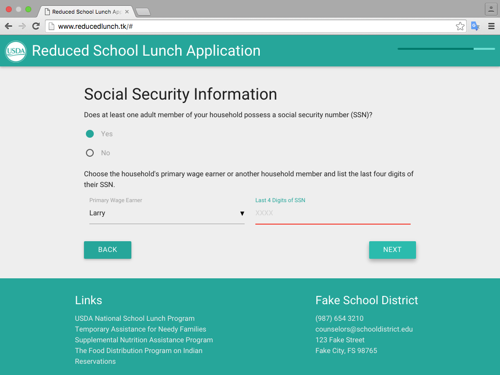
When users arrive to our form, they are greeted by a simple yet powerful interface that displays the relevant information front and center in a crisp, readable font with brightly colored buttons that are easily clickable. A thin, unobstructive header indicates that the form is for the reduced school lunch program and contains a progress bar, and a footer contains relevant links, leaving most of the screen for what the user is here for: filling out the form. We avoid using unnecessary images, which tend to be distracting and remove focus from the form elements. Instead, we pull off a modern look and feel by adopting a bicolor theme and lots of subtle elements such as shadows and font effects.
Helpful Animations
Sleek animations augment our minimalist interface by increasing user experience. Moving the cursor over clickable buttons cause them to light up and appear "deeper", informing users that they can click there. Activating a text field causes it to change color and retains a text label so that users know where they are typing and what the field is asking for. Having horizontally sliding panels leads to the illusion that progress is being made quickly and the form is going by fast.
Form Validation
Before allowing users to continue to different sections of the form, we ensure that the information they enter is valid. We do this in a nonintrusive manner that doesn't overwhelm the user with a bunch of red "invalid entries" messages. Instead, we wait for users to enter text and only highlight it as invalid when they have entered something that is incorrect. When users try to continue, but have a mistake in their form, we highlight that mistake and scroll directly to the textfield with that mistake, so they can resolve it and continue instead of having to guess what's wrong.
Guidance Tooltips
Our application uses many guidance tooltips to provide additional definitions, clarifications, and advice to users filling out the form. Whenever the user gets to a section that we think is potentially confusing, we display a small tooltip in the top right of the screen with a helpful message. When they move on to another section, the tooltip disappears so the form doesn't get cluttered. What sets our tooltips apart is the fact that they are contextually aware. For example, when the user arrives at the field to enter their address, we automatically display a reassuring message that their address is not required or if a user is about to click a checkbox, we'll show a definition of what the checkbox means. This is significantly better than the standard approach which requires the user to hover over certain text in which they need to go out of their way to access the tooltip while our method guarantees that they see it, making the contained information essentially unavoidable.
Contact Autocomplete
We configured our form to work with the autocomplete feature on many browsers, allowing browsers to automatically fill out some form fields, saving users' time and making their job easier.
Easy Navigation Flow
We have made it very easy for users to navigate through our form and go back to change things. We accomplished this by using a robust data model that is very flexible and allows us to replace information already collected and dynamically change the path of the flow being taken. As a result, users can go back at any time and easily change any of the information they entered. Additionally, a progress bar at the top of the form indicates what portion of the form is left and gives users an idea of what more to expect. Also, another small, but helpful feature in our navigation is the ability to use not only the buttons on the form to navigate, but also the back buttons on their browsers. This prevents situations in which users mistakenly click the back button and lose progress on the form.
Submission Preview
We have provided a nice way to see all the information entered in the form before submitting it. This not only allows parents to verify what they've entered before submitting the form, but also a way to see what provided information school districts will be reviewing. Upon submission of the form, they can download this information as a printable PDF for their records.
Translation Support
We are aware that English isn't the primary language for a significant portion of families applying for reduced school lunches. Thus, we designed our website to support multiple languages. Since most non-english speakers have translation plugins installed on their browsers to translate websites realtime, we tested our form with many of these commercial tools to ensure that it works in languages such as Spanish.
Accessibility Support
We made our form user friendly for people with disabilities by adhering to accessibility standards and maintaining compatibility with accessibility tools found on commercial computers. We maintained a high contrast ratio in the colors we used so that people with poor vision can still use our form. We also configured the UI elements so that they work with switch control, an alternative input method for those that can't operate keyboards and mice.
Cross-Platform Compatibility
We made sure our form works on many browsers, many operating-systems, on desktops, on laptops, on tablets, on smart phones. See the Compatibility Testing portion of this document for more info on how we accomplished that.
Development
We've written about the technologies we've used, the codebase, and getting started on our Github.
Testing
In order to create the best form that we can, we conducted various types of testing and used the results from our testing to improve the design, efficiency, and compatibility of our reduced lunch school application form. We've written about the testing we did on our Github.


Log in or sign up for Devpost to join the conversation.