-
-

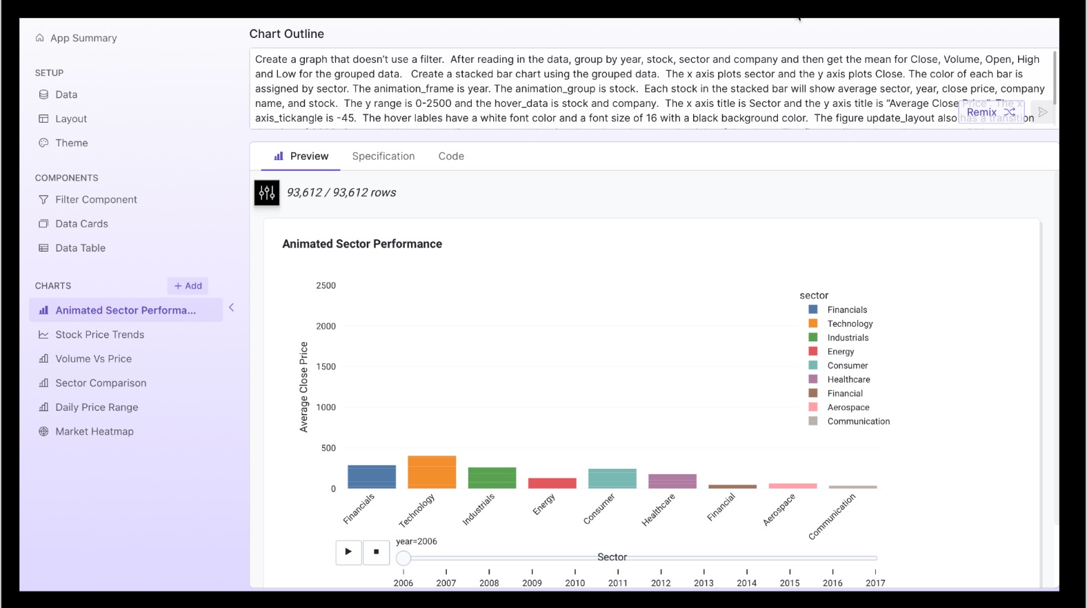
Plotly Data Analysis Generated In Plotly Studio
-
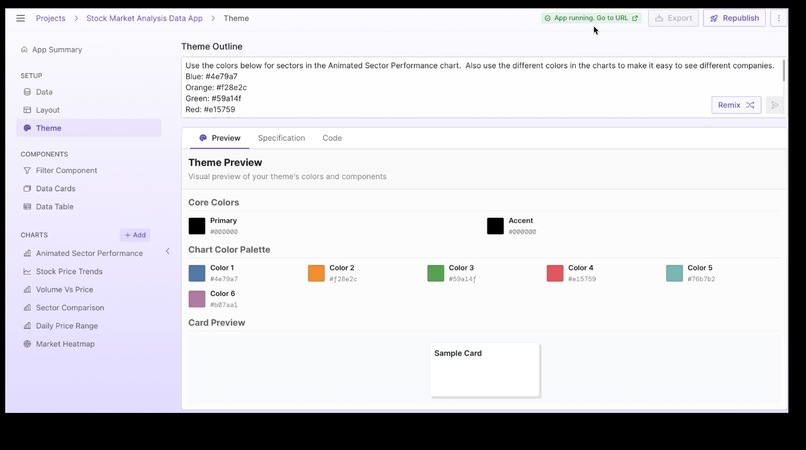
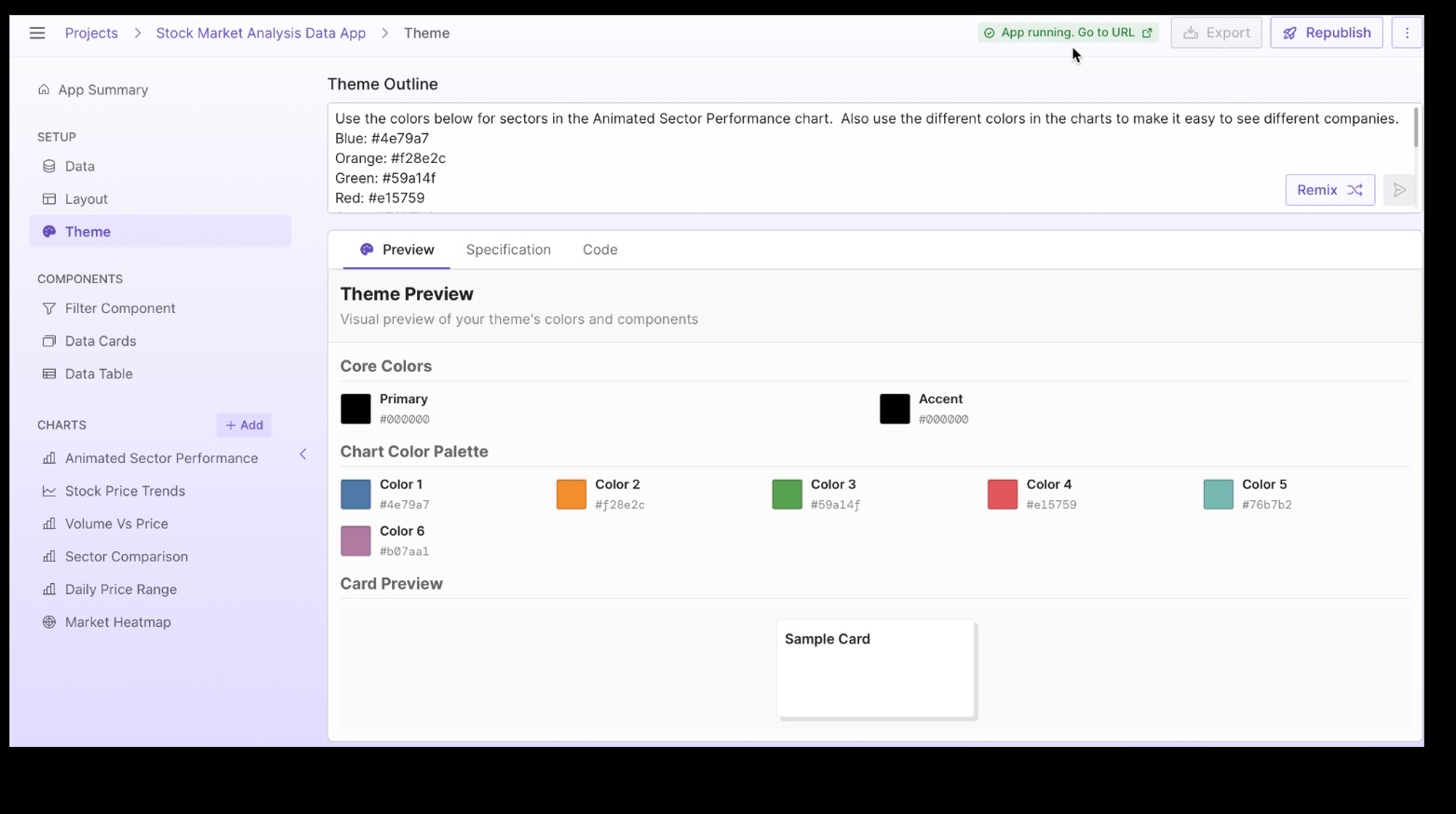
Working with Theme prompt
-
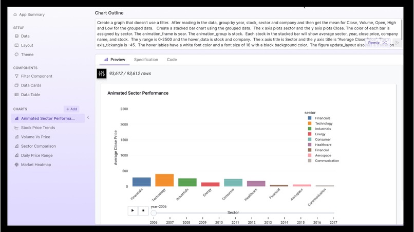
Remixing Chart prompt
Inspiration
I was working on a Jupyter Notebook with a Plotly animated chart and when I saw this hackathon, I thought it would be interesting to figure out how to include this chart in the dashboard cretated by the Plotly Studio. I wanted to see how I could use AI to recreate the chart I had in Jupyter Notebook. Also, I really like working with Plotly and it was an opportunity to learn their new technology.
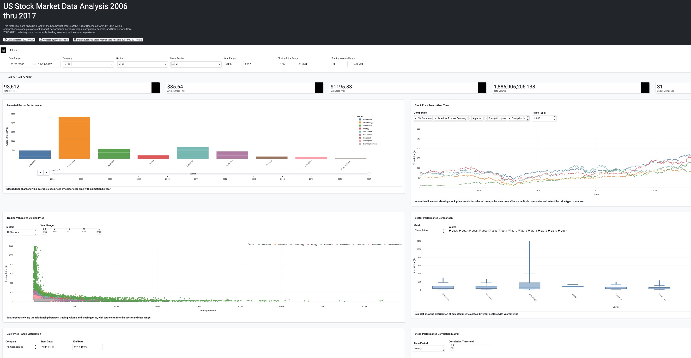
What it does
It provides an analysis of stock data around a turbulent time in the US economy, namely the "Great Recession" of 2007-2009.
How we built it
I created a dataset for use in the Studio that involved merging some of my data with a dataset from Kaggle.
Challenges we ran into
I spent some time learning how to make a prompt that would generated the animated performance sector chart that I had worked on in a Jupyter notebook. I also spent time learning about code and theme remix. I updated that colors used in my charts by remixing a theme.
Accomplishments that we're proud of
I like the way the charts turned out. I'm really happy to have learned how to use the Plotly Studio and see how it integrates with the Plotly cloud.
What we learned
It's possible to prompt your way to a beautifuly Plotly Dashboard. I appreciate being able to use AI to generate analytics. I think using AI forces you to become good at describing what you want to see your data do in a chart.
What's next for US Stock Sector Analysis 2006-2017
I want to share what I learned with others. I'm involved in education and will look for ways to share this.

Log in or sign up for Devpost to join the conversation.