-
-

US Police Shootings by Data
-
Coding Overview of Data Visualization


Inspiration
We tried to look at relevant information as it pertained to the real world, so we thought what better to crunch data on than the most prevalent hot topic: Policing.
What it does
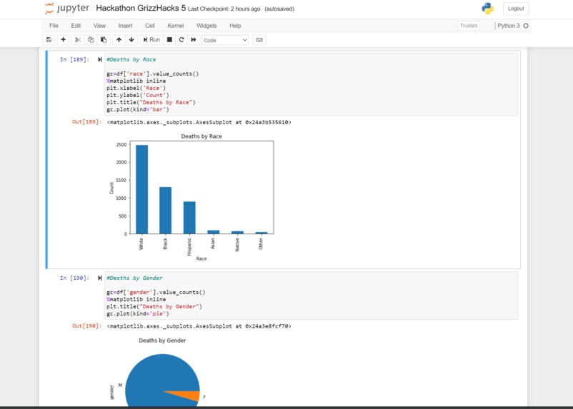
This project takes the total number of deaths by police in the United States and visualizes the data to break it into a few categories: Deaths by race, gender, state, age, mental illness, fleeing, and threat level.
How I built it
We used Anaconda version of Python to utilize Jupyter Notebook, which then allowed us to use libraries such as Pandas and Matplotlib.
Challenges I ran into
This project started with two go-getters and quick learners with only problems. There were no plus sides as we both nearly 9,000 miles apart completed all of these tasks via only text messaging and had the basic understanding of python. We tackled and learned every function and command line as we went, so when locating challenges, everything was a challenge that we fiercely defeated!
Accomplishments that I'm proud of
We are proud that have utilized downloaded the Anaconda version of Python which allows us to utilize the libraries. Most importantly, this was the first and successful data science project we have completed! It visualizes the data just as we have hoped for it too.
What I learned
We learned how to import libraries in order to visualize the data which was also imported from excel. We were able to clean the data, however, it was not necessary at all. We then learned to visualize parts of the graph to display the columns and variables we wanted.
What's next for US Police Shootings
What's next is that data never lies, it should be utilized by government officials, public speakers, and people in general to have the facts of policing in the United States by case for the past 4 years. Decisions should be made from visualizations of the graph and the data that it is derived from.
Read more about the issue at: https://www.washingtonpost.com/graphics/investigations/police-shootings-database/


Log in or sign up for Devpost to join the conversation.