

Inspiration
I created this project as I have always wanted to learn data visualization and was presented with The Correlates of War Diplomatic Exchange Data Set provided by the State Department. I do school research and most of the graphs I make are made with statistical analysis packages or Excel, programs that do not create visually appealing representations of graphs, and are severely limited by how complex the data can be. I was excited to learn how to use a better system for creating depictions of data. I believe this is especially important in an age where communicating to the general public how to accurately interpret data is becoming increasingly distorted and misleading.
What it does
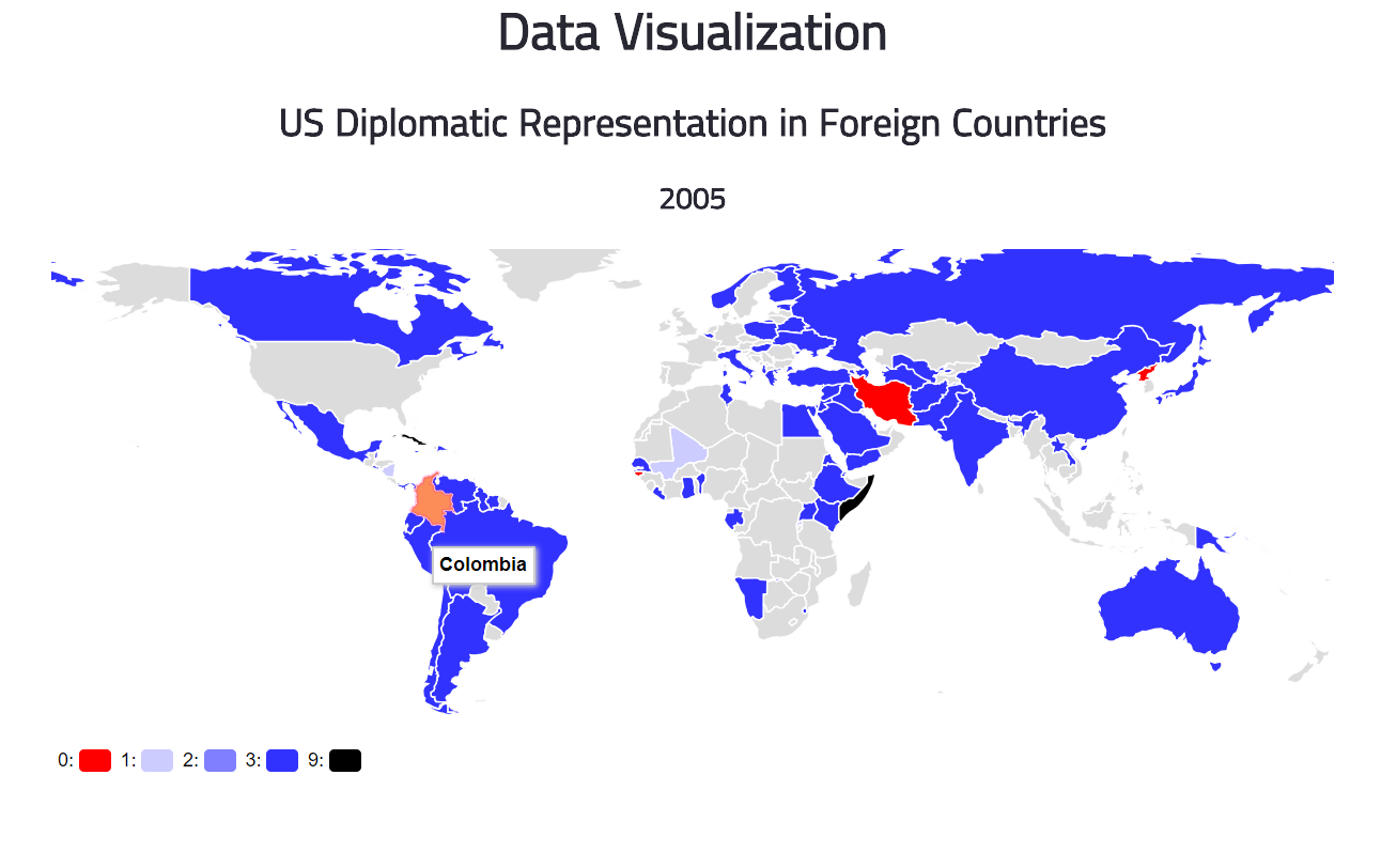
This was a simple data visualization project made with D3.js and The Correlates of War Diplomatic Exchange Data Set provided by the State Department. It visualizes US diplomatic representation levels in foreign countries on a world map over time. The main page allows you to choose a time, and then it takes you to a page with the map. I utilized a choropleth map design, with the intensity of the colors increasing with diplomatic representation levels, with no diplomatic ties indicated by red and other misc. levels by black. A level of user interactivity exists in which the country name appears when a user hovers over its region.
This allows for users to see how diplomatic relationships between the US and other countries have progressed over time. Important years such as the first year data exists, the start of World War II, and the most recent year the data exists are included. It is important to understand how the US has and currently stands on the world stage.
How I built it
Everything was made on Cloud9, utilizing the D3.js JavaScript library. Data was from the Correlates of War Diplomatic Exchange Data Set provided by the State Department.
Challenges I ran into
This was the first time I have ever worked with data visualization, so I had to learn how to use D3.js by myself. Data cleansing took much more time than anticipated, but in the end it all turned out alright.
Accomplishments that I'm proud of
I am very happy I was able to make the map at all. It was an extremely frustrating process as I had no experience in data visualization before, but also very exciting when everything started to work.
What I learned
I learned the basics of D3.js and for the first time did some data visualization outside of Excel (haha jokes). It was really fun and freeing to be able to make graphs without the constraints of automatic graph generators, but also frustrating. I started off how to make simple bar graphs, but throughout the hackathon I was able to learn how to make heat maps and then was able to create this simple project. I also learned how to scrub data so it would work with the program I created.
What's next for US Diplomatic Representation in Foreign Countries
As this was my first time using D3.js, I spend the majority of my time just learning how to use it, but I have lots of ideas in how to improve.
In the future I hope to have everything on one interactive webpage, with a timeline slider along the bottom that would allow the user to change the year represented by the world map. This would allow for a more comprehensive understanding of how diplomatic ties have evolved over time.
In addition, I plan to add a function where a country can be selected for which country's diplomatic representation levels are represented in foreign countries, instead of only the US's diplomatic representation levels.
Lastly, I also hope to make the page more visually appealing, as that is key to data visualization.


Log in or sign up for Devpost to join the conversation.