-
-
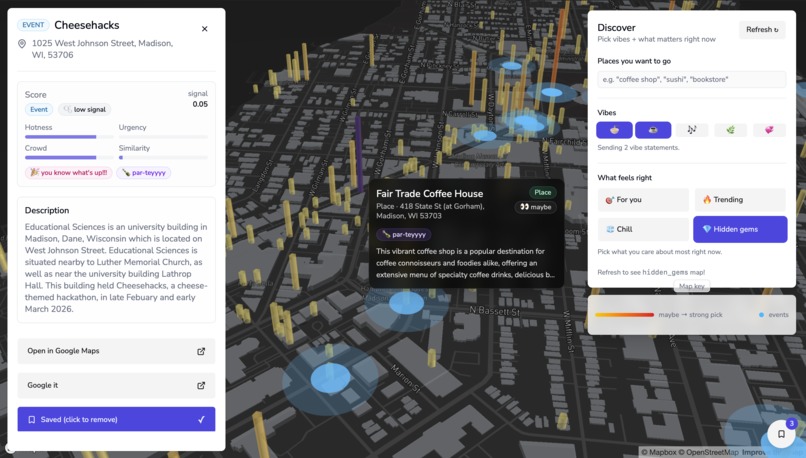
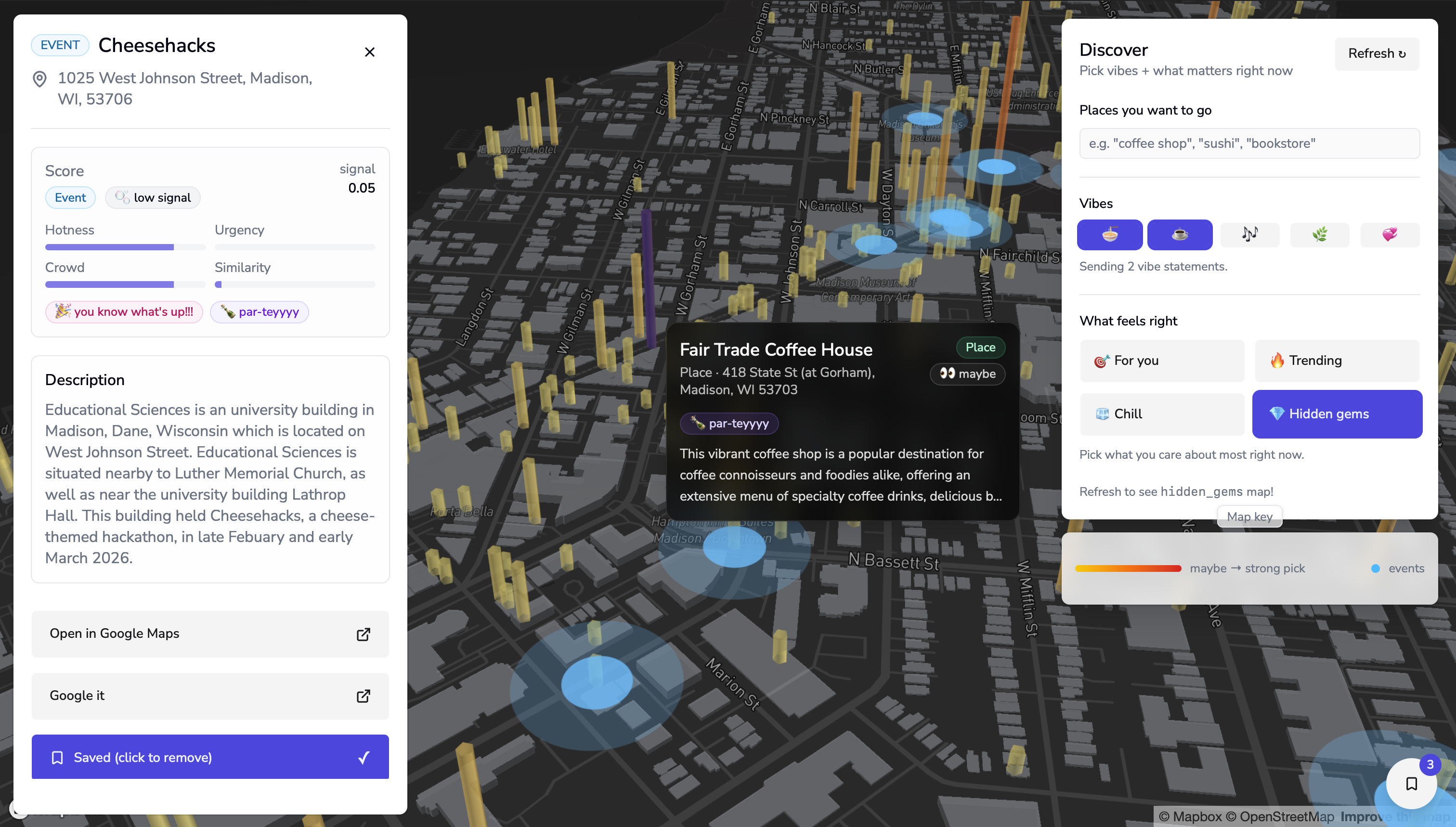
our state of the art UI
Inspiration
Cities are full of life — events, spaces, gatherings, and opportunities — yet much of that activity is invisible unless you already know where to look. We were inspired by the idea that people don’t lack places to go; they lack awareness of what’s happening around them in the moment. UrbanPulse started as a way to make the “pulse” of a city visible, helping people notice where the city quietly comes alive.
What it does
UrbanPulse visualizes activity across a city by aggregating signals such as relevance, popularity, crowd level, and urgency. Instead of browsing venue by venue, users can instantly see where energy is concentrated and explore areas that match their interests or mood. The goal isn’t to recommend a single place, but to help people understand their environment and discover nearby opportunities more naturally.
How we built it
We built UrbanPulse as a pipeline that turns scattered city signals into a unified spatial view. On the backend, we ingest real venue data for Madison and enrich it with foot-traffic signals from BestTime, event timing information, and keyword relevance computed using TF-IDF cosine similarity. We then combine these signals into a contextual score that adapts based on the selected exploration mode (relevant, trending, hidden gems, or chill). On the frontend, we used React and deck.gl to render a 3D visualization where each column represents the activity level of an area. The visualization updates in real time based on user input, allowing people to see how the pulse of the city shifts with different interests. The result is a system that transforms raw place and event data into an intuitive visual representation of urban activity.
Challenges we ran into
One challenge was translating abstract signals like popularity, urgency, and crowd level into a scoring system that felt meaningful rather than arbitrary. We had to iterate on normalization, weighting, and visualization scaling to make the results interpretable. Another challenge was data integration — matching venue records across sources and aligning them geographically required heuristics and fallbacks. We also had to balance real-time responsiveness with computational cost so the system could update quickly during the demo. Finally, designing a visualization that communicates context without overwhelming the user took several iterations.
Accomplishments that we're proud of
We’re proud that we built an end-to-end system — from data ingestion and scoring to an interactive visualization — within a short hackathon timeframe. We successfully combined multiple signals into a contextual score and translated it into a spatial visualization that clearly responds to user input. Most importantly, we created something that helps people understand their environment at a glance rather than browsing venue by venue.
What we learned
We’re proud that we built an end-to-end system — from data ingestion and scoring to an interactive visualization — within a short hackathon timeframe. We successfully combined multiple signals into a contextual score and translated it into a spatial visualization that clearly responds to user input. Most importantly, we created something that helps people understand their environment at a glance rather than browsing venue by venue.
What's next for UrbanPulse
Next, we’d like to improve data freshness and expand beyond a single city by automating ingestion pipelines. We also want to experiment with richer semantic matching and more personalized weighting so the pulse can adapt more precisely to individual users. Long term, we see UrbanPulse evolving into a tool that helps people feel more aware of their surroundings and discover opportunities they might otherwise overlook.


Log in or sign up for Devpost to join the conversation.