-
-
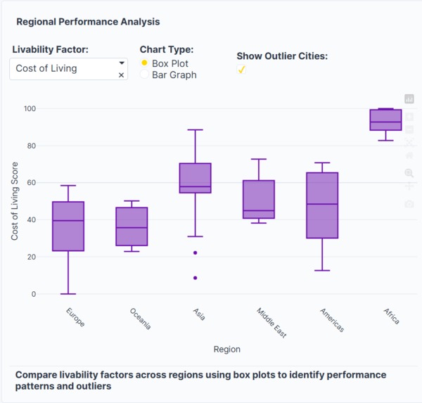
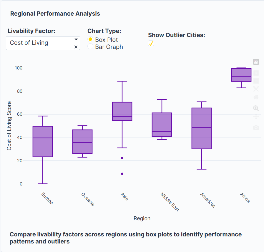
Regional comparing plots
-

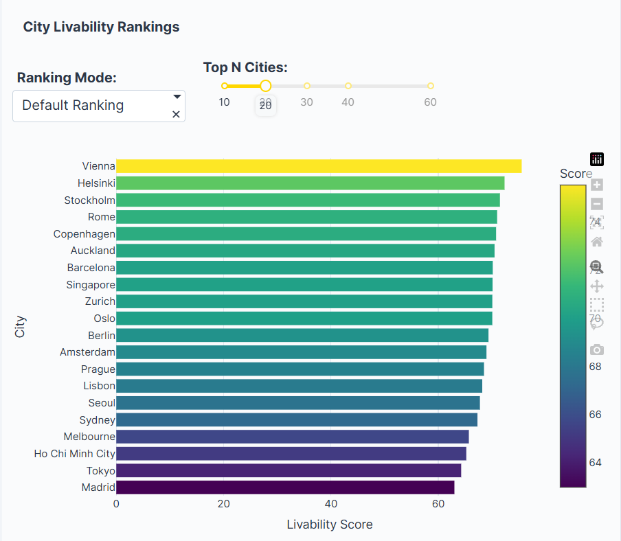
Normal Ranking
-
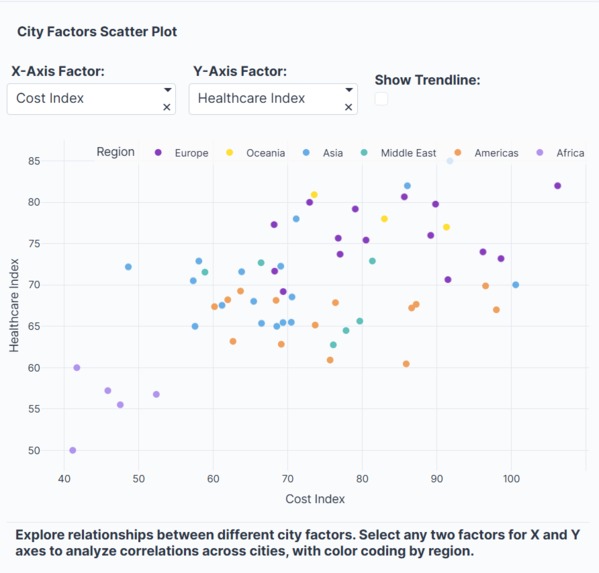
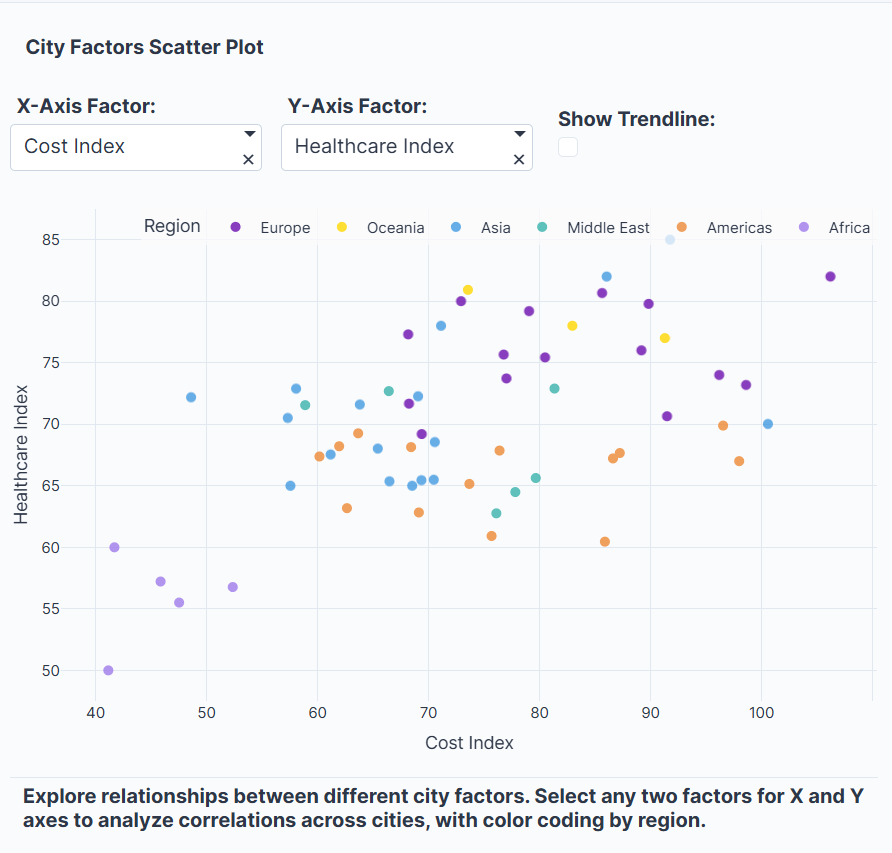
Scatterplot comparer
-
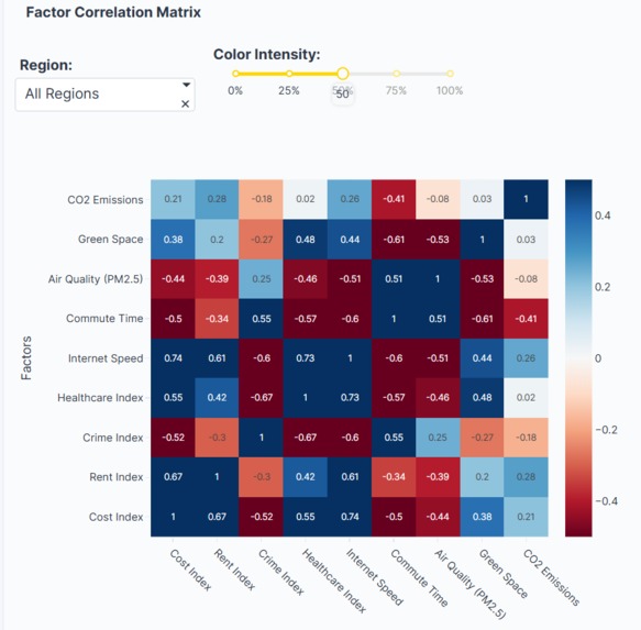
Factor Matrix
-
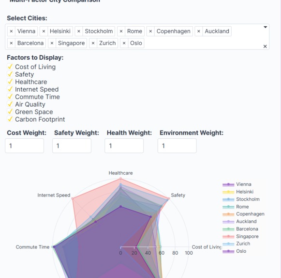
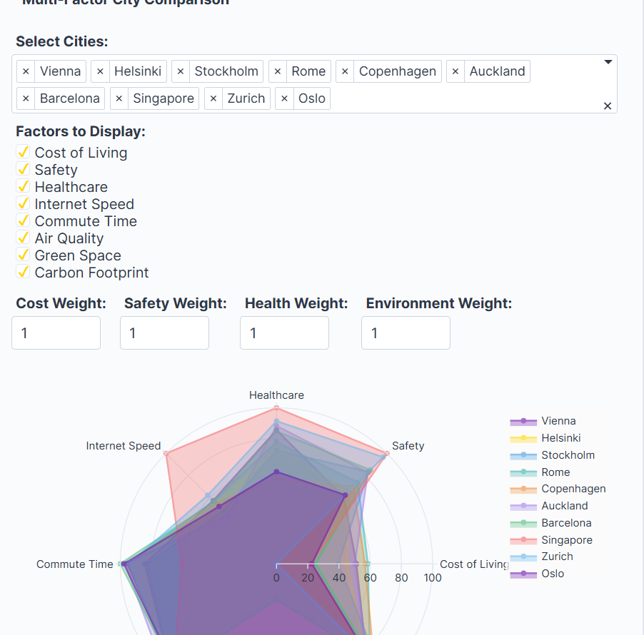
Radar City comparer
-
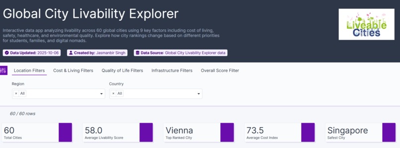
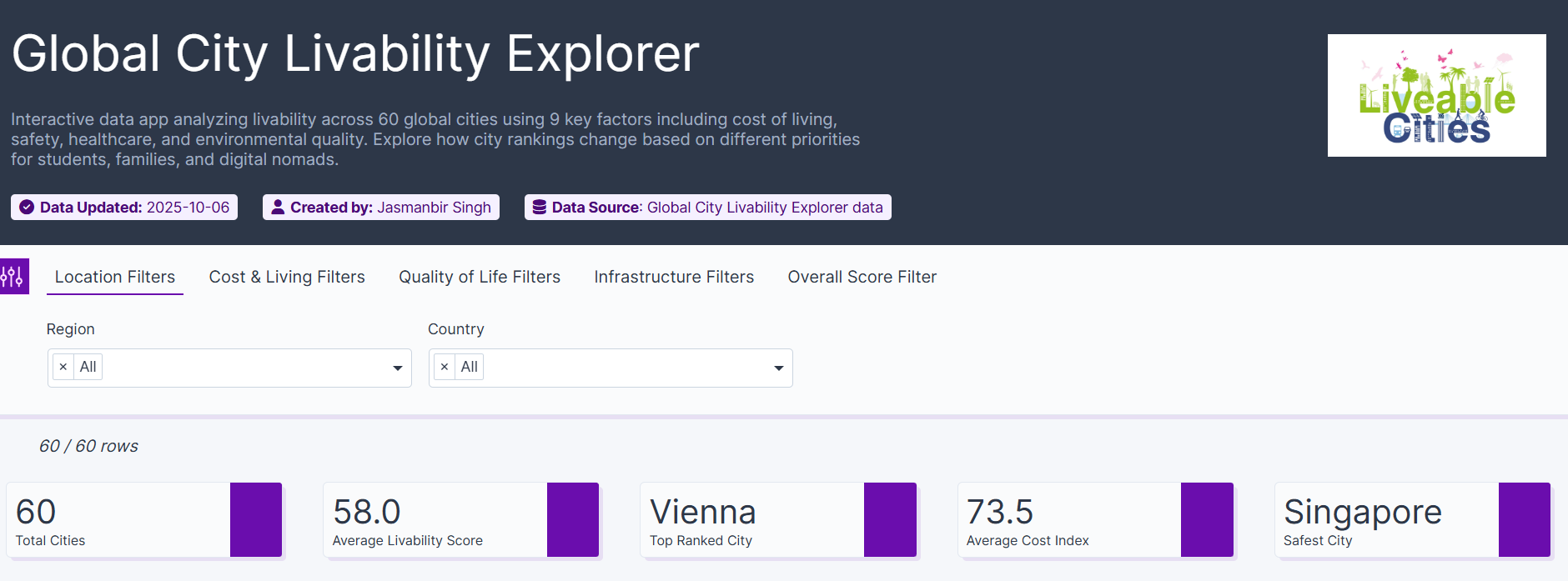
Header
-
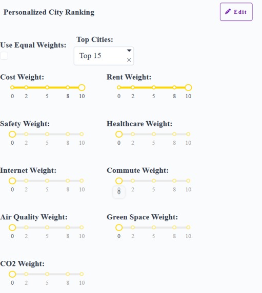
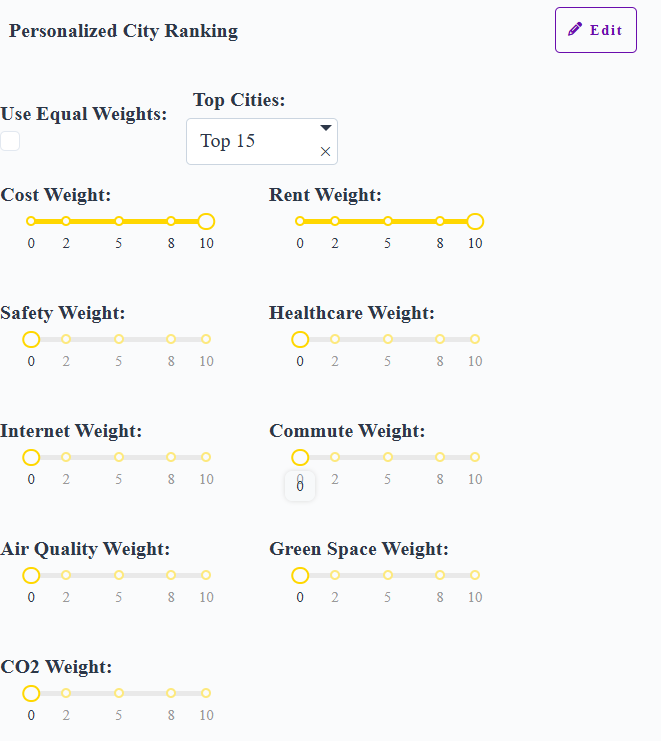
Weighted factors for city ranker according to our specifications
-
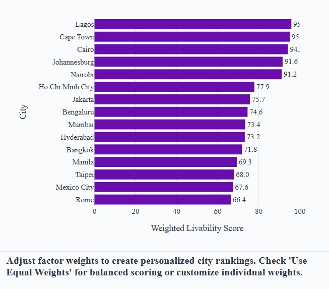
City ranker


Inspiration
We asked ourselves: what truly makes a city livable—is it cheap rent, clean air, or blazing-fast Wi-Fi? 🌆💜💛 The idea of letting people define their own version of “best city” inspired UrbanPulse.
What it does
UrbanPulse ranks 60 cities across 9+ factors and lets users personalize weights or choose presets (Student 🎓, Family 👨👩👧, Nomad 💻). The app reshuffles rankings live and reveals trade-offs with charts, maps, and correlations.
How we built it
We combined datasets (livability, air quality, CO₂, internet, commute, green space) → normalized to 0–100 → engineered preset scoring modes. Using Plotly Studio + pandas, we built interactive bar charts, radar comparisons, slope charts, and heatmaps—all themed in purple + yellow.
Challenges we ran into
Data gaps and mismatched city names were constant battles 🥴. Normalizing “bad is high” metrics like crime or commute required inversion. Designing charts that were clear, not cluttered, was another hurdle.
Accomplishments that we're proud of
We turned raw global stats into a fun, sleek, personalized explorer 🌍✨. The correlation insights (e.g. green space ↔ CO₂, cost ↔ crime) surprised even us. The clean purple–yellow design feels polished and vibrant.
What we learned
Livability is never one-size-fits-all. Safety tends to cost more, infrastructure factors move together, and environmental choices leave a strong fingerprint. Data storytelling + interactivity = real insight.
What's next for UrbanPulse: Global City Livability Explorer
We’ll add more factors (GDP, education, renewable energy ⚡), integrate real-time feeds (AQI, internet speed), enable multilingual UI, expand it to contain 350 cities and generate shareable “My Top 3” cards 📸. Long-term: an AI-powered city recommender to match people with their perfect vibe 🧭🤖.

Log in or sign up for Devpost to join the conversation.